✔ Parish - News Archive styling
Completed by Kyle S.
- Assigned to
-
 Kyle S.
- Notes
-
Two options (choose easiest and quickest, latter has more customizability for the client- pros and cons, I know)
https://church.agatha.diocesanweb.org/parish-news/- Images should all be the same size so they align, that means stretching if necessary. 407x271, which are the top three, based on aspect ratio I believe I like. But whatever works.
- The highlighted "[...]" should be switch to a read more link.
- The last two pictures should be aligned under the 2nd and 3rd in the first row.
This or switch the link on the homepage to https://church.agatha.diocesanweb.org/parish-news-archive/ which is a WP-ShowPost page and has more control over it and remove the height attribute that is highlighted in the bottom pic otherwise it doesn't flex well.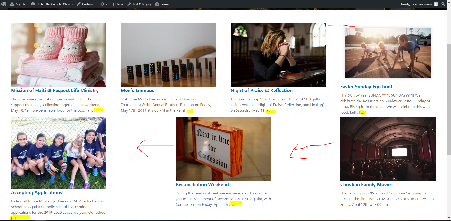
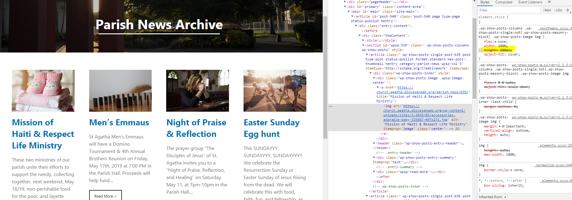
Text over the_excerpt() limit no longer has brackets around its ellipsis, and all items have a "Read More" link styled to match the rest of this site.