✔ Mobile Responsiveness - Test/make sure ready to go.
Completed by Kyle S.
- Assigned to
-
 Kyle S.
- Due on
- Notes
-
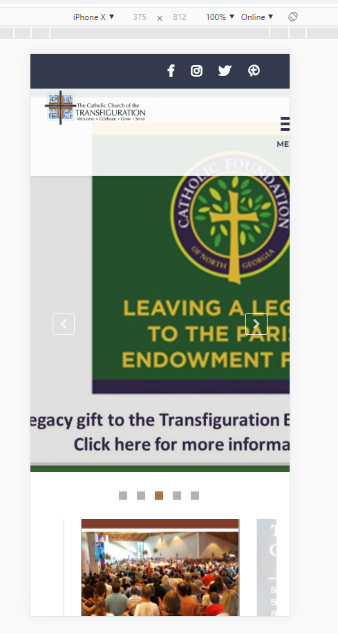
Menu is being cut off, logo should be centered and bigger, need a search, images in slider should be centered or aspect ratio, Just go through the site and templates/pages and just check that things are good to go.
Comments & Events
Kyle Sullivan,
Web Development
Should hero videos play on mobile? I'm guessing yes, so I added playsinline in the <video>s.
 Cody Armock,
Web Content Specialist
Cody Armock,
Web Content Specialist
I would think so too. Sounds good to me.
Kyle Sullivan,
Web Development
I added min-height: 30vh to .hero so that it doesn't get hidden when a mobile device is in landscape orientation.
Kyle Sullivan,
Web Development
I also fixed the header on mobile. The logo no longer shrinks excessively, and the menu-toggle remains on the screen.
Kyle Sullivan,
Web Development
The images in Ubermenu no longer show in ShiftNav. I added .mobile-hide to them, and it's working.
Kyle Sullivan,
Web Development
I've also updated the styling for the Slider Template and have adjusted the Page Headers to be more responsive.
Kyle Sullivan completed this to-do.