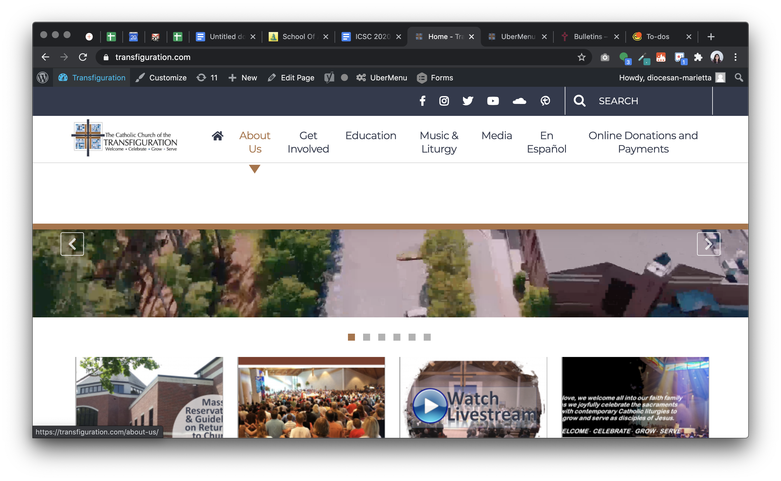
From the list: Build ✔ At certain screen size between mobile & small laptop, the menu is empty Veronica A. added this on Aug 20, 2020 Completed Aug 20, 2020 by Kyle S. Assigned to Kyle S. Notes Screen Shot 2020-08-20 at 1.03.08 PM.png 2.35 MB • Download Comments & Events Kyle Sullivan, Web Development It's having issues from 1023px – 1270px. Aug 20, 2020 at 6:16 PM Notified 1 person Kyle Sullivan, Web Development Wow, so there was a media query hidden in the Parent Theme. This has been a stark reminder of why I stopped building on the DPI Theme.Here's the relevant code from /transfiguration/sass/primary/headers/_ubermenu.scss..ubermenu { … .ubermenu-nav { li.ubermenu-item { .ubermenu-row { margin: 0; @media (min-width: 1024px) { display: flex; justify-content: flex-end; } } } } } Aug 20, 2020 at 7:36 PM Notified 1 person Kyle Sullivan completed this to-do. Aug 20, 2020 at 7:36 PM
Kyle Sullivan, Web Development It's having issues from 1023px – 1270px. Aug 20, 2020 at 6:16 PM Notified 1 person
Kyle Sullivan, Web Development Wow, so there was a media query hidden in the Parent Theme. This has been a stark reminder of why I stopped building on the DPI Theme.Here's the relevant code from /transfiguration/sass/primary/headers/_ubermenu.scss..ubermenu { … .ubermenu-nav { li.ubermenu-item { .ubermenu-row { margin: 0; @media (min-width: 1024px) { display: flex; justify-content: flex-end; } } } } } Aug 20, 2020 at 7:36 PM Notified 1 person
 Kyle S.
Here's the relevant code from /transfiguration/sass/primary/headers/_ubermenu.scss.
.ubermenu {
  …
  .ubermenu-nav {
    li.ubermenu-item {
      .ubermenu-row {
        margin: 0;
        @media (min-width: 1024px) {
          display: flex;
          justify-content: flex-end;
        }
      }
    }
  }
}