✔ Menu - Logo Spacing/Mobile - Needs to have less space to the right of the logo.
Completed by Kyle S.
- Assigned to
-
 Kyle S.
- Notes
-
It's currently pushing the menu & search icon down below before going to the mobile menu
Issue is when screen is between 1025px-1288px + other places between breakpoints (just go into inspect and start widening the screen to see what I mean.)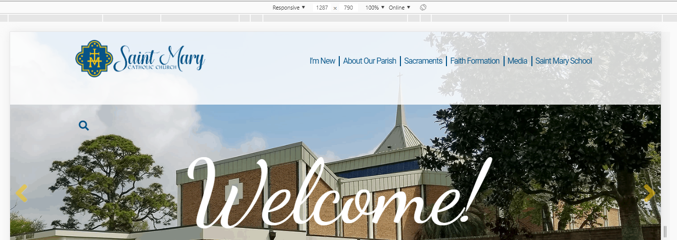
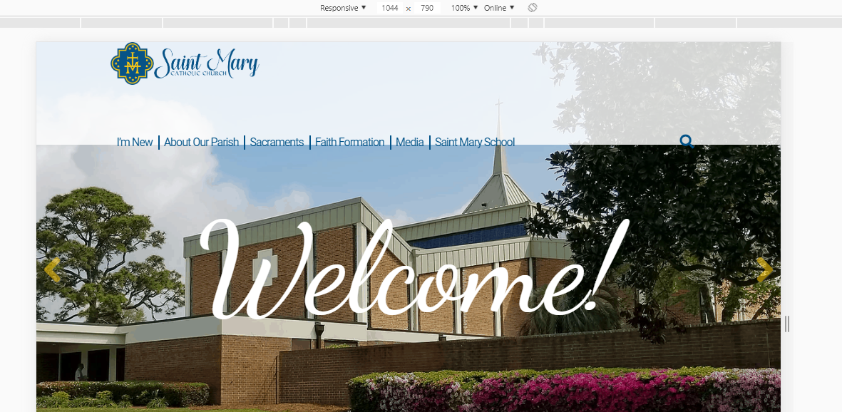
ALSO
The logo should have less padding to left
mockup vs actual

As to the padding, the edges of the header content is flush with the page container, with width: 80%; margin: 0 auto;.