✔ Contact Page - Make sure it is centered on mobile and make sure that the text is in the center. It doesn't look like it now.
Completed by Sam P.
- Assigned to
-
 Sam P.
- Notes
-
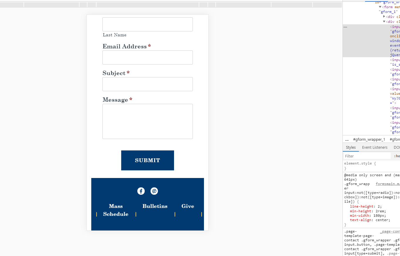
I think it needs a min-width otherwise it looks like it weird. In the images, you can see how the right side of the button is closer to the text than on the left.
dev with other fixes but not min-width vs dev with min-width.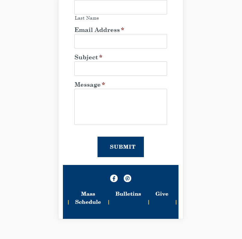
Comments & Events
Sam Pohlman completed this to-do.