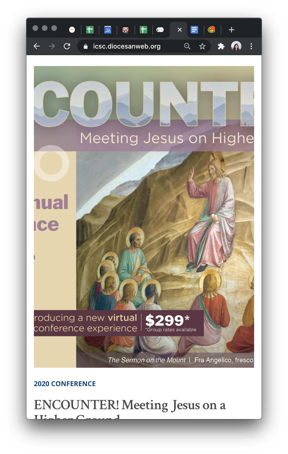
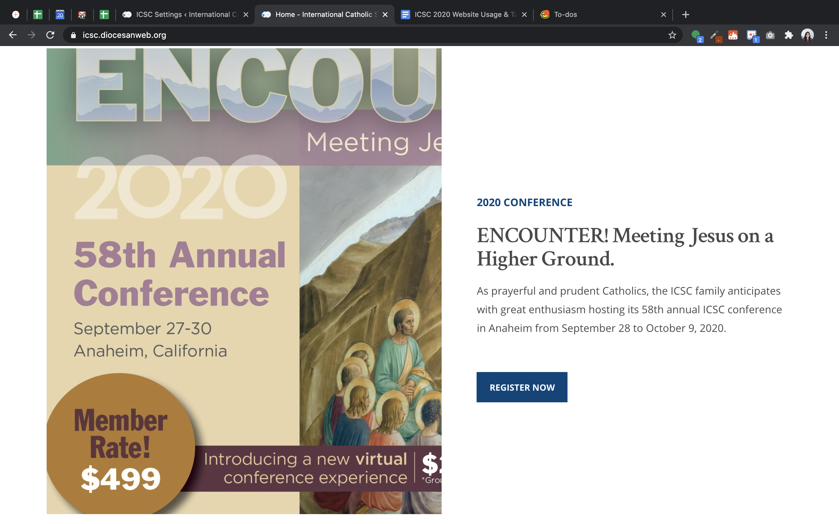
✔ Homepage - Conference Image - Have image keep it's ratio for mobile responsiveness. Please provide with ratio/recommended size
Completed by Ryan R.
- Assigned to
-
 Ryan R.
- Notes
-

Ryan R.
The mockup called for an image roughly 1280x800. On desktop however, the design only uses the left half of the image, so effectively 640x800 worth of image.
On tablet/mobile, we switch to a stack, and the portion of the image becomes semi-responsive. To keep things simple we put a fixed height on it, so that it looks and behaves similarly to the desktop size. The most obvious issue was that the image was centered on tablet/mobile, so I left-justified it.
I believe this adjustment will closer reflect the objective here, without trying to convert it to something pure responsive ratio.
The alternative would be to straight up crop the original 1280x800 image to left half 640x800, and use that as a "full" image. The only reason I didn't go that route to begin with was due to the vertical centering of the text on the right half. I needed a way to provide ample height without it being a function of browser width and image ratio. If the image was responsive instead, the desktop version wouldn't work as well, in my opinion.
Ryan, I'll let you know what we come up with!
Larger than Tablet
Tablet & Smaller
Actual image being used - Keep in mind the original image is the full spread and then cropped to 600x800 after scaling.
This way it'll be fully responsive and proportional throughout. I can honestly say this route was not as bad as I thought. Works quite well.
The situations described here were pretty straight forward. I did take a little liberty and with padding/widths/font-sizes just to fit things together a little smoother.
The situation not listed I did the following:
Larger than Tablet - With Sign-up Form Showing