Logo Request/Some Design Edits
Hi Christine,
I hope you are doing well! My co-worker, Cody Armock, said he had spoken with you about some design edits you were wanting.
First, I have attached the files for a black version of the logo for you.
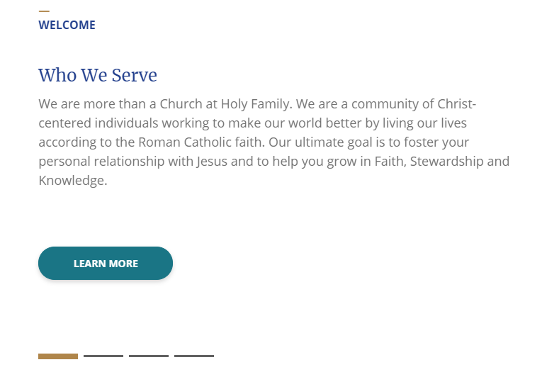
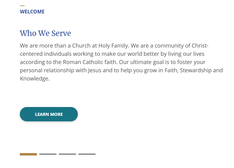
Next, he said he spoke with about changing the body font color to be a tad darker, and I think that should be fine. I have a 2 screen captures of the "Welcome" area on the homepage. The first screenshot is the current font color, and the second screenshot is with the color #404040, which I believe Cody showed you. It's a little darker and I think it looks nice and is readable. Let me know what you think of that and if that will work or if you would like something different.
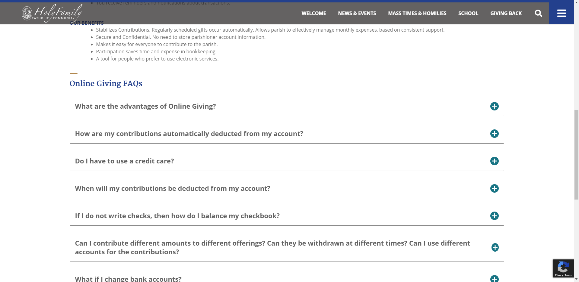
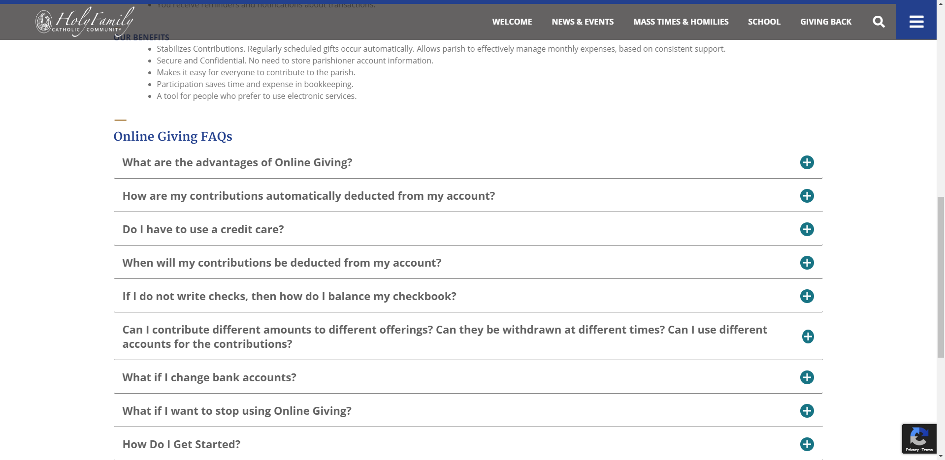
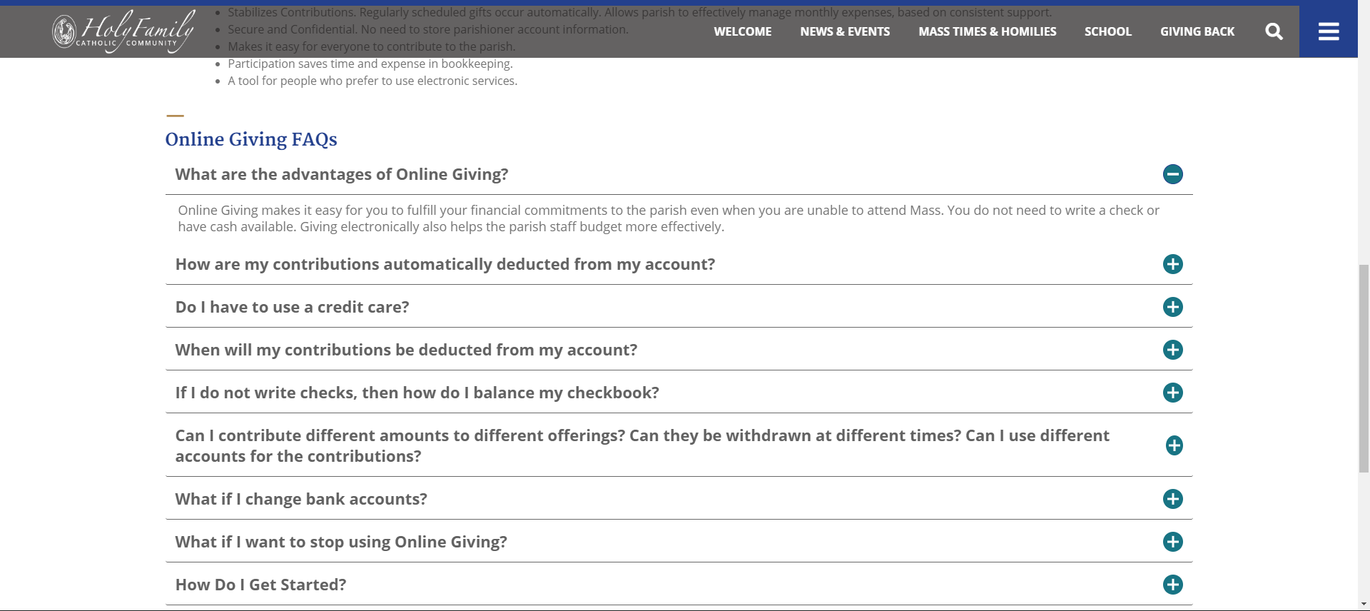
Finally, he said you spoke about the spacing of the accordion area. I have 2 screen captures for you to look at. We added a heading above the accordion area which I believe gives it more structure, rather than just appearing after the text above it. So the first screenshot is what it is currently, and the second screenshot is with some reduced space in between each of the accordions questions. I think this still works well and is still balanced. We just don't want them to get too close together and become difficult to read. Let us know if you like that spacing a little better or have any input about this.
If you more input or any please let us know, we are looking forward to hearing from you! Talk to you soon!
Best,
Blake Stapleton
I hope you are doing well! My co-worker, Cody Armock, said he had spoken with you about some design edits you were wanting.
First, I have attached the files for a black version of the logo for you.
Next, he said he spoke with about changing the body font color to be a tad darker, and I think that should be fine. I have a 2 screen captures of the "Welcome" area on the homepage. The first screenshot is the current font color, and the second screenshot is with the color #404040, which I believe Cody showed you. It's a little darker and I think it looks nice and is readable. Let me know what you think of that and if that will work or if you would like something different.
Finally, he said you spoke about the spacing of the accordion area. I have 2 screen captures for you to look at. We added a heading above the accordion area which I believe gives it more structure, rather than just appearing after the text above it. So the first screenshot is what it is currently, and the second screenshot is with some reduced space in between each of the accordions questions. I think this still works well and is still balanced. We just don't want them to get too close together and become difficult to read. Let us know if you like that spacing a little better or have any input about this.
If you more input or any please let us know, we are looking forward to hearing from you! Talk to you soon!
Best,
Blake Stapleton
Hi Blake!
Thanks for these – we’ll review shortly and get back to you, and greatly appreciate your being on top of it.
BTW, speaking of logos, I’d like to look into doing a vertical (or squared) version of our logo, for other uses outside the website. Not sure if it’s something you’d take on (and if there’s an add’l cost involved) or if we should have someone here look at doing it. Your thoughts, either way?
C
Hi Blake!
Thank you! A couple comments, in red below… ☺
Also, I saw that there were image dimensions in the style guide, at the end. I’m presuming that’s new as we discussed with Cody. I think this is what Lynn was looking for but I’m asking him to respond if not.
Thx
C
Blessings!
Christine White
Marketing/Communications Coordinator
Holy Family Catholic Church
www.HolyFamilyOrlando.com<http://www.holyfamilyorlando.com/>
CWhite@HolyFamilyOrlando.com<mailto:CWhite@HolyFamilyOrlando.com>
W: 407.876.2211 x253
“Nothing is impossible with God!” Luke 1:37
Hi Christine,
Unfortunately, Basecamp doesn't allow you to forward in other messages emails. If you could forward the comments to our department email, webdepartment@diocesan.com we will be able to see it.
Thanks so much!
Blake Stapleton
Unfortunately, Basecamp doesn't allow you to forward in other messages emails. If you could forward the comments to our department email, webdepartment@diocesan.com we will be able to see it.
Thanks so much!
Blake Stapleton
To all,
So I’m clear:
1920px image would need to be 565px depth?
Also, what size works best for the Plinkos?
Yours in Christ,
Lynn
So I’m clear:
1920px image would need to be 565px depth?
Also, what size works best for the Plinkos?
Yours in Christ,
Lynn
Hello Christine,
Plinkos will go to be the size of the plinko, a minimum height of 462px and will set the width automatically to adjust to the original dimensions of the image. So use an image of at least 462px tall and then the ratio of the image will stay similar. I would recommend using landscape orientation images. I would use images that are high resolution and somewhere in the landscape ratio of 1300x462 or around there. I hope that helps.
Cody Armock
Hi Christine,
Thanks for the feedback about those options. Here a couple more screens for you to see regarding them.
The first is a little bit darker font choice. Let me know if that is working.
The other is what the accordion looks like when it is open. We would eliminate some of the space that is currently there.
In regards to the vertical version of the logo, it would be an additional quote at this time. Since the original design hours for the project have been used up it would require a cost for the additional time. Let me know if you need any more information regarding that.
Talk to you soon!
Best,
Blake Stapleton
Thanks! Comments below…
C
C