Some Updates
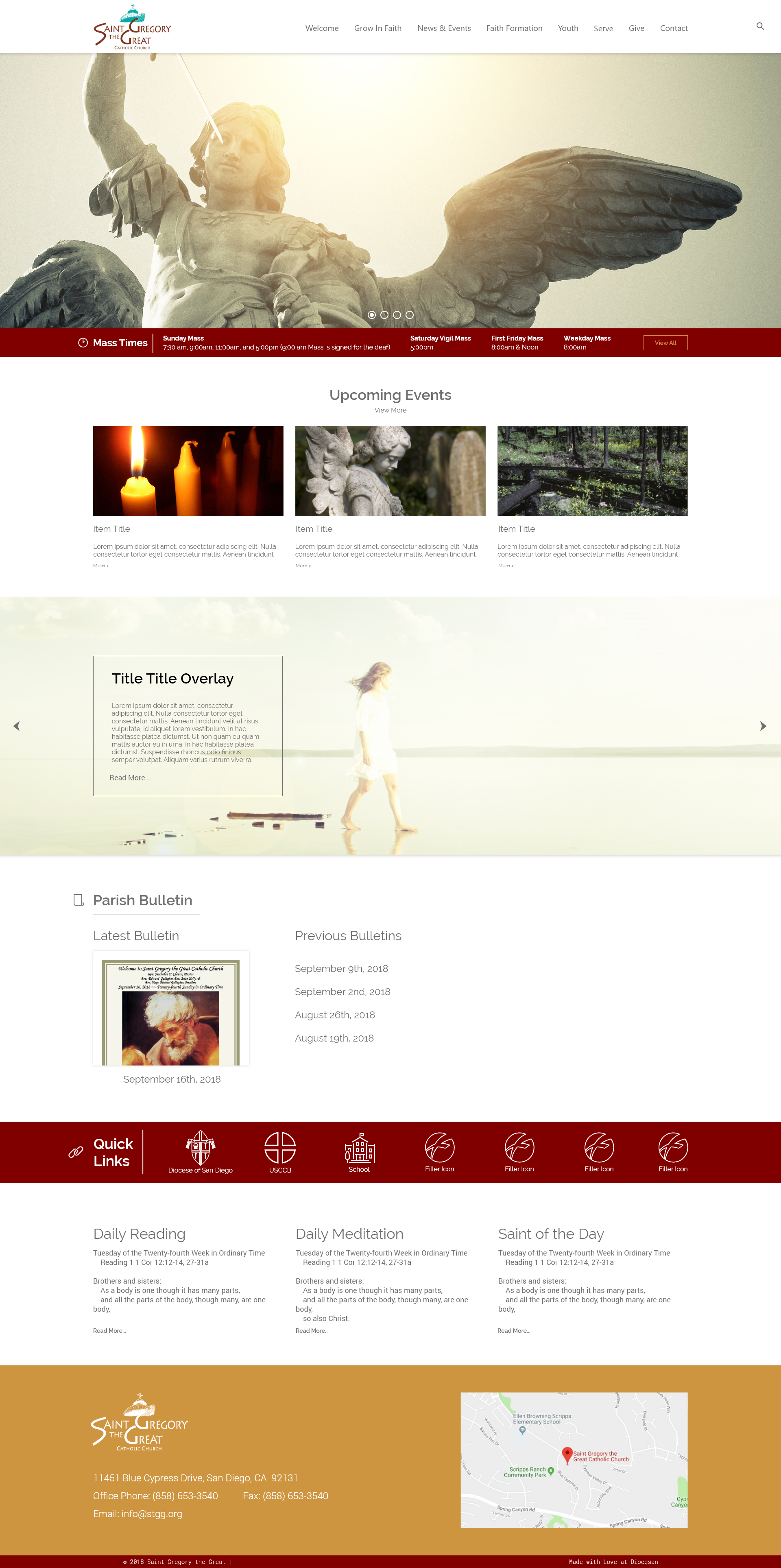
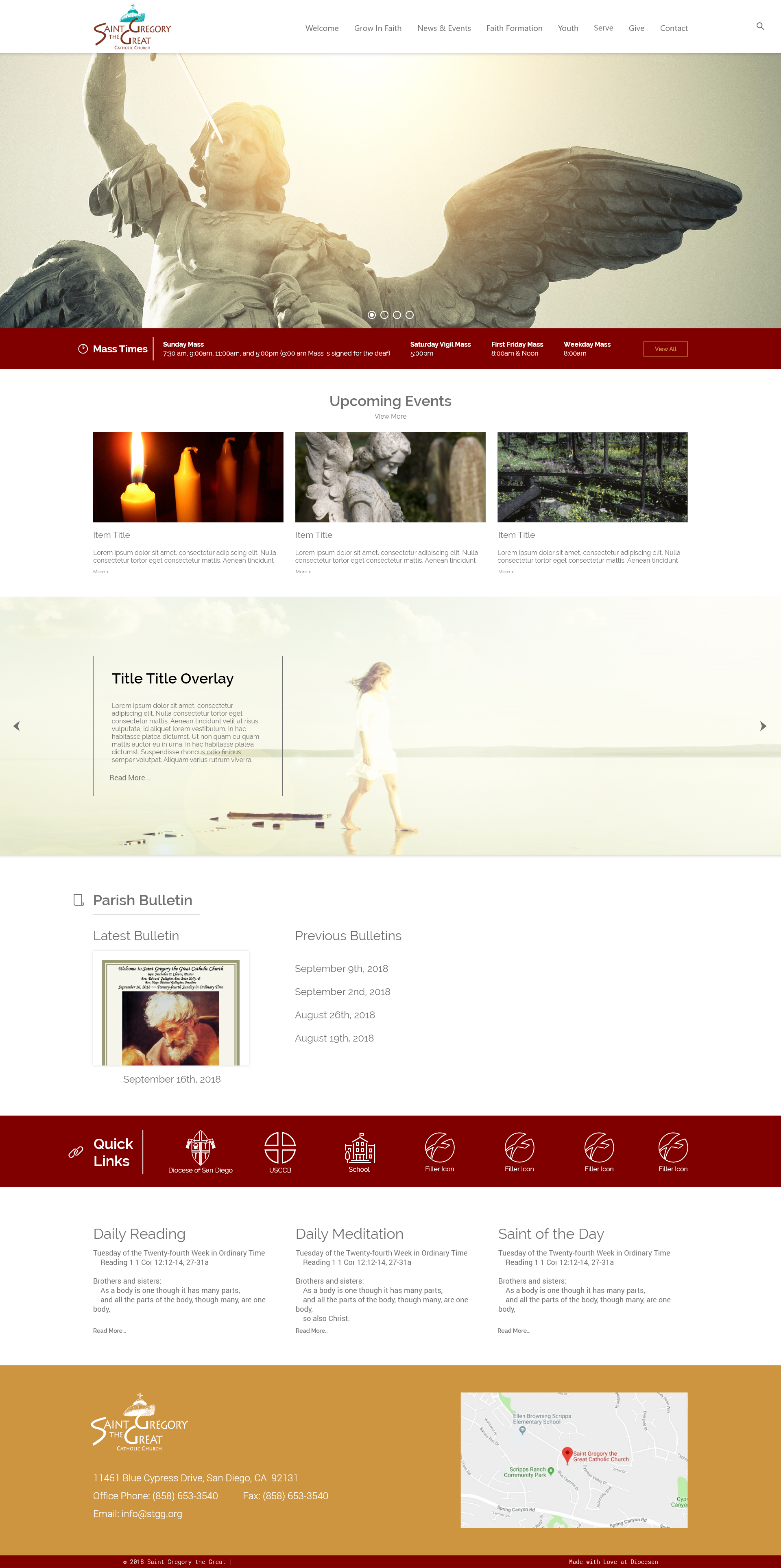
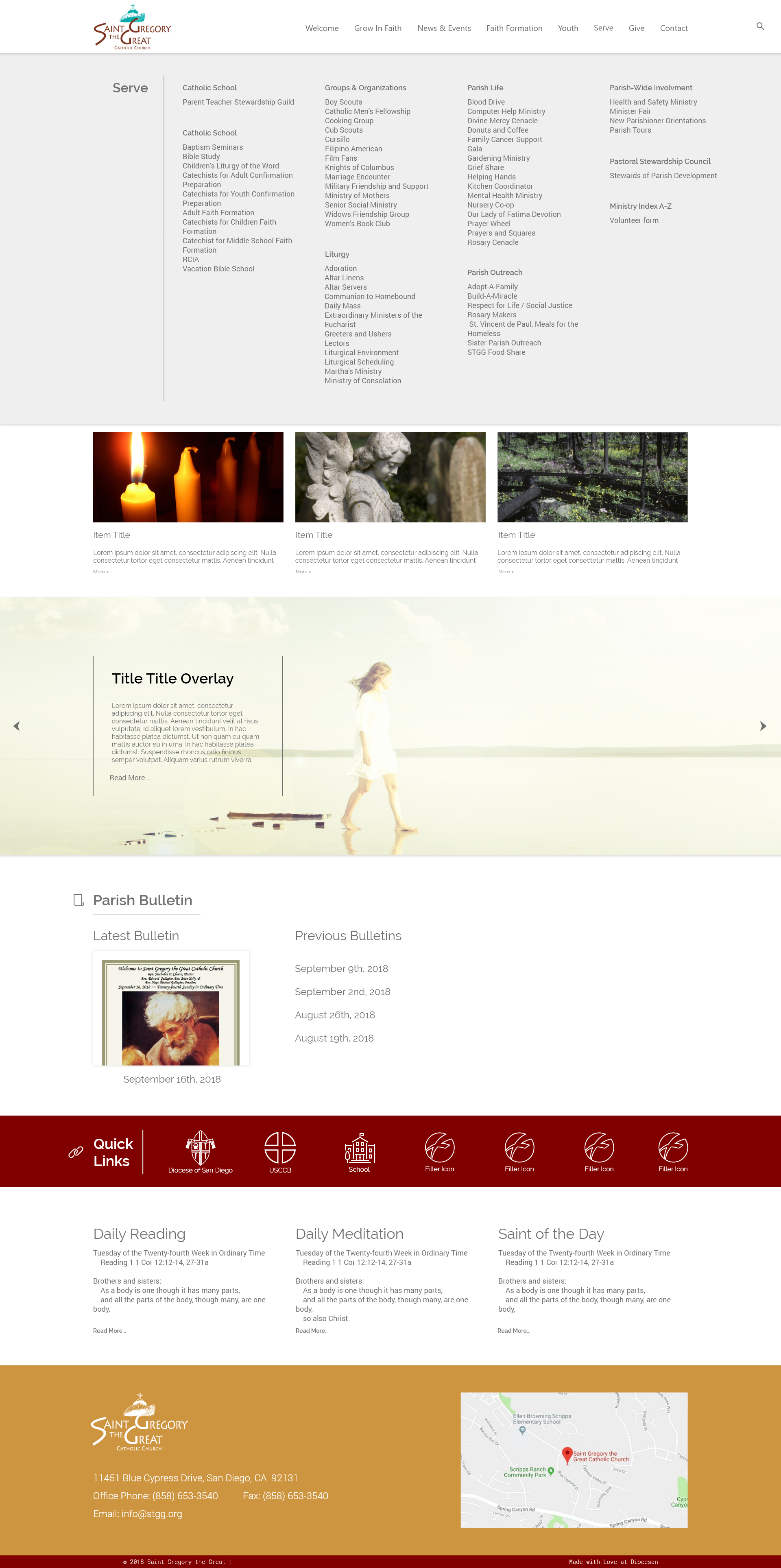
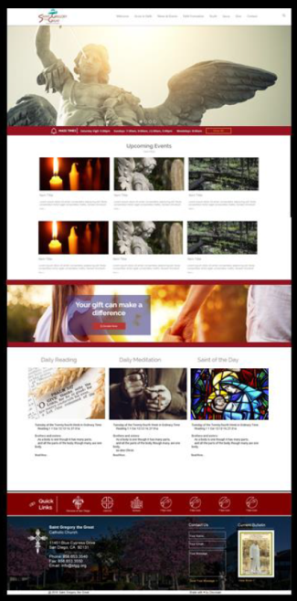
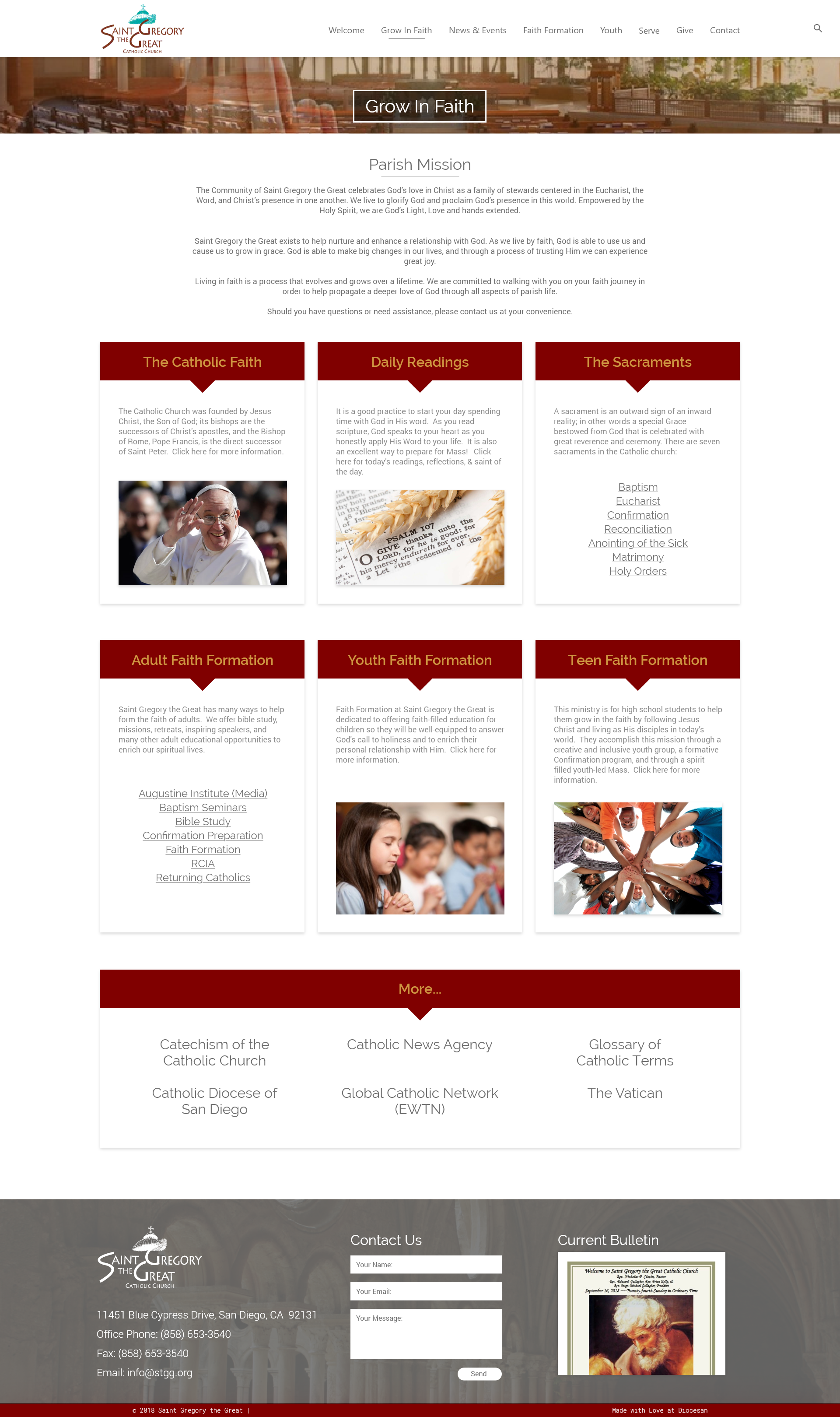
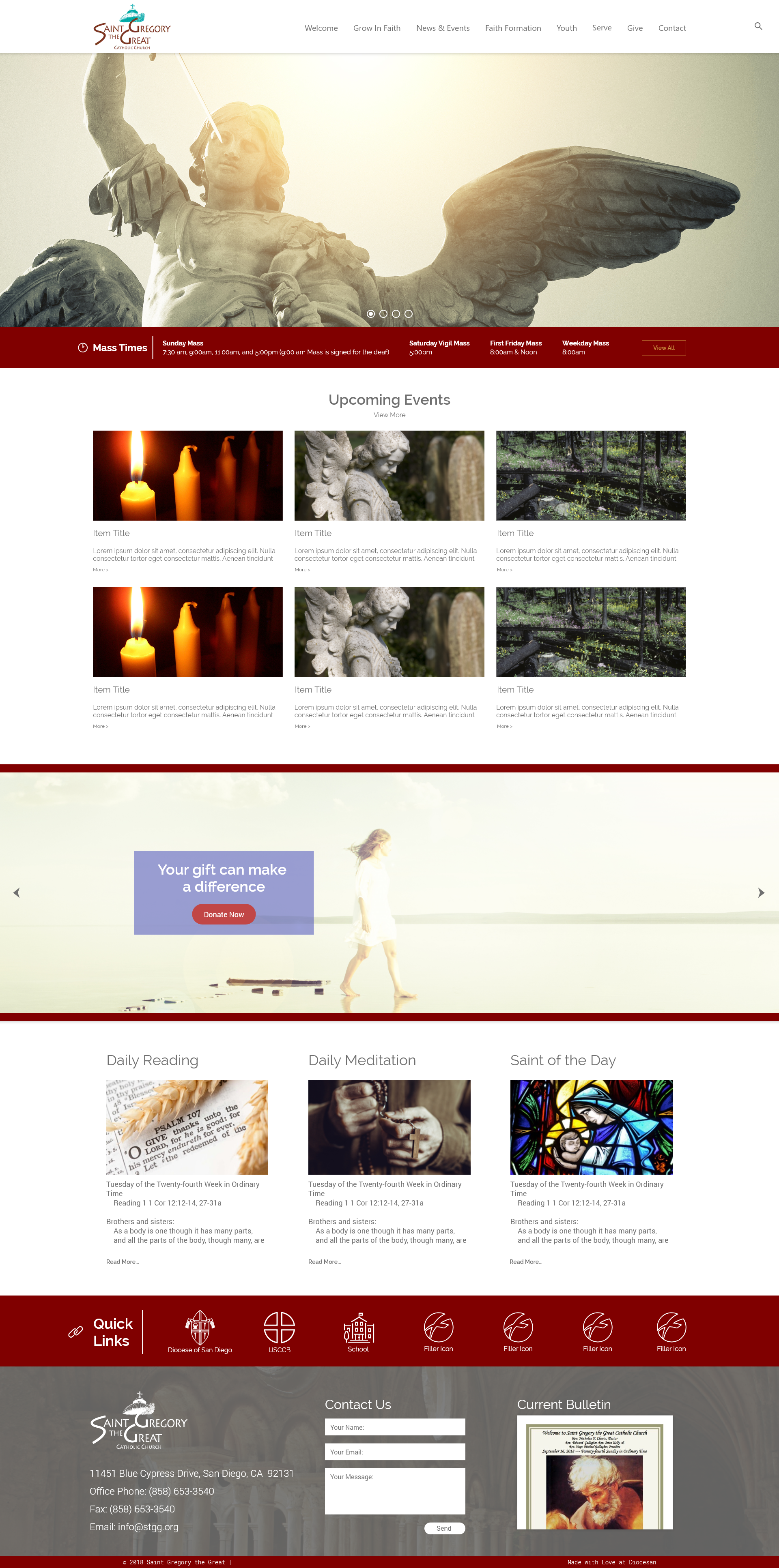
I have some updates here for you to take a look at. The homepage has some changes made to it, I'm working through the bulletin section to see if we can fit it this section a bit differently.
Hi Sam!
At first glance they look great. I can dive a little deeper tomorrow. Right off the bat though, I think I’d like the photo to be the main the band – there’s no need for two.
Thank you, Nichol
At first glance they look great. I can dive a little deeper tomorrow. Right off the bat though, I think I’d like the photo to be the main the band – there’s no need for two.
Thank you, Nichol
Sounds great! Ill make that change.
Thanks,
Samuel Lanning
Thanks,
Samuel Lanning
Hi Sam,
So sorry that I’ve not been able to look at this until today. I started working things through, and hope to work some more on it tomorrow so that I won’t be holding you up. I promise I haven’t forgotten you!
Thank you, Nichol
So sorry that I’ve not been able to look at this until today. I started working things through, and hope to work some more on it tomorrow so that I won’t be holding you up. I promise I haven’t forgotten you!
Thank you, Nichol
You're totally fine, I am working on your project today to fix the things you wanted to see the last time you commented as well as add a few more proofs and pages. I should have some more for you later today!
Thanks,
Samuel Lanning
Thanks,
Samuel Lanning
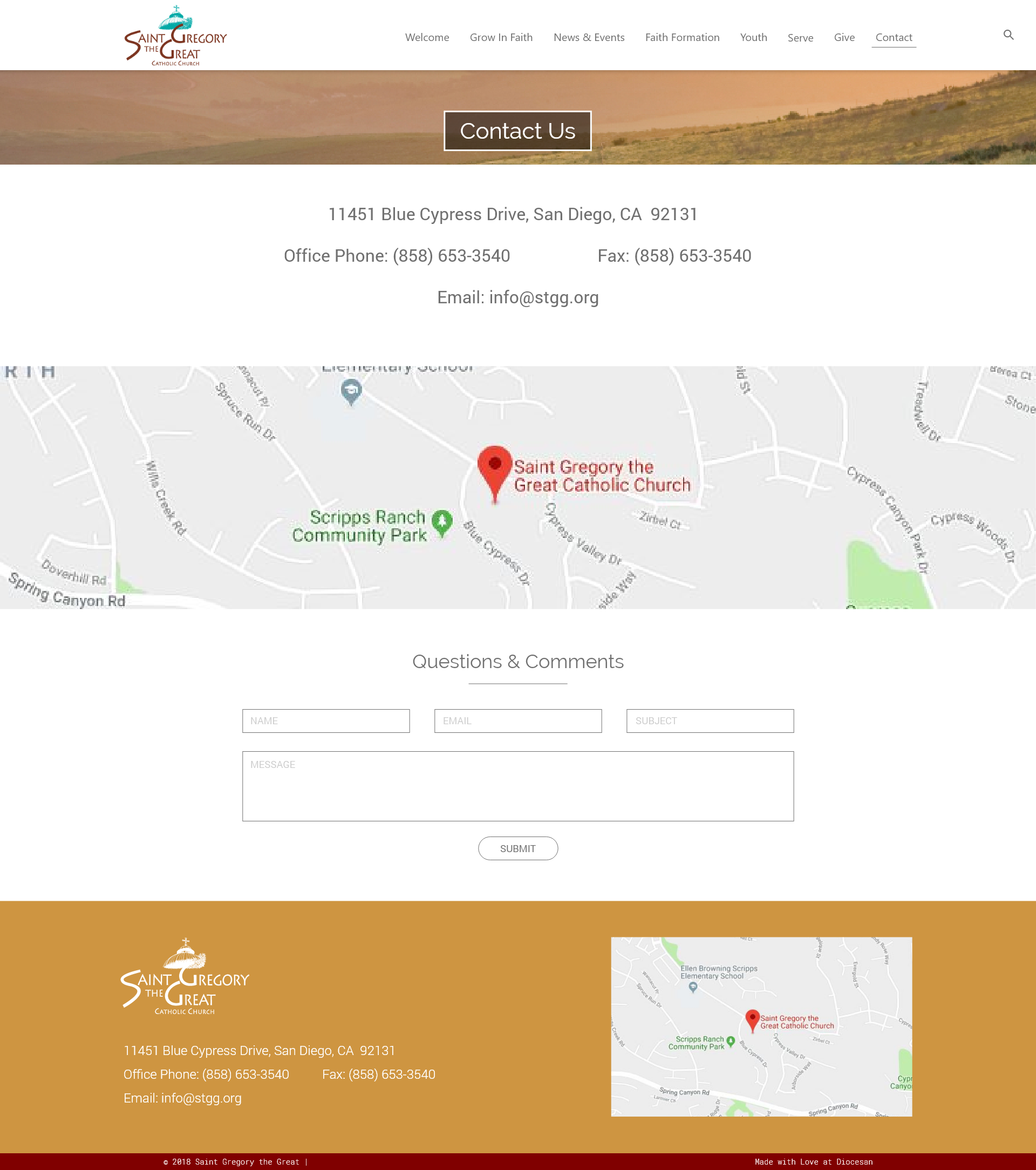
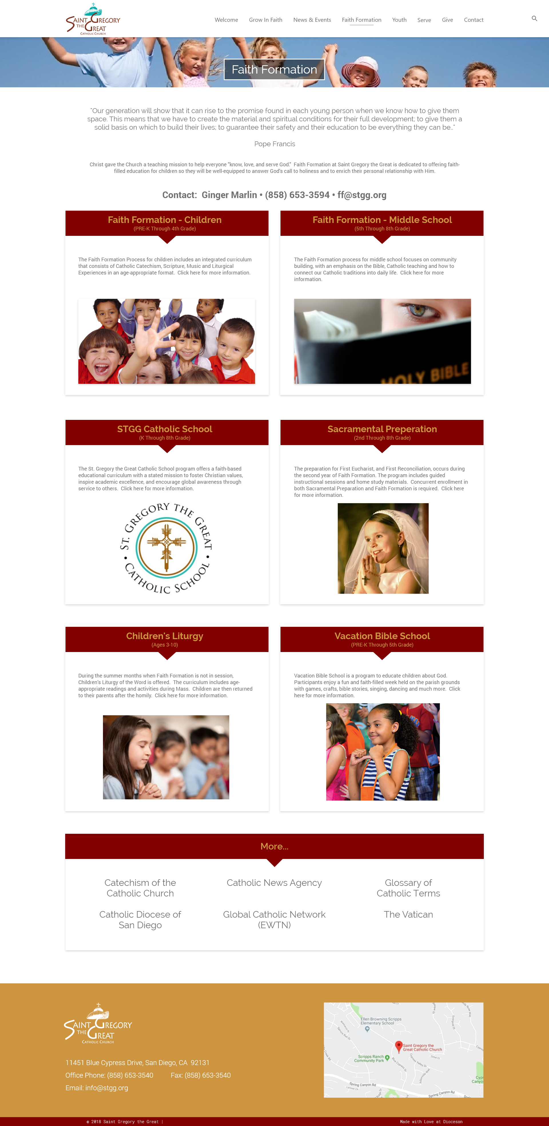
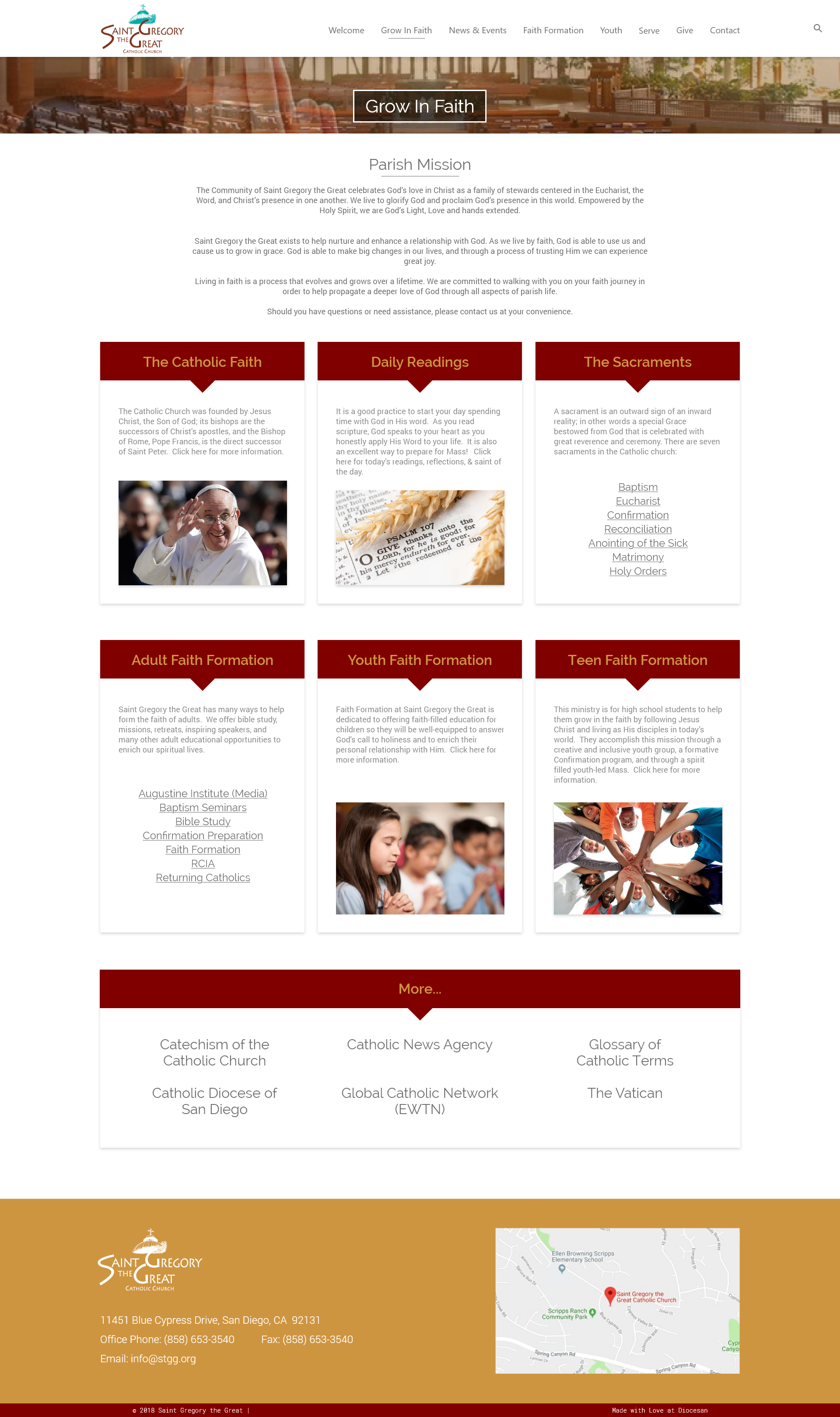
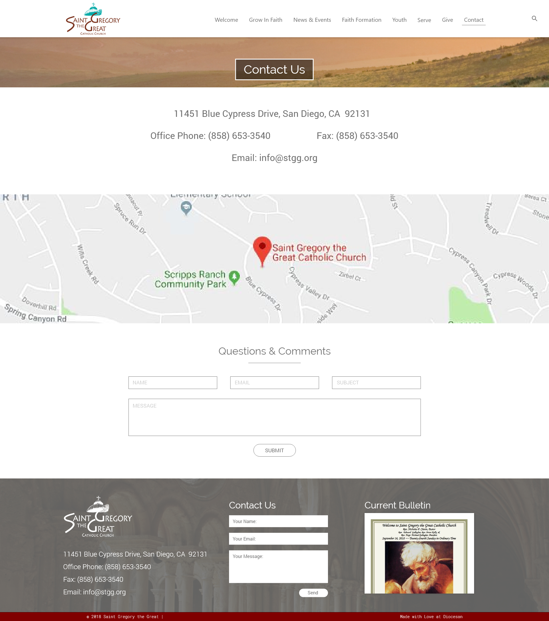
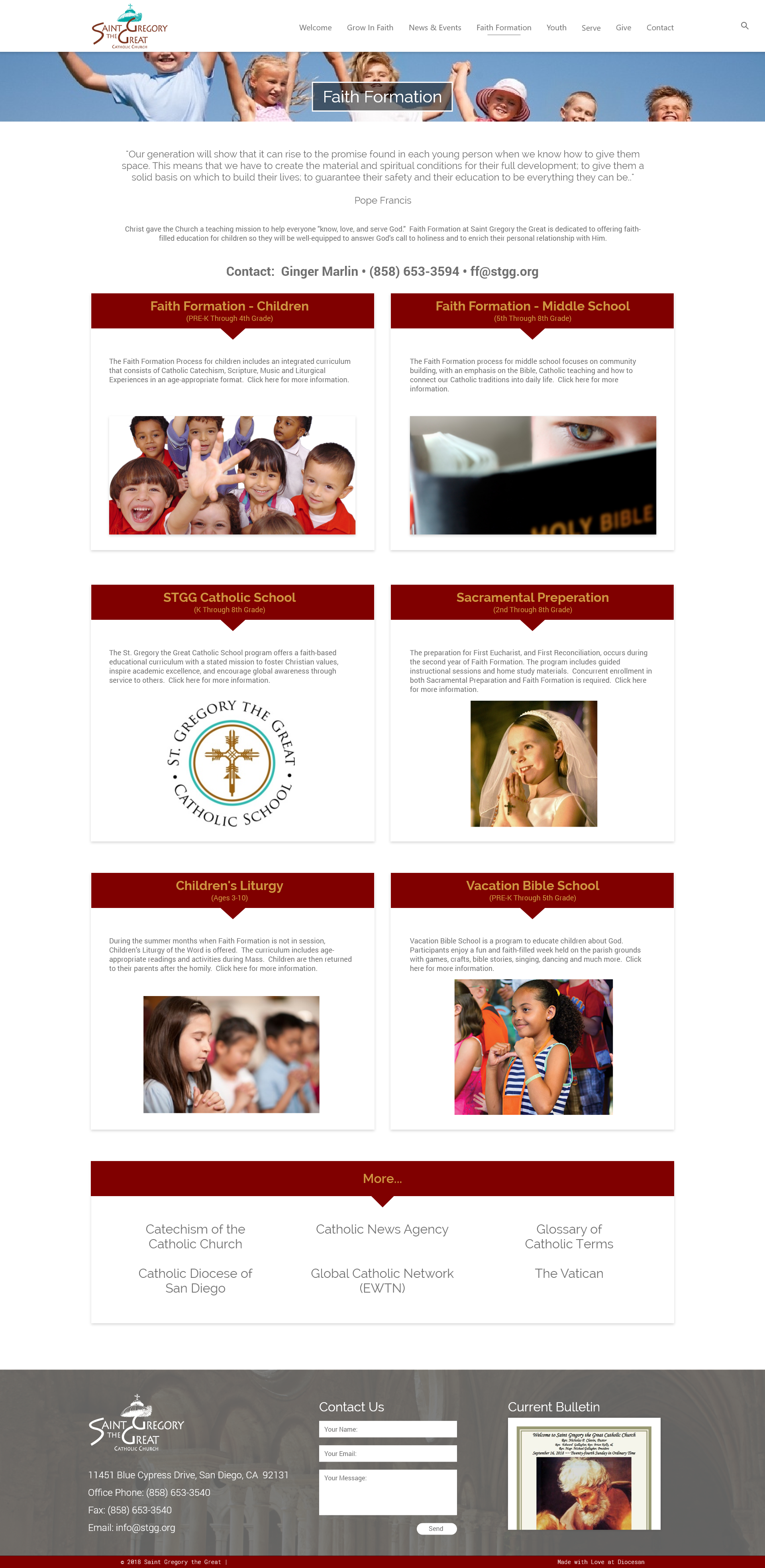
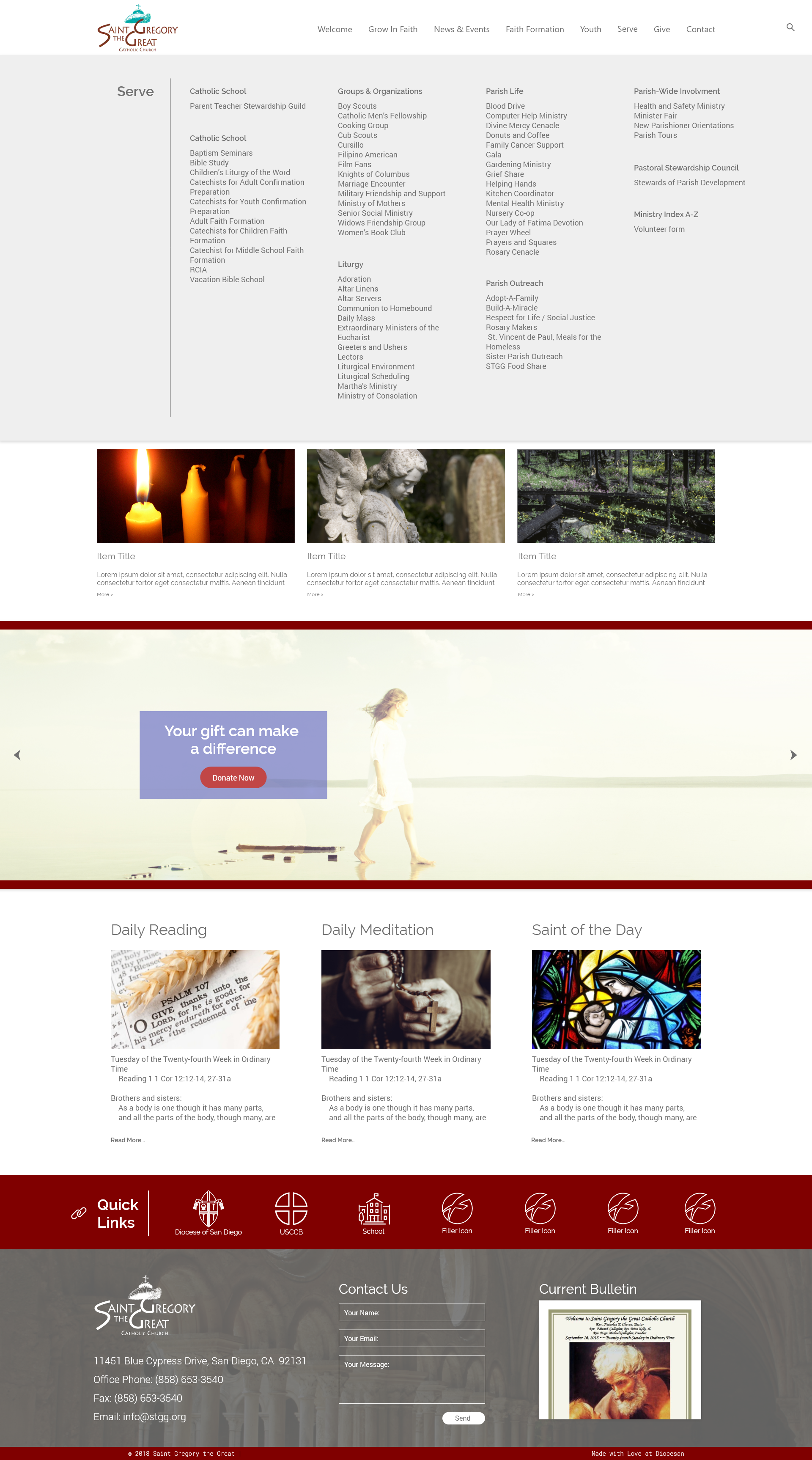
Here is the updated proofs for you.
Hi Sam,
I’ve been experimenting with different placement of things on the homepage and came up with a rough idea of what might work if it’s possible on your end (please bear with my cut & paste mock-up). Please see attached.
The reading, meditation, and saint of the day images would be neat if they rotated daily. (Am I dreaming too big?) I really love how you do that with “inspire daily” on the app and would like this to be the source of our daily meditations.
The quick link bar needs different content, but we can work on that. I like the animation and icons like the tan bar here: https://sainttims.org/ .
The bottom bar I totally changed, what do you think?
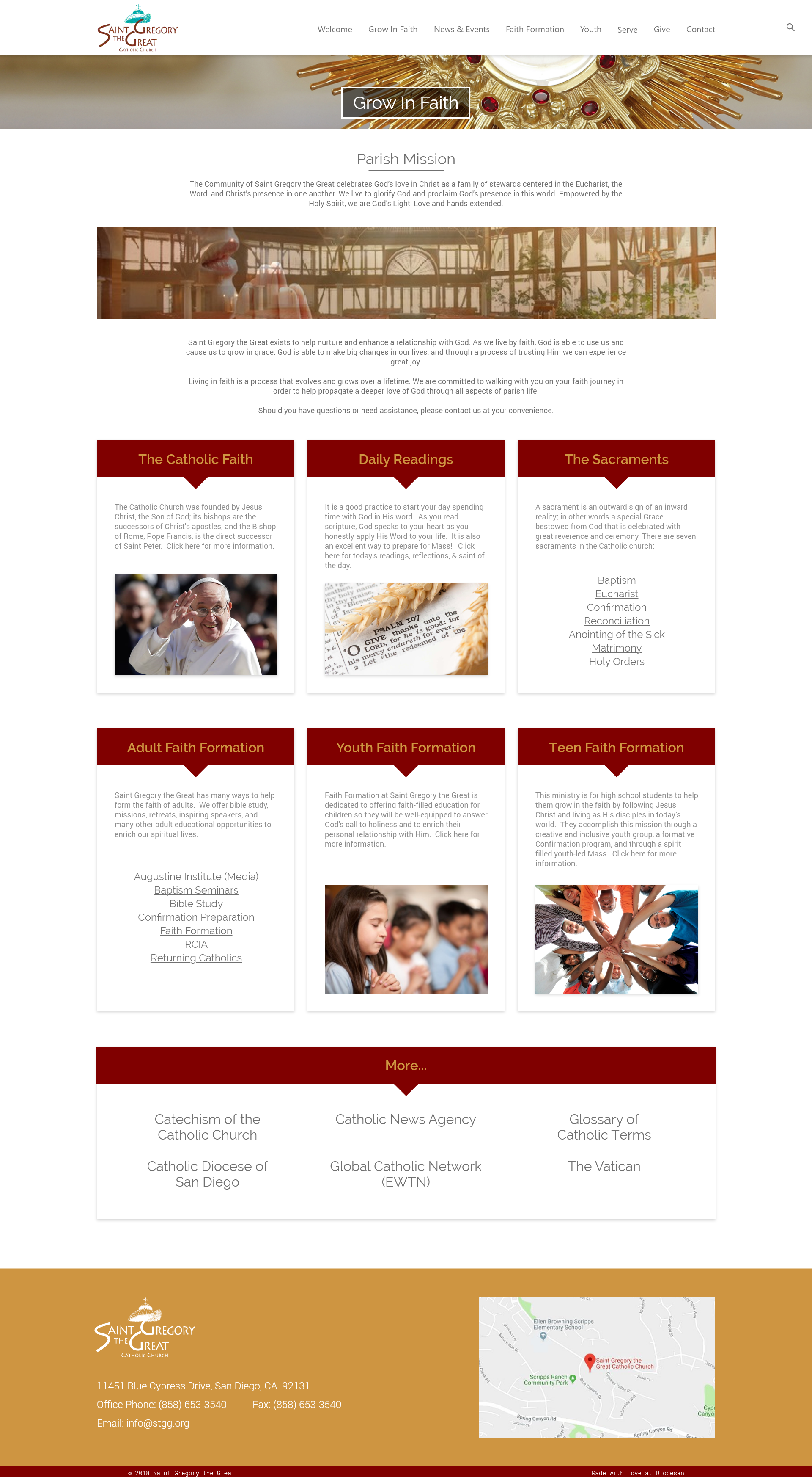
Thank you for being so patient with me. I feel like once we get the homepage ironed out the rest will come much easier. I like the landing pages you did below, with the only exception being that perhaps the photos could be a little larger in the top bar. We can talk more on these, as I have been really concentrating more on the homepage.
Blessings, Nichol
Hi Sam,
How are you? I’m wondering if you ever received this email with this mock-up? Are you working on it?
Thanks a million, Nichol
PS: I was able to connect with a bunch of Diocesan people this past week! You have such a great group of people, and it was especially nice meeting Veronica. I hope to get to meet you in person someday too. ☺
[cid:image003.png@01D471E6.84D4EAB0]
Yes i did receive your previous email, and i have been working on it. It has just been pretty busy around right now so I apologize for the slow turn around! I should have the updates for you soon.
Veronica told me that she met you! Wish I could have made it down but have too much on my plate at the moment to have made it!
Thanks,
Samuel Lanning
Veronica told me that she met you! Wish I could have made it down but have too much on my plate at the moment to have made it!
Thanks,
Samuel Lanning
Great, thanks!
Good afternoon,
I wanted to send you an update to the site so far!
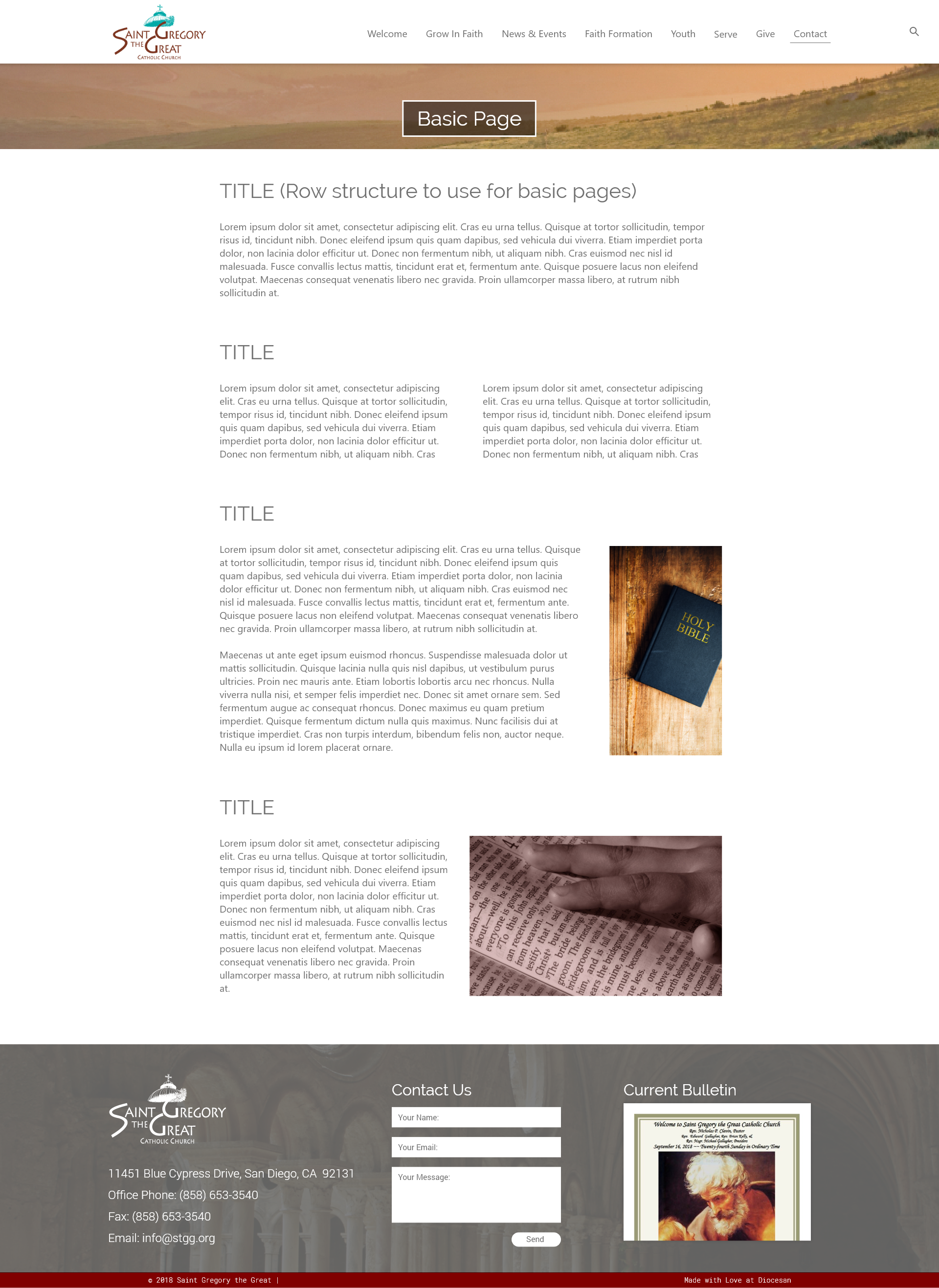
I know we are working hard and getting close to approval for the design, please take your time to look over the latest versions. I added a general page to showcase structure of pages with little bits of content or mostly text and small images. (Basic page Columns)
Hi Sam,
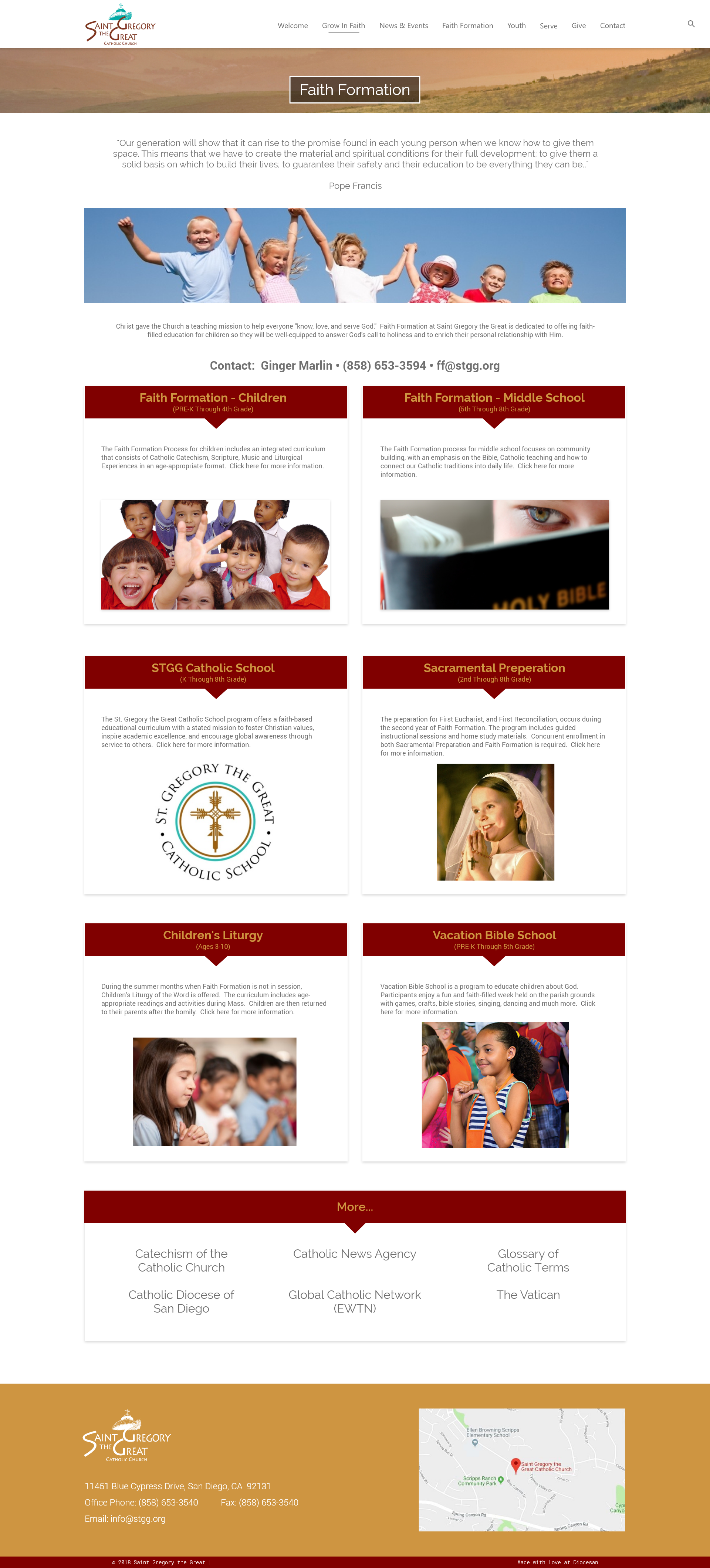
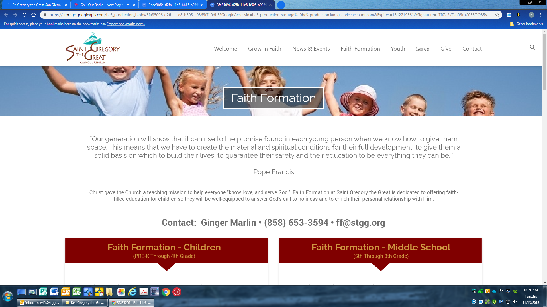
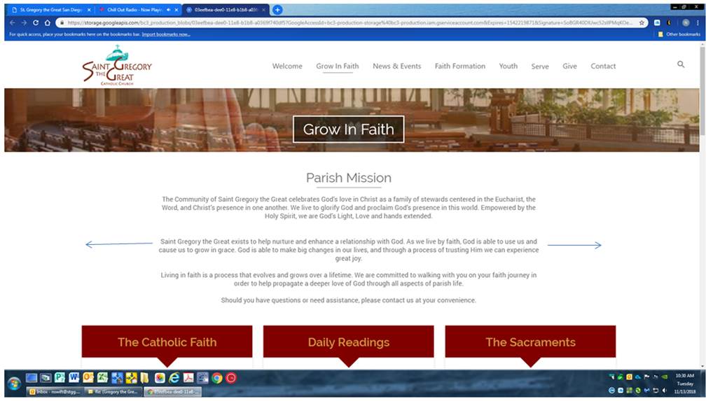
I’m curious on the secondary pages, what will the actual scale will look like? It looks GIANT on my screen. Here is a screen shot (see below). Is there a way to see this as it will actually be seen when I’m on the website?
Also, the banner is too narrow and is cutting off most of the photo. Can it be made taller? Lastly, the font sizes are off. I’d like the quote to be smaller and in italics, and the body to be normal and a bit larger.
Thank you, Nichol
[cid:image001.png@01D47B3B.45639CB0]
The overall structure looks good. Is it possible to stretch the text box for the first block of words as shown? It might be nice if it lines up, or better yet to have the ability to change block sizes on each page if I desire.
[cid:image003.jpg@01D47B3C.7BDD1E50]
[cid:image003.jpg@01D47B3C.7BDD1E50]
I use a 1920 by (X=Height) for the proofs. So this is a standard size for most modern monitors! The scale will be hard to represent unless your using a 1920x1080 monitor, it looks like you might be.
I can make the changes to the two typefaces for the quote and the body.( Keep in mind this will change the body copy for the whole project) I like to keep things consistent throughout the site!
Thanks,
Samuel Lanning
I can make the changes to the two typefaces for the quote and the body.( Keep in mind this will change the body copy for the whole project) I like to keep things consistent throughout the site!
Thanks,
Samuel Lanning
Oh and as far as the picture goes. Its used as a placeholder so the size depends on what photo you want to use and how you want it to sit in that section!
Thanks,
Samuel Lanning
Thanks,
Samuel Lanning
I do have that size monitor, but it still looks enormous. Is there no way to see it as I will actually see it when it’s on the internet?
Consistent typeface sizes will be good, I like that too.
Thank you
Consistent typeface sizes will be good, I like that too.
Thank you
So I can make the placeholder larger if I want to? It is currently cutting off most of the photo.
Off the subject, but in the menu where it says “serve” can you change this to “ministries” please? I wanted to change it on our current site, but it’s too much trouble to change so many pages since it is going away soon anyway.
I have another idea that might work, could we keep that size banner but have it roll over the photo from top to bottom? That might look cool.
Yea we can add a parallax effect to the image if that is what youre talking about?
Example here: https://ihatetomatoes.net/demos/simple-parallax-scrolling-tutorial/
(I wont be able to show this effect in the design phase, it will have to be in development)
Thanks,
Samuel
Example here: https://ihatetomatoes.net/demos/simple-parallax-scrolling-tutorial/
(I wont be able to show this effect in the design phase, it will have to be in development)
Thanks,
Samuel
It think that’s really cool. What do you think? Would it be weird for those pages?
Not at all, I have used the effect before on websites and it looks nice! I will make a note to have them add the effect in develop.
Thanks,
Samuel Lanning
Thanks,
Samuel Lanning
Ok, thank you
