✔ Mobile - Mass Times - Accordion similar to Quicklinks layout
Completed by Veronica A.
- Assigned to
-
 Sam P.
- Notes
-
REMEMBER, SHE IS COMPARING THE MASS TIMES TO THE QUICKLINKS AND WANTS THEM TO LOOK AS SIMILAR AS POSSIBLE.
- Closed Mass Times accordion should be same height and spacing as Quicklinks
- Transitions should match
- Breakpoints should match
Mobile should look like this closed:

Open should be similar to this BUT- when open, it should say "Hide"
- Add padding above "View All" button below Mass Times
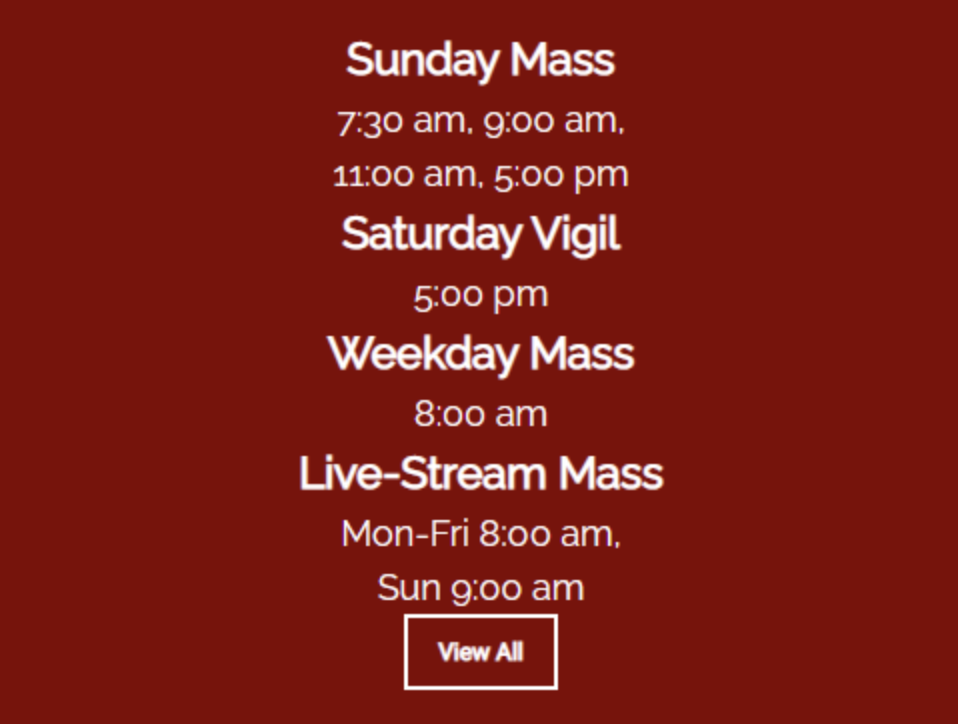
Font sizes and padding need to be the same so that if she took a ruler to it (which she will), they match up exactly but with a different icon and different title.