✔ Header - Logo alignment
Completed by Sam P.
- Assigned to
-
 Sam P.
- Notes
-
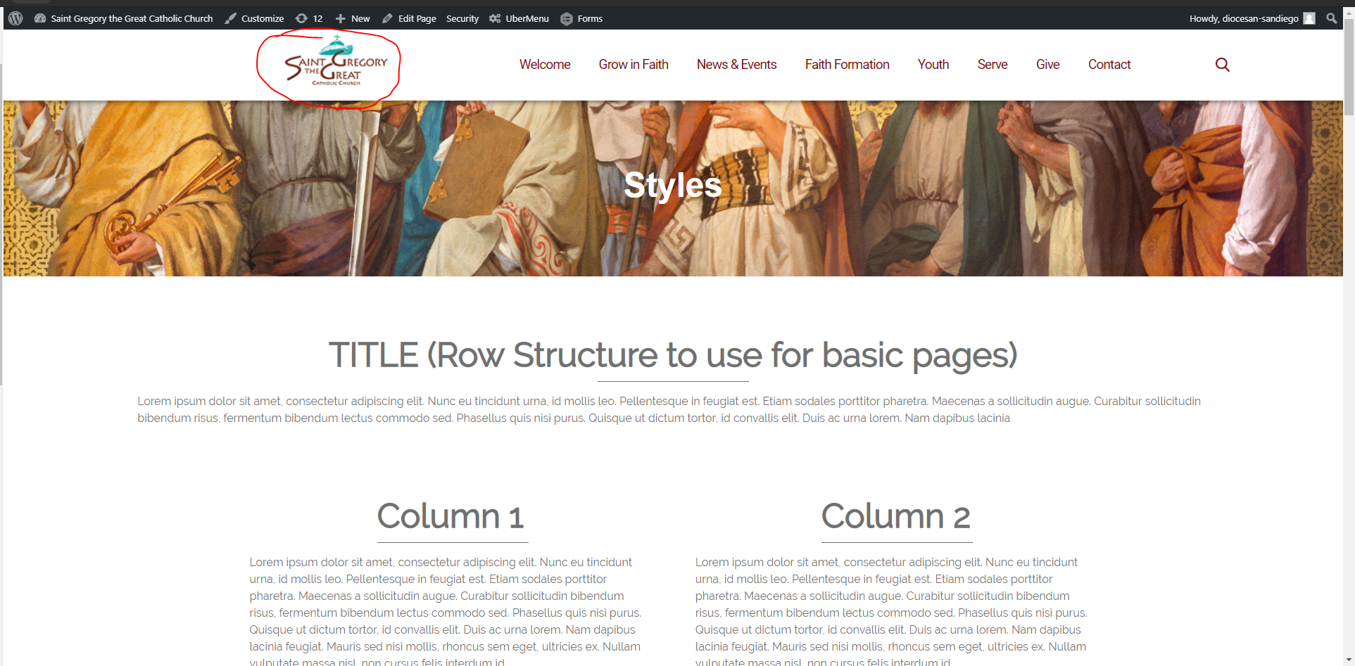
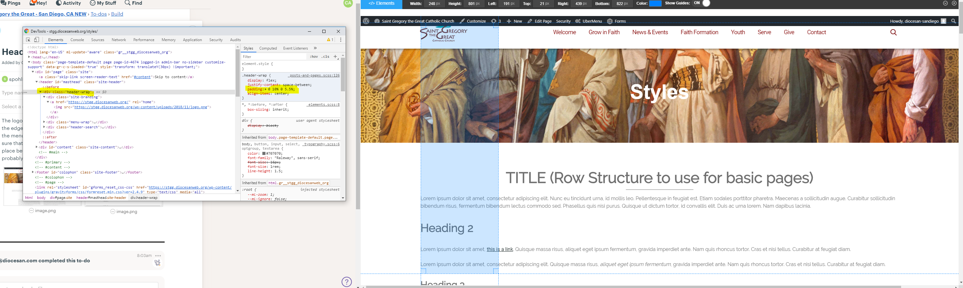
The logo in the nav bar is too far in, it needs to be further towards the edge of the screen, not by a ton, but still gives more room for the menu to expand.Proof snip is not perfect, but it is close. Make sure that the alignment of the body text or the logo is in the correct place before positioning one off the other, otherwise both will probably be wrong. Thanks.
Comments & Events
Sam Pohlman completed this to-do.

Cody Armock re-opened this to-do.
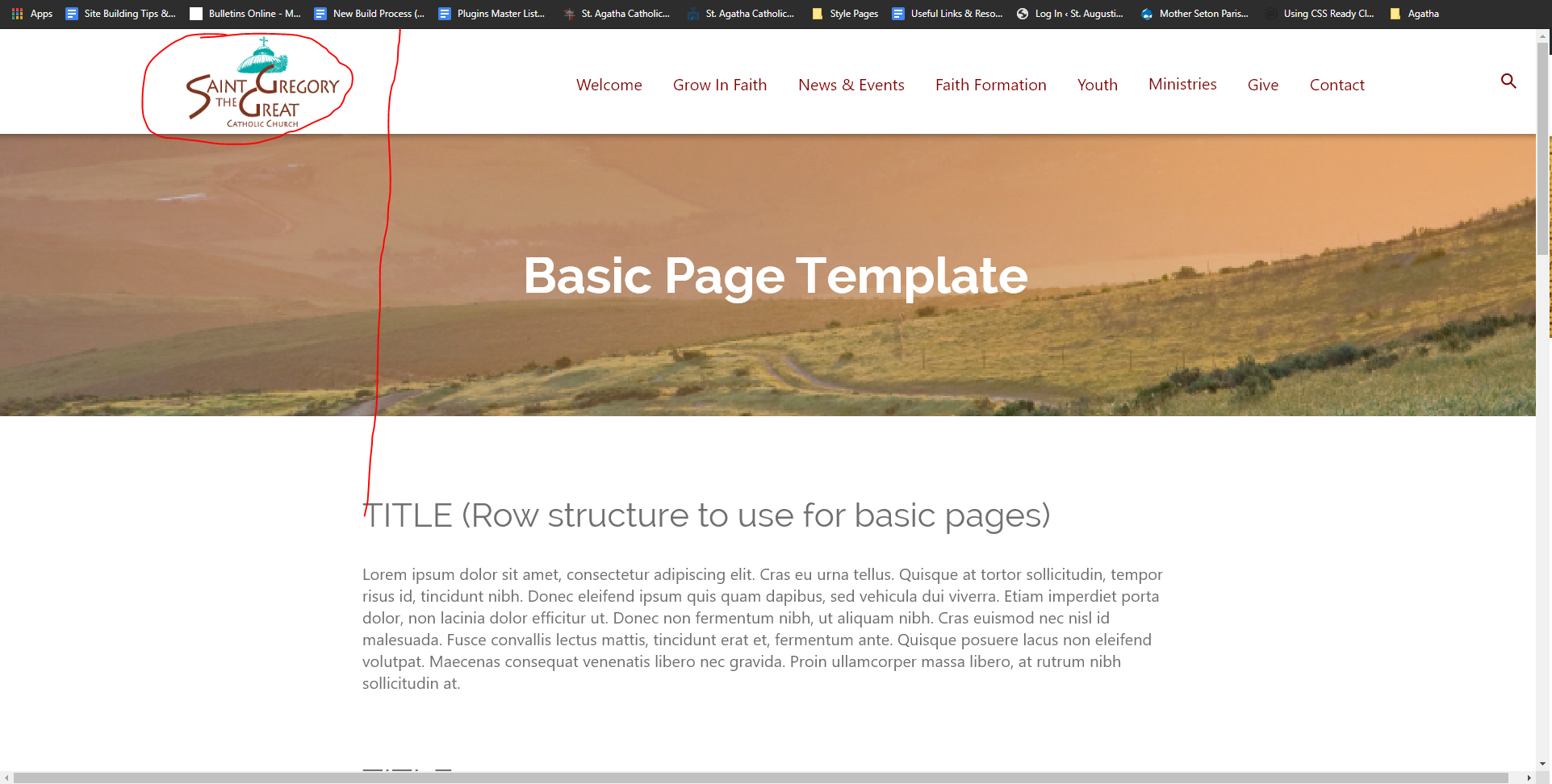
Fix vs previous. I know that the edges of the logo image were actually in alignment with the text, but what needed to inline was the colorful part of the logo. 5.5% on the left seemed to do it.
Sam Pohlman completed this to-do.