✔ Homepage Needs
Completed by Ryan R.
- Assigned to
-
 Ryan R.
- Notes
-
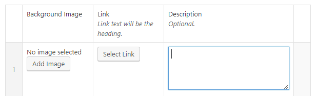
- Header Image or uploaded video
Like DOV, with featured image as background image and video that plays on top of image. - Welcome Message
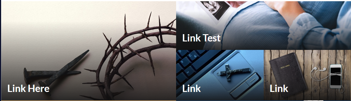
Single line of text - Mondrian Tiles (4-6)
Options like DOV, but the 6 items will be laid out differently.- Background image
- Link (Link text will be the heading)
- Description

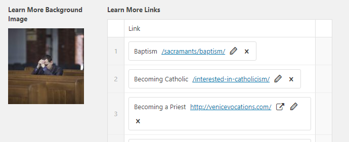
- Learn About Scroll Bar
Like DOV- Background Image
- Learn More Links
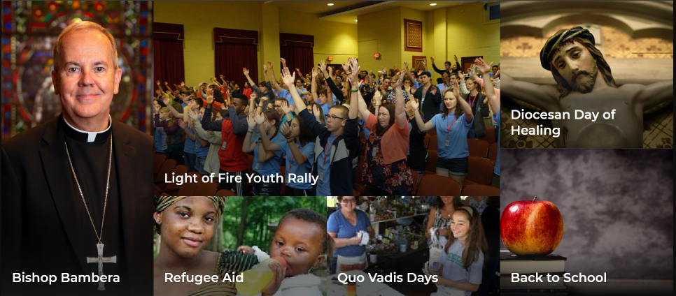
- Featured Items (4-12)
Featured items will not scroll unless you click on the arrows on either side, at which point, they will scroll 1 at a time.
Idea from dolr.org- Image
- Link (Link Text will be title)
- Description
- Events Shortcode (to be hard coded)
- Flow-Flow Shortcode (to be hard coded)
- Header Image or uploaded video
Header Image or uploaded video - Staged, need to convert to ACF option
Welcome Message - Staged, need to convert to ACF option
Mondrian Tiles - Complete (named them Blocks for now)
Learn About Scroll Bar - Functionally Complete
Featured Items - Functionally Complete, still some icon/styling to polish
Events Shortcode - Plugin installed, thats it.
Flow-Flow Shortcode - Basic set up. Need some feedback as to what the "More News" button is supposed to do/function.
https://scranton.diocesanweb.org/
Header Image/Video done.
Welcome Message done.
I noticed that the heads of people are cut off by the page header in the homepage video. I realize they are "behind" the transparent header, but it's painfully obvious in a couple of the clips (like the shot where Fr. Walsh is offering communion to the High School students, and the dancers, and the groom in the wedding shot! Is there a way to adjust either the video or the header so that this doesn't happen?
Thank you,
Connie
The obvious issue here is that subject matter (eyes, heads) are extremely close to the edge of the video. Generally speaking a good image or video would have the important subject matter near the center. Think of commercials and movies... people, things, logos are most often found in the middle half (up/down side-to-side). So the fact that people are cut so close to the edge doesn't help here.
We could forgo the menu overlay position and push the page content down to the bottom edge of the menu. (Video/image on Home page, as well as image on internal pages). Now, this being a simple cosmetic fix it does alter the overall design a bit.
I'd defer to