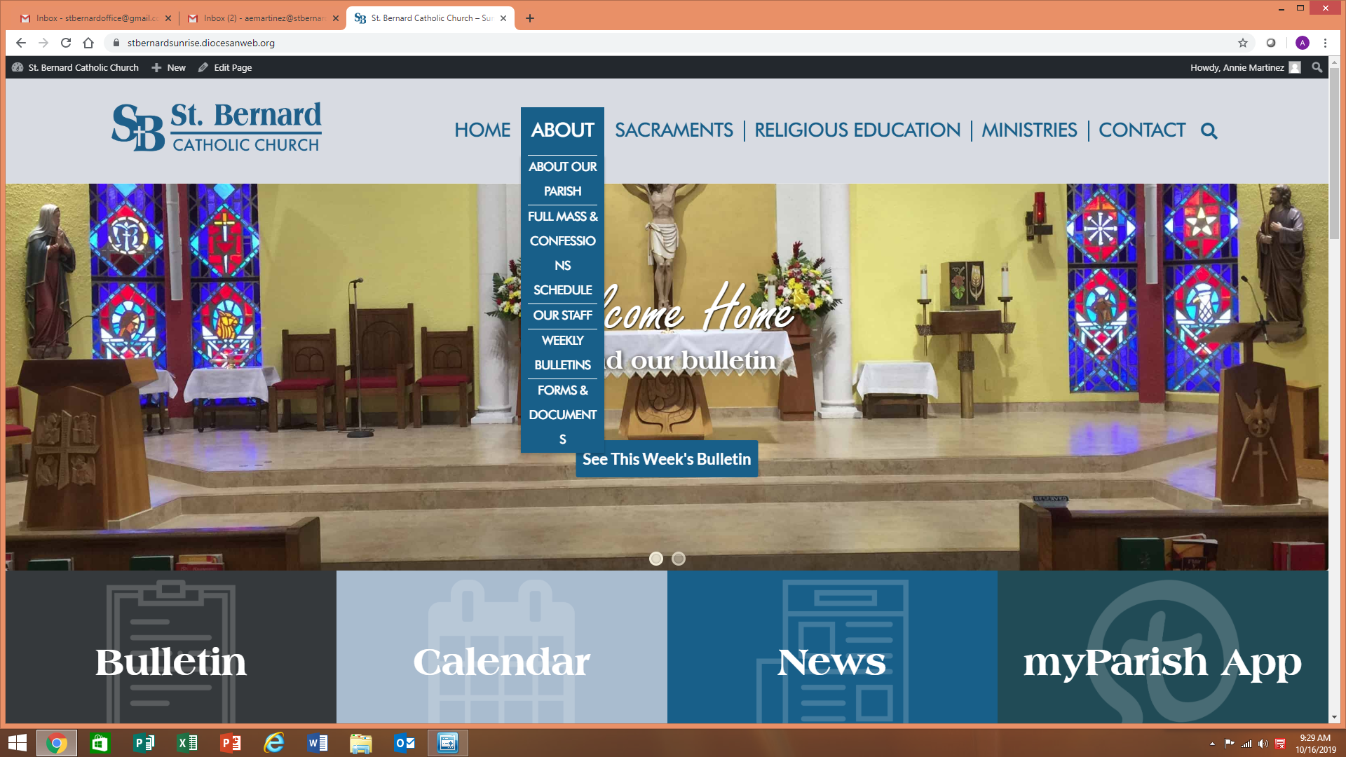
✔ Have menu dropdowns be a set widths rather than the width of the parent menu item
Completed by Sam P.
- Assigned to
-
 Sam P.
- Notes
-
- Make it the width of "Religious Education" (as long as that doesn't make things fall off the page)
I hate to bother, but can you please so that the words are not divided? They should fit in one row. The column should be thicker. As you can see, when we click the tabs, 2 words don't fit. Our Pastor doesnt like this. The 2 words are: Confessions & Documents. Please see here.
Comments & Events
I think it will be better if the font size for the menu items were made smaller.
Sam Pohlman completed this to-do.
The font change is fine, but their thing is that Full Mass & Confessions Schedule is on 3 lines and not wide enough. Is there something that we can do about this? I can update the main menu item to be "About Our Parish" and then it's wider, but they're trying to keep the menu simple
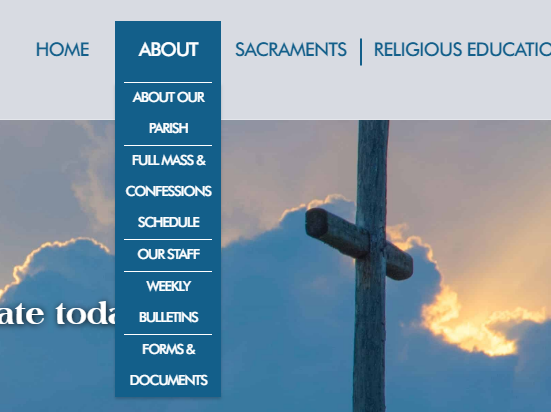
I can have the dropdown be wider and keep the main menu the same. Otherwise widening the main menu will cause it to drop below the logo, unless I make the font much smaller.
The main menu items are fine. It's just the dropdowns that they want to be wider