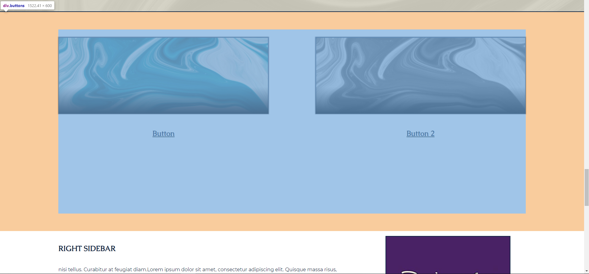
❏ Image Buttons - Way too much space for them between them and next content (Wait till after Second Training then we'll discuss) Archived
- Assigned to
-
 Sam P.
- Notes
-
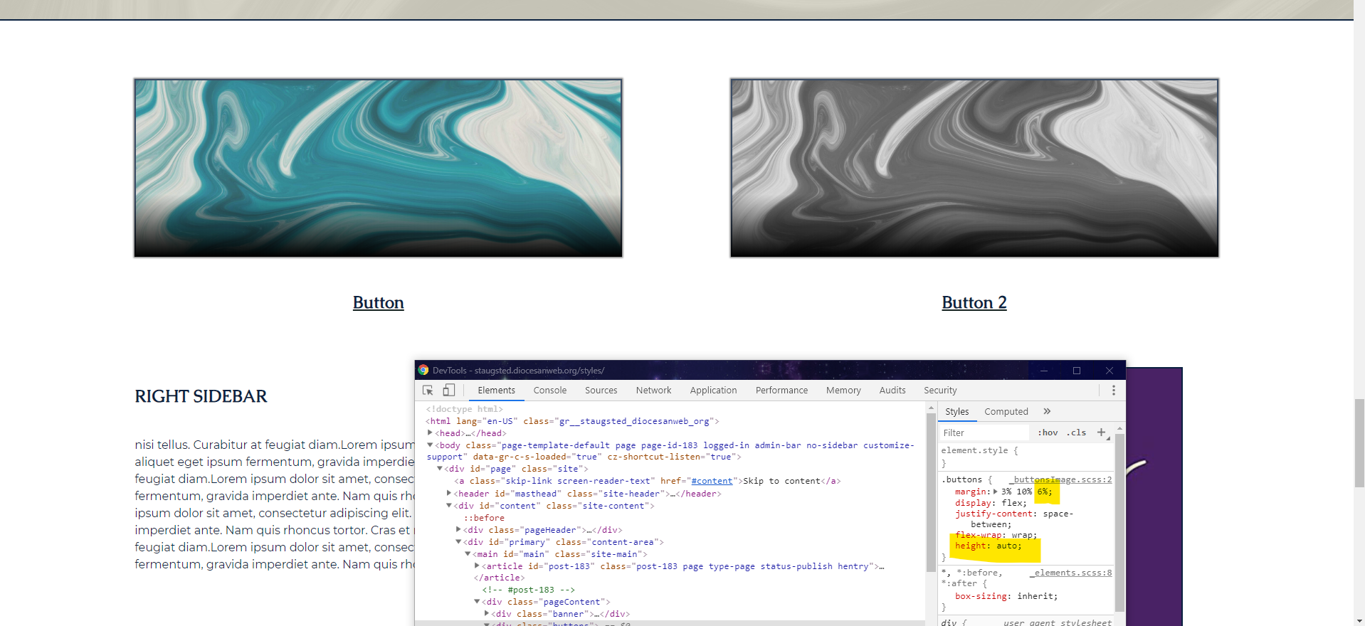
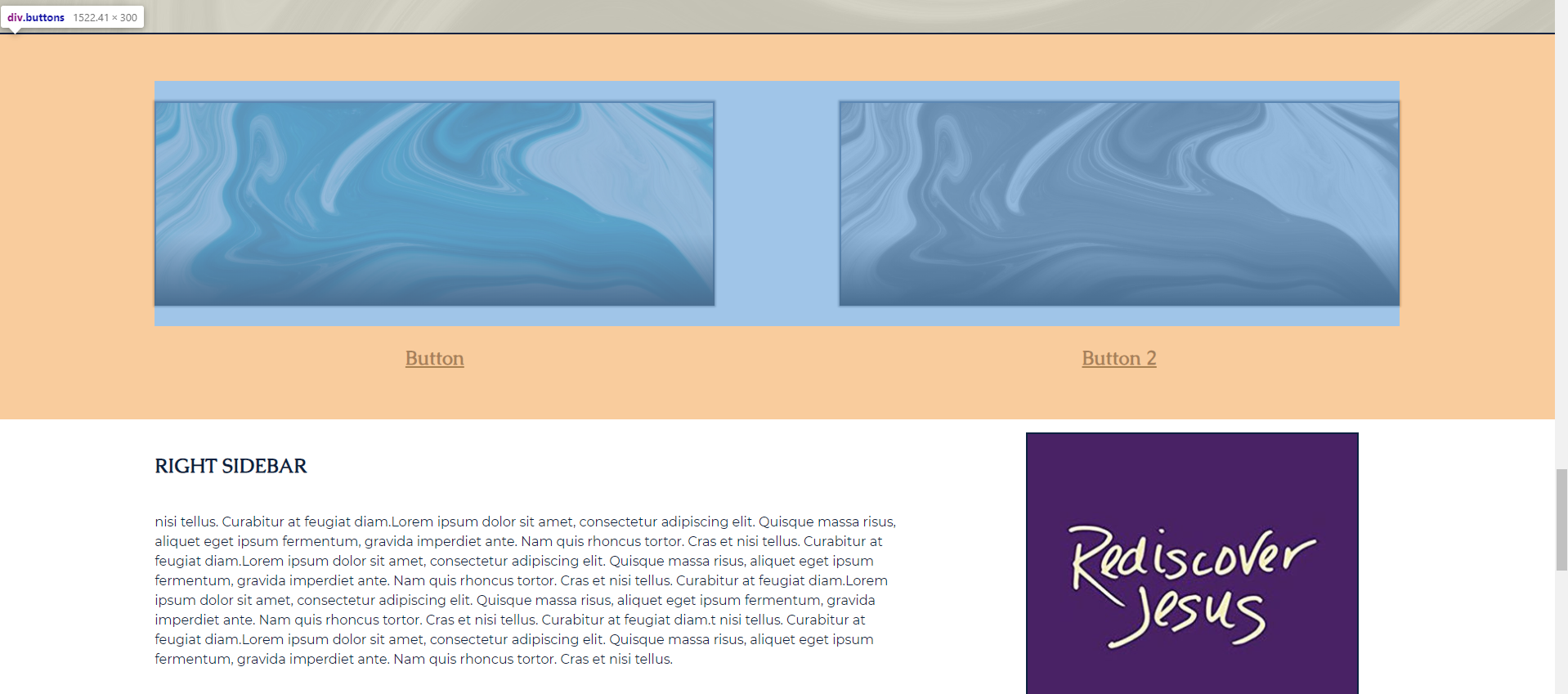
There is a massive gap between the buttons and the next form of content. I literally eliminated half the height of it and it looked a lot better. Do this to-do first, in order to make it look the best since the fix may change slightly.
Dev original vs Dev Fix (in inspector highlighted) vs Dev with Fix.