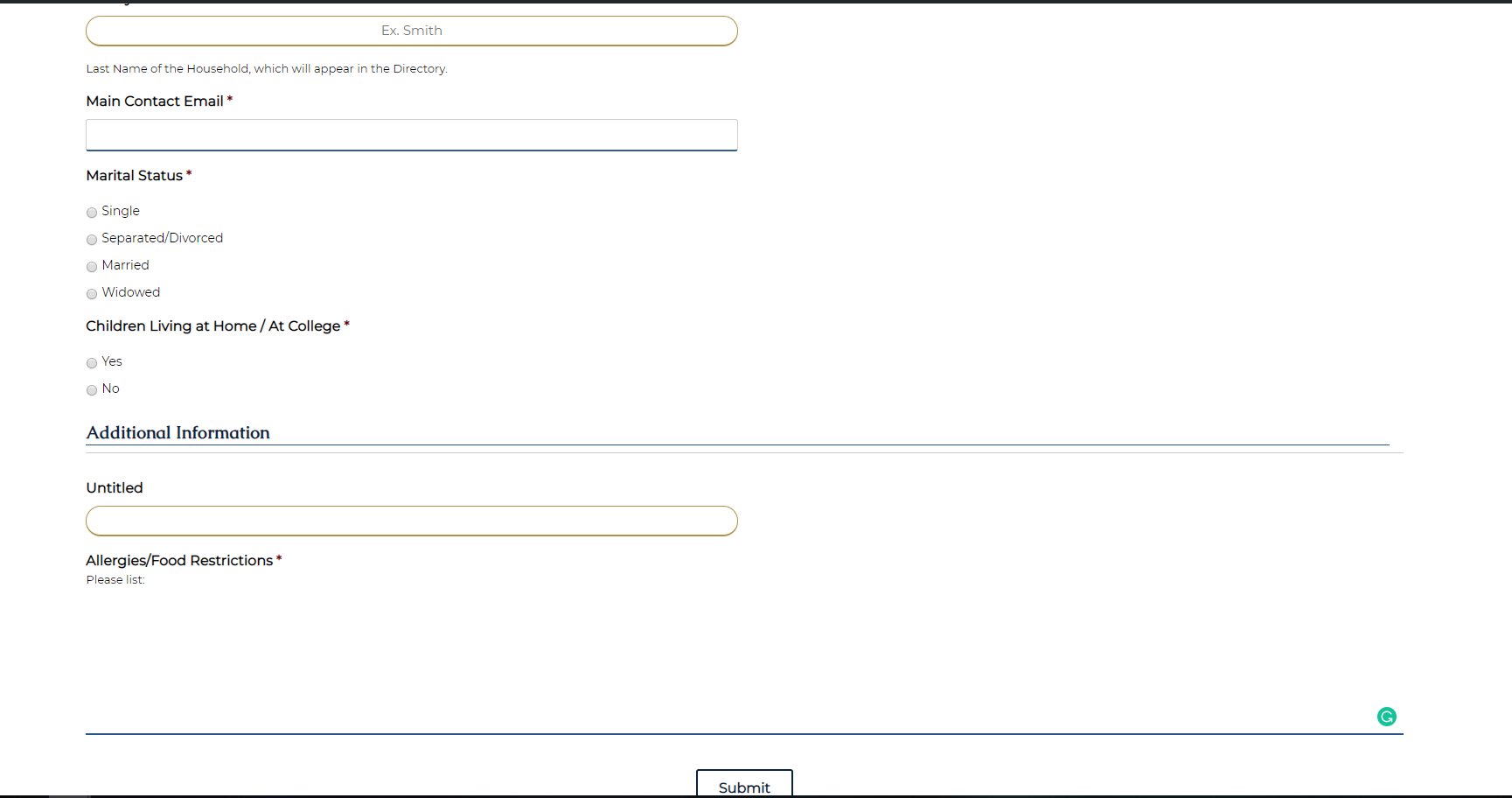
✔ Forms look way off,
Completed by Sam P.
- Assigned to
-
 Sam P.
- Notes
-
https://staugsted.diocesanweb.org/parish-registration-form/
The Single Line text is off and looks weird. Sections should not have the blue underline. Keep the way it is styled for the contact page only, but for the rest of the pages. Have them revert to the original styling, but change the borders of the input fields from the gray to the light blue for the site. Ask me before starting this please, so I can clarify.
Comments & Events
Sam Pohlman completed this to-do.
