✔ Format myParish App Messages to be smaller. Very long/large now. Styling issues too.
Completed by Sam P.
- Assigned to
-
 Sam P.
- Notes
-
Actual is on the left and zoomed out to 25% in chrome, proof is on the right.
- Make the boxes a lot smaller to hold like a 30 word excerpt type of thing.
- White text on current needs to be the color throughout the sight.
- Make sure date is same color as message.
- View all link should be like other link color, it's not.
- Not sure, if possible, but format myParish Icon above "Download the app today!" text. with Android and Apple icons below.
- Make the icons the same color as rest of the primary color of the site.
Thanks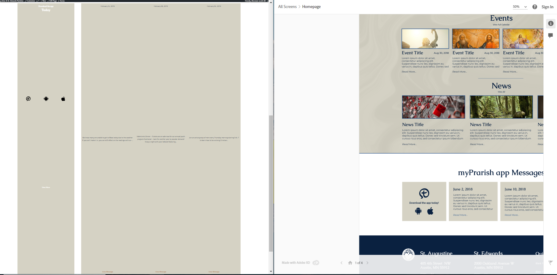
Comments & Events
Sam Pohlman completed this to-do.