✔ Footer - Styling content sections
Completed by Sam P.
- Assigned to
-
 Sam P.
- Notes
-
Photos below.
The font-families are different between the two. Caudex vs Montserrat, Proof has Caudeax. https://xd.adobe.com/spec/a8105b86-ba88-466e-41ed-3b6a6818845d-de21/screen/e9a2935d-5e5e-4355-9db2-44084bdfee42/Homepage/
Also, the font-weight of the headers make them look like they are glowing. XD says they are bold, so no fault of your own, but proof has them looking more like the normal font-weight. Just bigger font-size: 24px for the headers (address, "Office Hours", "Parish Office")
The actual office Hours days that is, "Monday-Friday" and "Tuesday, Thursday & Friday" need to be Roboto, not Caudex.
Spacing between headers and the content need to be condensed.
lastly, there is a difference between the St. Augustine and St. Edwards address in spacing. Looking at the code makes it clear of the difference. Augustine is in a space, where Edwards is not. So please correct that as well, that will probs fix the font-family issue.
Thanks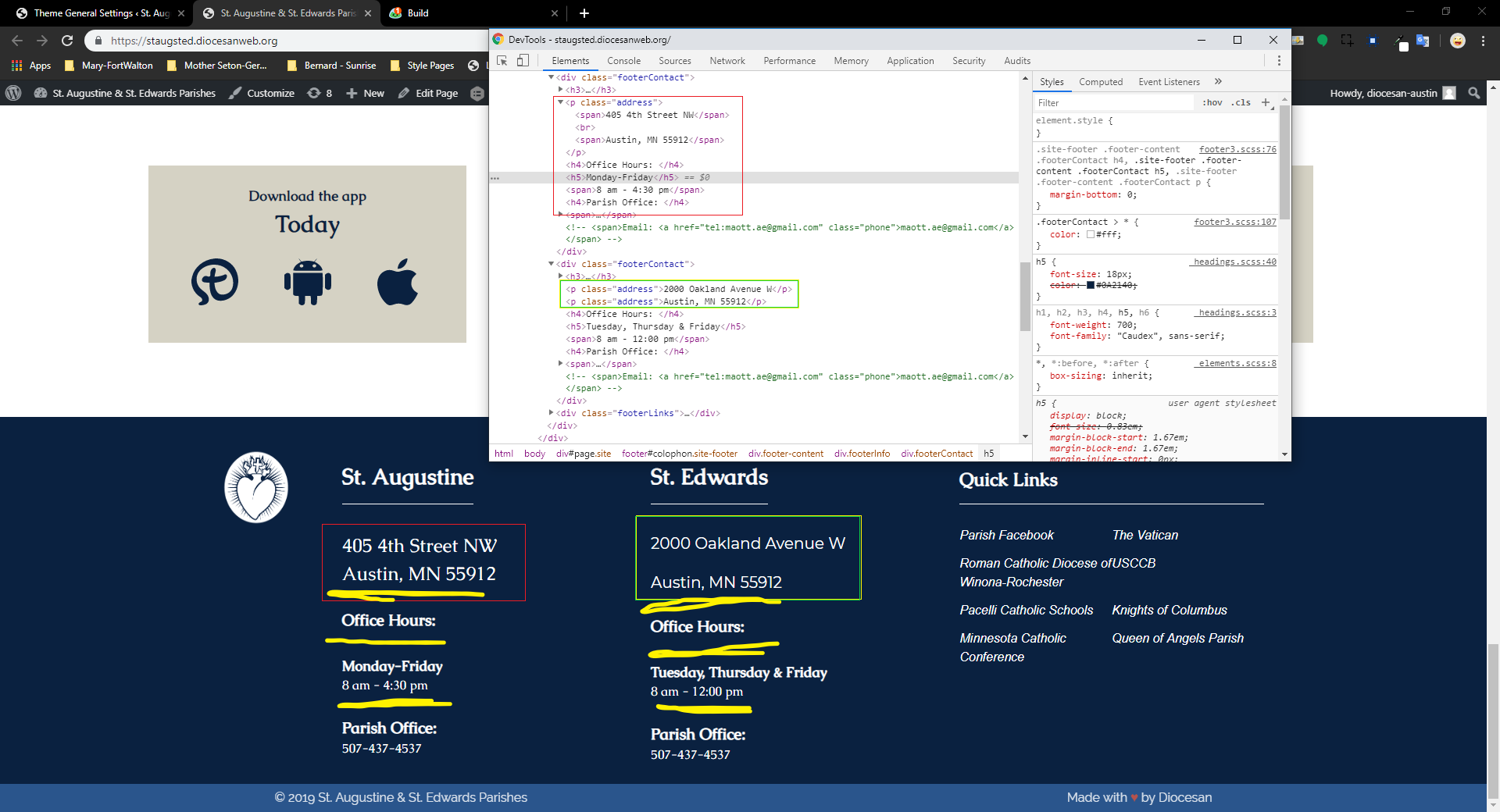

Comments & Events
Sam Pohlman completed this to-do.