Calendar will need to go to more than one line on smaller screens.
Notified 1 person
Cody Armock,Web Content Specialist
That is fine. but it should be in a line all the time whether that is horizontal on desktop or laptop or vertically on tablet and mobile.
Notified 1 person
Sam Pohlman,Web Developer
Veronica
The font size for the date will need to be smaller than what's in the proof so everything fits on one line, and the items need to wrap to different rows on smaller screens.
Another way to help fit everything is if the events' title contained spaces instead of the '/'. That way the title breaks better, separating word by word rather than letter by letter.
Notified 2 people
Veronica Alvarado,Project Manager
Danae
Should we make the dates or titles smaller? Limit to only 4 events? Thoughts?
Notified 3 people
Danae Chudy,Web Designer
Originally I had 4 but they wanted 6 events or more. I told them the most I could do is 6. Maybe make the dates and titles smaller?
Notified 3 people
Sam Pohlman,Web Developer
I shrunk the space between events. Font size for event name and location is 16px; Width of date is 90px and height is 100px.
 Sam P.
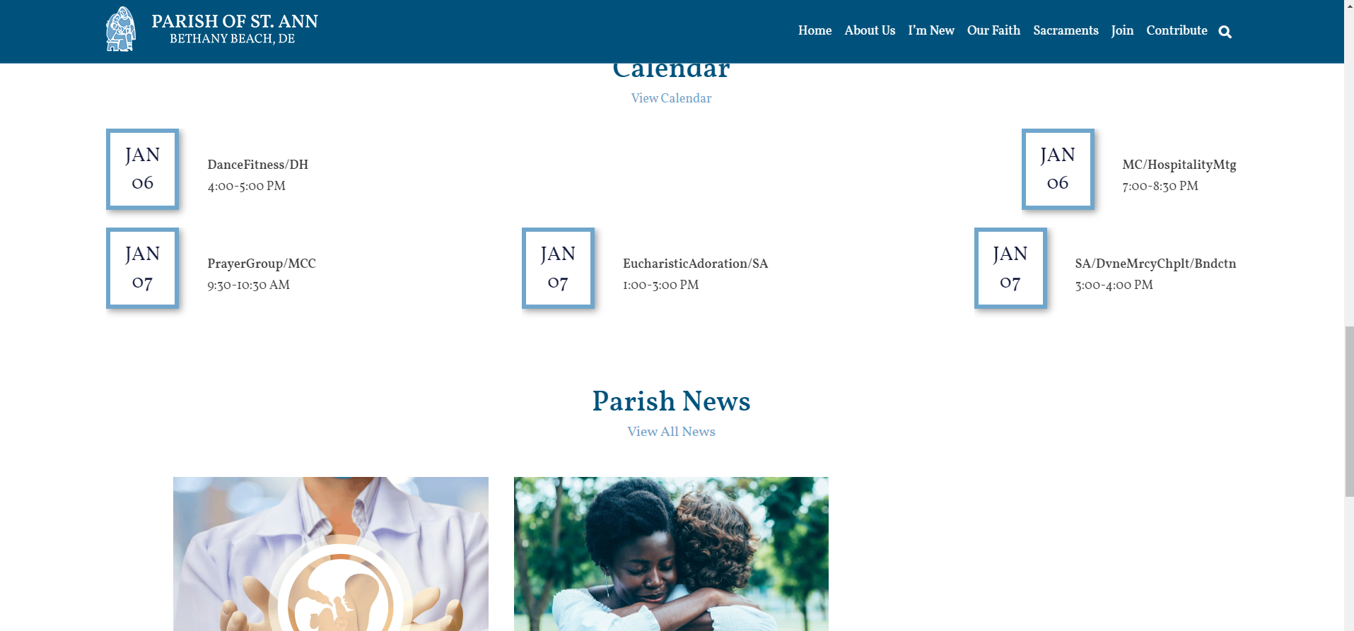
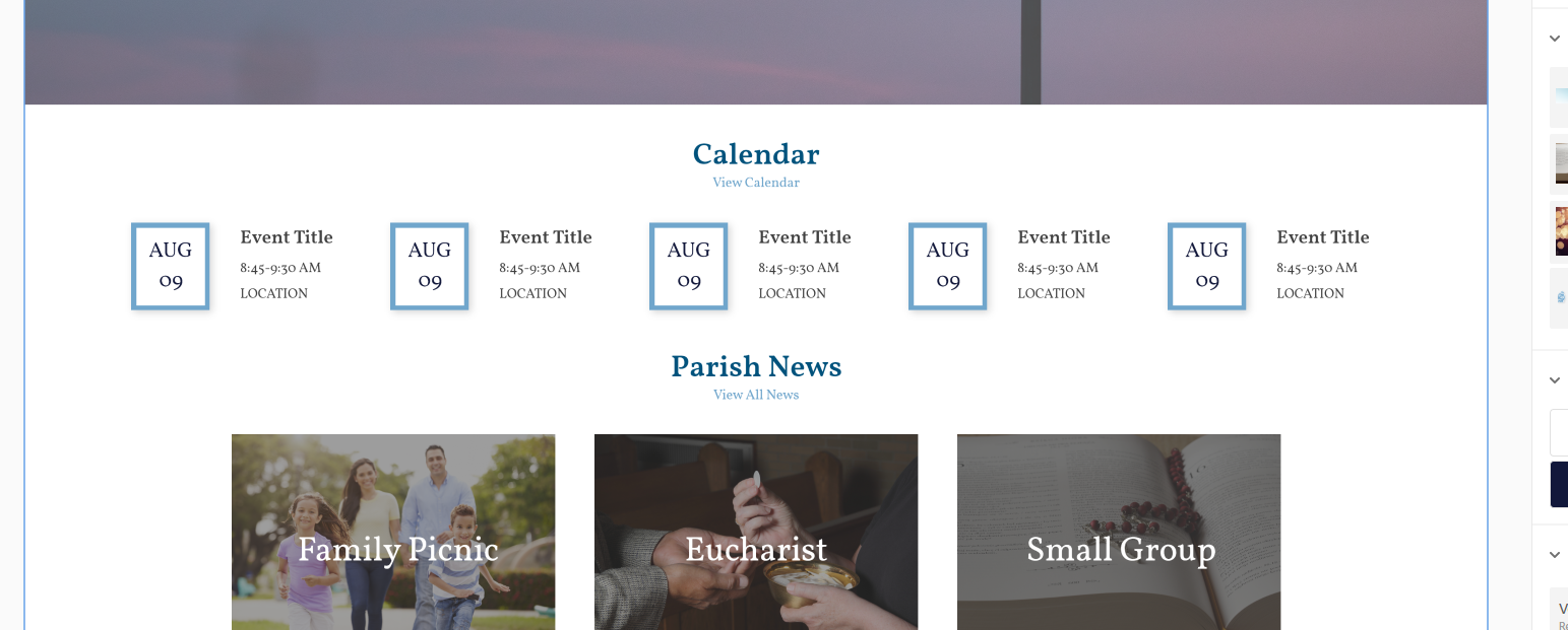
Another way to help fit everything is if the events' title contained spaces instead of the '/'. That way the title breaks better, separating word by word rather than letter by letter.