Homepage Options
Hello!
Here is a link to view all 3 options we spoke about in our meeting today. They are the proofs that are titled "Homepage, Homepage-1, Homepage-2."
https://xd.adobe.com/view/34f4edfb-8cfe-496b-6ccd-acd6646deef9-42c5/grid
Let us know which of these options you like the most or if there are any questions.
Thanks!
Blake Stapleton
Diocesan
 Brenda
Hi!
Question, when we look at the home page,
it is hard to tell what it would look like on
a full screen version. Is there a tab I can
press where all the editing type features
disappear and I would see it as a visitor would?
God bless,
Brenda Kozlowski
Director of Evangelization and Parish Life/Stewardship
Always Loved, Always Welcome
(248) 689-8380 Ext. 103
(248) 689-7489 Fax
Be sure to follow us on:
Instagram @ stanastasiatroy
Facebook @ St. Anastasia Catholic Church
Twitter - St. Anastasia@AnastasiaTroy
Visit our website at www.stanastasia.org
Are you a parishioner? Be sure to access
your free gift, a subscription to FORMED.org, today!
https://www.stanastasia.org/formed-gift/
 Veronica Alvarado
Good morning Brenda,
When in the grid view, you can click on a proof, then in the top right corner of the screen, there is an expand icon (looks like two arrows facing away from each other). If you click that, it will go full screen with no comments.
Alternatively, here are links to all options directly, full screen:
Homepage with only the first row of buttons visible before scrolling
https://xd.adobe.com/view/34f4edfb-8cfe-496b-6ccd-acd6646deef9-42c5/?fullscreen
Homepage with the first row of buttons and top of second row visible before scrolling
https://xd.adobe.com/view/34f4edfb-8cfe-496b-6ccd-acd6646deef9-42c5/screen/425672f0-af70-451a-9272-3ff226892621/Homepage-1?fullscreen
Homepage with the first and second rows of buttons visible before scrolling
https://xd.adobe.com/view/34f4edfb-8cfe-496b-6ccd-acd6646deef9-42c5/screen/3f7f742c-10a8-4280-82e0-05053f1f284f/Homepage-2?fullscreen
Have a blessed weekend,
Veronica Alvarado
Web Department, Diocesan
877-923-0777
877-923-0777
Brenda
Hi Veronica,
Fr. Steve and I went to the links and to the
original link. None of them show us
a ‘full’ screen view. There is still white
on the bottom.
The image of the heading, the picture and
the buttons seems like a rectangle even
when enlarged. It shows white at the bottom.
Not a full screen view.
Any other ideas of how we could see the full
view?
Thanks!
God bless,
Brenda
Brenda
Also, Blake, will you please send me a draft with
no buttons at all visible on the full screen?
Thanks!
God bless,
Brenda
no buttons at all visible on the full screen?
Thanks!
God bless,
Brenda
Brenda
Also, Blake, will you please send me a draft with
no buttons at all visible on the full screen?
Thanks!
God bless,
Brenda
no buttons at all visible on the full screen?
Thanks!
God bless,
Brenda
Veronica Alvarado
Good afternoon Brenda,
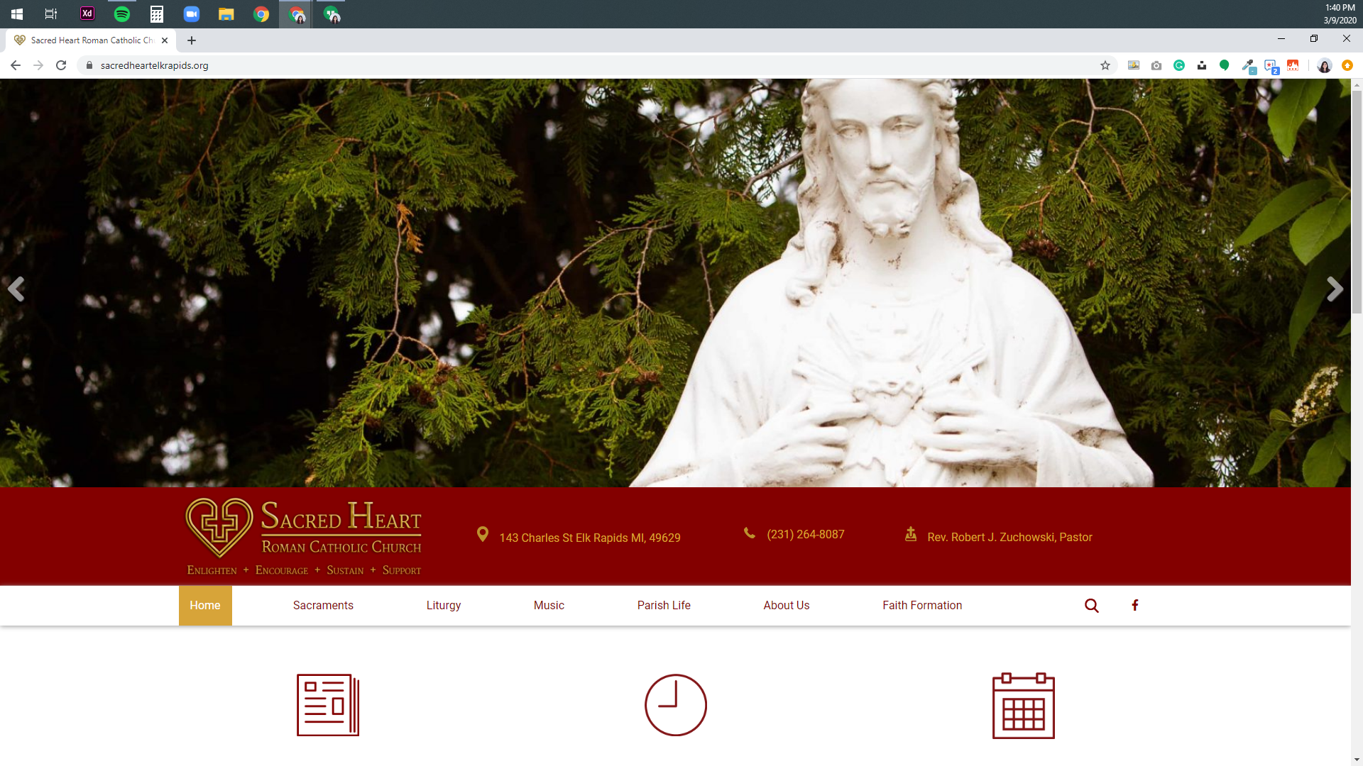
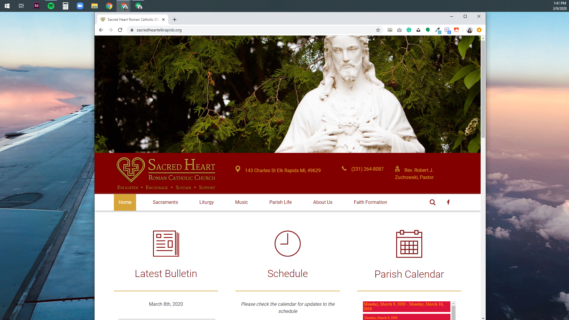
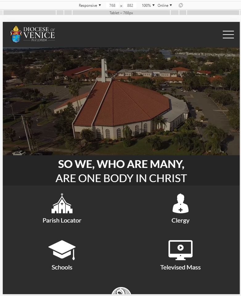
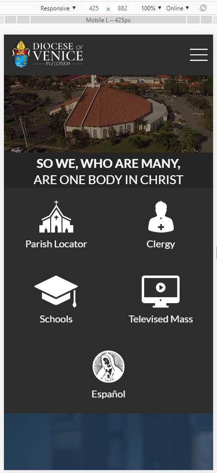
Unfortunately, the white is displaying because your full-screen size is not the same as what we use as our "viewport of a standard desktop computer," which is a 1920 x 1080 screen resolution, minus the space for a web browser's tabs and search bar.
Of course, on your actual site, there would not be any white space but for the design, we must set a viewport height to accurately represent what someone on a standard 1920x1080 desktop computer would see. Any window taller than the set height will see white at the bottom.
In your case, if your computer is desktop (larger than laptop) size but smaller than our 1920x1080 size, you would see whatever is below that white would be moved up, since your main image will be using a ratio slider (keeps image ratio as screen is resized). So on different screen sizes, you can see more or less of the content below.
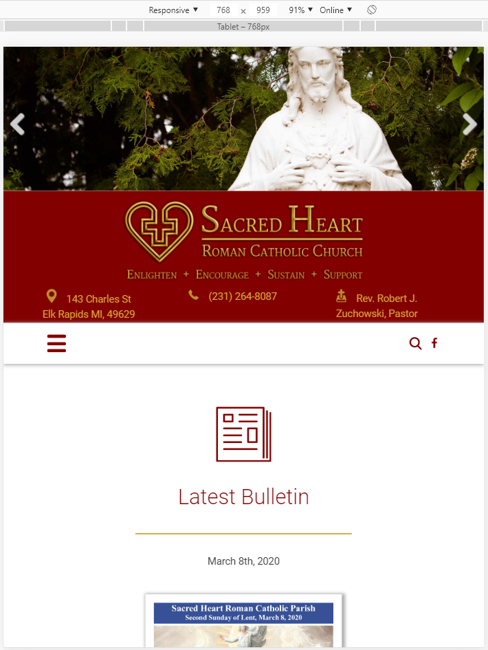
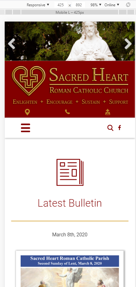
Here is an example of a site that shows more/less below the image depending on the screen width, as yours would do: https://sacredheartelkrapids.org/
Fullscreen on 1920x1080:
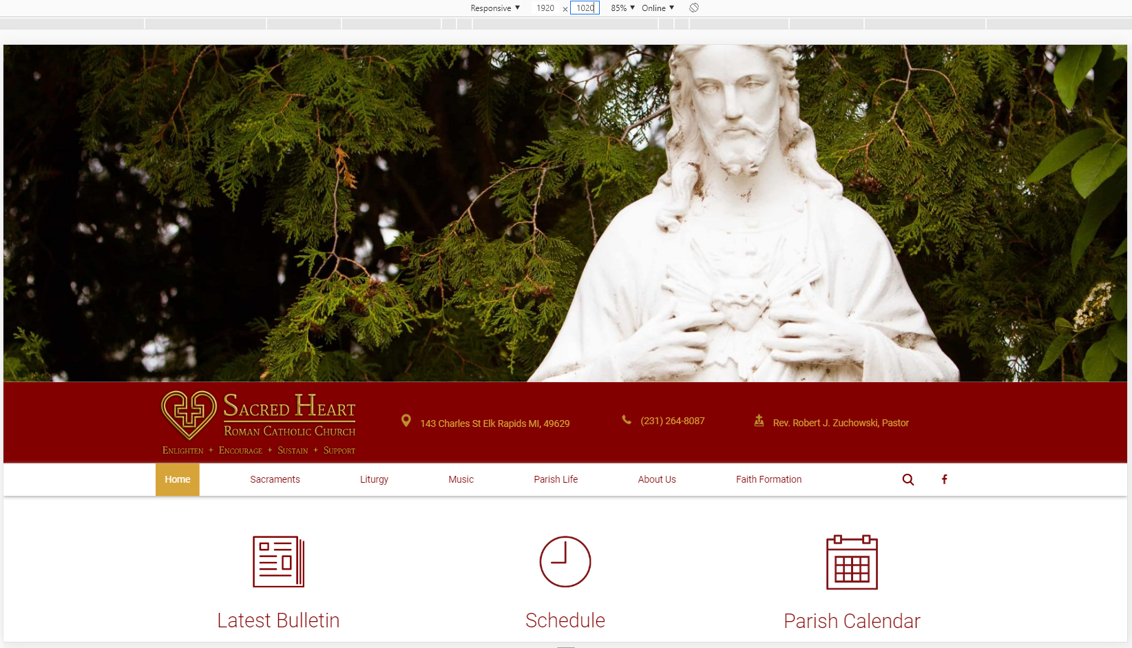
Less widescreen (slowly seeing more of the content below the image)
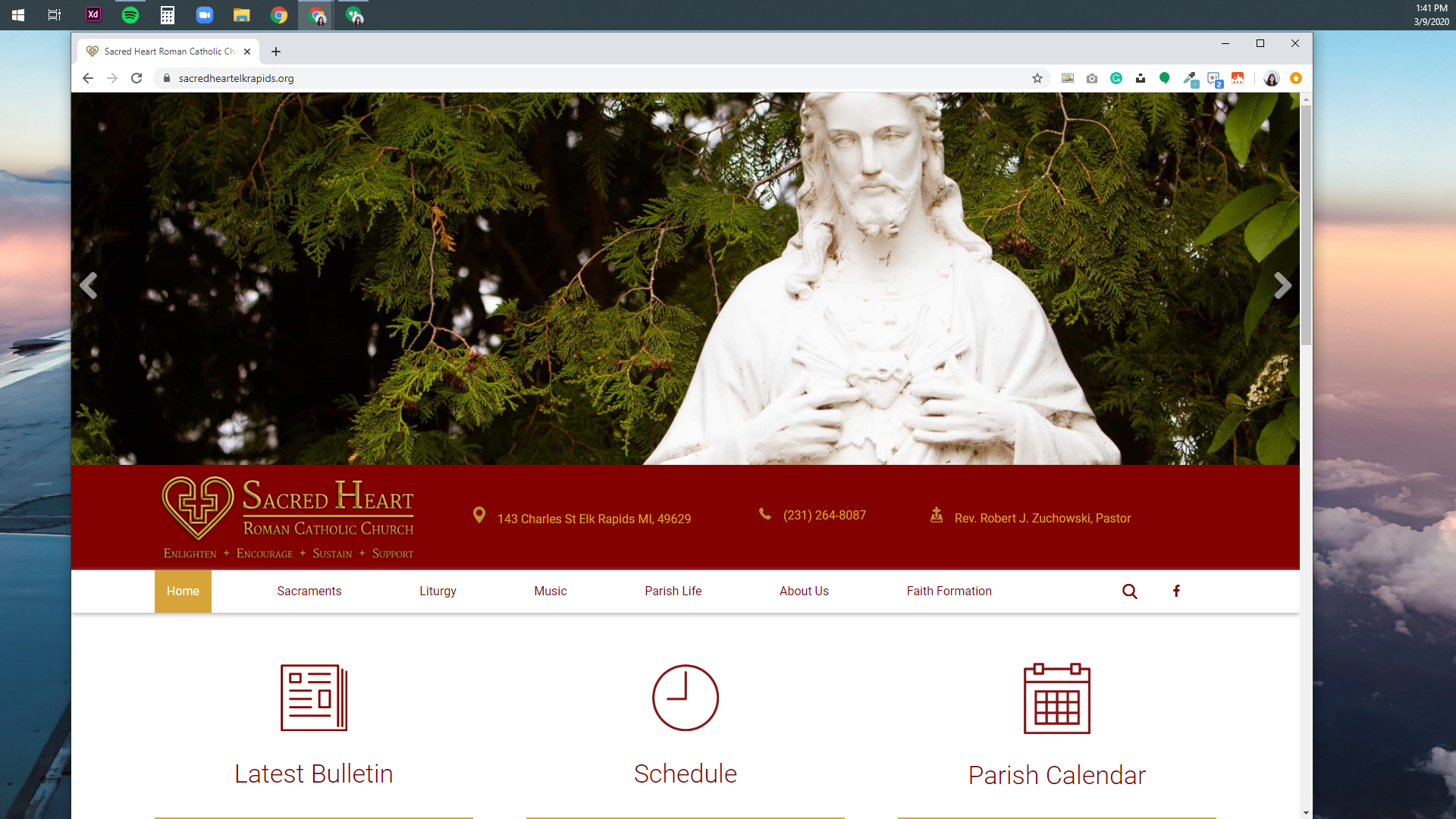
Less widescreen (seeing more content below the image)
Less widescreen (seeing more content below the image)
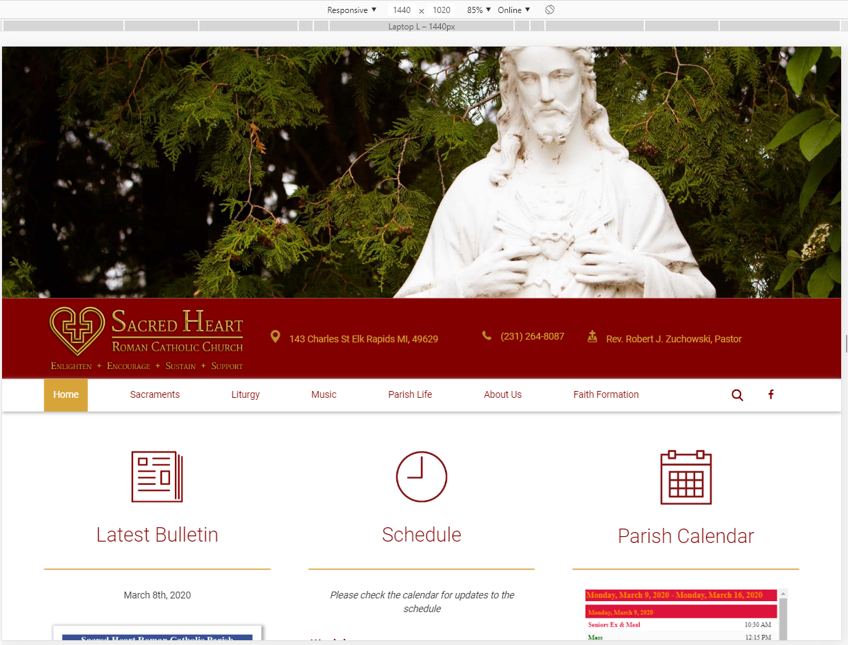
Tablet Size (more information below the iamge, although now they have their mobile menu and content stacking into a single column)
Mobile Size
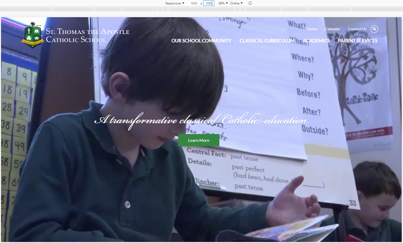
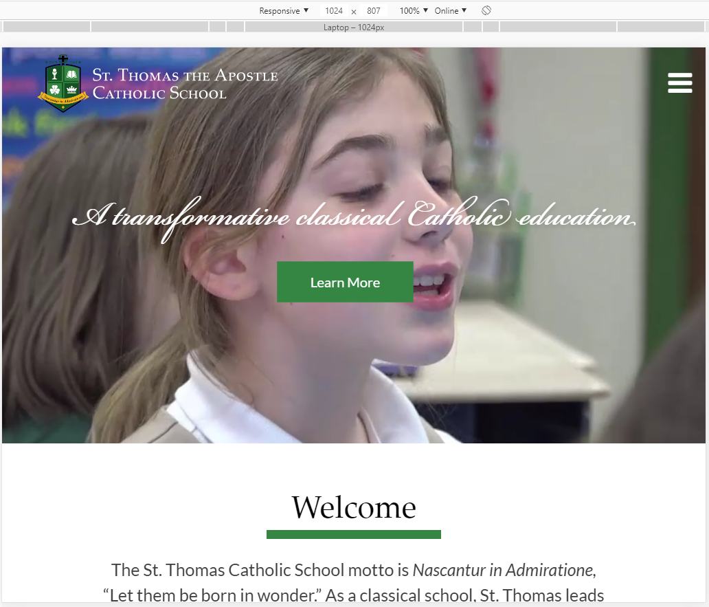
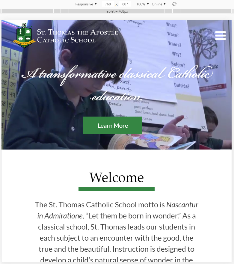
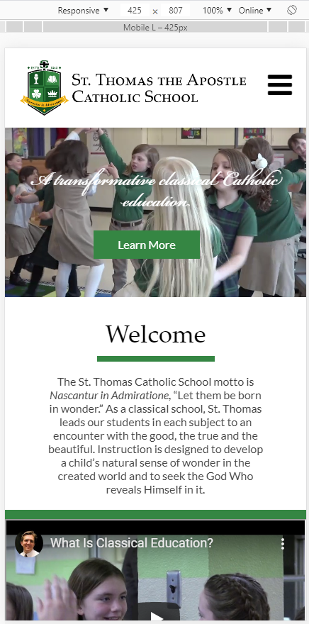
Another example of this would be https://sta2.org/school/ and how their page changes depending on the screen width:
Desktop > Small Laptop > Tablet > Mobile Phone
Mobile Size
Another example of this would be https://sta2.org/school/ and how their page changes depending on the screen width:
Desktop > Small Laptop > Tablet > Mobile Phone
If this made things more confusing, let me or Blake know and we can explain it to you over the phone. It's a concept that can get confusing pretty quickly, so don't hesitate to ask for further clarification if you would like more information.
Blake will be sending another version of the homepage (video full screen), as you had requested, shortly.
Thank you,
Veronica Alvarado
Web Department, Diocesan
877-923-0777
Brenda
Aaaaa…. Thanks for the explanation. Now – we thought
the picture would almost consume a screen (and adjust
to the screen accordingly).
The model visually of what we said we would like was:
https://dioceseofvenice.org/ The video there is very prominent.
So, how can our pic size be adjusted to more fill the screen?
I already know that this was not the proportion we
thought the pic size would be: https://sacredheartelkrapids.org/
?? So sorry if this puts us backwards … but I’m so glad
to work this out now rather than too too late.
God bless,
Brenda Kozlowski
Director of Evangelization and Parish Life/Stewardship
Always Loved, Always Welcome
(248) 689-8380 Ext. 103
(248) 689-7489 Fax
Be sure to follow us on:
Instagram @ stanastasiatroy
Facebook @ St. Anastasia Catholic Church
Twitter - St. Anastasia@AnastasiaTroy
Visit our website at www.stanastasia.org
Are you a parishioner? Be sure to access
your free gift, a subscription to FORMED.org, today!
https://www.stanastasia.org/formed-gift/
 Blake Stapleton
Hi Brenda,
Here is the homepage option you requested. "Homepage - 3" is the version that would have the buttons under the full image. I added the arrow at the bottom of it that could have a subtle animation to tell you to scroll down.
https://xd.adobe.com/view/34f4edfb-8cfe-496b-6ccd-acd6646deef9-42c5/grid
Let us know if you have any questions.
Thanks!
Blake Stapleton
Web Department, Diocesan
877.923.0777
877.923.0777
Veronica Alvarado
Hi Brenda,
Sacred Heart in Elk Rapids is certainly an extreme case. They chose to have their slider be very short.
In your case, your website on different screens would look more like sta2.org. Their video fills the whole page on desktop and shrinks once you are on smaller screens.
https://sta2.org/school/
Desktop > Small Laptop > Tablet > Mobile Phone
Diocese of Venice does NOT use a ratio-based video and instead uses a viewport-based video. This means that their video is a set percentage of the height, regardless of width. So their video actually gets cut off on the sides until it reaches tablet size, at which point it switches from being 90% to a much smaller height and some of the top/bottom of the video are cut off.
Desktop > Laptop > Tablet > Mobile
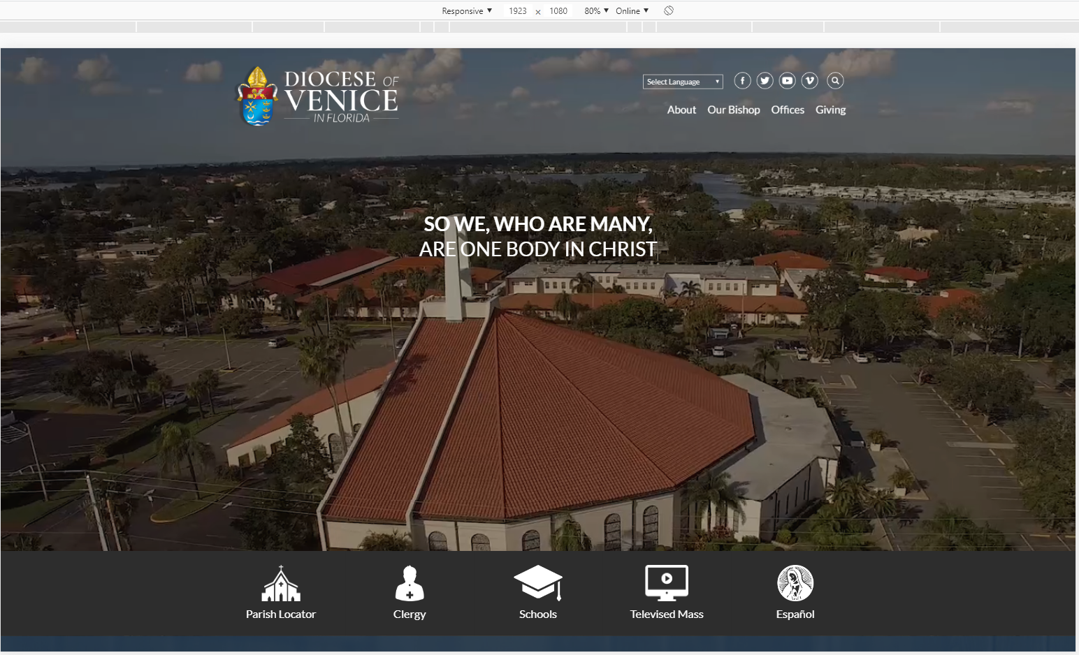
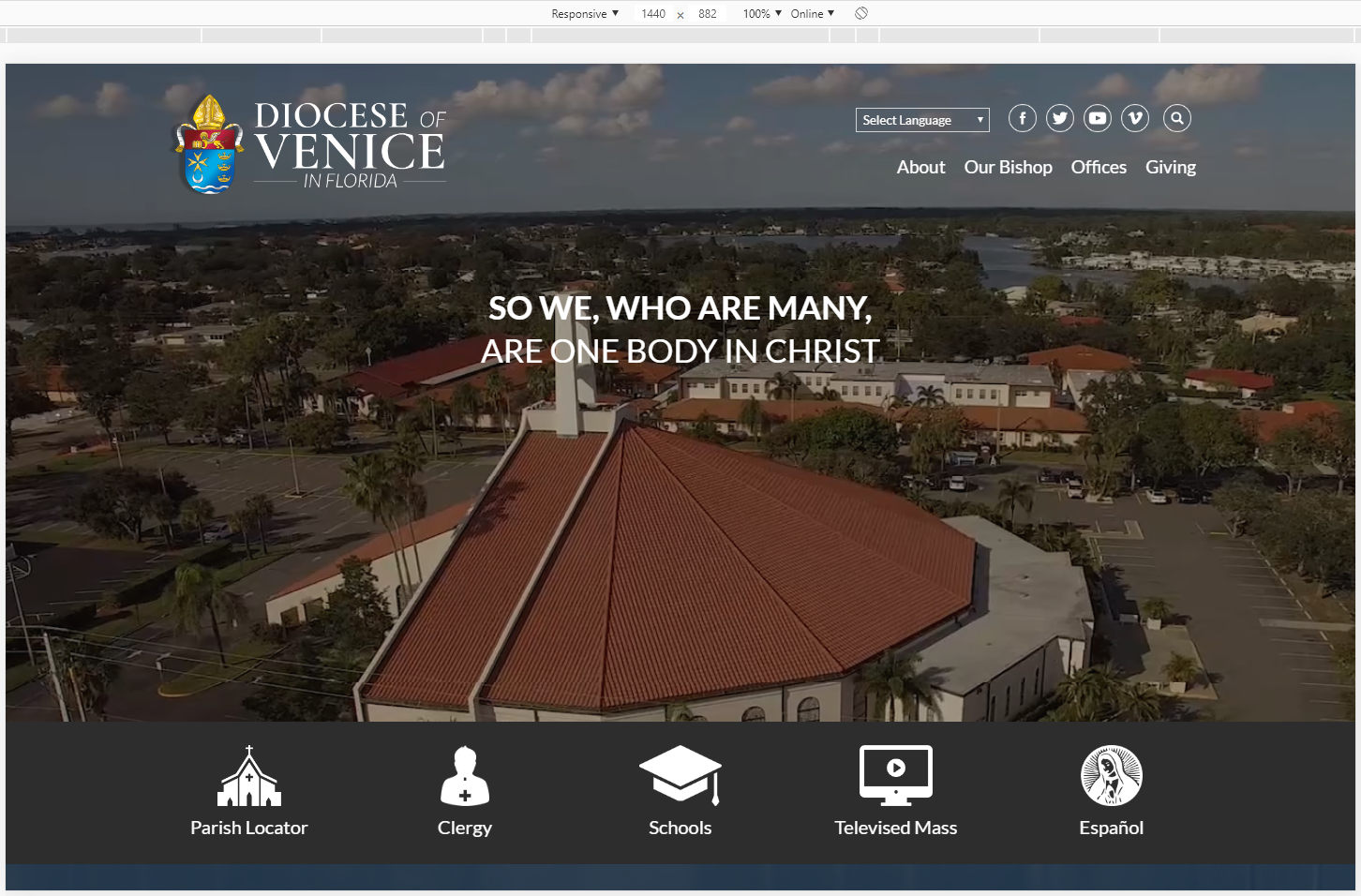
We can build it out to match the Diocese of Venice, but want to make sure you understand that this means that, at times, the sides of the video may be cut off. So if there is a group photo, people would get cropped out.
Let me know if you need clarification on the differences between the two,
Veronica Alvarado
Web Department, Diocesan
877-923-0777