Layout Color change
Good Afternoon,
I have a copy of the homepage with the color change. let me know if its working out better for you, I will update the inner pages when you say the colors work!
Thanks,
Samuel Lanning
I have a copy of the homepage with the color change. let me know if its working out better for you, I will update the inner pages when you say the colors work!
Thanks,
Samuel Lanning
Hi Samuel,
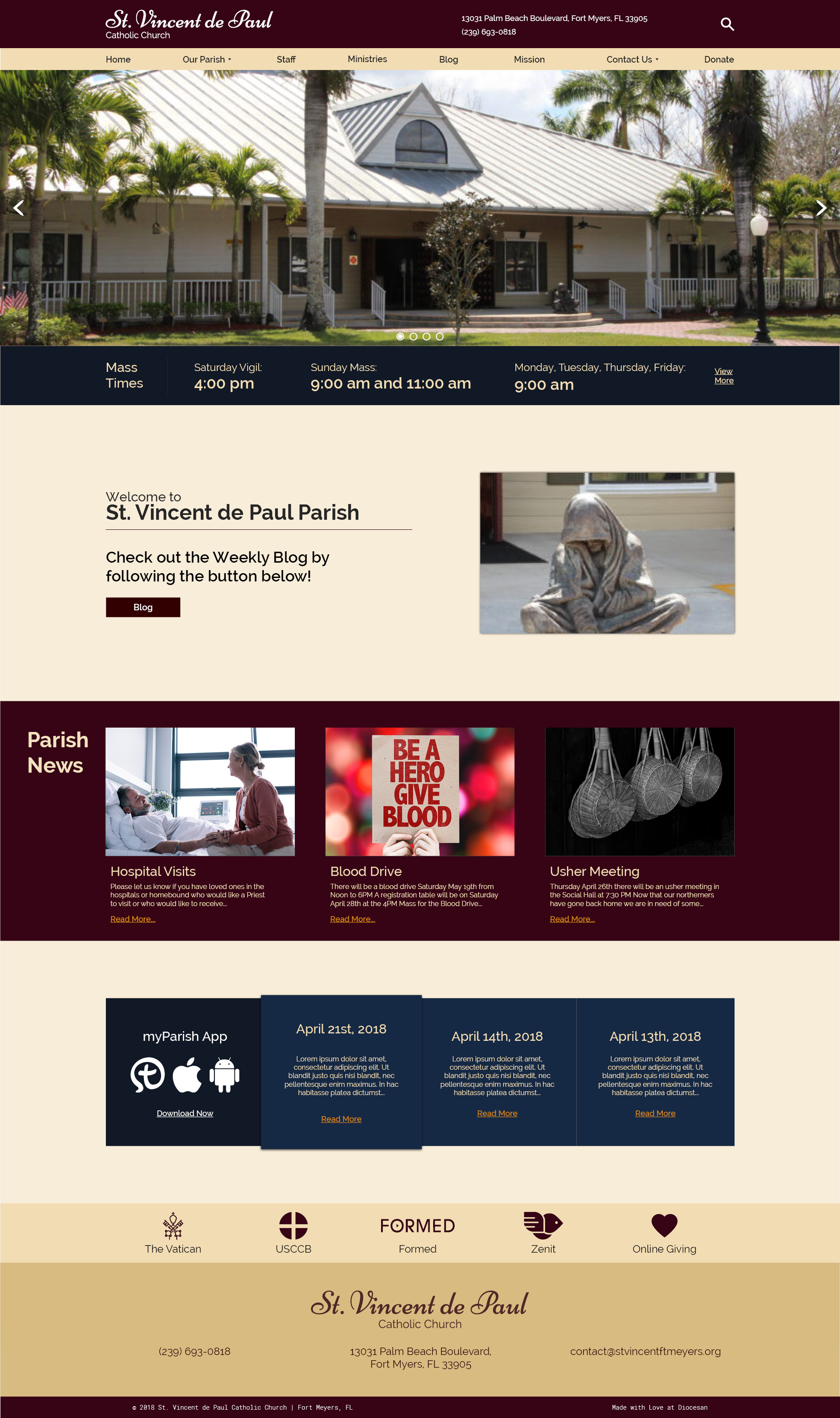
There are a few things I want to change. I do like the new color scheme, although I still think there is too much white on the page. Can you use a pale cream for that instead. Also, the very top bar in wine color needs to be deeper, as in longer from top to bottom. It doesn’t look balanced with the rest of the page. Also the white part in the center with the picture of the beggar could be a little shallower. Also, we would to try the same font for the title ‘St. Vincent de Paul’ as the font farther down, not italicized. Can we try that.
Thanks,
Murchadh
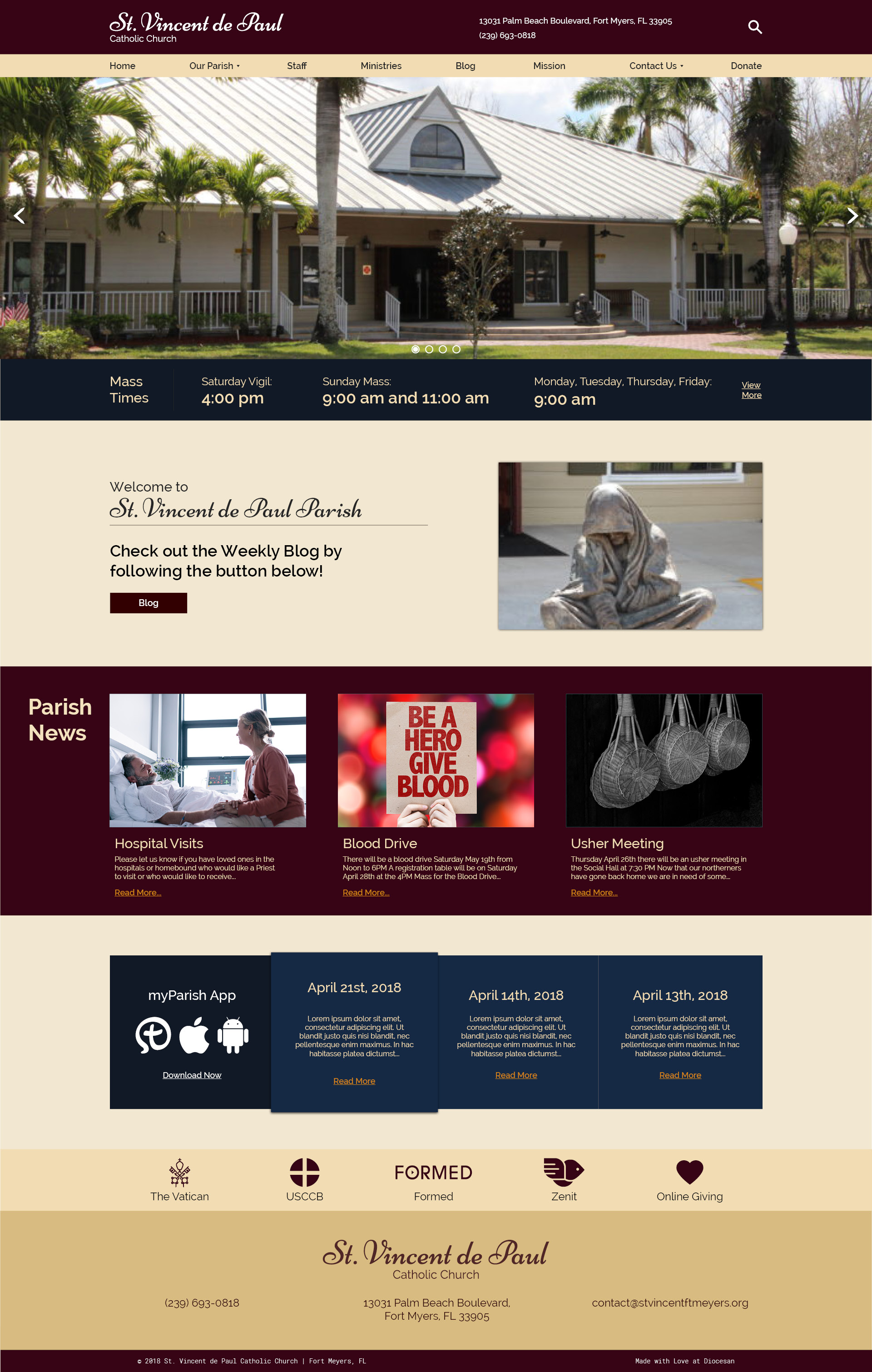
Good Morning, I have the changes for you to take a look at.
On the link you gave me, no changes are showing
Sorry, I think the colors have changed, but you didn’t change the font or the length of the very top bar in wine color
Ok I guess I was a bit confused let me see if Im reading it correctly now. Other than increasing the height of the top bar which is currently 120 pixels in height (Equal to 1.6 inches)
You want the Logo font which is currently a Script style font to match the Sans Serif font in the "Welcome" section?
And the background is now a light cream color as you had requested. the only white left is the top logo and address, as well as the myParish app logos and such.
Thanks,
Samuel Lanning
Is there a number I can call you at? It might be easier to talk to you directly.
Murchadh
Murchadh