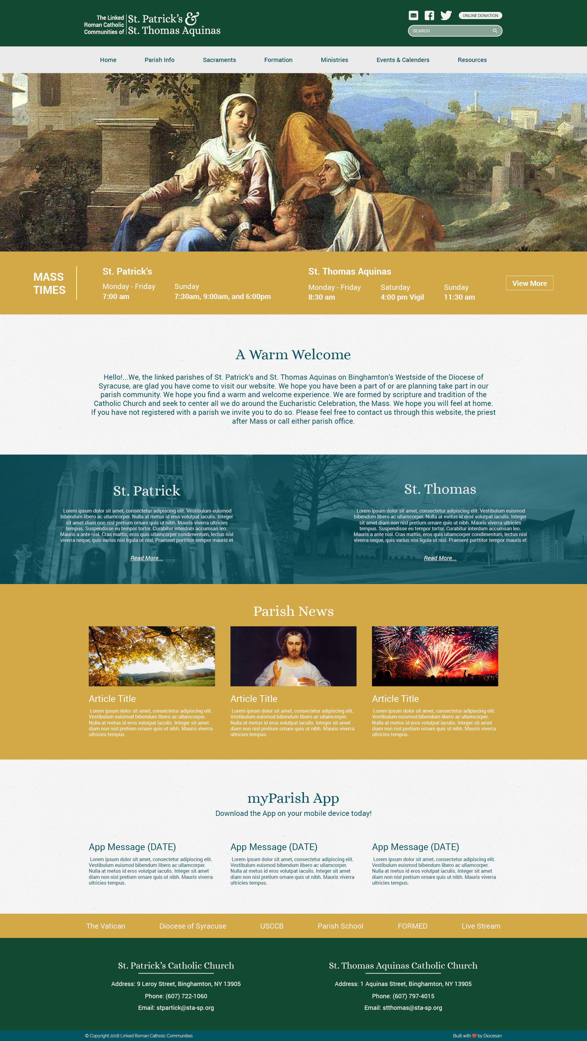
Homepage Proof
Good Afternoon!
I have a copy of the homepage for you to take a look at today, It also has the most recent logo iteration for you to review.
Thanks,
Samuel Lanning
I have a copy of the homepage for you to take a look at today, It also has the most recent logo iteration for you to review.
Thanks,
Samuel Lanning
I wasn't personally satisfied with the colors used so I changed them up a bit. Here is the updated proof! Let me know what you think, Feel free to giv eme a call if you have any questions!
(616) 878-5200 ext. 219
Thanks,
Samuel Lanning
(616) 878-5200 ext. 219
Thanks,
Samuel Lanning
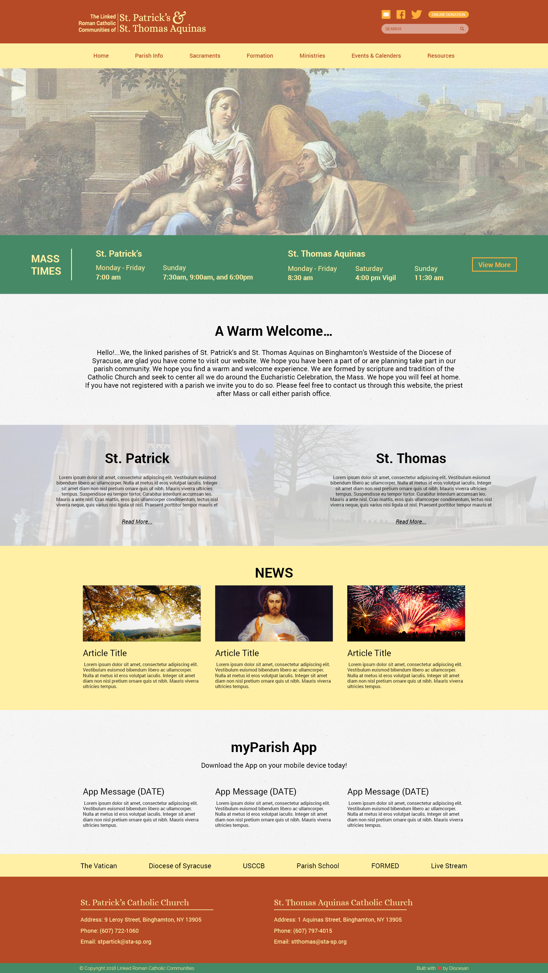
Dear Sam-
Thank you for the work.
A few quick thoughts….
I think the header is still too small.
Burgundy is not a color that I think works for us.
How about the following colors?:
DARK GREEN
GOLD
DARK TEAL
(These are taken from my font color wheel. I have indicated their color name)
Would like to see the header font used at the various sub headers, i.e. ‘Mass Times’, ‘A Warm Welcome’, etc.
Danita
I will swap the colors and the titles, I like the idea of using a teal instead of burgundy!
Thanks for the feed back!
Samuel Lanning
Thanks for the feed back!
Samuel Lanning
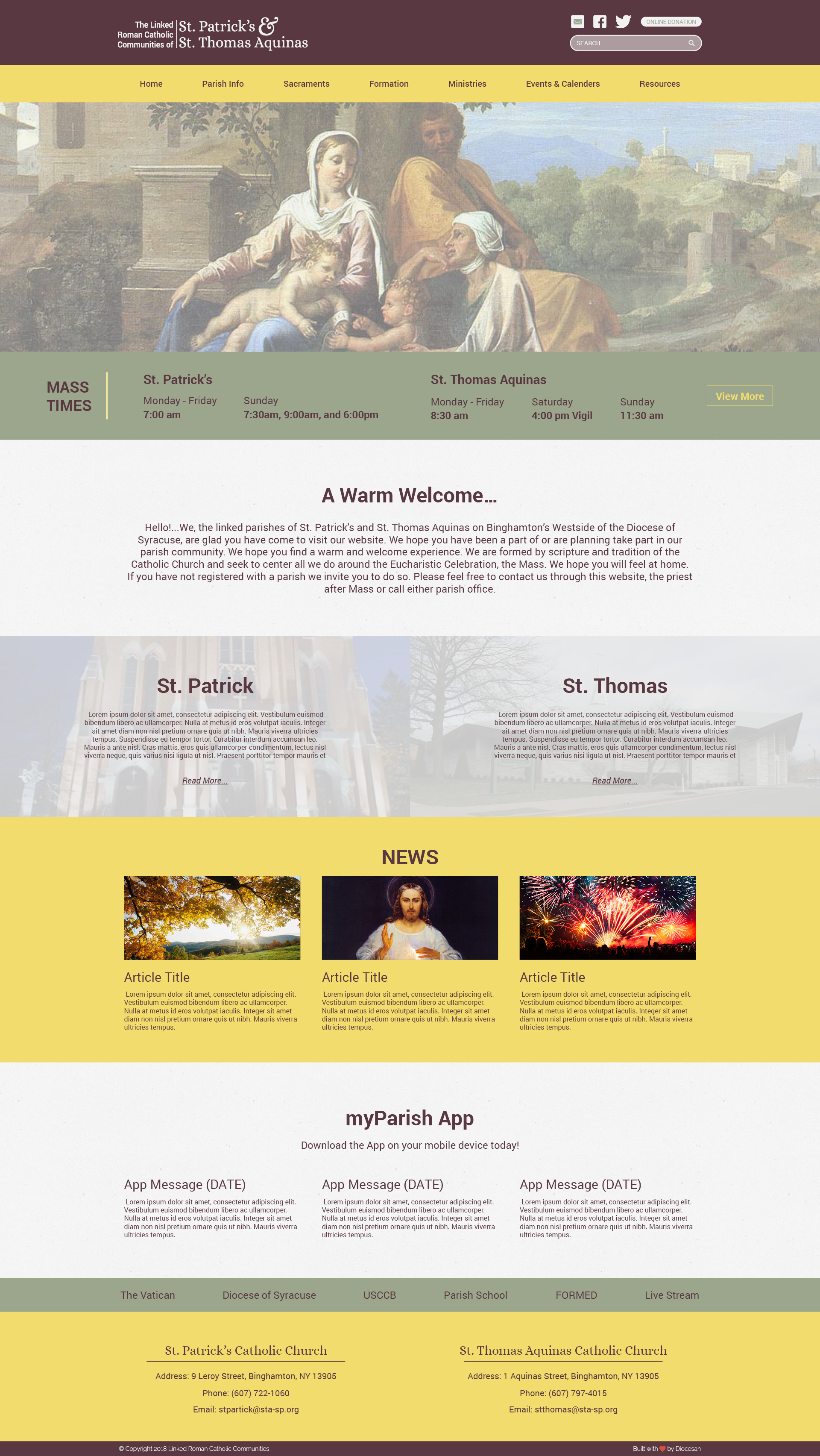
Here is an updated version of the proof I think the colors are coming together well!