So sorry that I haven't been in touch. I'll be out of the office later this month, so there's a lot to get done!
I will get the developer to take a look as to why the landing page logos & information are not lining up correctly.
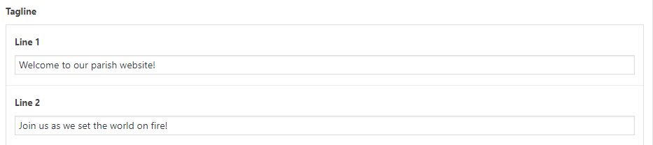
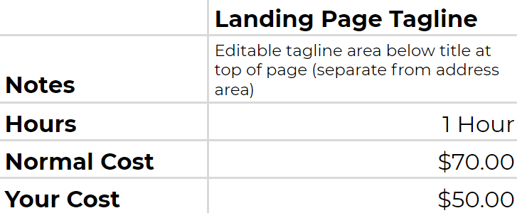
For Father's tagline on the landing page, this is something we would have to build out as right now, no such area exists nor was it in the approved design for us to build off of. Fortunately, it wouldn't take too long. The developer estimated an hour, but that time includes adjusting for any issues that could prolong the process.
This estimate is based on the tagline working just like the address area, only without a link, so:
2 lines of text
first line same font size as address line 1
second line same font size as address line 2
Centered below Saint Ignatius of Loyola Parish and above the Church & School logos
No link
If you have any changes to this, please let me know, as I will have to ensure the given estimate still covers your needs.
If you're still having issues with it, please let me know so I can remote into your screen and see exactly what the issue is!
Thank you,
Veronica Alvarado
Web Department, Diocesan 877-923-0777
To:
Amy Lesko
TO THE CLIENTVeronica Alvarado,Project Manager
Amy,
Do you mean the staff page? The contact pages don't have any names that I know of, but I want to double check.
When you say banner, which one do you mean (slider, header, blue buttons below slider, communications center, etc.) and on which site (school, church, or both)?
This must be because we updated the Heading and Paragraph fonts. To ensure we changed them across all pages/templates, we had it override whatever the headings and paragraph fonts previously were. I am so sorry that we did not have the foresight to see how it would affect the homepage. I have marked this as emergent and will have the developer work on that first thing this morning.
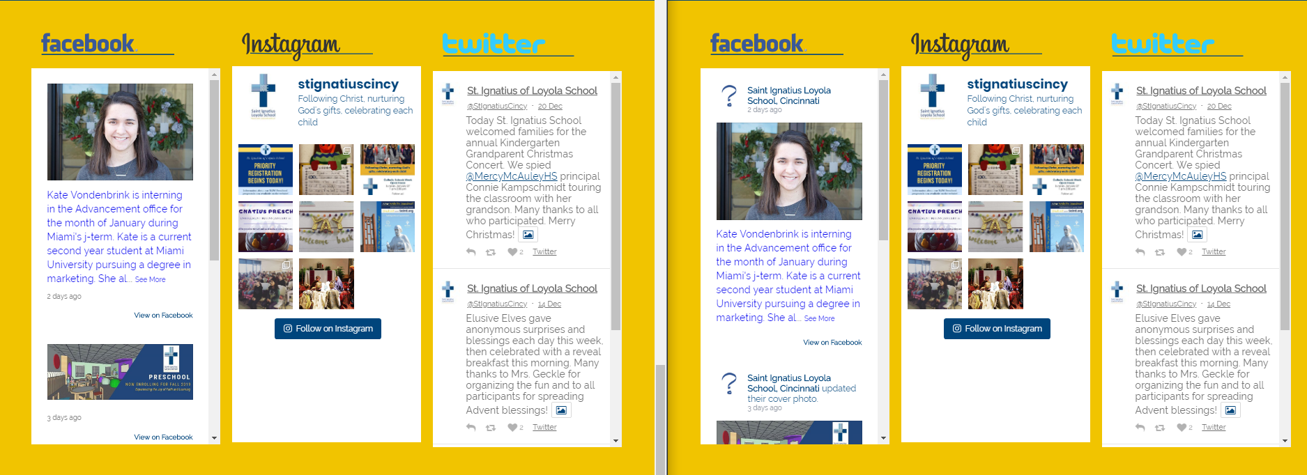
As for the Facebook not showing the avatar, it has to do with Facebook's API changes in February of 2018. Avatars (user's profile pictures) are no longer pulled in, even if we use an API User Token (required for displaying Facebook posts now). However, we do have the option of removing the header from the Facebook posts. I have done so in the image on the left. Instagram and Twitter have similar options
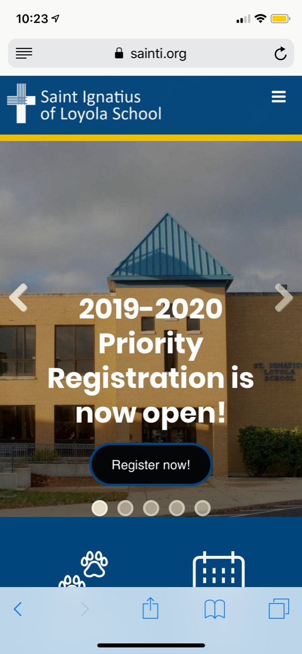
I was planning to send an email last night to mention something was not quite right with the mobile responsiveness of the site. The contact us page is very messy, with reading names very difficult. The banner on the mobile seems to be not aligned as once was, so there is overlapping over the link button. (which happens to be registration.)
On a computer the homepage seems like some of the font colors were changed, to gray with dark backgrounds which makes it very hard to read? FB on the school side has the question mark, instead of logo.
Sorry not to ramble off a ton of stuff, but we opened a registration yesterday, so we have so many viewers coming or will be coming to the site, and are just a bit disappointed to have to have it look as it does.
"For as in one body we have many parts, and all the parts do not have the same function, so we, though many, are one body in Christ and individually parts of one another." - Romans 12:4-5
From: Veronica Alvarado <valvarado@diocesan.com> Sent: Saturday, January 12, 2019 1:49 PM To: Webmaster Subject: Re: User accounts Just to double check, here are the accounts I will be removing:Church
Church : Amy Lesko Megan Mears Rick Berning Fr. David Kobak Fr. Geoff Drew (I need to add some, but will use the form you gave me)
School: Amy Lesko Megan Mears Fr. Geoff Drew Melanie Crowe Kevin Vance (Also need to add Assistant Principal for school)
Thanks Amy
Sent from my iPhone
To:
Amy Lesko
TO THE CLIENTVeronica Alvarado,Project Manager
Amy,
We have updated the staff pages so that they wrap accordingly and should not overlap each other.
If you meant the slider, it is due to the heading size, although on an iPhone X and 8, the registration slide looks fine. But if this is an issue that you see happening on multiple mobile devices, be sure to change the heading size. It may be that the text is too large for that many words plus a button.