✨ Page Fold vs Aspect Ratio
Good afternoon everyone,
Yesterday, we discussed the two different types of hero images for the homepage; Page Fold or Aspect Ratio. This will determine if you would like the homepage to resize based on the fold (image fills up the height of the screen of any device you're on) or based on aspect ratio (image keeps it's ratio, even though on mobile it may be very small).
Since this is something that must be decided upon before the design can be officially approved, I wanted to share some examples of some sites that have used either fold or aspect ratio:
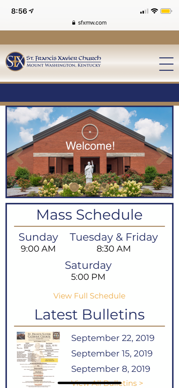
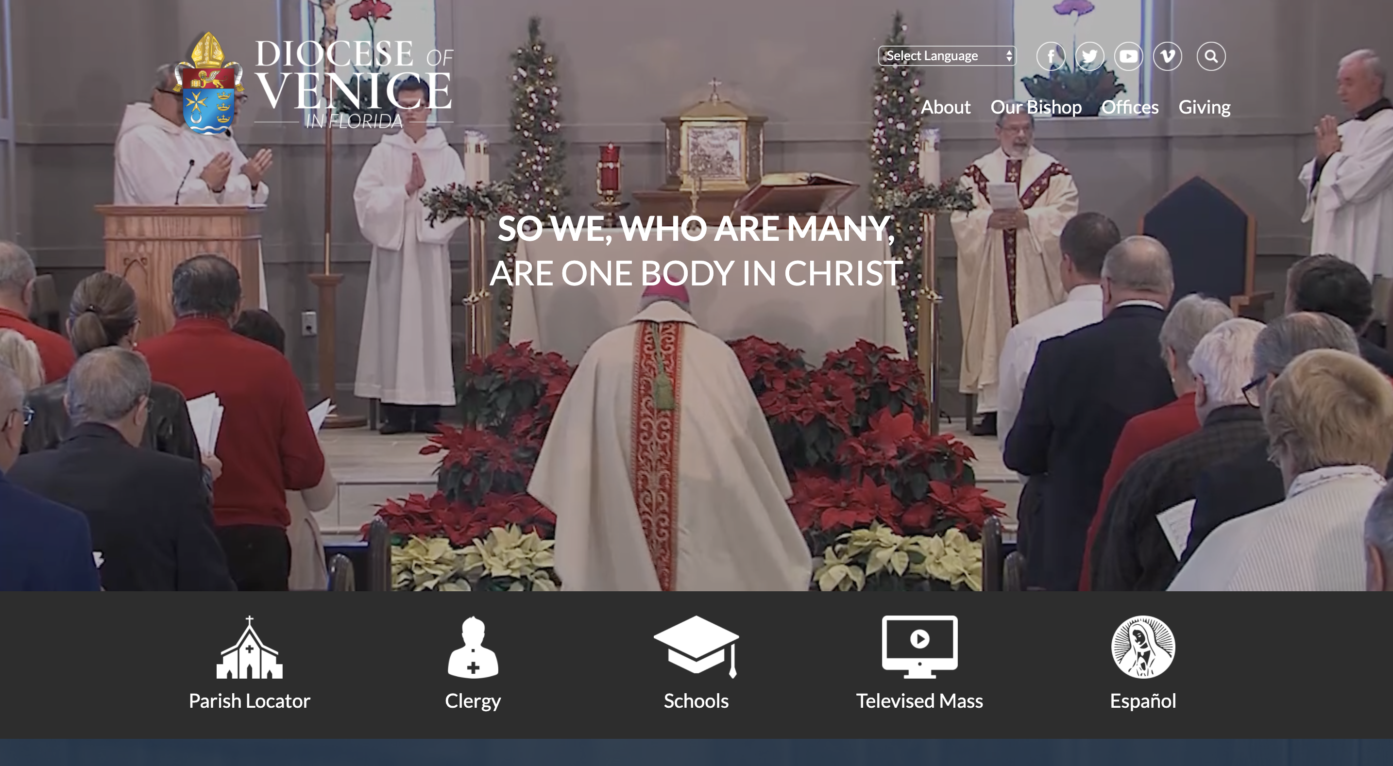
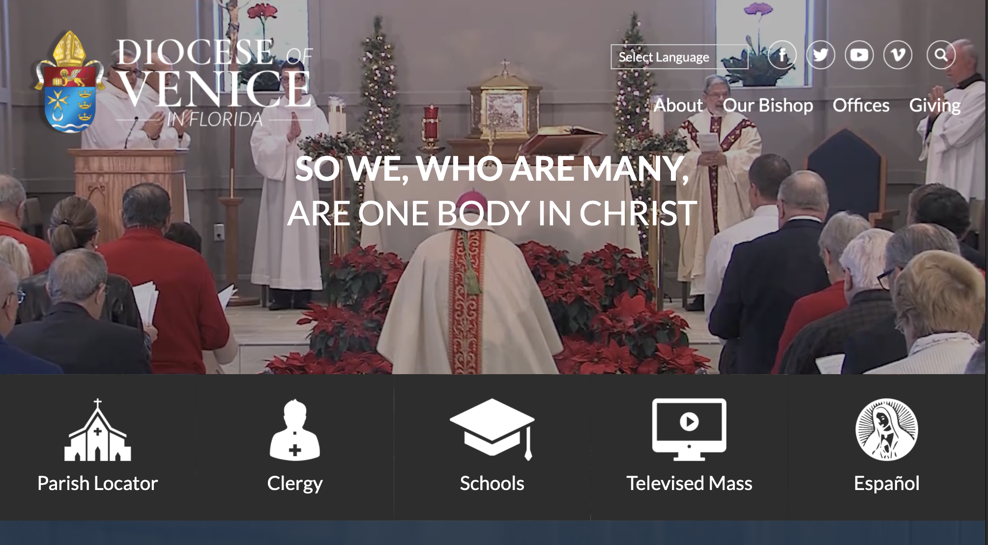
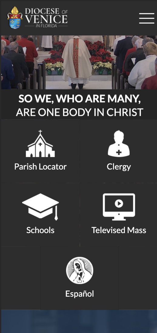
Page Fold (3 examples)
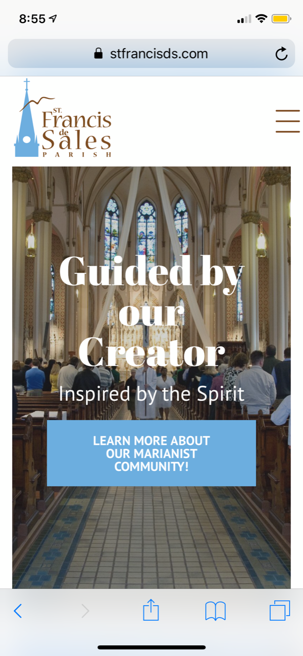
- Image will always fill the same percentage of the screen
- Diocesan will add fields for text so that it resizes on mobile
- When used properly, images are background/mood-setting images, not focal points
- Text will use the same fonts as website theme
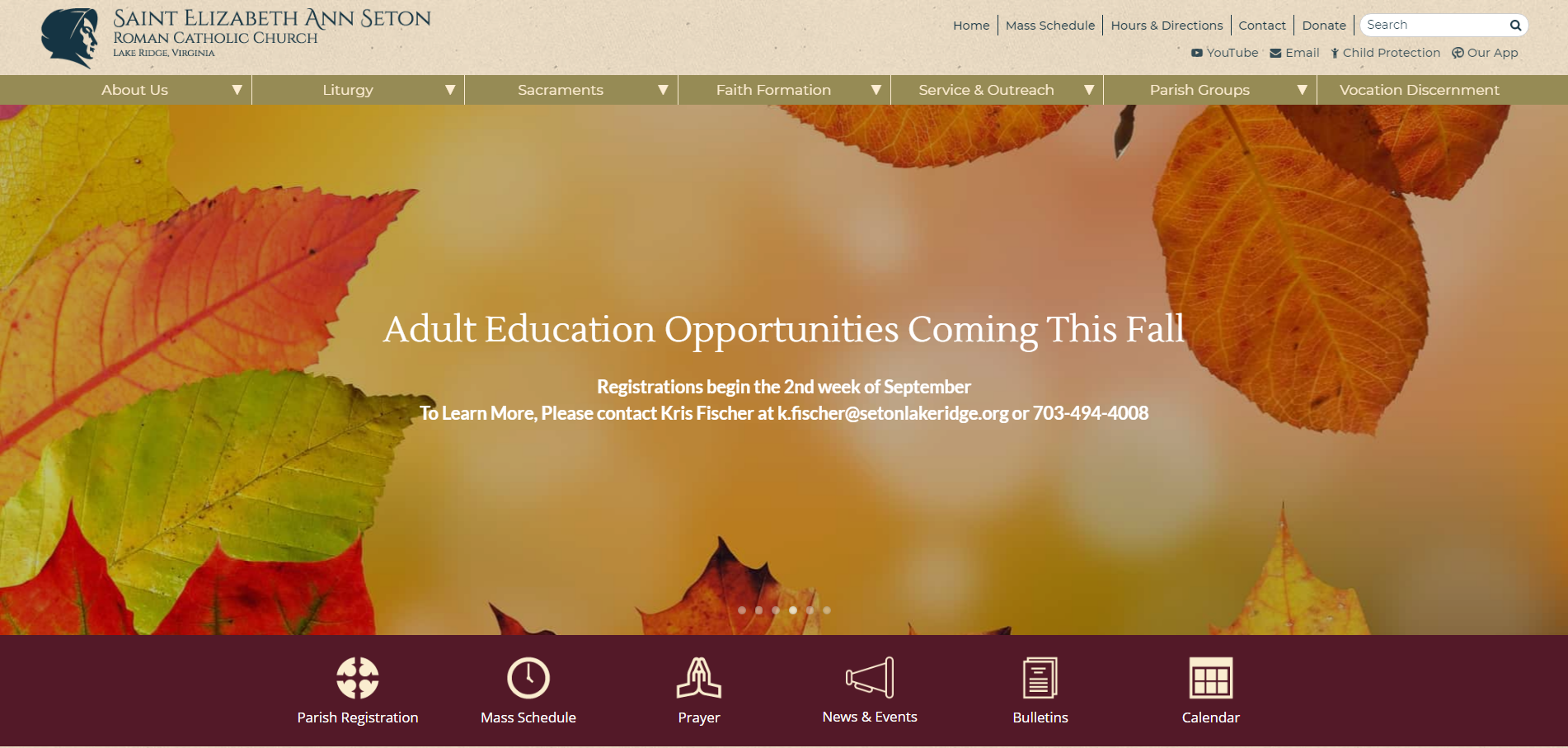
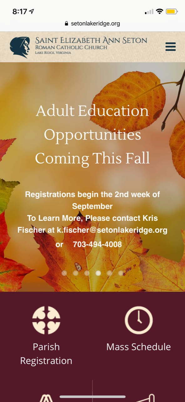
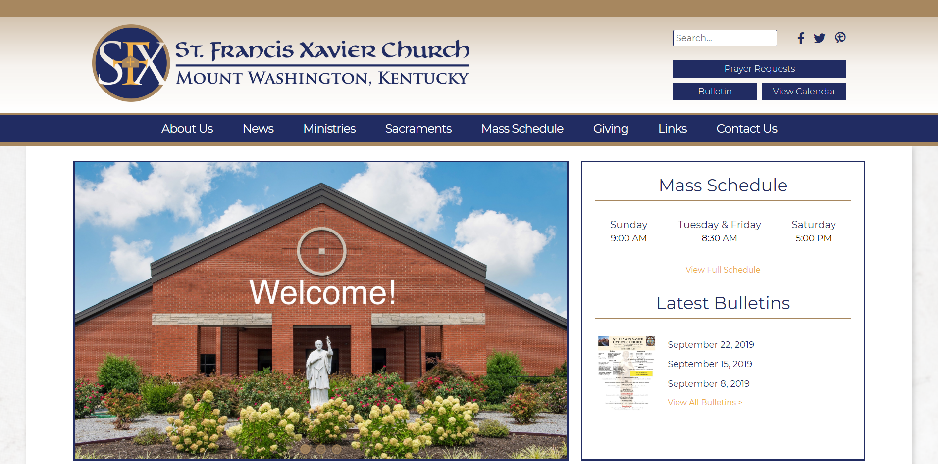
Saint Elizabeth Ann Seton - Lake Ridge
http://setonlakeridge.org/
http://setonlakeridge.org/
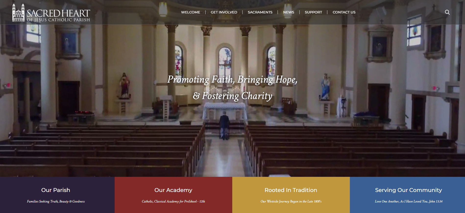
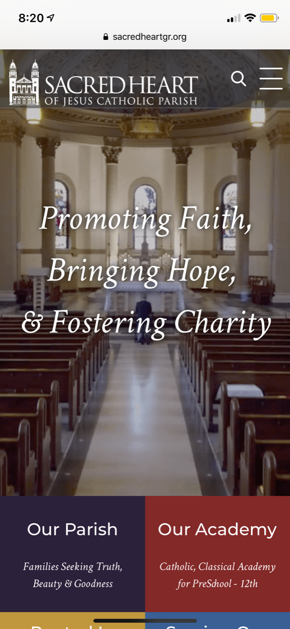
Sacred Heart of Jesus - Grand Rapids
http://sacredheartgr.org/
http://sacredheartgr.org/
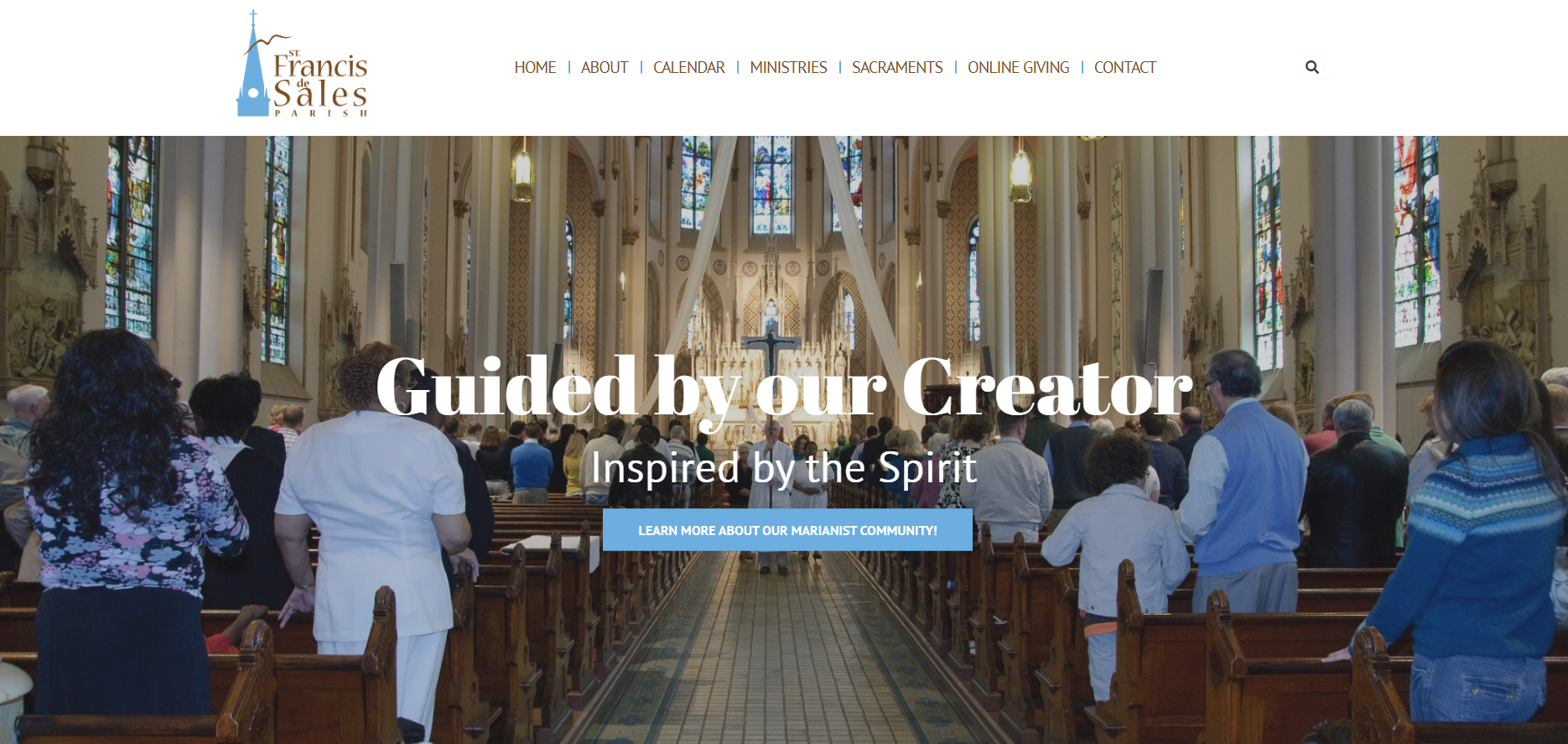
St. Francis de Sales - Cincinnati
https://stfrancisds.com/
https://stfrancisds.com/
Aspect Ratio (4 examples)
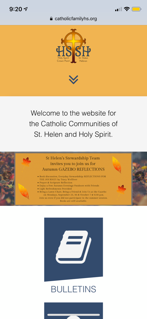
- Against best practices/not recommended since any text on slide would not be mobile responsive (so some text may be too small to read)
- Image will keep its exact ratio & never crop
- Items below image will move up or down depending on the width of device used
- Best used if you plan on putting text directly on your images or specific images of people's faces
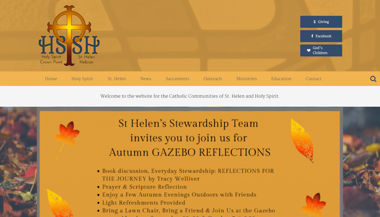
Holy Spirit & St. Helen - Crown Point
https://catholicfamilyhs.org/
https://catholicfamilyhs.org/
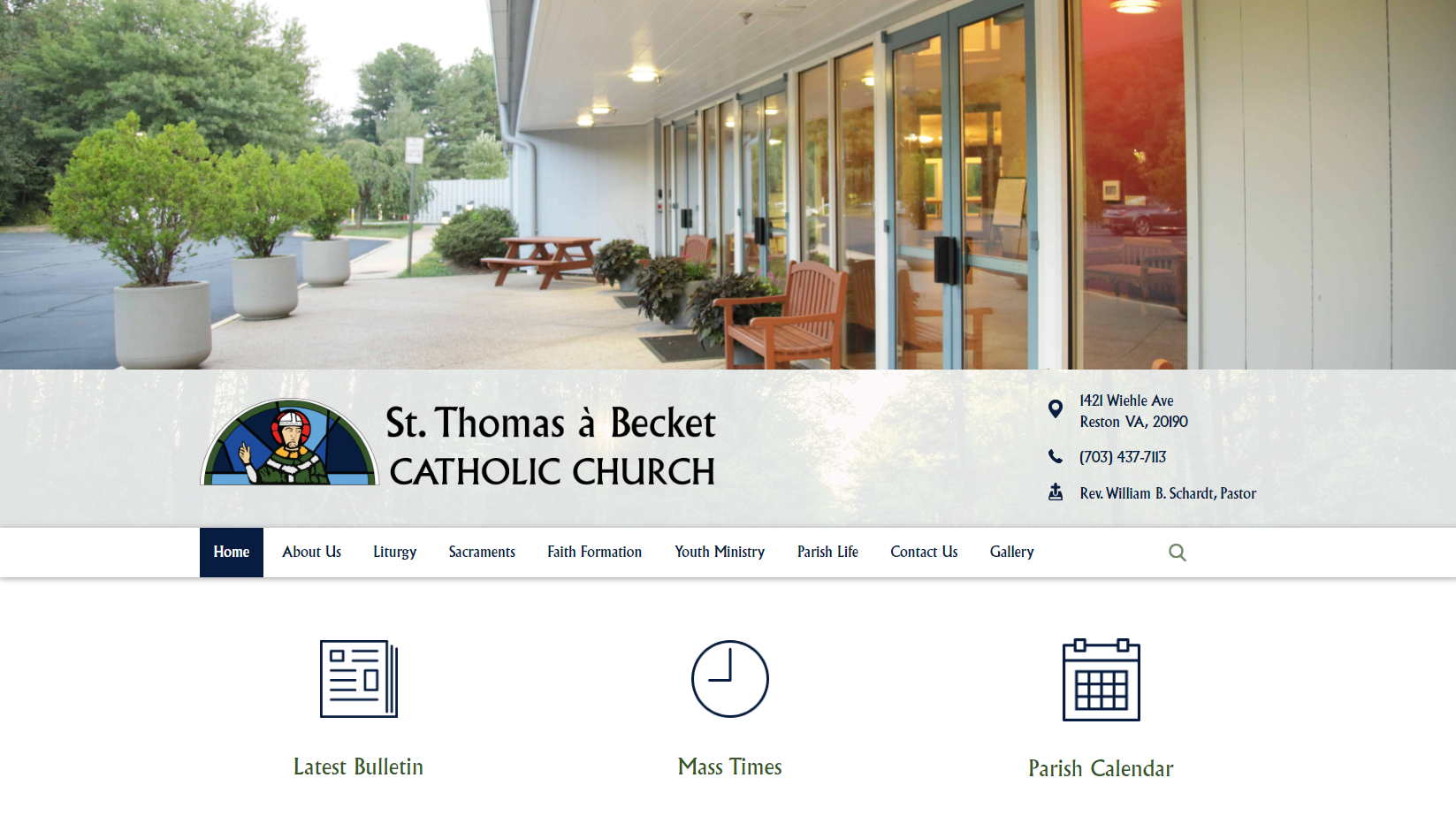
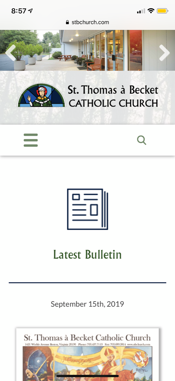
St. Thomas a Becket - Reston
https://stbchurch.com/
https://stbchurch.com/
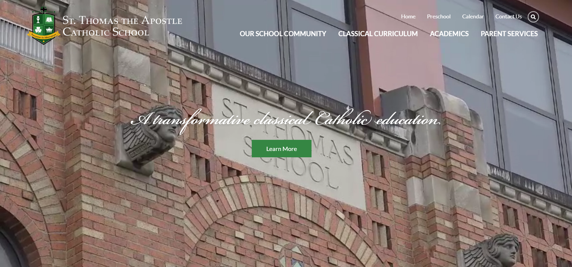
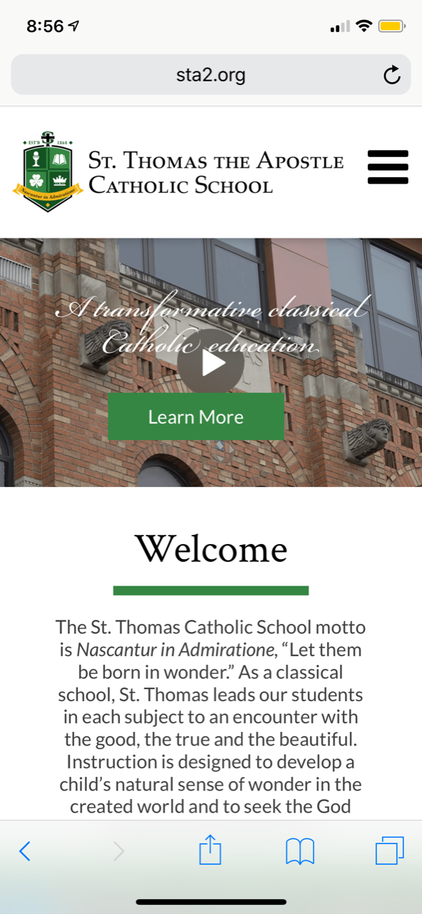
Thomas the Apostle - Ann Arbor
https://sta2.org/school/
https://sta2.org/school/
Hybrid
- Allows for variation so the image never has too much cut off
- Diocesan will add fields for text so that it resizes on mobile
- Image/video moves below menu
- Text moves below on smaller screens
- When used properly, images are background/mood-setting images, not focal points
(Images with text on them may have text cut off) - Text will use the same fonts as website theme
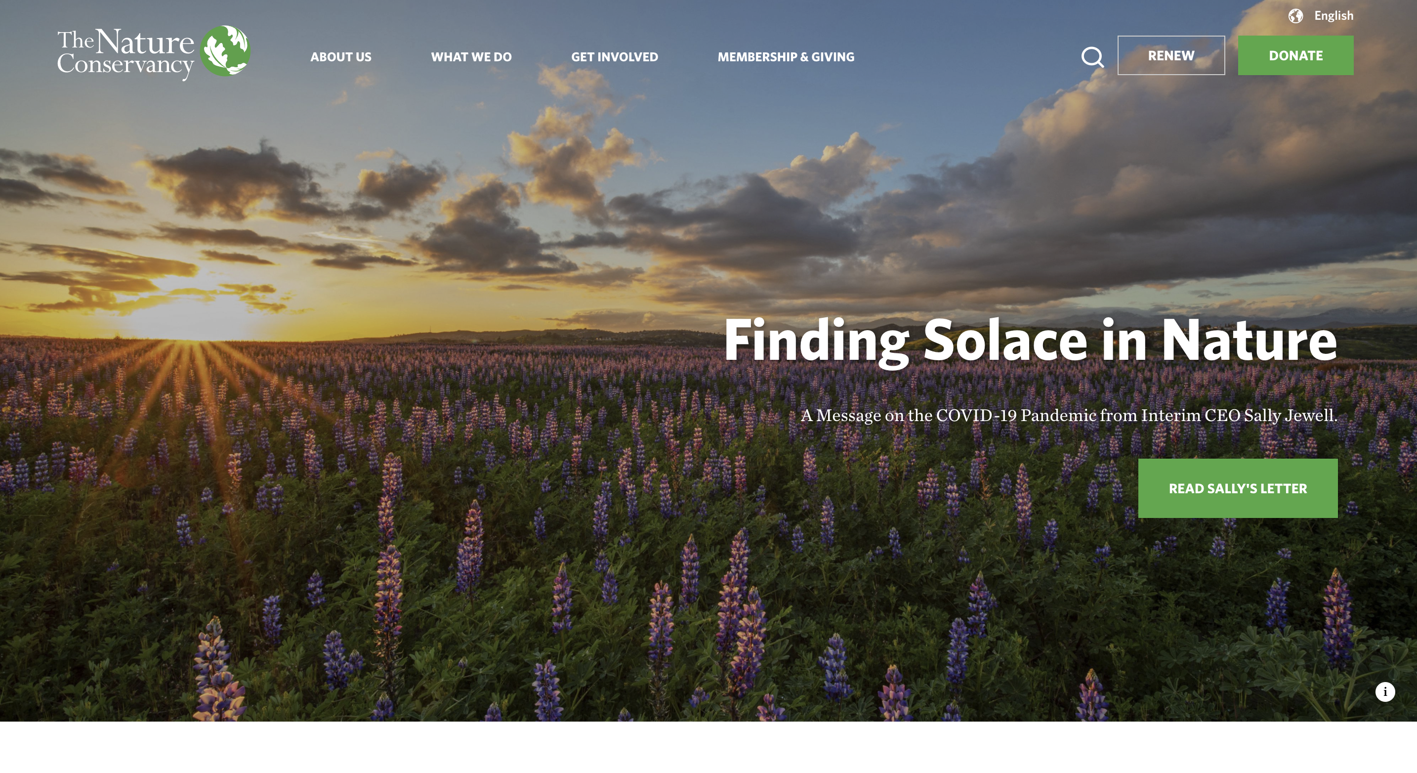
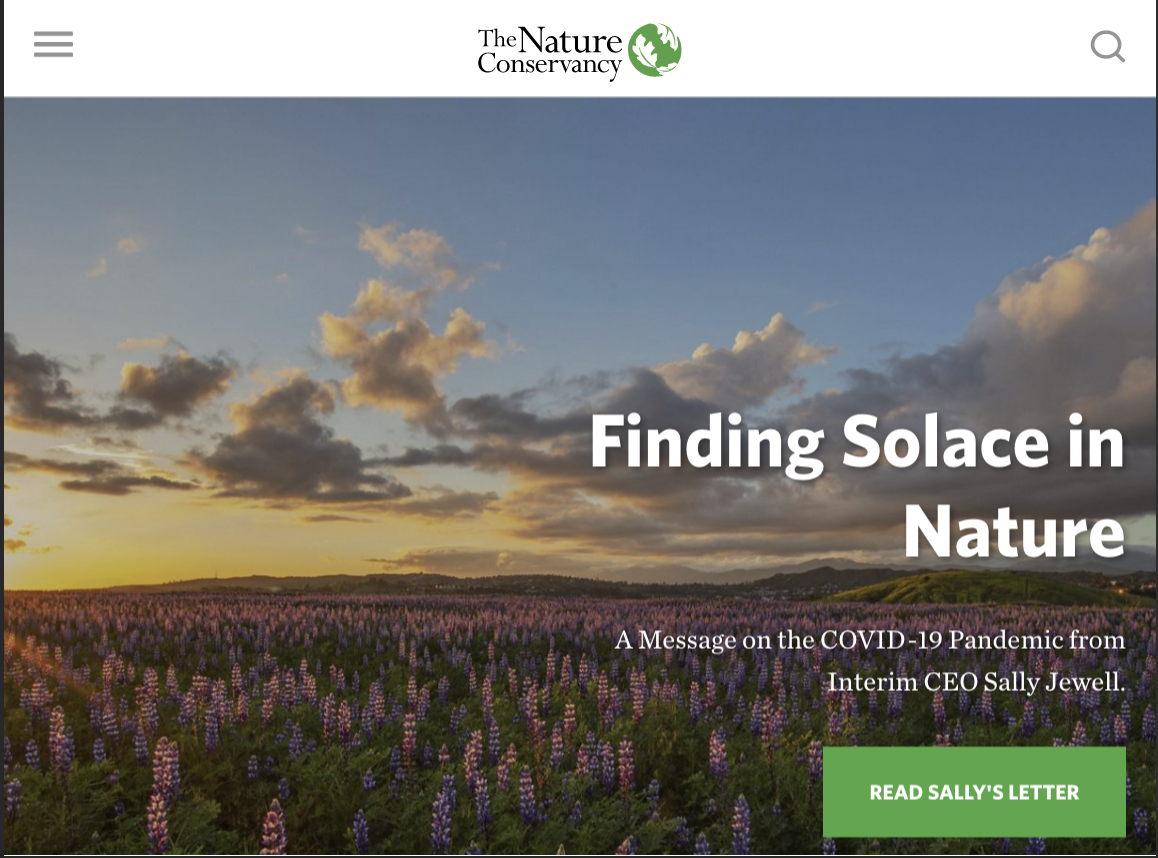
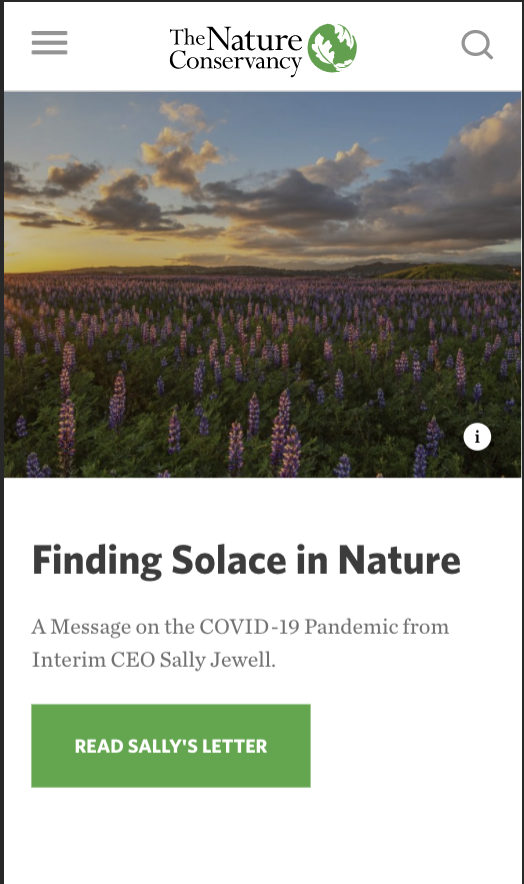
Nature Conservancy
https://www.nature.org/en-us/
https://www.nature.org/en-us/
- Desktop
- Tablet
- Mobile
Other Things to Keep in Mind
- Statistically, we've found that our parish websites are visited on a mobile phone up to 67% of the time (does not include tablets).
- Putting information in your slider greatly reduces the likelihood of people scrolling down to view the rest of your website
- Sliders should only include 4-6 images
Please remember that this decision must be made before designs are approved since the mobile design and development will depend on your choice. Additionally, once the designs are completed and official approval is given, any changes to the mobile functionality may result in additional developmental costs.
Let us know if you have any questions.
Thank you,
Veronica Alvarado
Project Manager, Web Department
877-923-0777