Update to Footer
Good morning everyone,
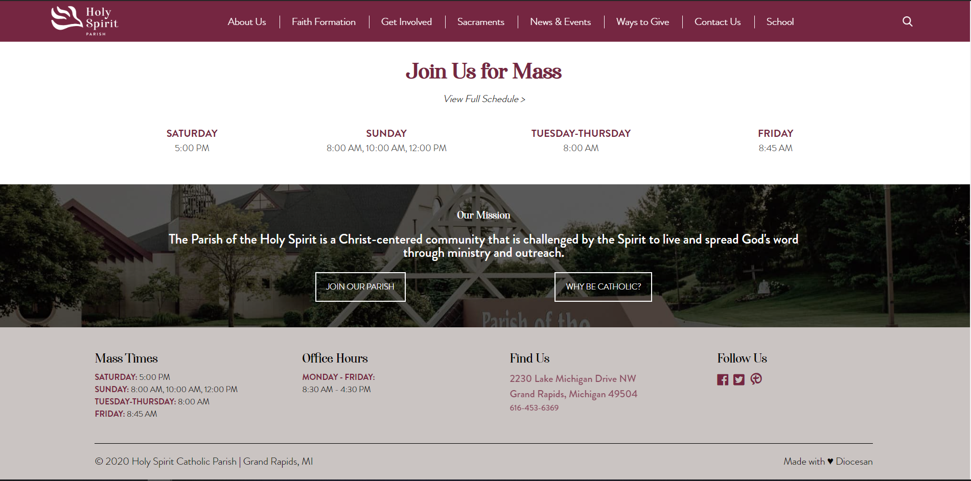
While reviewing your website, we found it to be very maroon-heavy. Reviewing your style guidelines, we think that using your beige for the footer may be a better fit for the website. Since the beige is not currently used on the site very often, it provides the perfect tie back to your bulletin and other marketing pieces.
Below is a screenshot of what we propose for the beige footer.
Let us know what you think and we can make the update on both the school and parish sites at no additional cost.
Thank you!
Veronica Alvarado
Web department, Diocesan
877-923-0777
877-923-0777
Thanks for looking at this and proposing a change. I agree that we need to bring the beige in to the site more, unfortunately not in the footer. Fr. Mark and I looked at this together yesterday and prefer the footer to be maroon. We would like to as is for this item.
Thanks!
Thanks!
I think it makes it look overcast/dingy. I would prefer to be white or maroon.
Not a problem! Just wanted to make the suggestion since Blake had brought it up.
It will be left as is.
It will be left as is.
Veronica Alvarado
Web department, Diocesan
877-923-0777
877-923-0777
Thanks!