Design Introduction
Hello Alicia and Sandra,
My name is Danae Chudy and I am the web designer at Diocesan that will be working with you on your new web project. I am reaching out to let you know that we are nearly ready to begin the design process.
In order to begin the design process, we need from you:
- A logo
- Your chosen colors for your site
- Your chosen fonts.
Thank you for your cooperation as we work hard to deliver a beautiful new site for you!
Have a great day and I will talk to you soon!
Danae Chudy
Diocesan Publications
Web Designer
877-923-0777
Hello Danae,
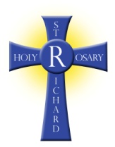
I have attached the logo here for you. I do not know what the font is, but we would like the same font which is used in the Cross logo. Sandra is currently out of office so I won't be able to check with her to see if she knows what the font is. We would like the colors to be those used in the Cross, blue and yellow.
I have attached the logo here for you. I do not know what the font is, but we would like the same font which is used in the Cross logo. Sandra is currently out of office so I won't be able to check with her to see if she knows what the font is. We would like the colors to be those used in the Cross, blue and yellow.
Good morning Danae,
Attached is another (hopefully better) attachment of our logo.
Also, I wanted to clarify about the color scheme. When I mentioned the colors of our logo, the blue and yellow, I would prefer if the background is not so dark. Our current site has a very dark background, and we no longer want that. We want a lighter, more welcoming look.
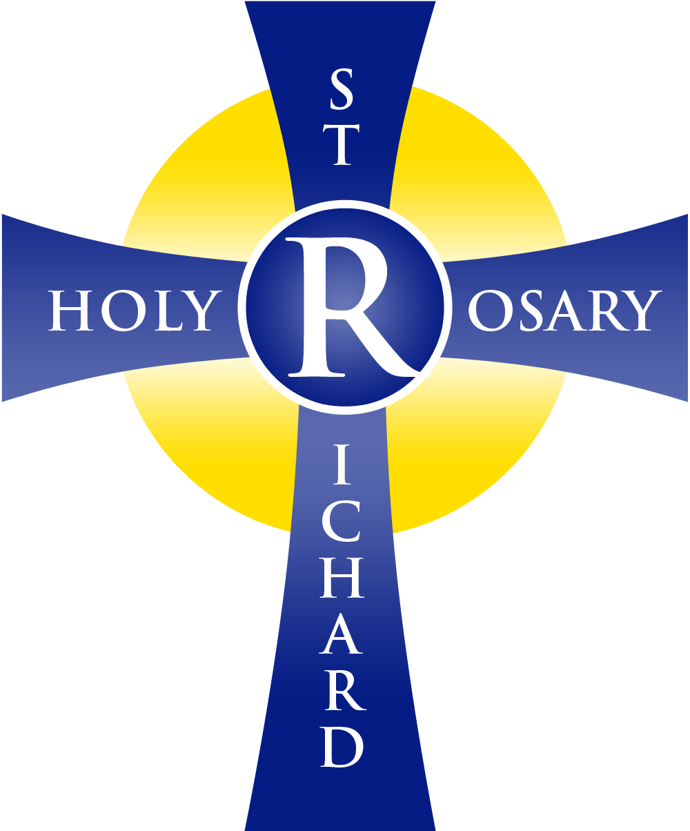
Hi Alicia and Sandra,
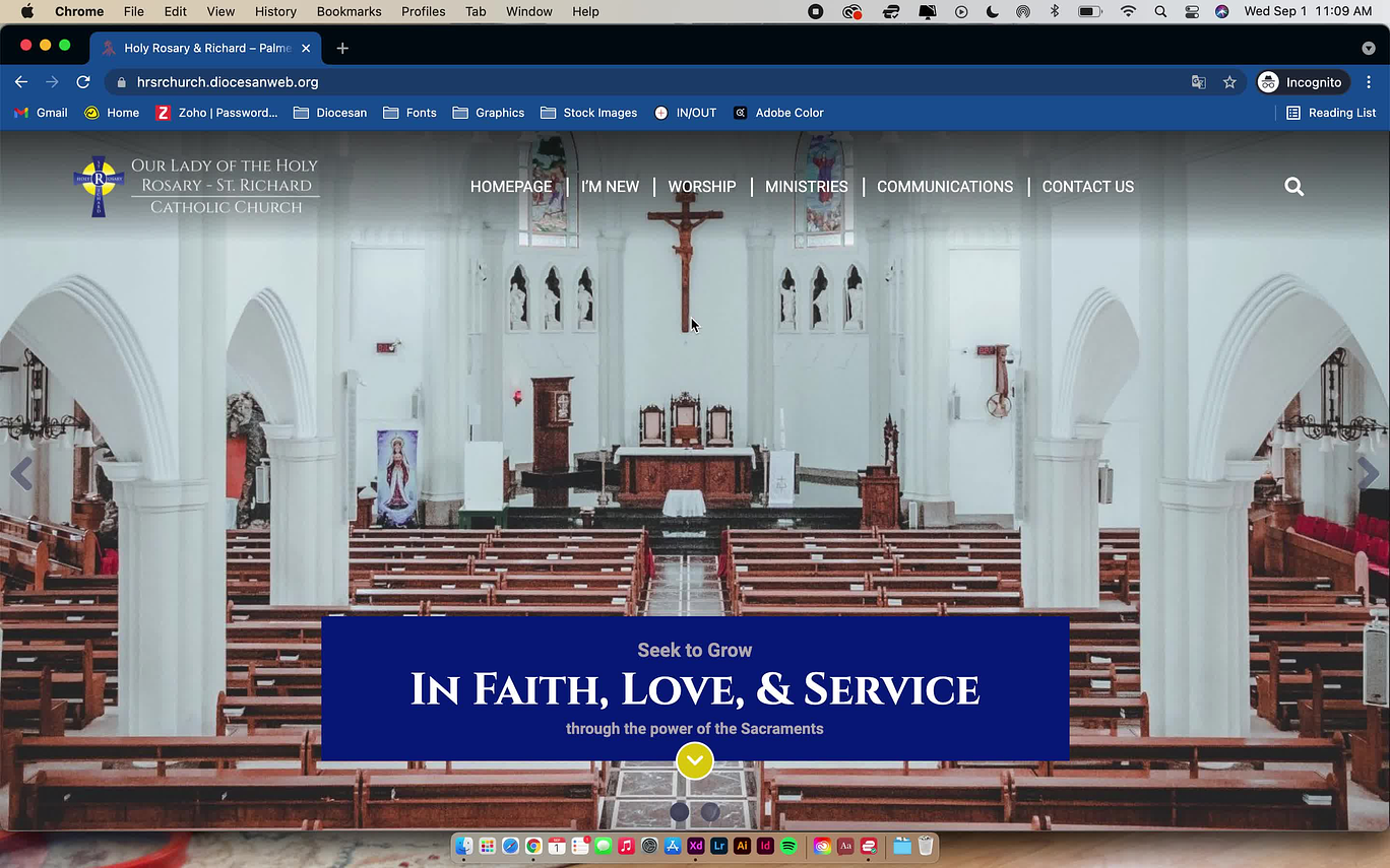
Here is the link to the website. What do you think of the colors and fonts used? Of course, we will update the content to reflect your own later on in the project.
https://hrsrchurch.diocesanweb.org/
Please let me know if you are ready for the website approval or if there are any changes you'd like to see!
Thanks,
Danae Chudy
Diocesan Publications
Web Designer
877-923-0777
Hello Danae,
It looks pretty good, just a few things:
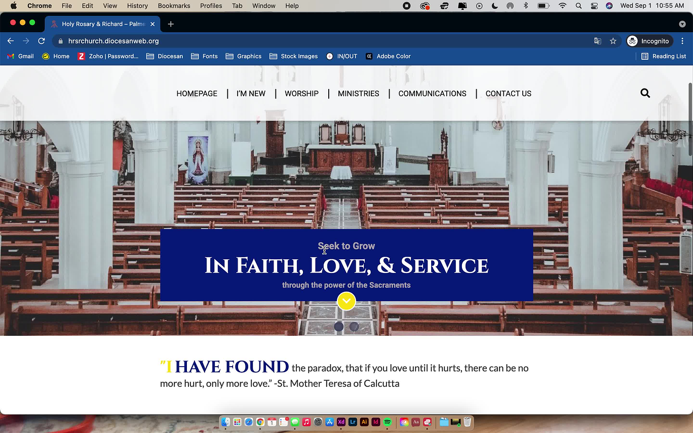
1. Could we have the Cross (Logo) on the top left be larger?
2. Could we see the heading font on the footer (Holy Rosary, Quick Links, Follow us) in our yellow/gold which is used in the logo instead?
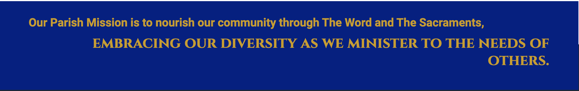
3. Same with "Our Parish Mission..." Then we can decide if we prefer the yellow/gold to the blue
Blessings,
Alicia Mendes
This email is meant for the intended recipient only. If you are not the intended recipient, please delete the email and contact Holy Rosary - St. Richard Catholic Church.
Our Lady of the Holy Rosary - St. Richard Catholic Church
7500 SW 152nd Street
Palmetto Bay, FL 33157
Phone (305) 233-8711
Fax (305) 254-2756
Email: amendes@hrsrcs.org (mailto:amendes@hrsrcs.org) Website: www.hrsrchurch.org (http://www.hrsrchurch.org)
Office Hours: Monday through Thursday, 8:30 am -4:30 pm, Friday 8:30 am - 12:00 pm.
It looks pretty good, just a few things:
1. Could we have the Cross (Logo) on the top left be larger?
2. Could we see the heading font on the footer (Holy Rosary, Quick Links, Follow us) in our yellow/gold which is used in the logo instead?
3. Same with "Our Parish Mission..." Then we can decide if we prefer the yellow/gold to the blue
Blessings,
Alicia Mendes
This email is meant for the intended recipient only. If you are not the intended recipient, please delete the email and contact Holy Rosary - St. Richard Catholic Church.
Our Lady of the Holy Rosary - St. Richard Catholic Church
7500 SW 152nd Street
Palmetto Bay, FL 33157
Phone (305) 233-8711
Fax (305) 254-2756
Email: amendes@hrsrcs.org (mailto:amendes@hrsrcs.org) Website: www.hrsrchurch.org (http://www.hrsrchurch.org)
Office Hours: Monday through Thursday, 8:30 am -4:30 pm, Friday 8:30 am - 12:00 pm.
Hi Alicia,
I wondered if we wanted to add Holy Rosary - Richard Catholic Church on the right side of the logo? Even if we make it bigger it'll be hard to read. Let me know if that's what you want to do!
Also, the website is updated with the colors- if you could just hit refresh on the link, you'll be able to see it. (: https://hrsrchurch.diocesanweb.org/
Thanks!
Danae Chudy
Diocesan Publications
Web Designer
877-923-0777
Hello Danae,
I think we need to add Our Lady of the Holy Rosary-St. Richard Catholic Church to the right side of the logo. Is there a reason the logo needs to be so small? Is it because I sent you a less than optimal image? I can try to get a better one.
I like it with the yellow font. I will check with Sandra and get back to you next week, because the office is already closed today.
Hi Alicia,
The logo is smaller because it fits within the sticky menu. Your logo resolution is a good resolution!
I think it will help to have the words on the side of the logo though. I'll send you a mockup shortly!
Thanks,
Danae Chudy
The logo is smaller because it fits within the sticky menu. Your logo resolution is a good resolution!
I think it will help to have the words on the side of the logo though. I'll send you a mockup shortly!
Thanks,
Danae Chudy
Diocesan Publications
Web Designer
877-923-0777
Hi Alicia,
What do you think of this? Please refresh this link: https://hrsrchurch.diocesanweb.org/
Thank you!
Danae Chudy
What do you think of this? Please refresh this link: https://hrsrchurch.diocesanweb.org/
Thank you!
Danae Chudy
Diocesan Publications
Web Designer
877-923-0777
Hello Danae,
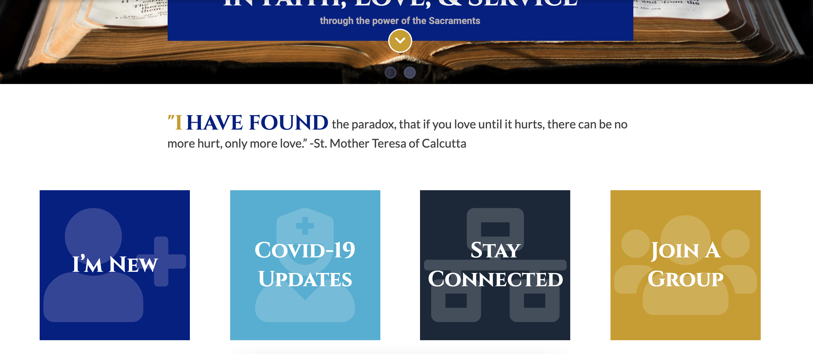
I really like this. I think adding the Church name makes a big difference. I especially like the logo and name with the blue font when the drop down menu appears.
I like the yellow font in the footer, I would prefer if the same yellow or a lighter yellow was used in the mission statement though.
So far so great!
Hi Alicia,
What do you think of this?
We can for sure change it if you would prefer that.
Thanks!
Danae Chudy
What do you think of this?
We can for sure change it if you would prefer that.
Thanks!
Danae Chudy
Diocesan Publications
Web Designer
877-923-0777
Hi Danae,
I don't mind the mission statement being in two different colored fonts. I just want the color to match more closely to the yellow in the footer. I can't really tell unless I see the two together on the page.
Sorry to be a pain.
I don't mind the mission statement being in two different colored fonts. I just want the color to match more closely to the yellow in the footer. I can't really tell unless I see the two together on the page.
Sorry to be a pain.
No problem! I did go with a darker yellow because you couldn’t read it on the white background. I can show you what it looks like with your yellow, but I highly suggest a darker tone for legibility. I will update that soon.
Thanks!
Danae
Thanks!
Danae
Hi Alicia and Sandra,
Here are the options. Let me know what you prefer!
Yellow in the logo:
A shade darker than your yellow:
The gold-yellow I had:
Here are the options. Let me know what you prefer!
Yellow in the logo:
A shade darker than your yellow:
The gold-yellow I had:
Thanks!
Danae Chudy
Diocesan Publications
Web Designer
877-923-0777
Hi Danae,
I agree with Alicia. Adding the church name makes a HUGE difference. Fr. likes it too.
Blessings,
Sandra
I agree with Alicia. Adding the church name makes a HUGE difference. Fr. likes it too.
Blessings,
Sandra
Hi Danae,
I like the yellow in the original "Original Yellow" file for the first line of the mission statement and the shade darker for everything else. So the color of the first part of the mission statement and the font for the footer headers are the same. I prefer the darker yellow on everything else. I do not like the "I" in yellow in "I have found". Can we leave that "I" or whatever it will be in the dark blue font that the other font is?
I appreciate all your help with this.
Hi Alicia,
Ok sounds good! I will ask our developers to change some of the coding. Also, we can change the "I" to the primary blue color.
Stay tuned!
Thanks,
Danae Chudy
Ok sounds good! I will ask our developers to change some of the coding. Also, we can change the "I" to the primary blue color.
Stay tuned!
Thanks,
Danae Chudy
Diocesan Publications
Web Designer
877-923-0777
Thank you, we are so excited 😁
Hi Alicia and Sandra,
Here is the website. If you could hit refresh for me, you'll see the changes to the website. https://hrsrchurch.diocesanweb.org/
Please let me know if you are ready for the design approval or any other changes and we can move forward from there!
Thanks,
Danae Chudy
Here is the website. If you could hit refresh for me, you'll see the changes to the website. https://hrsrchurch.diocesanweb.org/
Please let me know if you are ready for the design approval or any other changes and we can move forward from there!
Thanks,
Danae Chudy
Diocesan Publications
Web Designer
877-923-0777
Hi Alicia and Sandra,
I hope you enjoyed the long weekend! I wondered if you had a chance to look at the changes we made to the website?
https://hrsrchurch.diocesanweb.org/
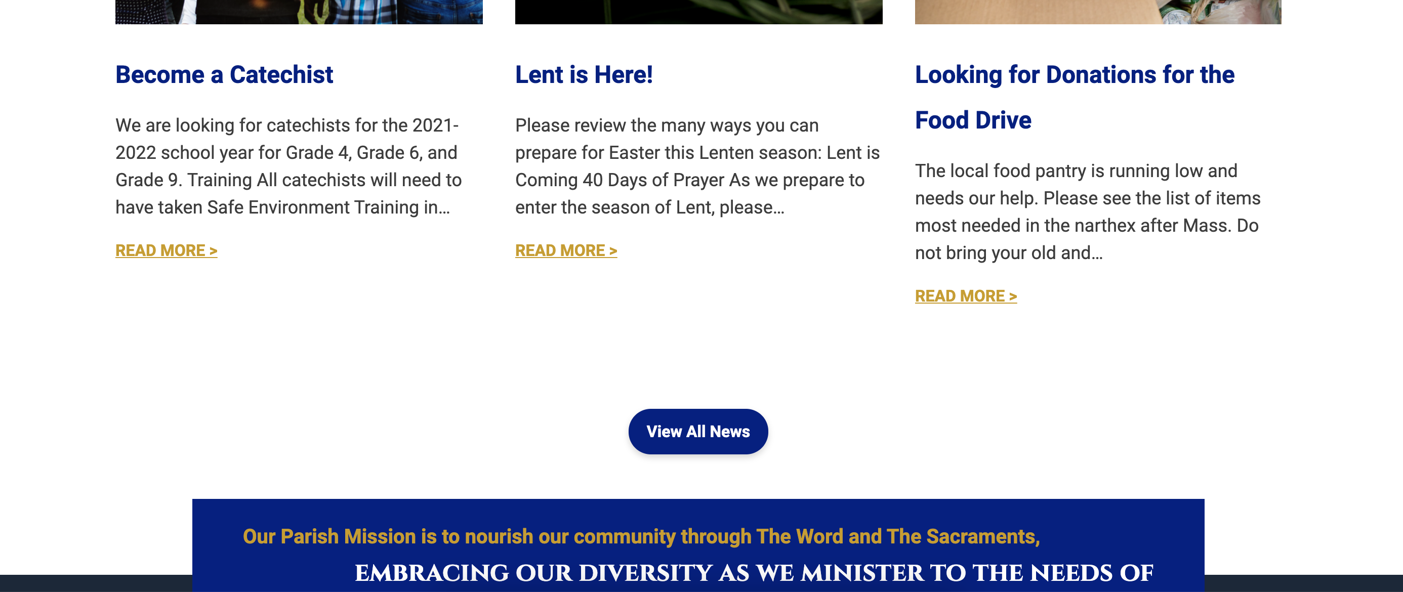
I'd love to get this project into the development queue! Please let me know if I can help with anything else!
Thanks,
Danae Chudy
I hope you enjoyed the long weekend! I wondered if you had a chance to look at the changes we made to the website?
https://hrsrchurch.diocesanweb.org/
I'd love to get this project into the development queue! Please let me know if I can help with anything else!
Thanks,
Danae Chudy
Diocesan Publications
Web Designer
877-923-0777
Hello Danae,
Sorry for the delay, we really like the colors now, just a few things:
* Could we please have the whole mission statement in yellow and lowercase font? As it is now, the first part of the mission statement is in upper and lower case, but the second half is in upper case.
* Below the Mission statement, the Church name is Holy Rosary and Richard. That's because this is just a mock up right? We can change that later, right?
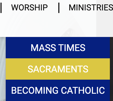
* In a previous version, in the header, when we scrolled over the tabs, the background color was our yellow, could we have that yellow back as opposed to the blue it is now please?
* Interestingly, when Sandra was looking at the site with Fr. Sullivan, and she scrolled over the tabs in the header and rested on an item, the font in the Church name at the top left turned from white to blue. That does not happen when I view the site, but Sandra and Fr. Sullivan would like to keep that.
Those are all we have for now. Overall, we are really happy with the color scheme, thank you!
Sorry for the delay, we really like the colors now, just a few things:
* Could we please have the whole mission statement in yellow and lowercase font? As it is now, the first part of the mission statement is in upper and lower case, but the second half is in upper case.
* Below the Mission statement, the Church name is Holy Rosary and Richard. That's because this is just a mock up right? We can change that later, right?
* In a previous version, in the header, when we scrolled over the tabs, the background color was our yellow, could we have that yellow back as opposed to the blue it is now please?
* Interestingly, when Sandra was looking at the site with Fr. Sullivan, and she scrolled over the tabs in the header and rested on an item, the font in the Church name at the top left turned from white to blue. That does not happen when I view the site, but Sandra and Fr. Sullivan would like to keep that.
Those are all we have for now. Overall, we are really happy with the color scheme, thank you!
Hi Alicia,
Here are the responses to your questions. (:
* Could we please have the whole mission statement in yellow and lowercase font? As it is now, the first part of the mission statement is in upper and lower case, but the second half is in upper case.
Yes, I will have our developer change that for you.
* Below the Mission statement, the Church name is Holy Rosary and Richard. That's because this is just a mock up right? We can change that later, right?
Yes, you can change the name of the church on the backend. I just updated it to show the proper name.
* In a previous version, in the header, when we scrolled over the tabs, the background color was our yellow, could we have that yellow back as opposed to the blue it is now please?
Do you want the background to be yellow and then dark blue on the hover? Or the lighter blue for the hover?
* Interestingly, when Sandra was looking at the site with Fr. Sullivan, and she scrolled over the tabs in the header and rested on an item, the font in the Church name at the top left turned from white to blue. That does not happen when I view the site, but Sandra and Fr. Sullivan would like to keep that.
It sounds like your cache is keeping the old version of the logo. Could you do a hard refresh?
- Windows users: hold down Ctrl and then press F5 on your keyboard.
- Mac users: hold down Cmd and Shift and then press R on your keyboard.
Let me know if that fixes the issue!
Thanks,
Danae Chudy
Thanks,
Danae Chudy
Diocesan Publications
Web Designer
877-923-0777
Thanks Danae,
We want the yellow on the hover is what I think Sandra was saying.
I will let her reply to confirm as well.
Thanks,
Alicia.
We want the yellow on the hover is what I think Sandra was saying.
I will let her reply to confirm as well.
Thanks,
Alicia.
Hi Alicia,
If you check the footer, you'll see the mission is the same yellow and same font.
https://hrsrchurch.diocesanweb.org/
I haven't changed the menu because I think blue is easier on the eyes so it is easier to read. Let me know your thoughts!
Thanks,
Danae Chudy
If you check the footer, you'll see the mission is the same yellow and same font.
https://hrsrchurch.diocesanweb.org/
I haven't changed the menu because I think blue is easier on the eyes so it is easier to read. Let me know your thoughts!
Thanks,
Danae Chudy
Diocesan Publications
Web Designer
877-923-0777
Hello Danae,
I understand what you mean about the blue being easier on the eyes. Can we try the yellow font in the drop down on the hover instead? So when you hover and the blue menu drops down, the font is yellow in that dropdown menu?
Also, I am not sure if Sandra is still seeing it, but she mentioned that in the drop down menu, when she puts her mouse over an item like, Mass Times, the font in the name of the Church changed to blue. I do not see that when I do it, But Sandra and Fr. Sullivan really liked that. Please let me know if that is happening in this latest version.
Blessings,
Alicia Mendes.
Hi Alicia,
I would advise keeping that the font color the way it is because again it will be hard to read... especially with a hover effect.
I would advise keeping that the font color the way it is because again it will be hard to read... especially with a hover effect.
It sounds like your cache is keeping the old version of the logo. Could you do a hard refresh?
- Windows users: hold down Ctrl and then press F5 on your keyboard.
- Mac users: hold down Cmd and Shift and then press R on your keyboard.
Thanks!
Danae Chudy
Danae Chudy
Diocesan Publications
Web Designer
877-923-0777
Good afternoon,
After reviewing with Fr. Sullivan, he likes the font and colors. He keeps asking about the drop down that went from yellow to light blue and I explained what you had recommended. Is there any way he can see a side by side drop? He likes the mission statement and that box is blue with yellow letters.
Thanks for all your assistance with this.
Blessing,
Sandra
Hi Sandra,
Do you want to see both options? If so here are the options. I'd keep the dropdown dark blue but we could change the hover color?
Do you want to see both options? If so here are the options. I'd keep the dropdown dark blue but we could change the hover color?
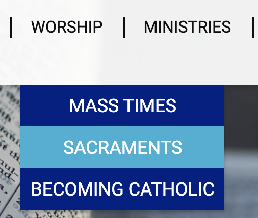
Let me know your thoughts!
Thanks,
Danae Chudy
Thanks,
Danae Chudy
Diocesan Publications
Web Designer
877-923-0777
Perfect!
I will share with Fr. Sullivan as soon as he returns from the Priest Convocation. Hopefully, he will be back by Thursday.
Thank you,
Sandra
I will share with Fr. Sullivan as soon as he returns from the Priest Convocation. Hopefully, he will be back by Thursday.
Thank you,
Sandra
I just checked with Fr., and he is in agreement that the blue looks better.
Thanks,
Sandra
Thanks,
Sandra
So the light blue hover effect?
Are there any other changes? Or are we ready for the design approval? (:
Thanks!
Danae Chudy
Are there any other changes? Or are we ready for the design approval? (:
Thanks!
Danae Chudy
Diocesan Publications
Web Designer
877-923-0777
Yes ma'am. When Fr. saw them side by side, it helped him decide.
Thank you,
Sandra
Thank you,
Sandra