Gregory the Great - San Diego, CA (UNUSED)

Design Notes

NOT A FAN OF ACCORDIONS OR BUTTONS bc they have so much information.

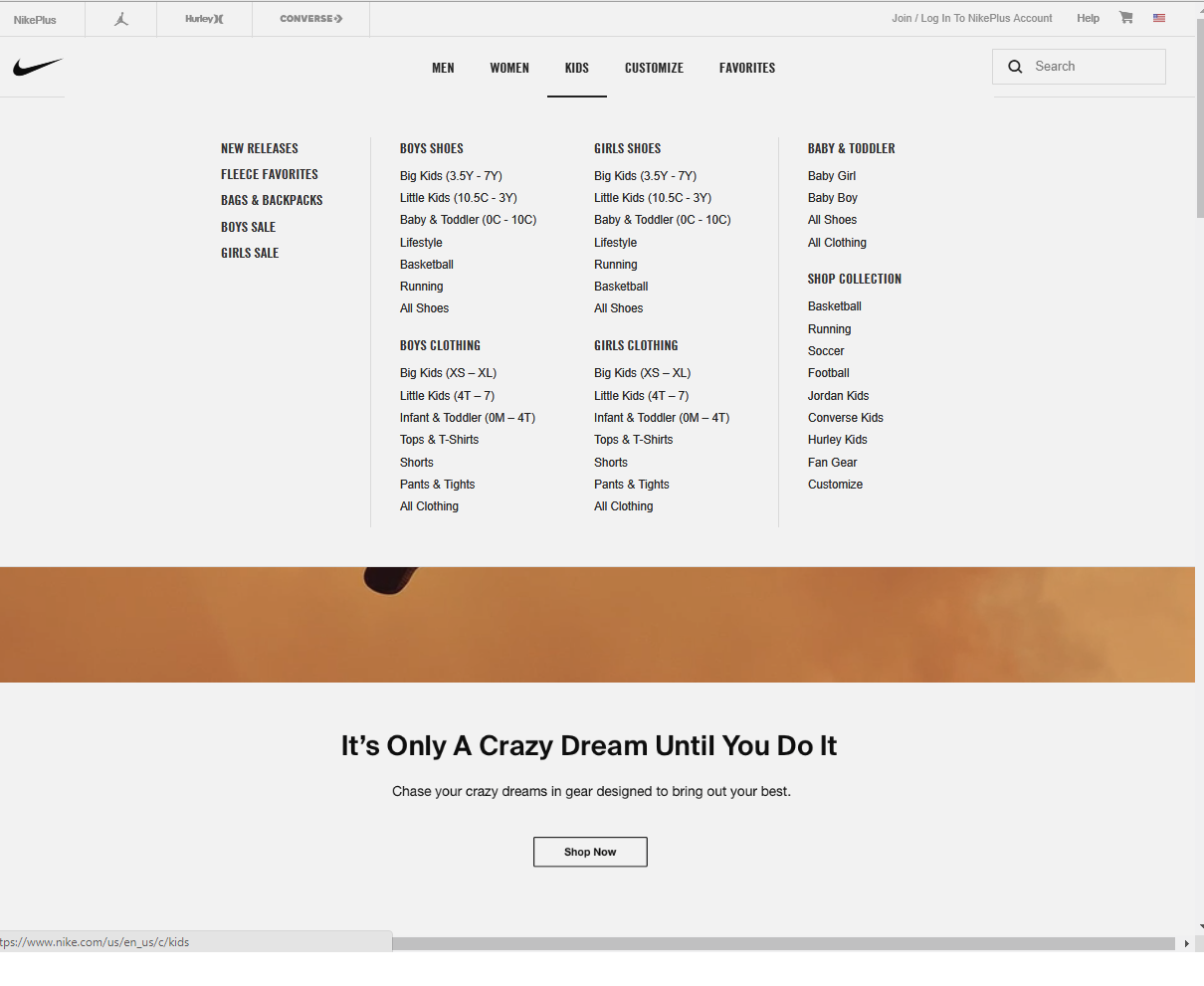
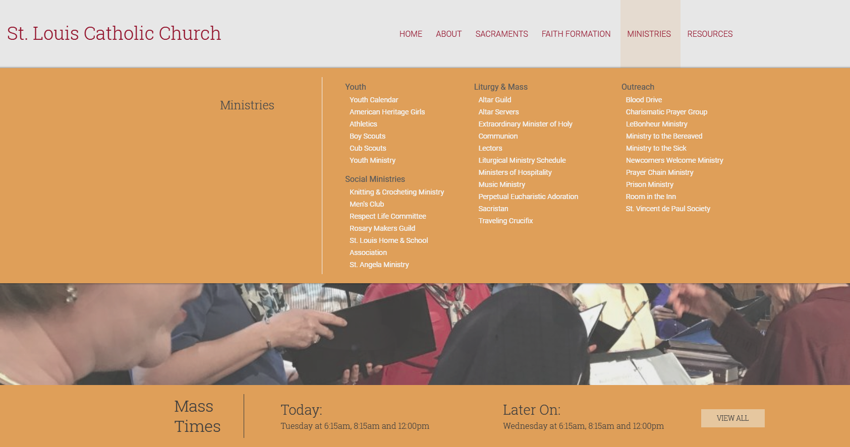
When I talked to Nichol, we decided that the menu is staying, as is and that they will be using a Mega Menu for things like Welcome & Serve in their menu.
I sent them examples of these two:

Comments & Events

Veronica Alvarado, Project Manager at Diocesan
Talked with Nichol a bit more today to go over the sitemap. She also had a few design notes:

Homepage

  • Parish calendar events on homepage (Google Cal)
  • Bulletin with image (even though they are not bulletin client, so they are okay with uploading bulletin w/ image each week)

Important Items for Homepage or Footer

(not in any particular order)
  • Search
  • Directions
  • Mass Times
  • posts
  • Bulletins
  • Daily Readings
  • Address & Contact Info
  • Link to School
  • Link to Diocese
  • Link to Forms
  • Link to Calendars

Ministry Pages Template/Layout

  • Description
  • Image
  • Contacts
  • New & Events (posts)
  • Links
Veronica Alvarado, Project Manager at Diocesan
Over the phone/sent to me:

Mobile 

Websites we like

  • https://sacredheartfla.org/
    • Clean crisp look, nice wording on the rotator, easy to navigate menu.  (SL & JR didn't like the photo that you roll over when scrolling) 
    • Pages within site are nicely laid out, although we'd prefer the top photo band to extend the full width. 
    • Need a place for upcoming event ads, and don't need announcements or videos. 
  • https://saintjohnjackson.org/
    • Nice composition of blocks and bands, easy to navigate menu.  Our content would be very different, but we can work with this.
  • https://ccfoundationhz.org/
    • Nice animations on homepage
    • Rotator looks unique but we would prefer full screen and more height
    • Would prefer side bands to be white to give a more spacious look.
  • https://stbart-stjoe.org/
    • Rotator is interesting, would prefer to see different words that correspond to the photo.
    • Can't tell what mages look like, site appears to be incomplete, but it might work.
  • https://stlouischurchmphs.org/
    • Menu is nice, and pages look good.
    • Rotator is perfect height.
    • With revisions, this design could work if we can incorporate some of the features that are nice above.
  • https://sainttims.org/
    • I love this site, but SL & JR were not fans
    • I think the menu is cool and I like the bands below the rotator
    • Would like to see the rotator with less height and will concede to the log and the menu being off the photo for clarity.
    • Pages behind the homepage look good, nice that they go more to the outer edges than some. 
    • Do not like the stationary side bar on every page, would eliminate this.