Fold vs Aspect Ratio
Good morning Krista and Gretchen,
Danae let me know that you have not yet decided if you would like the homepage to resize based on the fold (image fills up the height of screen of any device you're on) or aspect ratio (image keeps it's ratio, even though on mobile it may be very small).
Since this is something that must be decided upon before the design can be officially approved, I wanted to share some examples of some sites that have used either fold or aspect ratio:
Since this is something that must be decided upon before the design can be officially approved, I wanted to share some examples of some sites that have used either fold or aspect ratio:
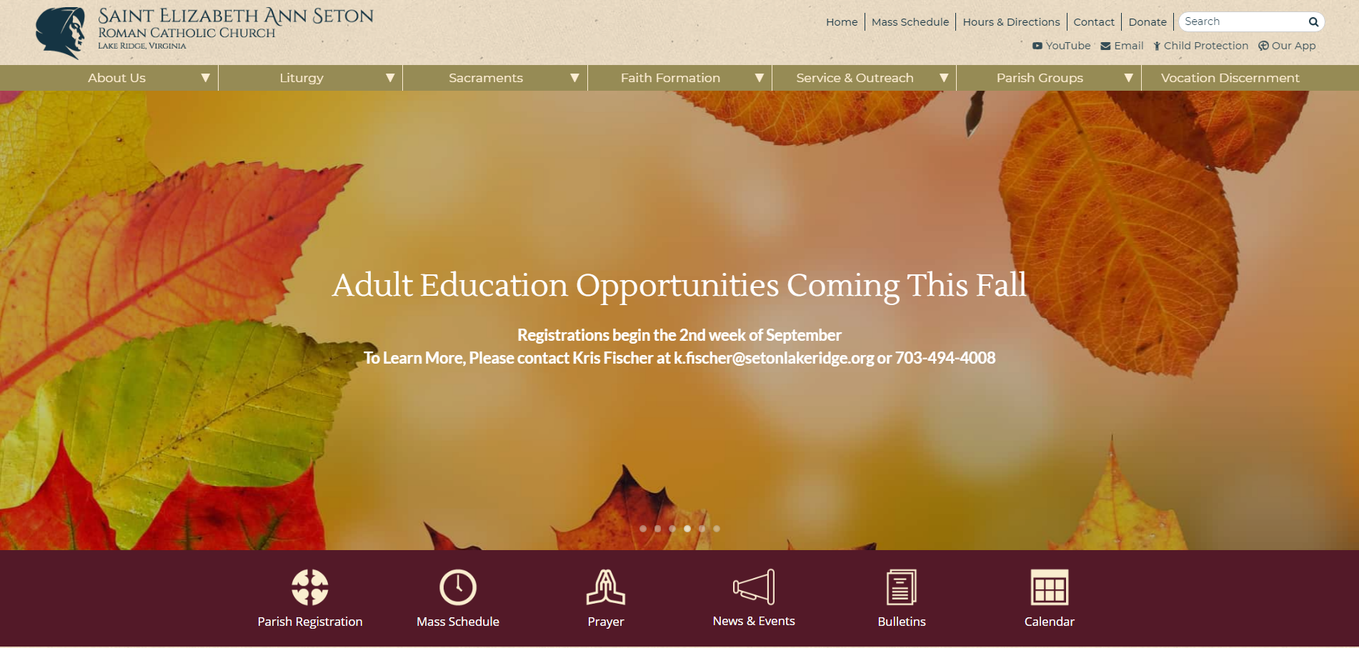
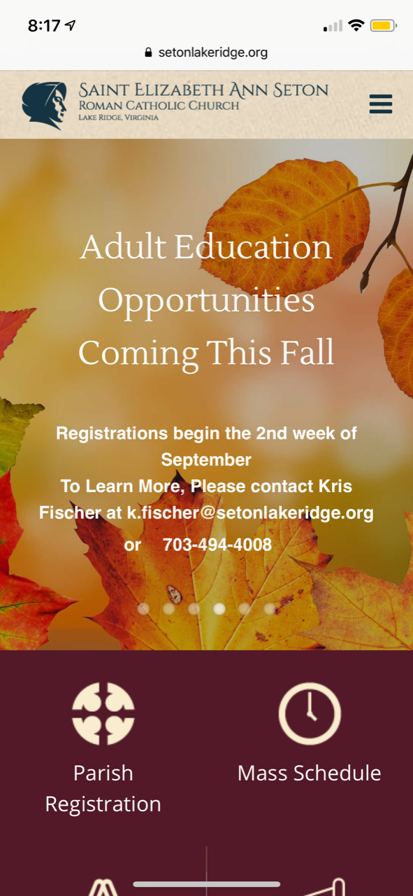
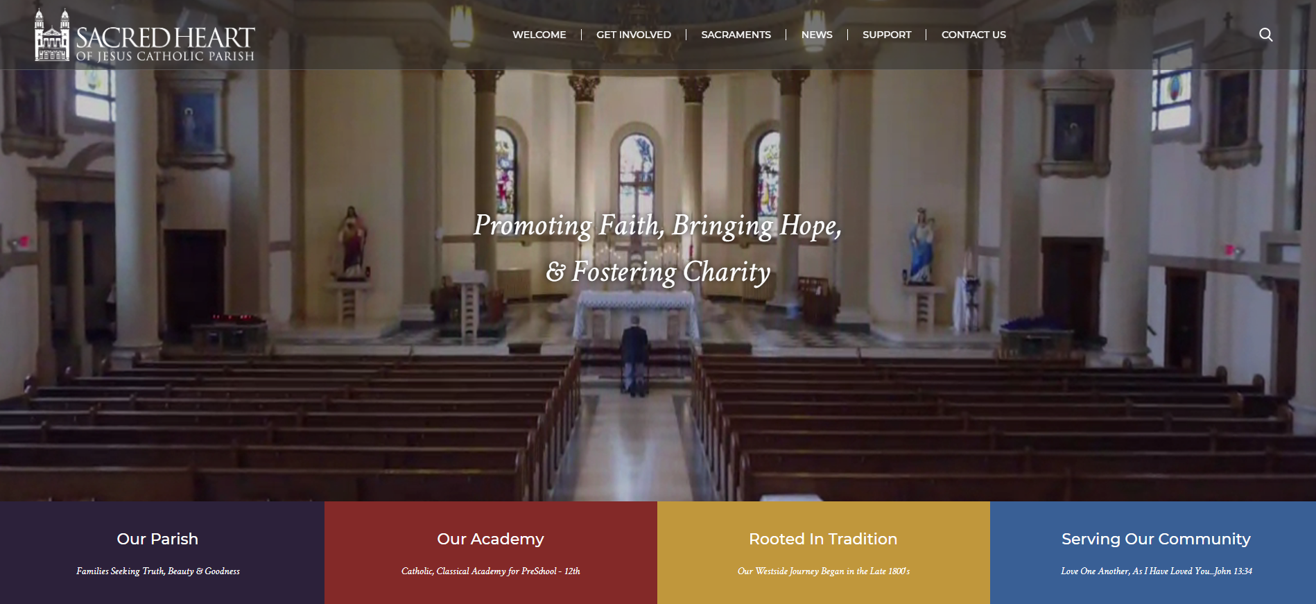
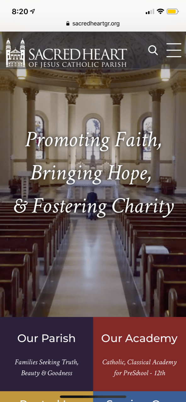
Fold (3 examples)
- Image will always fill the same percentage of the screen
- Diocesan will add fields for text so that it resizes on mobile
- When used properly, images are background/mood-setting images, not focal points
- Text will use the same fonts as website theme
Saint Elizabeth Ann Seton - Lake Ridge
Sacred Heart of Jesus - Grand Rapids
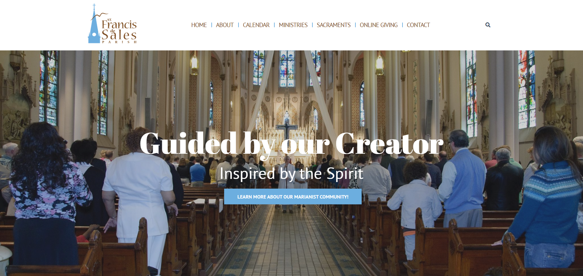
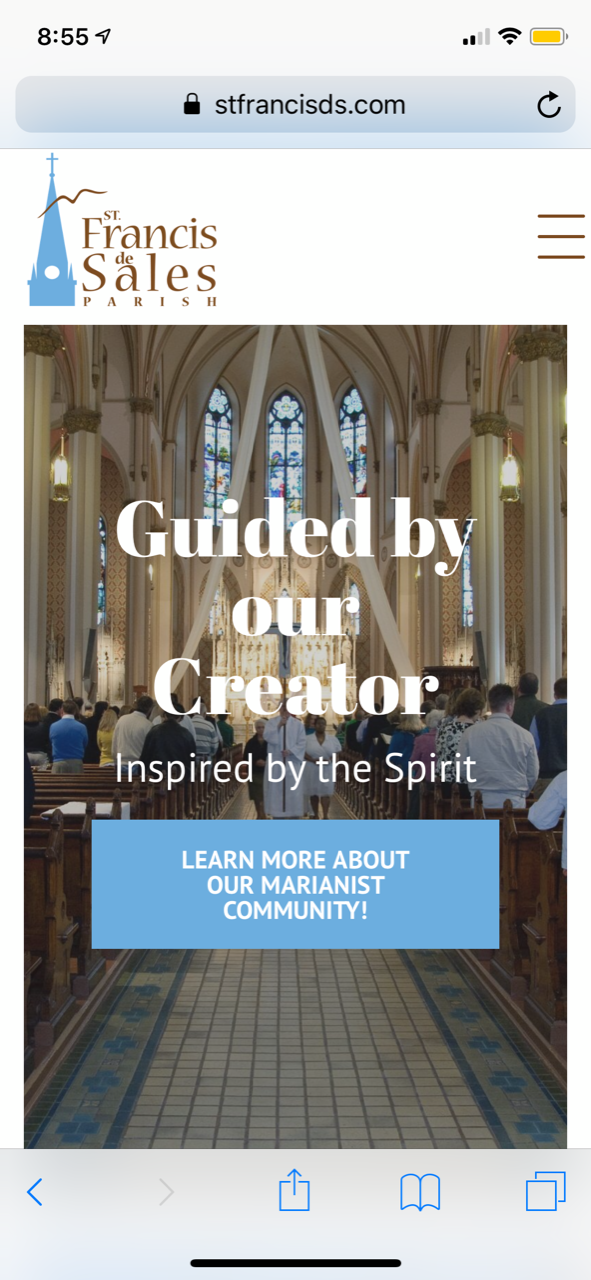
St. Francis de Sales - Cincinnati
Aspect Ratio (4 examples)
- Against best practices/not recommended since any text on slide would not be mobile responsive (so some text may be too small to read)
- Ability to choose exactly what part of a photo displays
- Ability to know exact dimensions of what image should be
- Image will keep its exact ratio & never crop
- Items below image will move up or down depending on the width of device used
- Best used if you plan on putting text directly on your images or specific images of people's faces (although text will become larger/smaller depending on screen size)
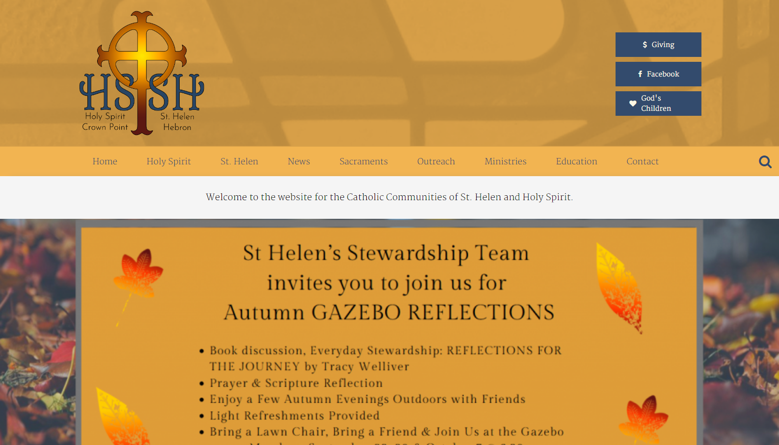
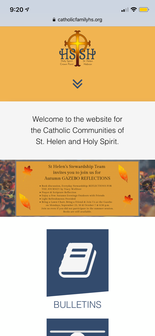
Holy Spirit & St. Helen - Crown Point
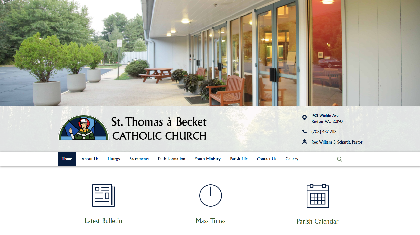
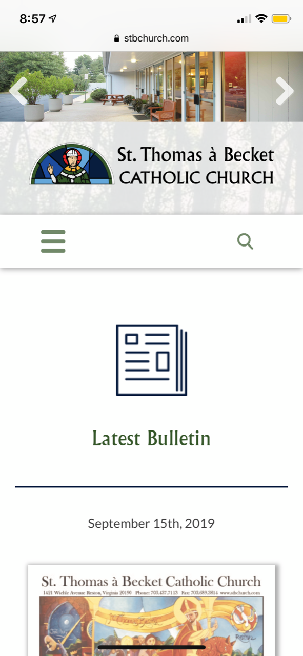
St. Thomas a Becket - Reston
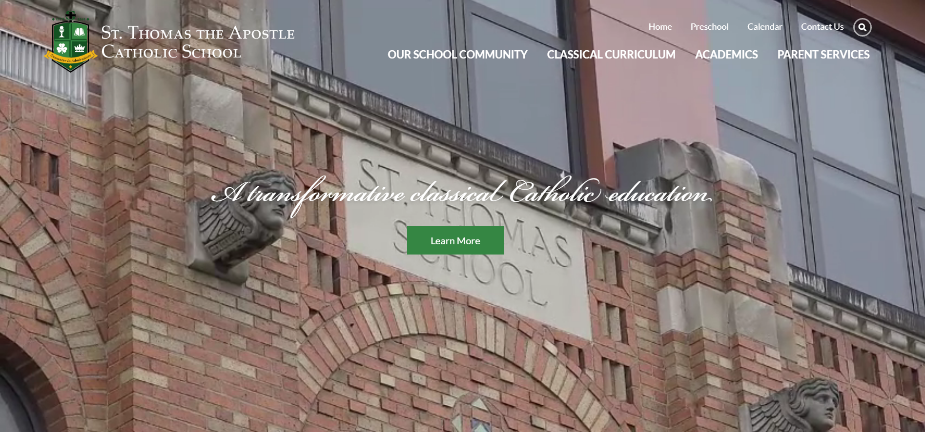
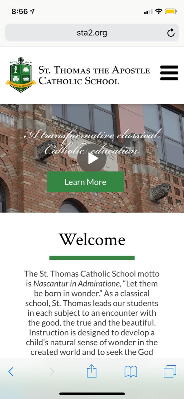
Thomas the Apostle - Ann Arbor
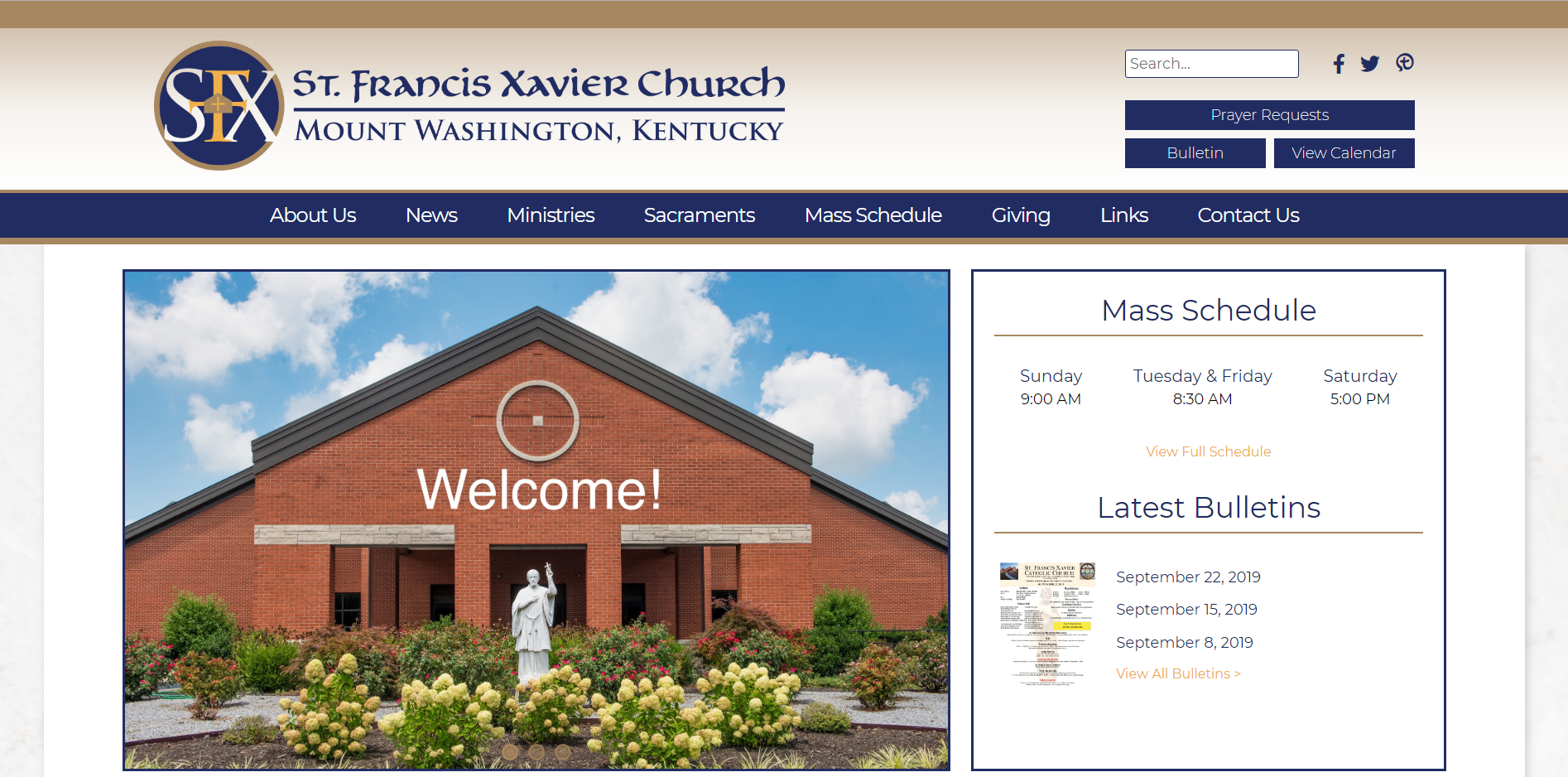
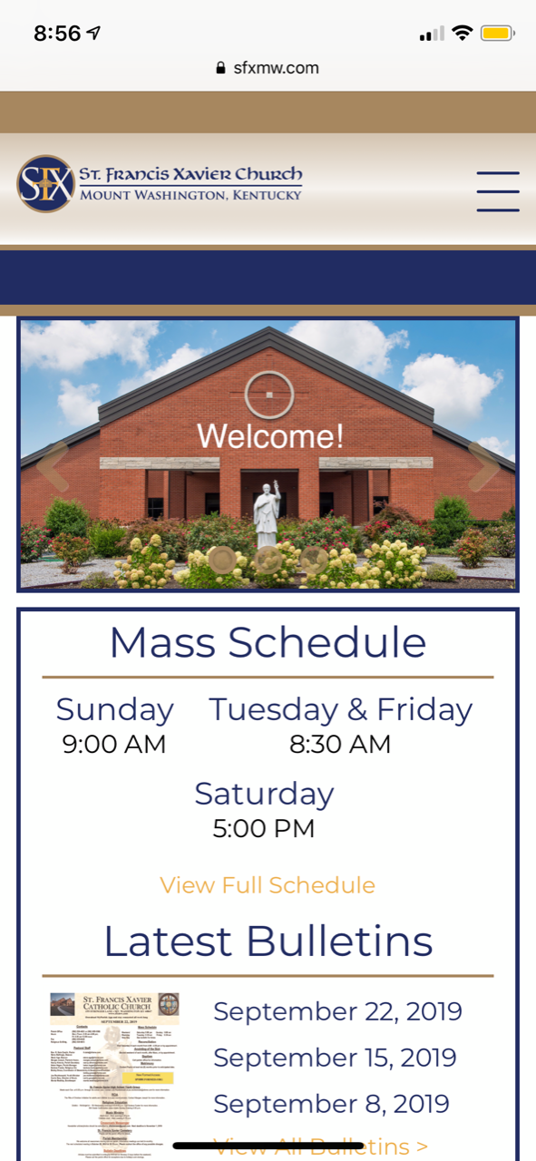
St. Francis Xavier - Mount Washington
Other Things to Keep in Mind
- Statistically, we've found that our parish websites are visited on a mobile phone up to 67% of the time (does not include tablets).
- Putting information in your slider greatly reduces the likelihood of people scrolling down to view the rest of your website
- Sliders should only include 4-6 images
Please remember that this decision must be made before designs are approved since the mobile design will depend on your choice.
Let us know if you have any questions.
Thank you,
Veronica Alvarado
Web Department, Diocesan
877-923-0777
877-923-0777
 Krista Jeffreys
Veronica,
I am currently review all of the examples. Can you tell me what your preference would be?
I would love your input.
Thank you!
Krista Jeffreys
Business Manager
Saint George Church
(814) 864-0622, ext. 350
I am currently review all of the examples. Can you tell me what your preference would be?
I would love your input.
Thank you!
Krista Jeffreys
Business Manager
Saint George Church
(814) 864-0622, ext. 350
 Veronica Alvarado
Of course!
As your web professionals, Diocesan encourages the use of the page fold since it captures attention in all of the right ways.
Not only does it immediately strike visitors on any device as beautiful, but it also allows you to add text in a way that will be responsive to screen size. That is, the text will automatically resize once the screen width reaches certain points.
Additionally, it teaches you and any other website editors to use background images as just that: backgrounds. This will help emphasize the text and content that you are using the image to draw them to. Many people think that supplying visitors with all the information on the homepage is the way to go, but the homepage should only give frequently searched for jump-off points. This allows people to get enough information to find what they need, or get them interested, while not giving them so much information that they are overwhelmed with a "busy" homepage.
Some other points:
- Images are not screen-reader (ADA) compliant while fold-based images and text fields are.
- Important information (text) will never be cut off or too small to read.
- Homepage with videos can still have text over them
- Always perfectly fills the screen upon first landing on the homepage
If you have any questions about how it would work, please don't hesitate to ask
Veronica Alvarado
Web Department, Diocesan
877-923-0777
877-923-0777
 Gretchen
Hi Veronica: Thanks for the feedback. I spoke with Krista yesterday and we discussed. We like the Sacred Heart layout and example from the top three that you suggested. It makes sense what you have said and we like the mobile look of this one. Does this help? GK
Gretchen Kerr
Administrator/Communications Coordinator
Saint George Church
5145 Peach Street
Erie, PA 16509
814-864-0622
"Jesus Christ is the same yesterday, today, and forever."
HEB 18:8
Gretchen Kerr
Administrator/Communications Coordinator
Saint George Church
5145 Peach Street
Erie, PA 16509
814-864-0622
"Jesus Christ is the same yesterday, today, and forever."
HEB 18:8
Veronica Alvarado
Thank you for getting back to me so quickly. I will make sure Danae knows that the "Fold" option is what you would like to use.
Have a blessed weekend,
Have a blessed weekend,
Veronica Alvarado
Web Department, Diocesan
877-923-0777
877-923-0777