Homepage Updates
Good Afternoon,
I wanted to send you an update to the homepage! Let me know if we're getting closer!
Thanks,
Samuel Lanning
I wanted to send you an update to the homepage! Let me know if we're getting closer!
Thanks,
Samuel Lanning
Made a few more changes to the proof based on the notes from last week.
The notes you just sent over, are they in reference to this latest proof?
Please let me know.
Thanks,
Samuel Lanning
Please let me know.
Thanks,
Samuel Lanning
Yes
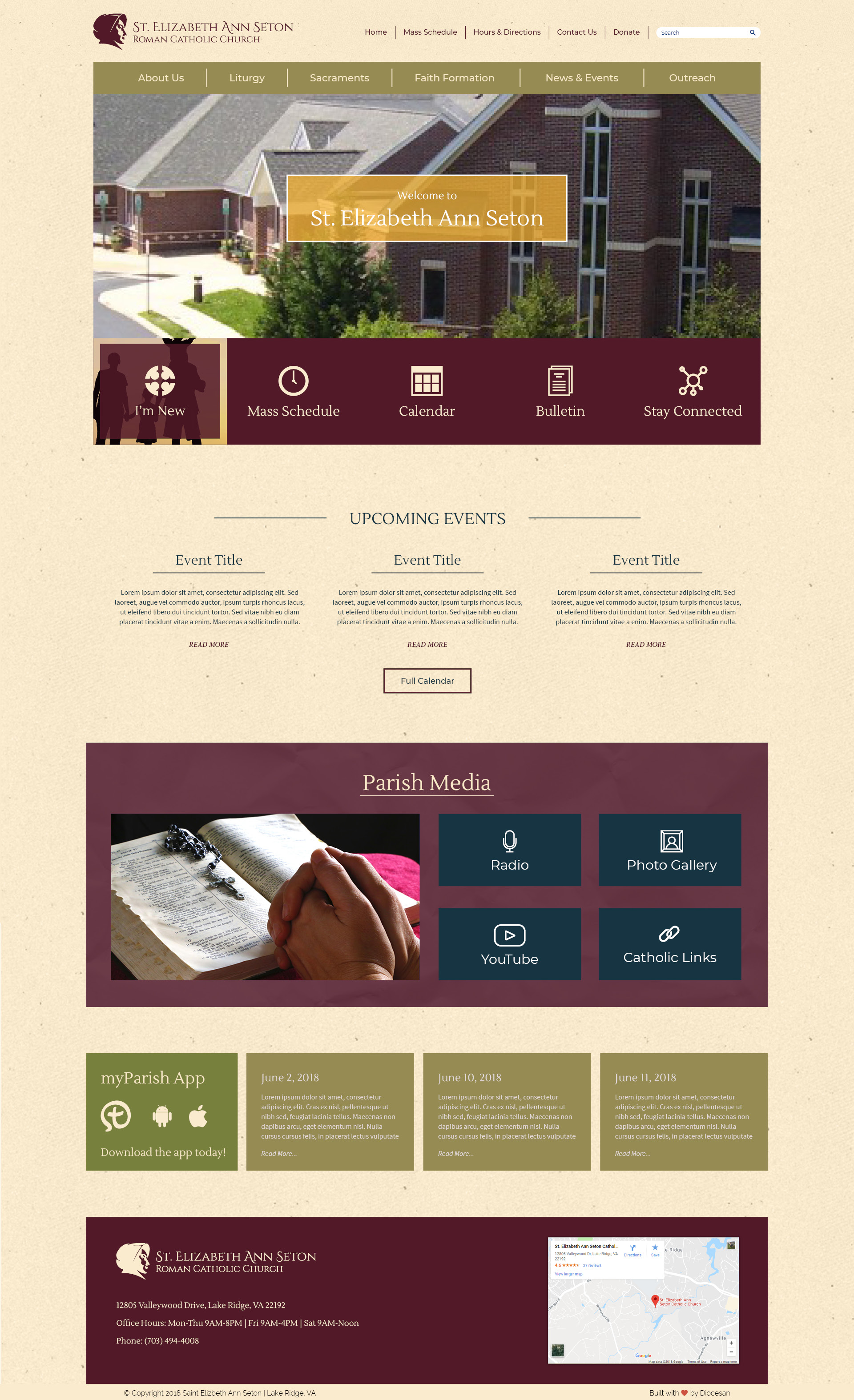
Good Morning, I have some updates to the page. I Made some color changes so the pages didn't become too tan. If you would like some changes to the color let me know. I feel like the burgundy is much better now than what I had before!
Thanks,
Samuel Lanning
Thanks,
Samuel Lanning
Sam,
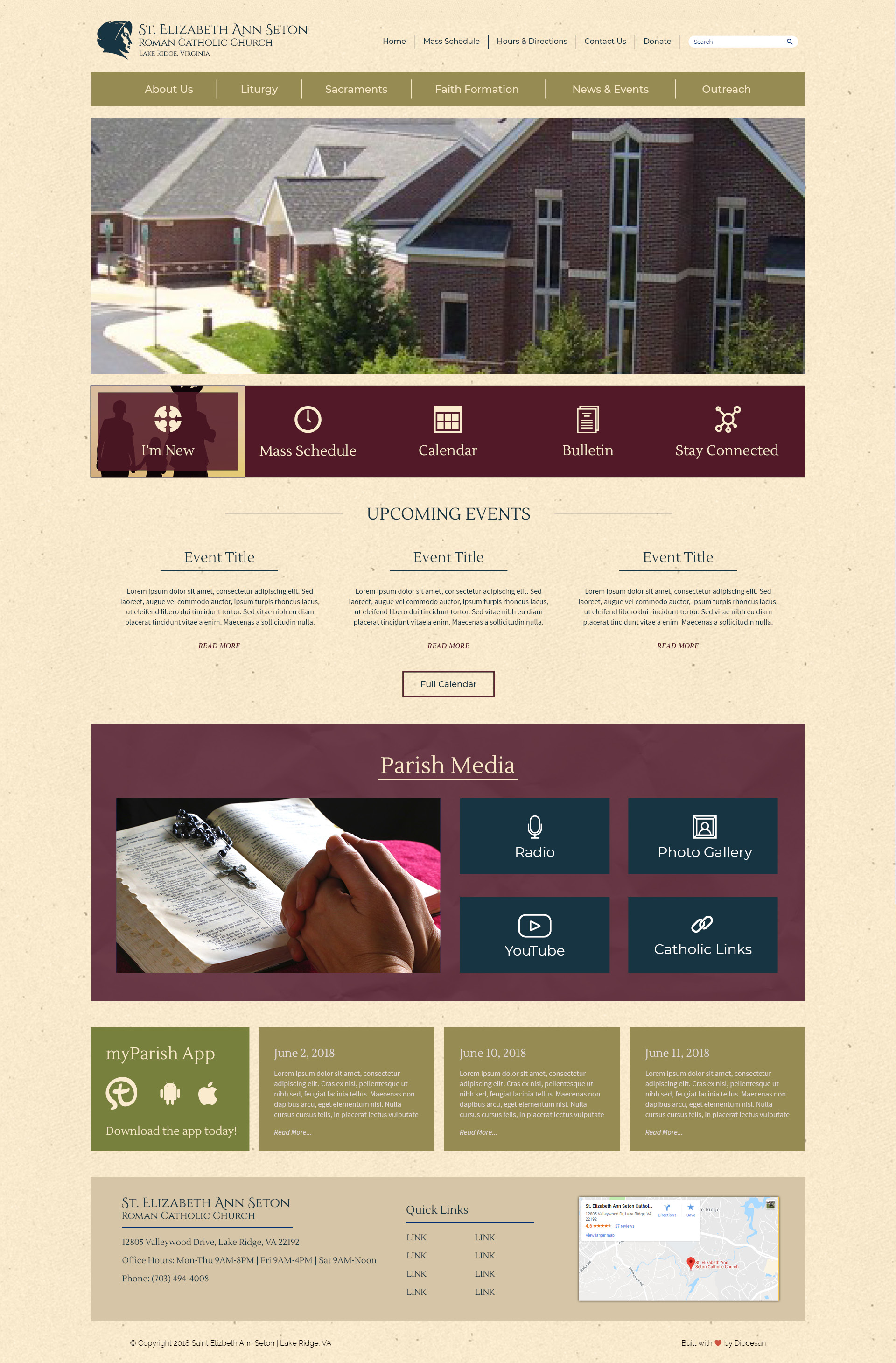
Wow! This is looking great! Can we trim the main navigation bar (sage color bar) the same width as the photo? And can you trim the feature buttons to the exact same width as well – may need to make the buttons smaller? Also, can you trim the parish media maroon box as well – make same width. Lastly, can we make the bottom color same as the top border? Like the way the logo stands out at the top; perhaps make the height of this one a little smaller – can you trim it down to where the address is? That is where 12805 Valleywood starts.
So excited to see the next proof. Thanks Sam, for everything.
Violet
Sam,
Where can we put our info (my parish app & youtube) buttons? Can we try putting it right above the search box and also on the bottom border? Thoughts?
Thanks,
Violet
Where can we put our info (my parish app & youtube) buttons? Can we try putting it right above the search box and also on the bottom border? Thoughts?
Thanks,
Violet
Yea that will work great for those! Any other social media, external links, or places you want people to be able to reach from the homepage?
Sam,
Can you please remove the faith formation “featured” button? It’s already in the Navigation Bar.
Thanks!
Can you please remove the faith formation “featured” button? It’s already in the Navigation Bar.
Thanks!
That’s it for now. Can we add them later if we decide to have other social media accounts?
yes you can! I will remove the FF button! thanks
Haven't gotten around to adding the social icons yet but made the layout changes.
Thanks Sam!
Sorry just 2 more adjustments. Could you make the height of the featured buttons bar (maroon in color) smaller perhaps 1.5” – 1.75”?
And at the bottom of the page rather than maroon can we do a different shade or texture of beige? Could you try using the darker beige on this proof for the bottom box? And make the height maybe 3”?
Thanks!
Violet
Absolutely! I can make it happen!
Starting to look much more solid!
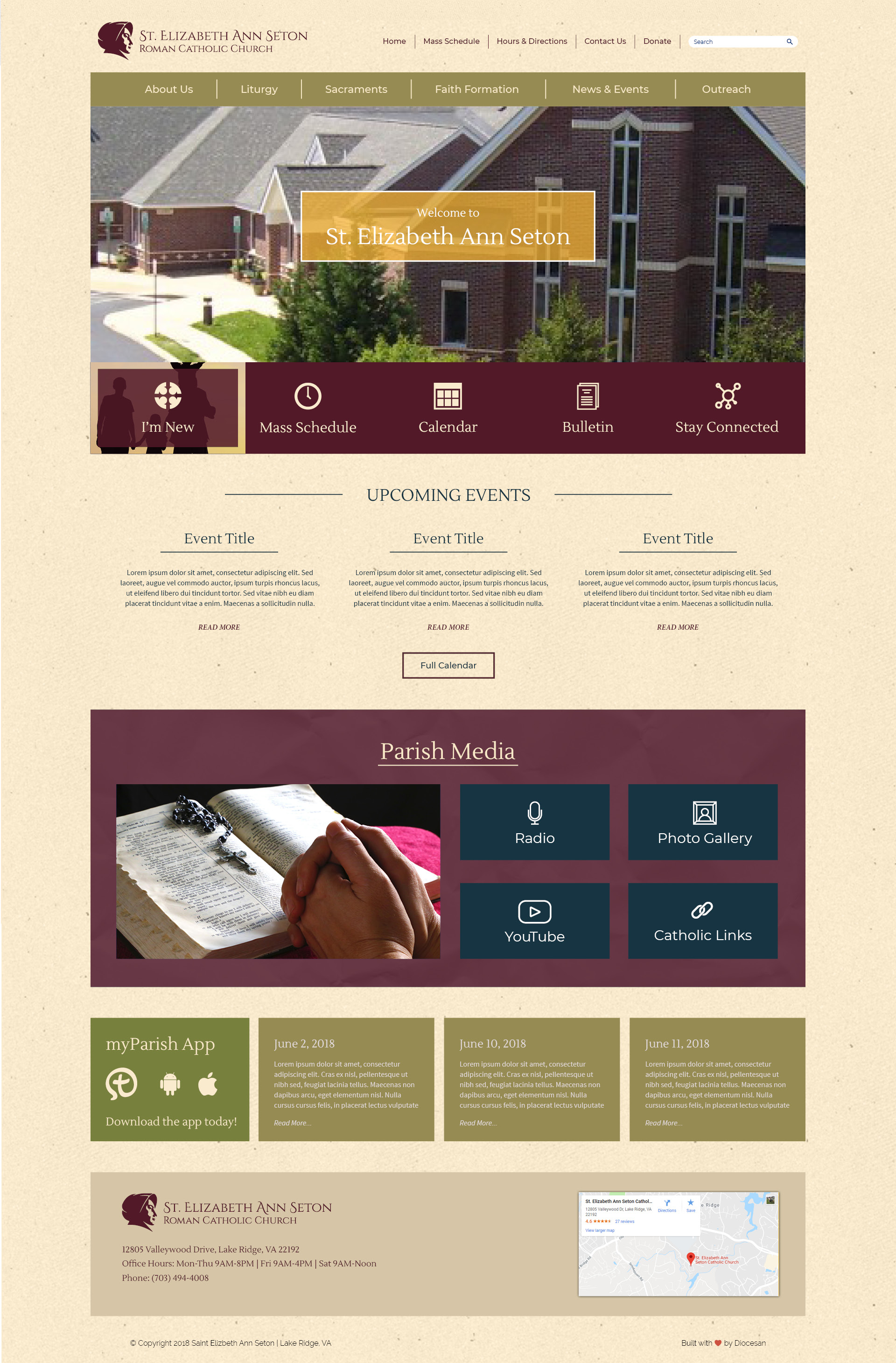
I also have a few inner pages for you to take a look at now based off the home Page!
LOVING IT! Definitely going in the right direction...I think we are really close on the home page. Nice work Sam and Violet!!!
Violet I look forward to our meeting with the IT Committee tomorrow. Really proud of what we have to show them.
God bless you both,
Fr. Bashista
Violet I look forward to our meeting with the IT Committee tomorrow. Really proud of what we have to show them.
God bless you both,
Fr. Bashista
Good Morning Sam,
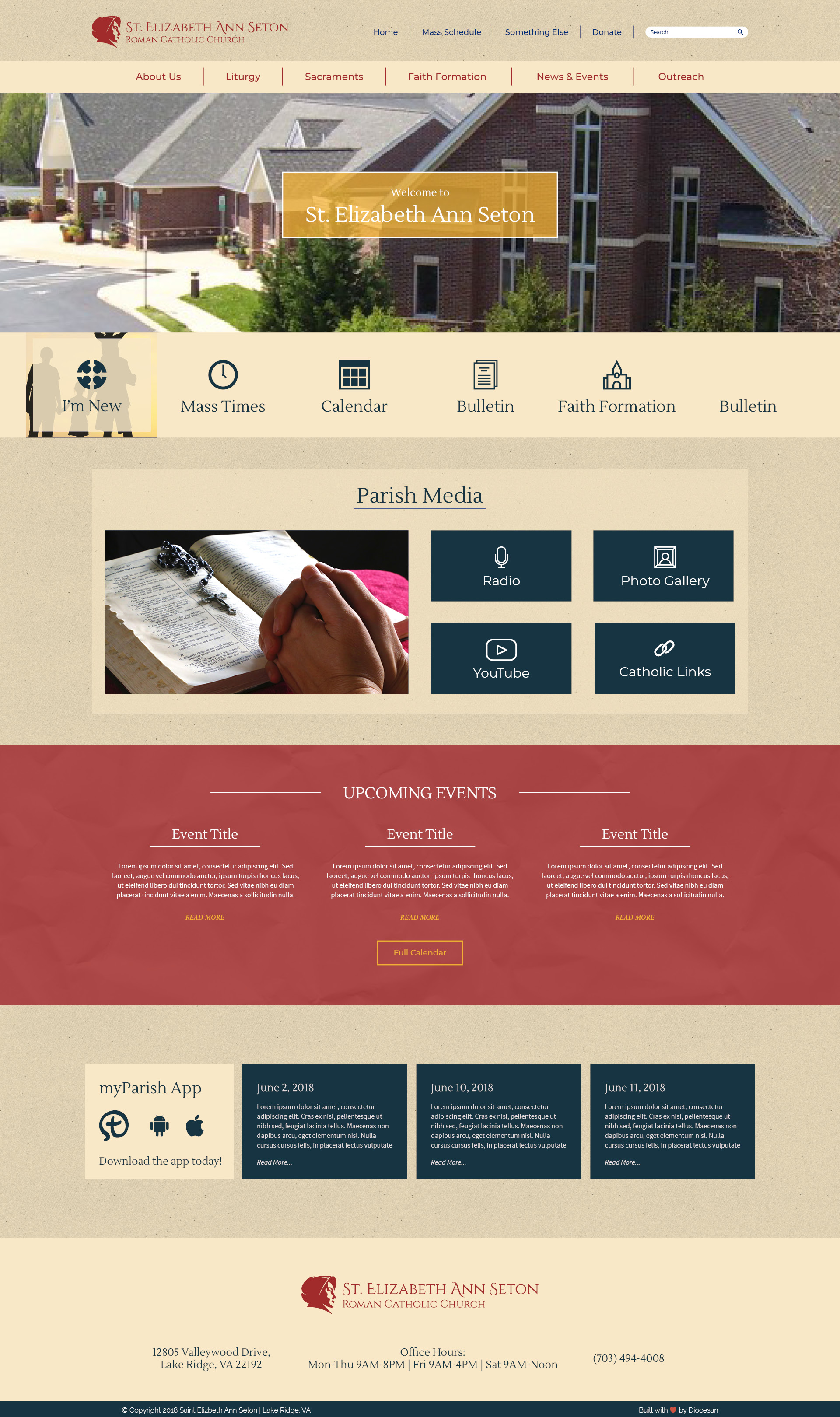
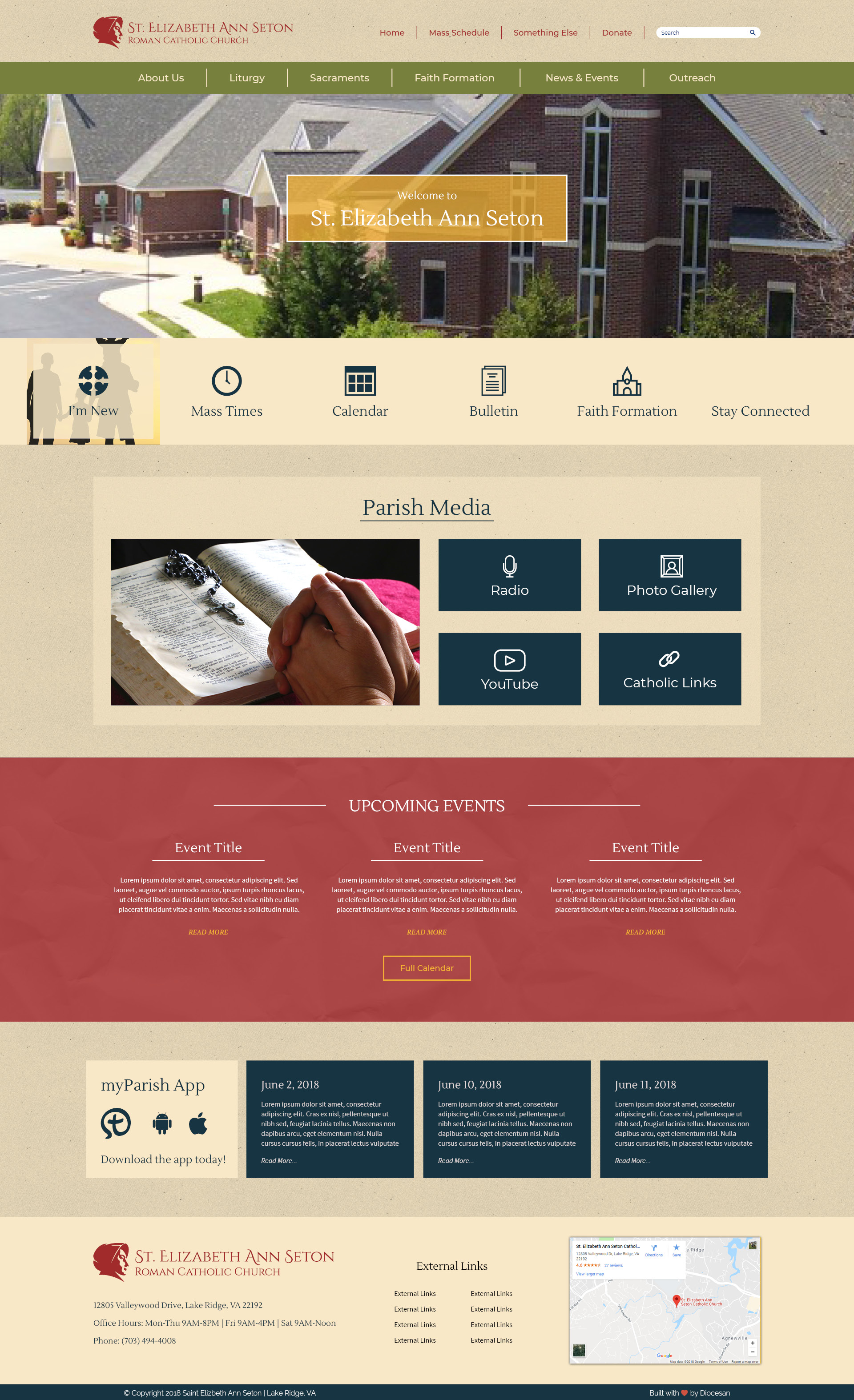
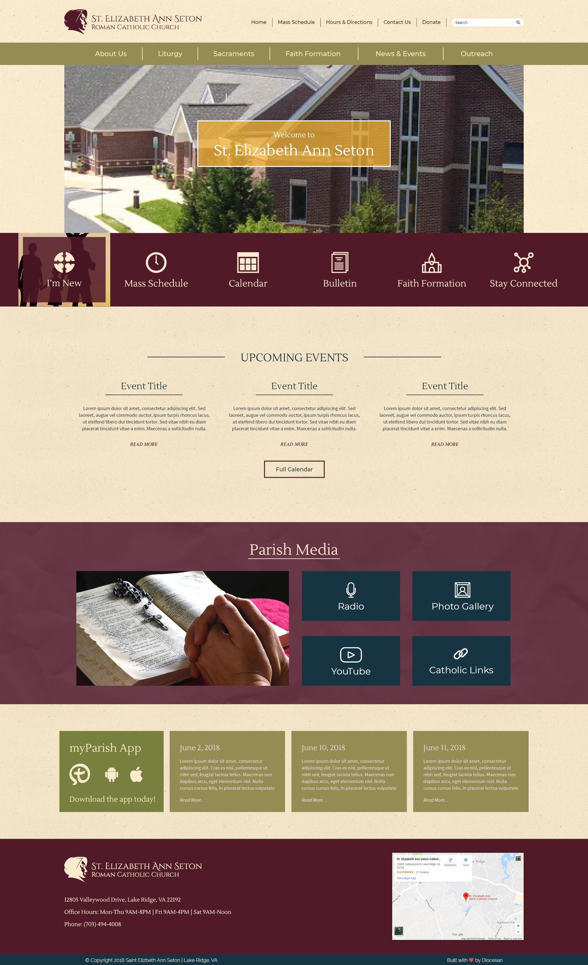
We had our IT Meeting last Friday, and here are a few suggestions that were made:
1. The logo at the top, please make her the same color blue as the Parish Media squares.
2. The SUB-NAV text also in the same blue
3. Social Media Icons also in the same blue
4. Please spell out St. to Saint
5. Please add ‘ Lake Ridge, Virginia’ underneath ‘Roman Catholic Church’ – perhaps a smaller font size
6. Could you please remove the “Welcome to St. Elizabeth Ann Seton” box on the photo
7. Could you please add a space between the Main Nav and the photo? -- please see the seton shrine for an example
8. Could you also please add a space between the featured buttons and the photo as well.
9. At the bottom, please remove the Seton logo, that is her face only – text in the same blue as above
10. At the bottom, we would also like to add ‘quick links’ to some frequently used sections – these sections are still to be determined
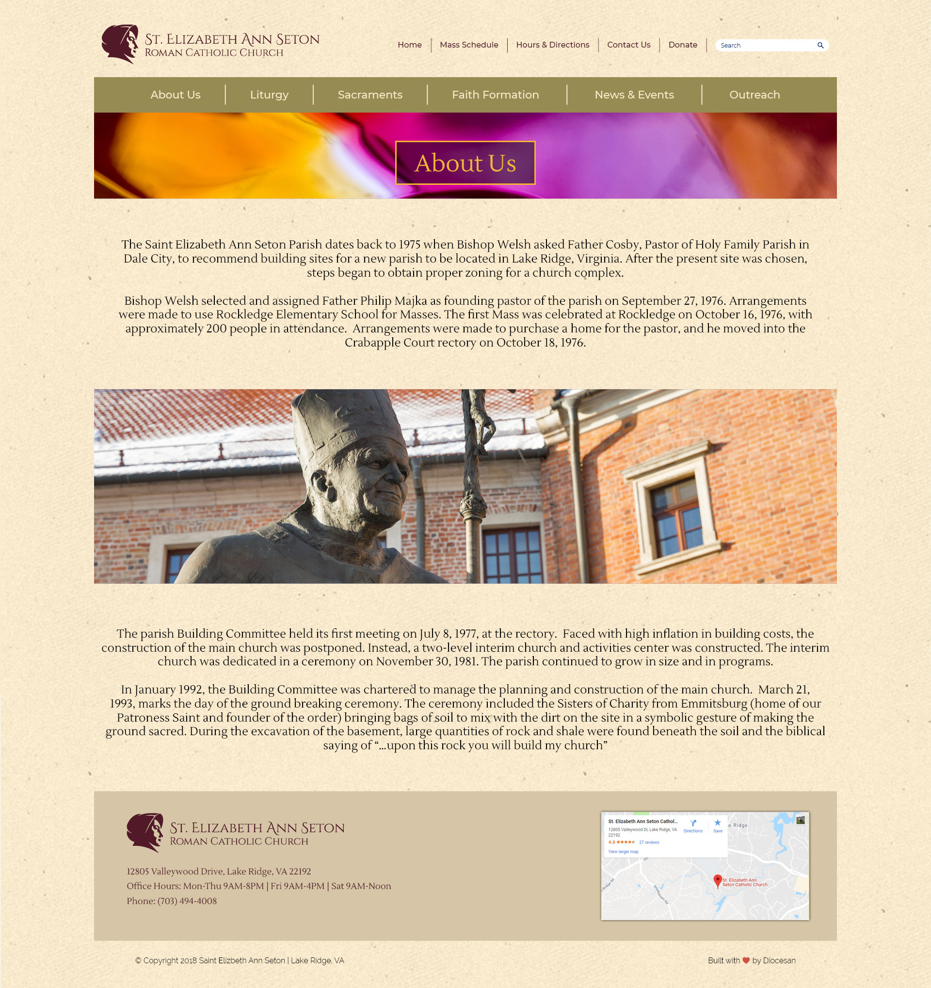
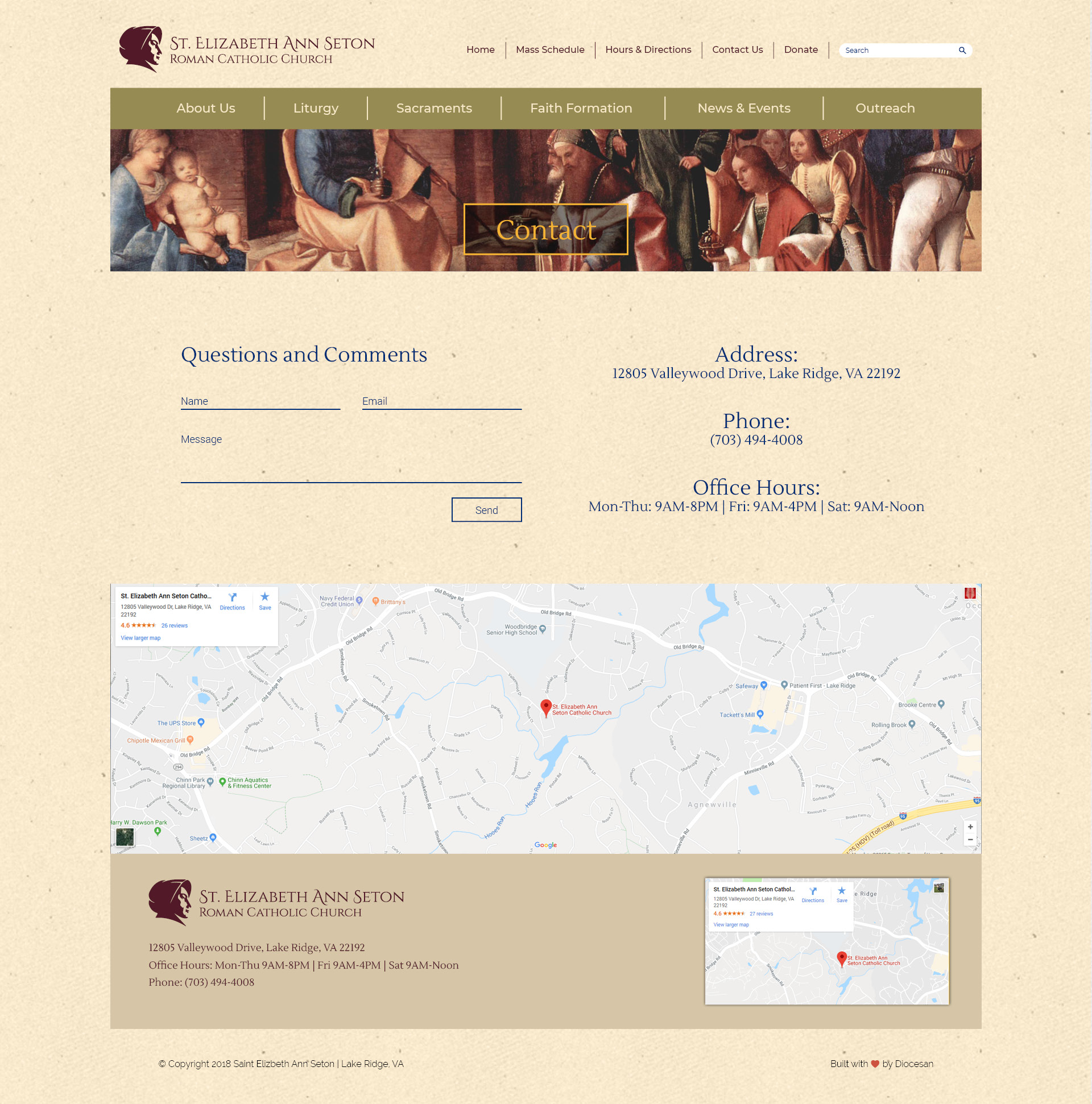
Regarding the sub-pages, we would like to have the option to add photos or not. Additionally, for the Contact page, could you make the ‘Questions and Comments’ fields like bubbles with limited characters (150 max). Also, could you add a space between the map and the bottom section?
Thanks Sam! Looking forward to seeing the next proofs.
Blessings,
Violet
We had our IT Meeting last Friday, and here are a few suggestions that were made:
1. The logo at the top, please make her the same color blue as the Parish Media squares.
2. The SUB-NAV text also in the same blue
3. Social Media Icons also in the same blue
4. Please spell out St. to Saint
5. Please add ‘ Lake Ridge, Virginia’ underneath ‘Roman Catholic Church’ – perhaps a smaller font size
6. Could you please remove the “Welcome to St. Elizabeth Ann Seton” box on the photo
7. Could you please add a space between the Main Nav and the photo? -- please see the seton shrine for an example
8. Could you also please add a space between the featured buttons and the photo as well.
9. At the bottom, please remove the Seton logo, that is her face only – text in the same blue as above
10. At the bottom, we would also like to add ‘quick links’ to some frequently used sections – these sections are still to be determined
Regarding the sub-pages, we would like to have the option to add photos or not. Additionally, for the Contact page, could you make the ‘Questions and Comments’ fields like bubbles with limited characters (150 max). Also, could you add a space between the map and the bottom section?
Thanks Sam! Looking forward to seeing the next proofs.
Blessings,
Violet
Sam,
Could you put the following text on the main page?
“Be attentive to the voice of grace.”
Similar to the Diocese of Venice website. Thanks!
Violet
Could you put the following text on the main page?
“Be attentive to the voice of grace.”
Similar to the Diocese of Venice website. Thanks!
Violet