✨ Mobile site display issues
Veronica/Ryan,
Viewing our site on a mobile device
- On Safari mega menu cuts off at Media. You can't see or get to Parish Life or Vocations. See below:

- On Chrome, the mega menu displays all the way, to include Parish Life and Vocations, but the blue background is not visible below Media

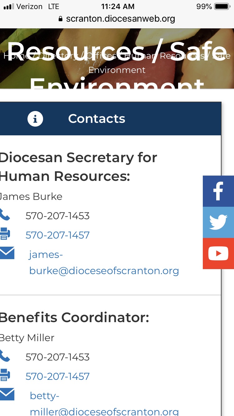
- The text on the header images spans more than one line, it is being cut off. Examples are Catholic Social Services, Human Resources / Safe Environment
- The Contacts box is cutting off on the left side of the screen, just a bit. For example, half of the D and and half of the H is cut off on "Diocesan Secretary for Human Resources:" on the Human Resources / Safe Environment page.
These, and several other mobile related items have been accounted for. We've tackled all the primary items and areas of interest.
There still may be a few minor things like spacing between title and image, but overhanging elements or elements running into each other should be few and far between.
If you find anything significant, please let me know.
The blocks that are part of the right sidebar on the full site (Contacts, What Can I Help You Find, etc.) are still positioned too far left on the mobile site. The first letter of each line of text is being cut off either in total or partially. Same in both Chrome and Safari on my iPhone 7. Here’s a screen shot from Chrome.
My apologies for not prompting you on this, but you'll want to clear your cache. This is very likely a cache issue where your phone still has the older style sheet. If by some bizarre chance the issue persists after you clear your cache, you'll have found an iPhone 7 specific issue and I'll have to investigate.
Here's what it looks like on my iPhone 8:
Connie
I added a tiny wrinkle to the stylesheet setup so that browsers, particular mobile browsers, shouldn't be able to cache the stylesheet. This should eliminate testing issues for everyone.