Homepage Logo Discussion
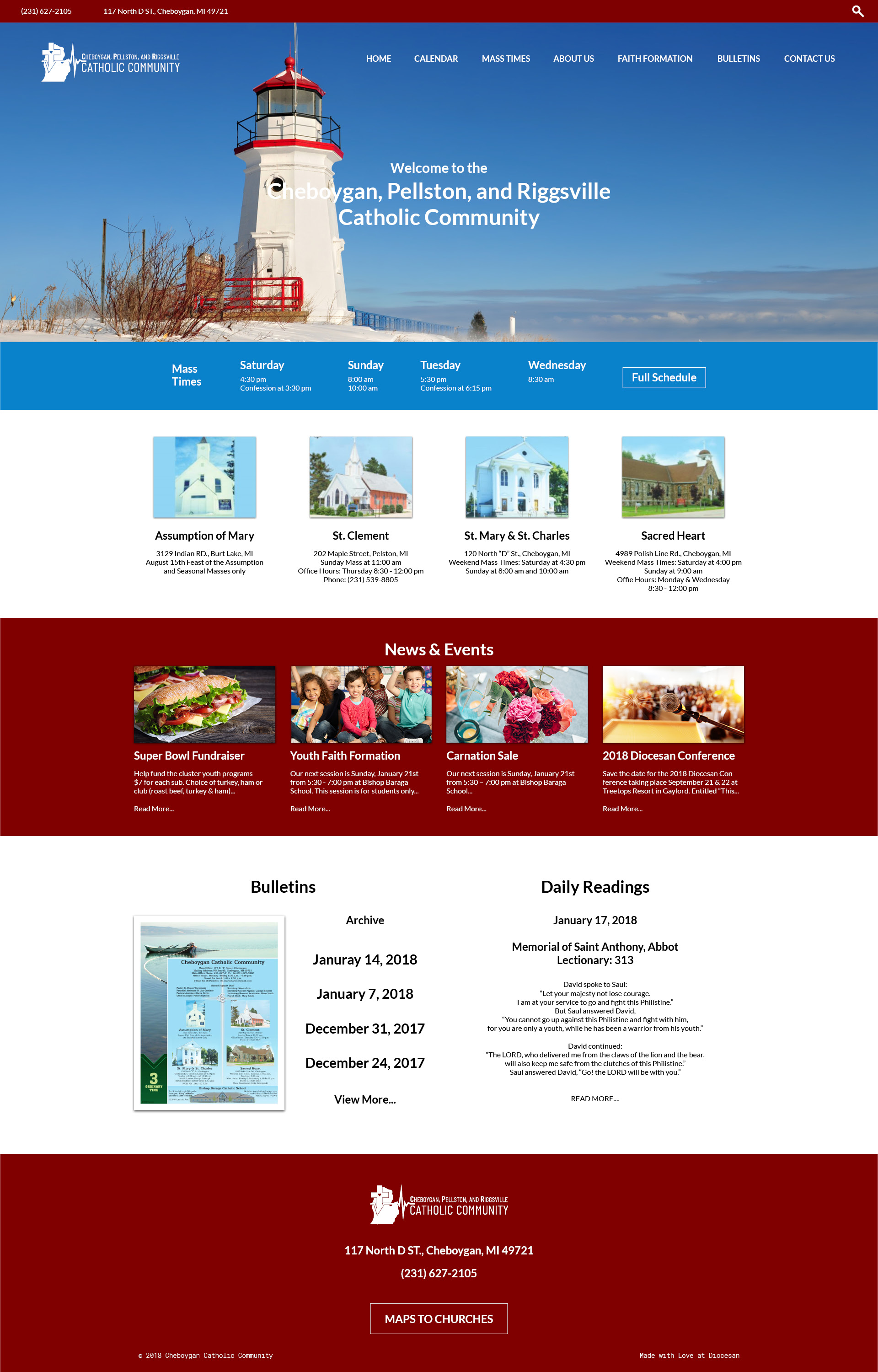
Here is an update to the logo with the typography changes.
Hi Sam,
I like the change in typography.
Looking forward to seeing the logo updates.
I'd like to see the logo in a different color. You choose your the expert.
I like the change in typography.
Looking forward to seeing the logo updates.
I'd like to see the logo in a different color. You choose your the expert.
Here is a new logo treatment. the icon has been shifted to cover more of Northern Michigan as well as the change from community to "parishes" I am still kind of working on color to fit well. I really like the logo as white for the website but would love some color for other materiel such as print, envelopes, and letter head where the background will most likely be white.
Thanks,
Samuel Lanning
Sam,
Can you change Catholic Parishes to the same font as above and change the State of Michigan to a gray like a shadow behind the cross?
Can you change Catholic Parishes to the same font as above and change the State of Michigan to a gray like a shadow behind the cross?
There is only one font used in the logo, the difference in sizes and weights may be throwing it off a bit
Sam,
What do you think about the gray background?
What do you think about the gray background?
I think it looks nice, really puts the emphasis on the cross and heart beat, while keeping the Mitten behind and not a dominant feature, It would look great on a white background or on paper, as well as on the web!
Sam,
Father approved we all like it.
It's a go, anxious to move forward.
Great Job!
Father approved we all like it.
It's a go, anxious to move forward.
Great Job!