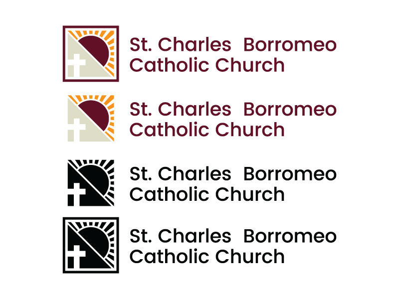
Logos
I took some time last Friday after we spoke to mock up a few versions of the logos so you can take a look at those before we talk about the sites design! It will help with the direction we decide to go for.
Good Morning,
I have another logo for you to look at, Fitting Charles Borromeo's profile.
Fairly simple but easily applicable to any piece you would need it for, good as a black and white logo and can have color added as well.
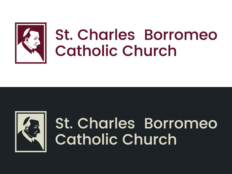
I have another logo for you to look at, Fitting Charles Borromeo's profile.
Fairly simple but easily applicable to any piece you would need it for, good as a black and white logo and can have color added as well.
Hello Sam,
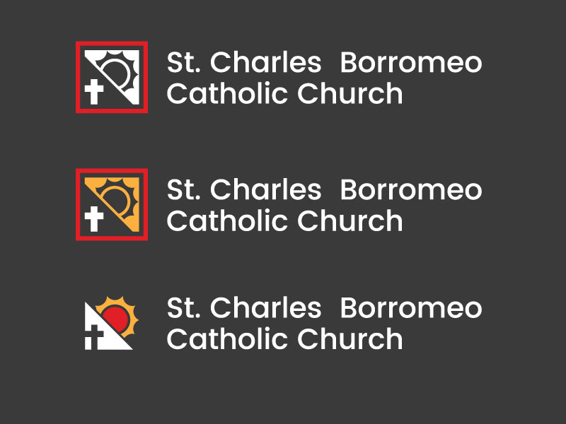
Unfortunately, this one is still not hitting home with Fr. Ralph. How about something simple like adding rays of sunshine to our current logo and making the sun yellow or golden instead of black. The outline could be changed to burgundy instead of black?
Let me know.
Thanks,
Jonathan
Unfortunately, this one is still not hitting home with Fr. Ralph. How about something simple like adding rays of sunshine to our current logo and making the sun yellow or golden instead of black. The outline could be changed to burgundy instead of black?
Let me know.
Thanks,
Jonathan
Here is another version that I put together, this one is closer in lone with your original but still pushes towards the square/icon form to allow for usability across many platforms!