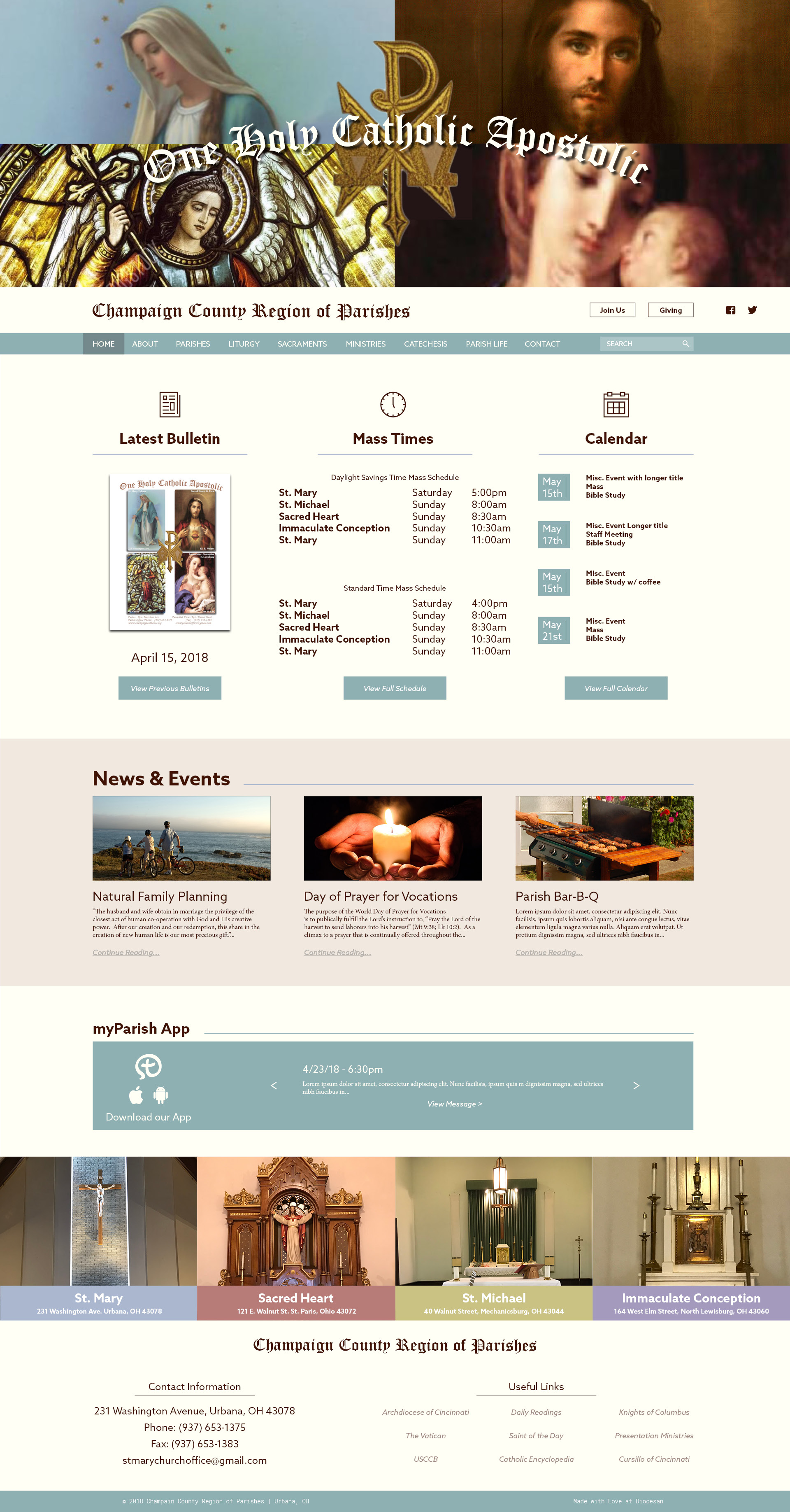
More pages, with the final changes on the list.
I have some more pages for you to take a look at today as well as the final touches to the list of changes you gave me for the home page!
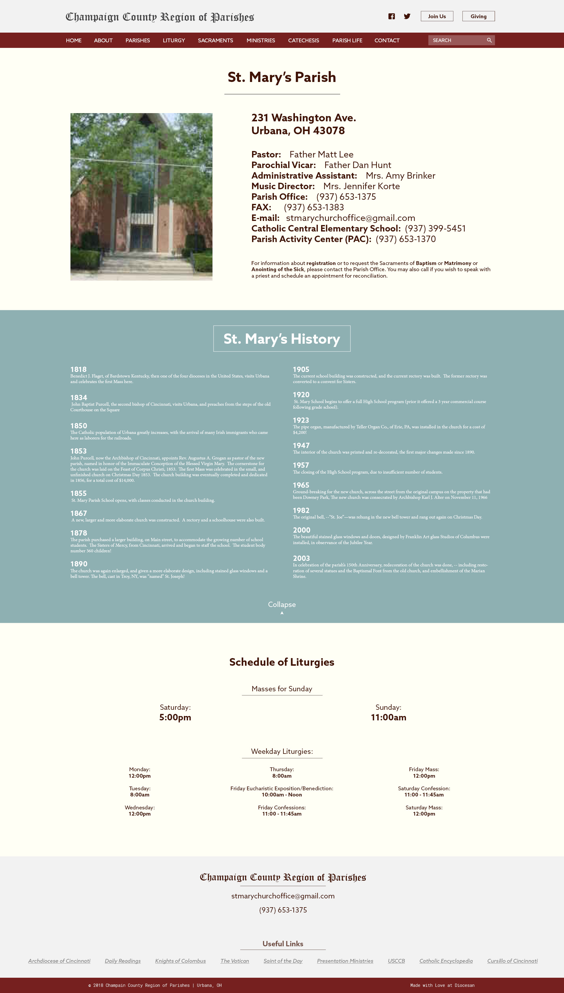
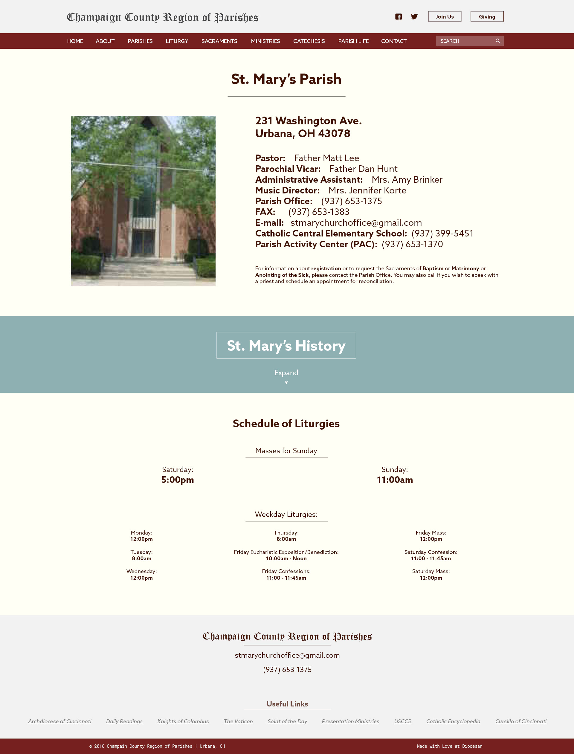
The second and third page are to represent each parish page on the site, Giving them a section with what we call an accordion to hold the history or whatever info you want to share about each parish! The two pages show how the functionality would work with the Collapse and Expand buttons.
This shows how the history section will look when "Expanded"
This shows how it will look when the section is "Collapsed"
Hi Sam!
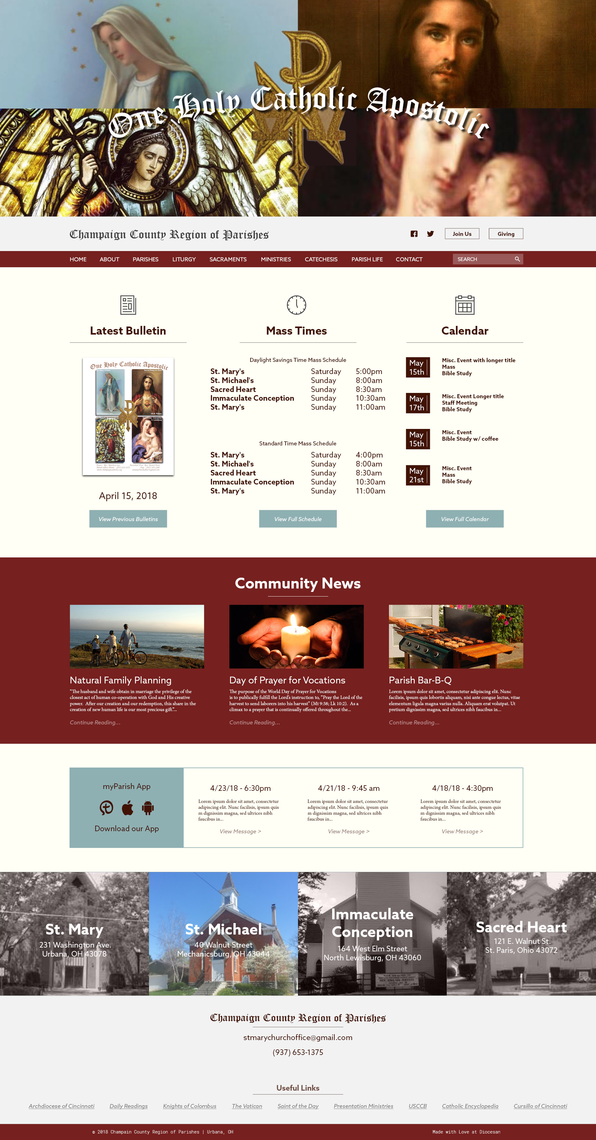
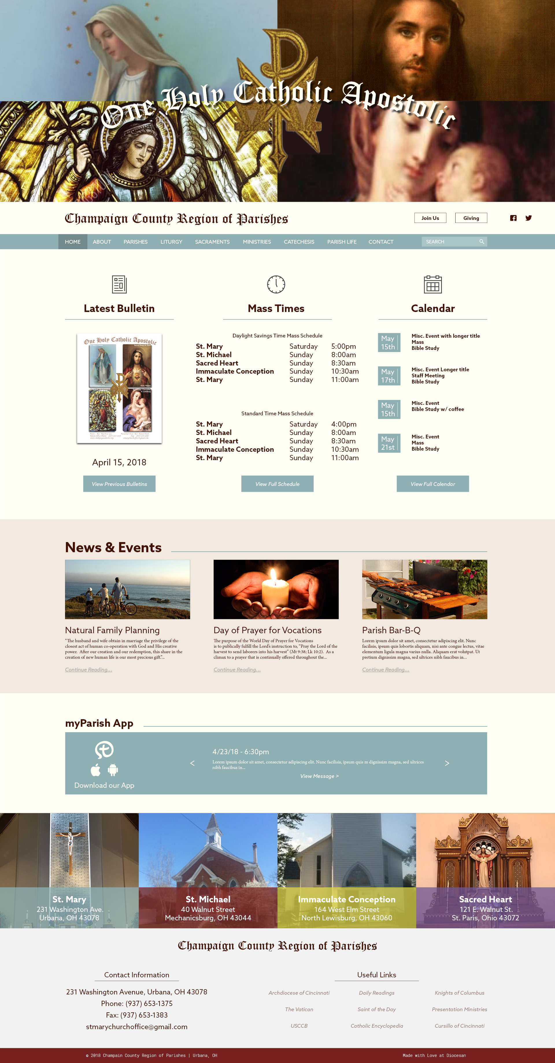
I'm going to talk about each section of the home page from the top down, and I'm going to call each section a row. I still have some concerns with some of the colors, and we can talk about that, but for starters I'll be commenting on formatting and other aspects.
* The top row has the four prayer card pictures, the Chi Rho, and the One, Holy Catholic, Apostolic. It looks great!
* The second row has Champaign County Region of Parishes, the Facebook and Twitter Icons, the Join Us and Giving Buttons. Can you make the text for Champaign County Region of Parishes larger (like it was in the first draft), and move the FB and Twitter icons to the right of the two buttons?
* The third row starts with HOME and ends with the Search box. It looks great!
* The fourth row has the bulletin, Mass schedule, and calendar. It looks great! One item to note is that none of the parish names are possessive. It is St. Mary not St. Mary's, and St. Michael not St. Michael's.
* The fifth row has Community News. I'm still not sure about the title of the section. The first thing I think of when I see "Community News" is news about our town. The second interpretation could be news about our parish community. I know we discussed this before, but I guess I need an explanation of exactly what information goes in this section. Also, I would still rather see that row separated from the row above and below in a different, less stark manner. Once again, I'll ask you to look at stmarkhr.org (http://stmarkhr.org) as I like the way theirs is separated.
* The sixth row has the app information. It's better, but I like the stmarkhr.org (http://stmarkhr.org) set up, again it offers the same kind of row distinction without being so stark
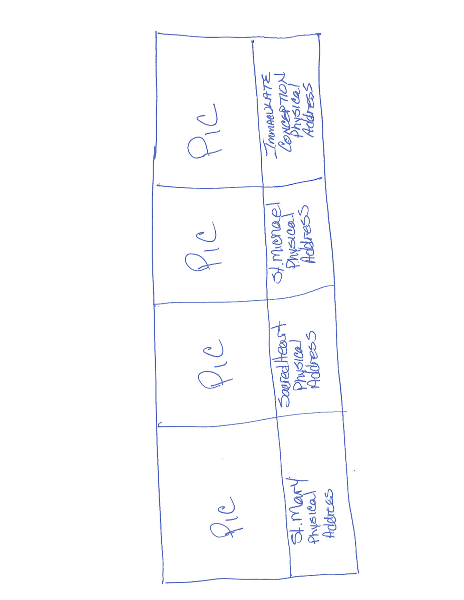
* The seventh row has the pictures of the churches which will be the links to the individual parish pages. I know you'll be changing those pictures to the ones I'm sending you of the interiors, and I still owe you pictures for St. Michael and Immaculate Conception. I should be able to send you those next week. I'm not a fan of the way the parish name and address are over the pictures. I wondered if you could make each one a vertical rectangle that had the church picture at the top of the rectangle and the church name and physical address below. The color for the part below the picture where the name and address are would be whatever color we assign to that parish. I've attached a crude drawing of what I mean.
* The eighth row has some of the regional office contact information with the links below. I'd like to see that row divided into two columns 1/3 for Contact and 2/3 for Links (as we'll be wanting more links, but I'm slowly putting that information together. Also, the spelling on those links will need to be proofed. Knights of Columbus is Columbus not Colombus. stmarkhr.org (http://stmarkhr.org) is laid out like that.
On the left, would be: And on the right would be
Contact Quick Links
Champaign County Region of Parishes With the
231 Washington Avenue links listed
Urbana, OH 43078 in two
columns
PH: 937-653-1375
FAX: 937-653-1383
Email: stmarychurchoffice@gmail.com (mailto:stmarychurchoffice@gmail.com)
* The ninth row is currently the links, see above for my feedback.
The tenth row is the copyright information.
On the colors: I do like that blue-green color you've got there. It's really the shade I have been trying to use for any events that are for the entire region of parishes, so YAY!
Row 1: Cream Text
Row 2: Cream background with brown text
Row 3: Blue-green background with brown text. Blocks changes to brown with cream text when hovered over
Row 4: Cream Background, brown text, lines under headings "Latest Bulletin, etc." blue-green, blue-green date blocks, click for more buttons at bottom blue-green with brown text that change to brown with cream text when hovered over
Row 5: Cream background, brown text, brown header text to left followed by blue-green line
Row 6: Cream background, brown text, brown header text (myParish App Messages) to left followed by blue-green line, app box blue-green like you have it, but I like the version stmarkhr.org (http://stmarkhr.org) has with the arrow on each end
Row 7: See attached rough drawing
Row 8: Cream background with brown text, perhaps a vertical blue-green line between the contact side and the links side (see above about the two sides)
Row 9: Blue-green background with brown text, copyright information.
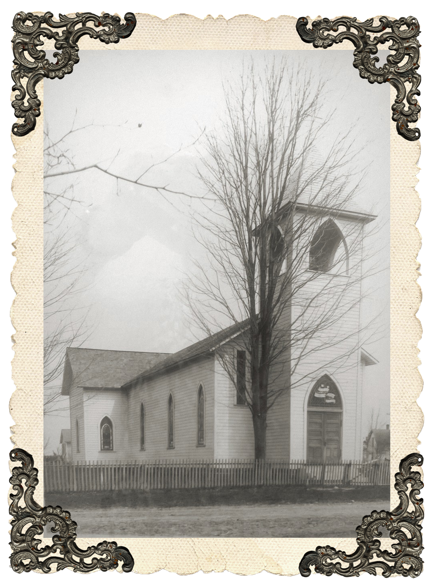
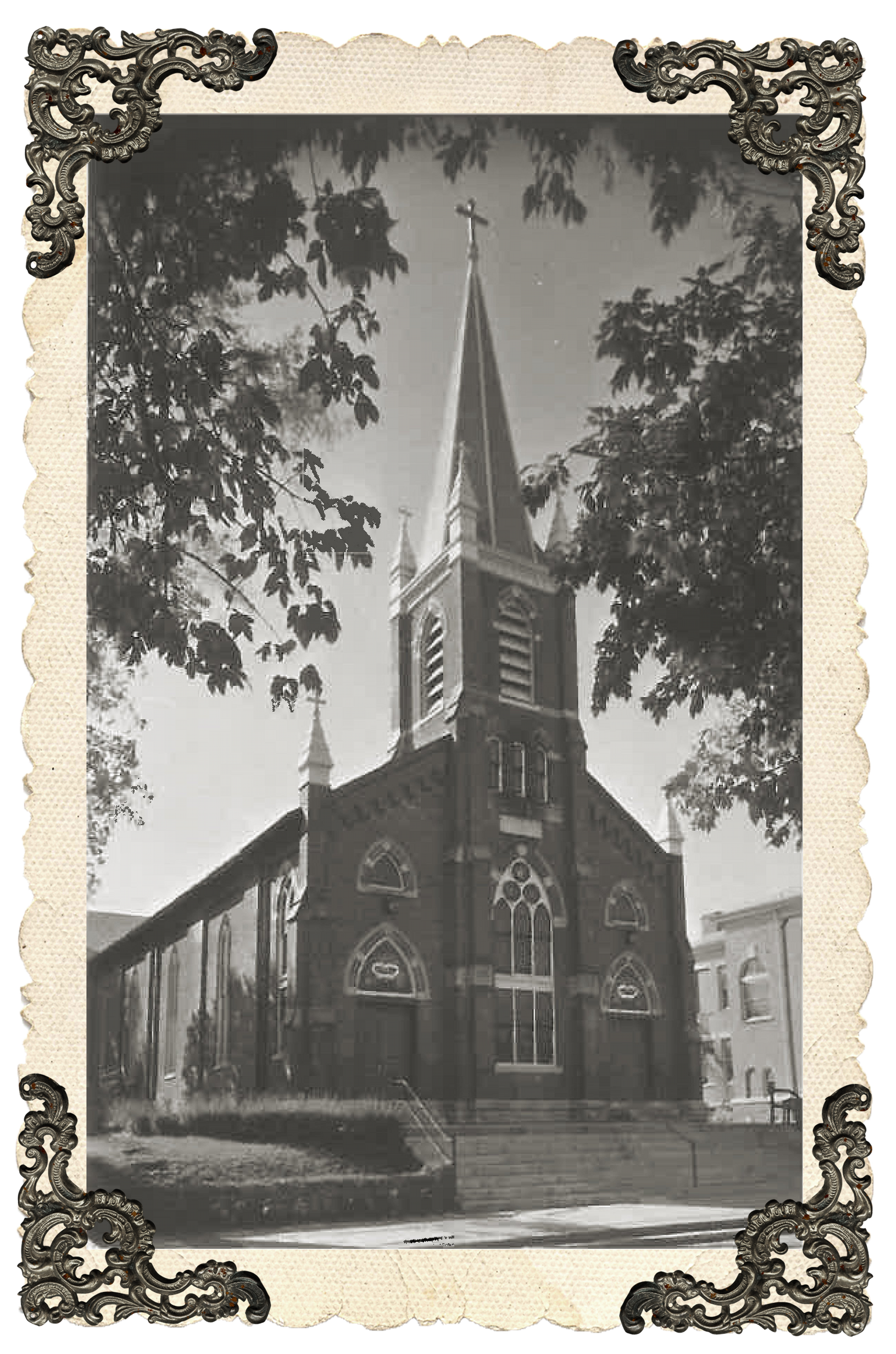
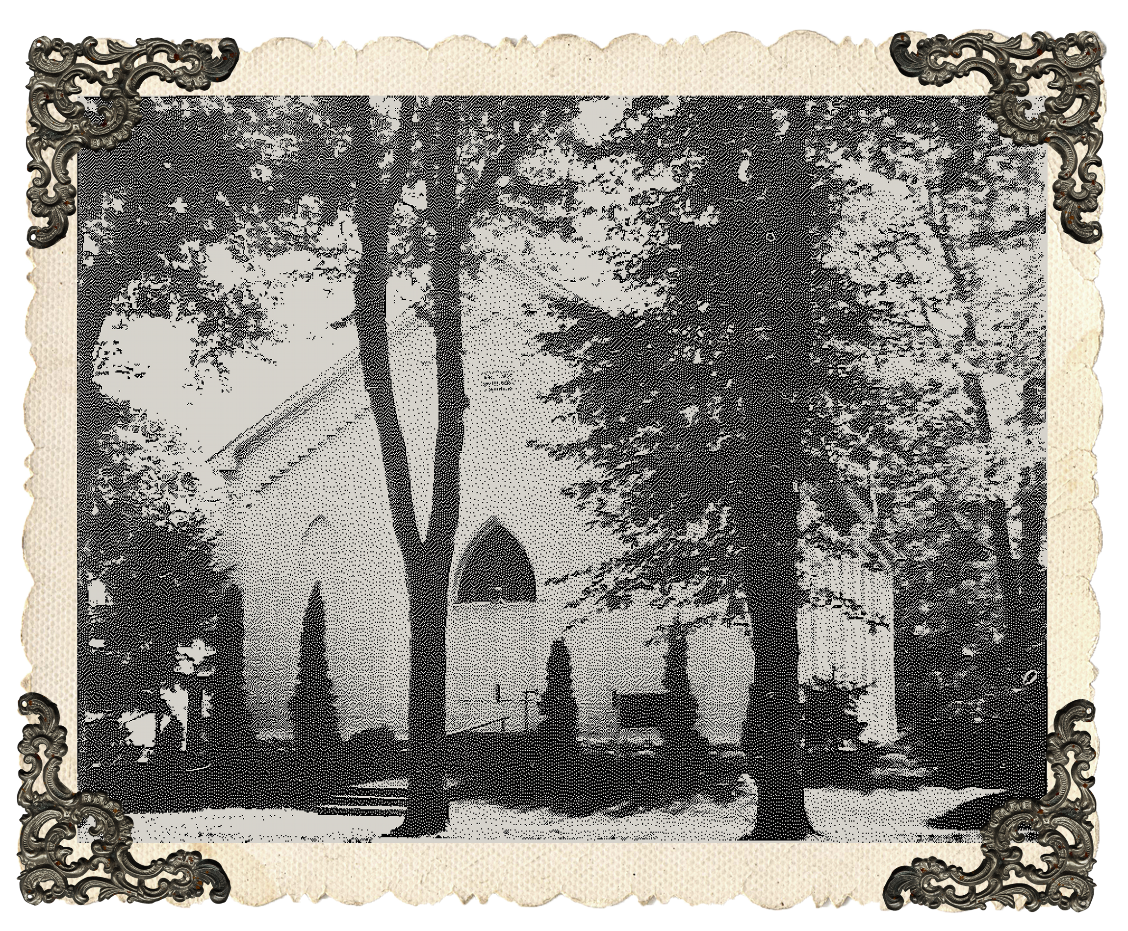
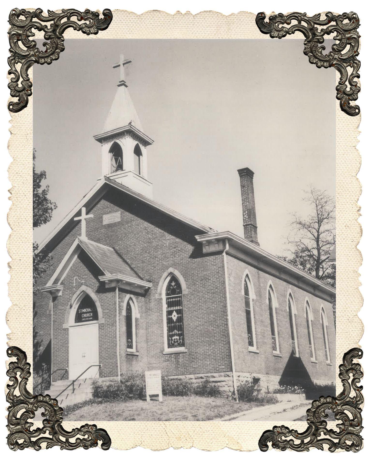
When it comes to the subsequent pages for each parish, I think we'd like to use the exterior picture you have plus the interior picture, and I have some antique exterior pictures for the parishes as well.
If we could use the exterior picture with the parish information, the interior picture with the liturgy schedule.
I love the accordion for the history, and we could use the antique picture inside the accordian. Also, there's supposed to be a google map for the location.
I'd like to add a section where there could be parish specific events that those parishioners should know about.
Regarding the colors for the individual parish pages. I'd like to use the same colors as the main page for row 1 with the region name, row 2 with the categories, the last row with the copyright, and the next to the last row with the regional contact information and links.
I'd also like to keep the cream background with the brown text, but have the lines under the headings and the history box be the color associated with the parish blue for St. Mary, red for Sacred Heart, yellow for St. Michael, and purple for Immaculate Conception (though we still need to determine what exact colors of blue, red, yellow, and purple).
For the record, I'm a little less sure about my requests for the parish pages than I am about the main page because I've seen the main page more than once now.
Also, when it comes to content for all the other pages, for instance anything under the sacraments tab, when and to whom do I need to provide that, or will we be able to add it all ourselves when the page is active?
Sorry this is so long, and I do appreciate all your help and patience. It's really hard sometimes to figure out what we want until we see it. Also, it's so difficult to tell you in writing, so please let me know if any of this doesn't make sense.
Thanks so much for all you're doing,
For the images on the bottom of the parishes with the address, Did you mean horizontal? Because Im not really sure placing the content vertically would be the best practice. and Im not sure how it would fit into the current design.
Just want to make sure.
Thanks,
Samuel lanning
Just want to make sure.
Thanks,
Samuel lanning
Hi Sam,
When you view the attachment I sent you see it vertically, but the text is sideways, right?
That is just because of the way I scanned it. For the web site that should be horizontal. Left to right St. Mary, Sacred Heart, St. Michael, Immaculate Conception, with the picture at the top and the physical address below.
Does that make more sense?
Sorry about that!
Attached are the historical pictures I mentioned in my last email.
Thanks!
Thanks!
Awesome! these are great pictures! And yes I was going to make the section stay the same (horizontal) but you had a typo earlier talking about it being vertical and wanted to just double check to make sure! The picture of the sketch was fine and made it clear that you must have meant to say horizontal!
thanks
Samuel Lanning
thanks
Samuel Lanning
Also a lot of the content your asking to use the blue/green background with the brown text. Those colors are a bit to close in saturation and being somewhat dark don't really blend well together. We try to keep contrast enough to make it easier to read and the cream color stands out a lot better on the dark blue green backgrounds.
My suggestion would be to use the cream on top of the blue green instead of the brown.
My suggestion would be to use the cream on top of the blue green instead of the brown.
I'm okay with that.
Thank you!
Thank you!
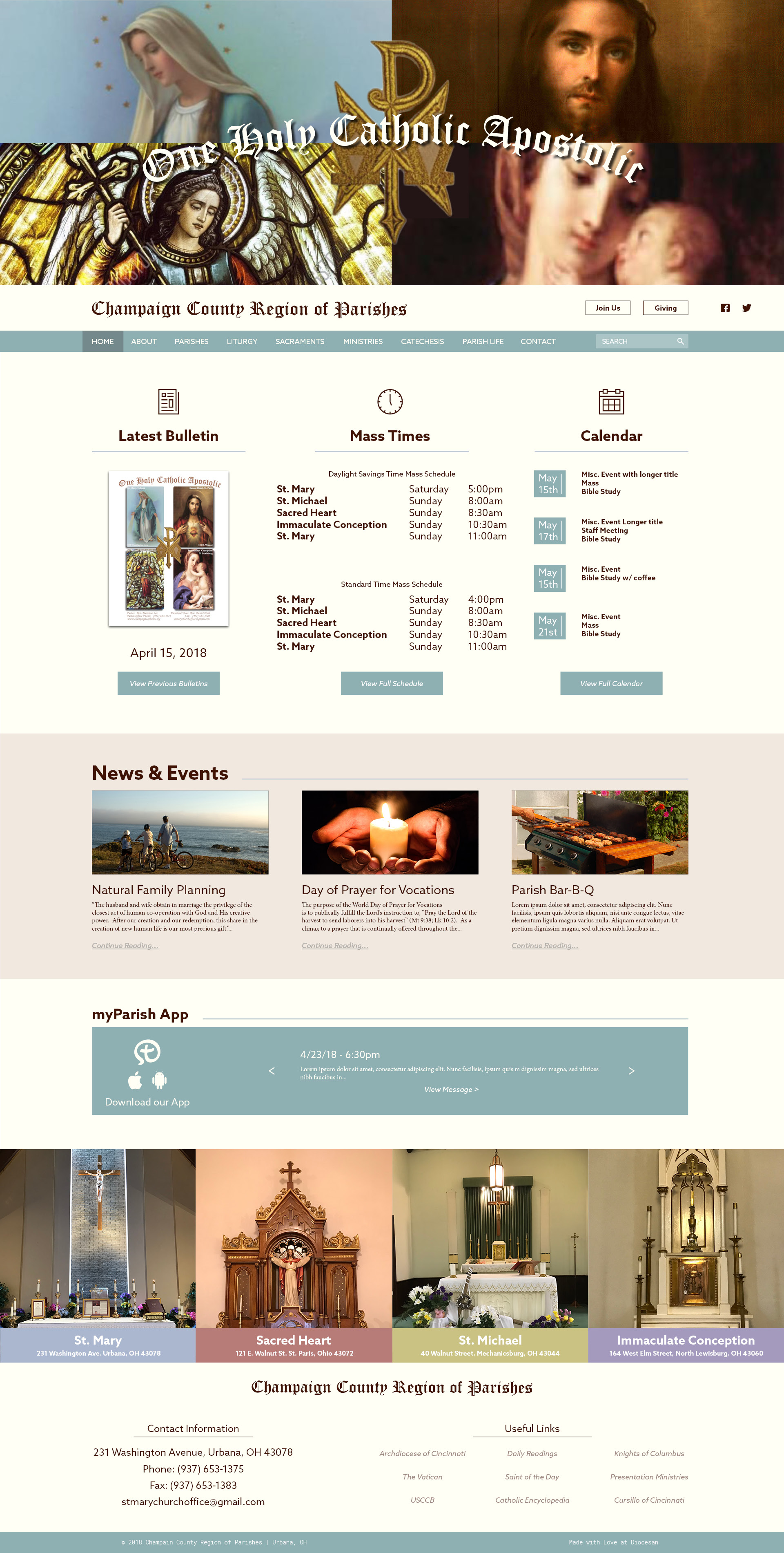
I have an update to the proof! Let me know what you think, I tried to steer away from going the exact route of St. Mark for the news/events section. I removed the dark red section behind for a more subtle take on the tan color we're using for the project.
Thanks,
Samuel Lanning
Thanks,
Samuel Lanning
I LOVE it!
Still a couple of little things.
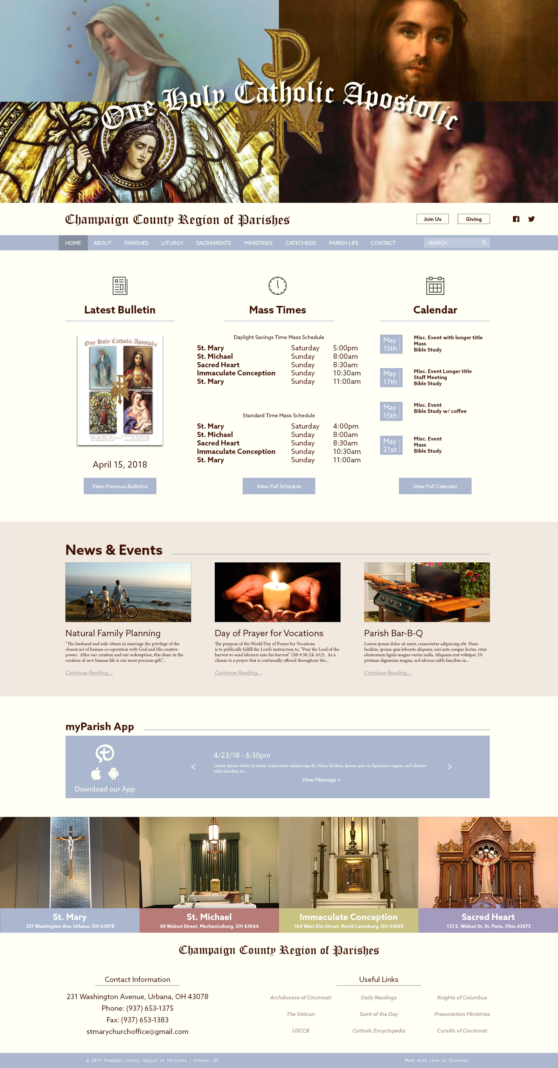
Is it possible to put the colored blocks with the physical addresses under the pictures instead of overlapping the pictures? Also, The color blocks are on the wrong parishes. You do have the color blocks in the order we'd like them from left to right, but the pictures are wrong and the addresses aren't with the correct pictures. It should be as follows:
St. Mary Picture with address and blue color (this is currently correct)
Sacred Heart picture with address and red color (currently the color is in the correct location, but the picture and address are on the far right)
St. Michael picture with address and yellow color (currently the color is in the correct location, but the picture and address are in the second spot from the left)
Immaculate Conception picture with address and purple color (currently the color is in the correct location, but the picture and address are in the second spot from the right)
Is the background of the section with the regional contact information and links still white, and if so can it be cream?
Can the copyright line be the blue-green color too?
How do we work on the actual colors for the four parishes? We're in the right ballpark, but the wrong seats. Is there some way I can work on it and tell you, or is it some other process?
You are awesome!
I did some work on the colors for the individual parishes. Attached are the original pictures with the colors I'm looking at next to the picture. Inside the color block is the information. What do you think?
Good morning Sam,
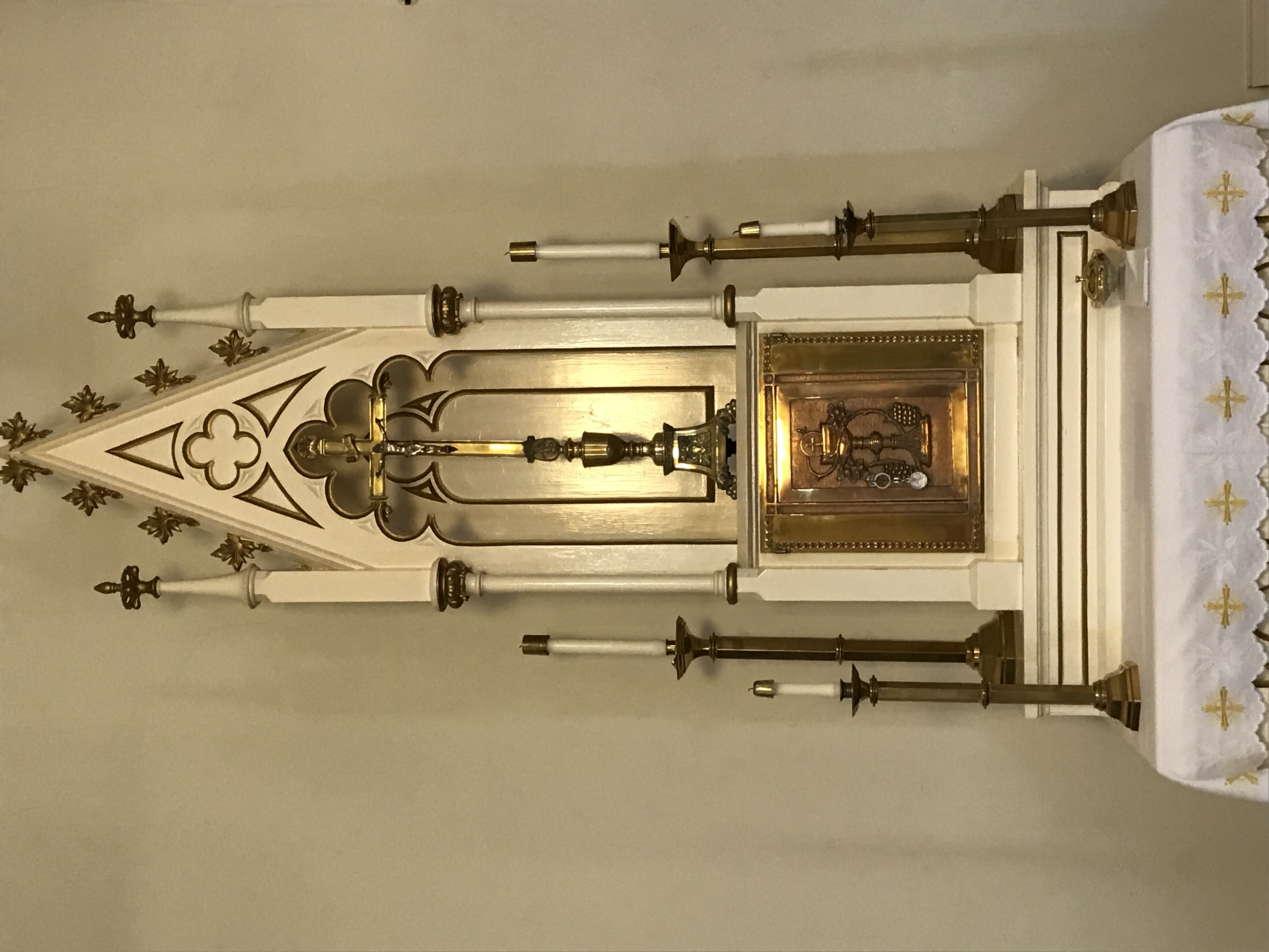
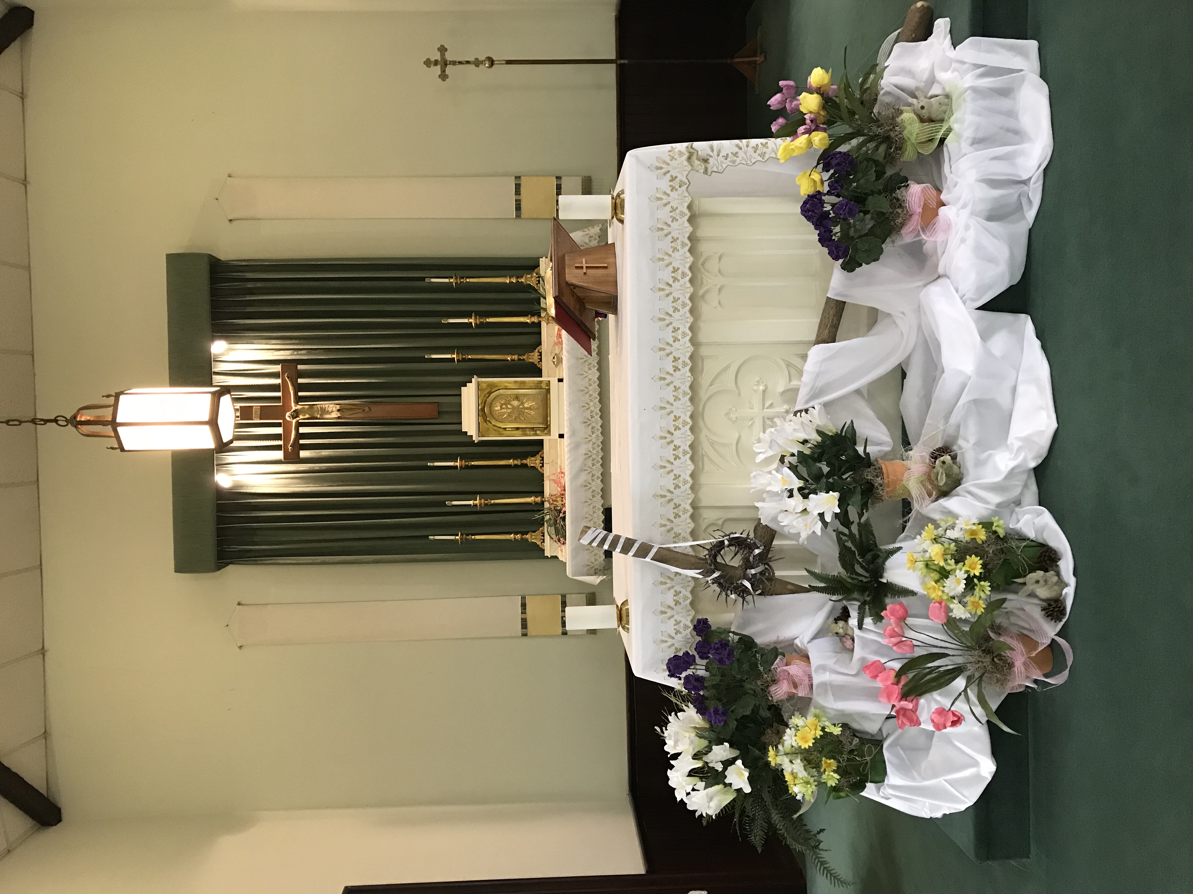
Attached are the interior photos of St. Michael and Immaculate Conception.
Thanks for all the hard work you're doing!
Attached are the interior photos of St. Michael and Immaculate Conception.
Thanks for all the hard work you're doing!
Thanks for the pictures and the colors! I have to do some trickery in order to get the shade your looking for so the cmyk values and transparency will not be the same. I want the color with 0% opacity so it will be true on all backgrounds. I will send you copies of the colors based off the old colors so you can see what I mean.
Thanks!
Thanks!
Okay, thank you.
However, I'd like to be able to use the four colors for the parishes and the blue-green color you've got for the home page in our bulletins. Does that mean that in order to see the same colors in the bulletin (on white paper) that I'd use the CMYK values and transparency that I gave you? And then the colors for the web page will appear to be the same colors that I'll be using in the bulletin, but will have different CMYK values and transparency because they're on line. Is that right?
Thanks!
Yes, both colors will be the same, the one you use for the bulletin and transparency will be the same color as the ones used on the web. The CMYK values will be different since you are using transparency and I will not be.
Color is very weird when you introduce transparency and the possibility of saturation distortion so we try to use solid colors on the web. It will be easier for us on this end, You can continue to use the CMYK values with transparency.
Thanks,
Samuel Lanning
Color is very weird when you introduce transparency and the possibility of saturation distortion so we try to use solid colors on the web. It will be easier for us on this end, You can continue to use the CMYK values with transparency.
Thanks,
Samuel Lanning
Thanks!
Also one other question, Do you want these colors to be associated with just the images at the bottom? I have started to switch the current blue/green with the color for St. Mary to match so our color scheme isn't all over the place. If you want to keep that current blue green instead please let me know!
Thanks,
Samuel Lanning
Thanks,
Samuel Lanning
I want to keep the current blue-green for the Champaign County Region of Parishes home page.
However, when we switch to the individual parish pages the blue-green gets replaced with the blue for St. Mary.
Sacred Heart's individual parish page should have the blue-green replaced with the red, and so on for the other two individual pages.
In the end, the overall look and feel of the individual pages will be the same as the main home page, but you'll immediately know which parish you're on because of the color change.
Does that make sense?
Yes, that makes better sense. Thanks!
Also, I like the colors you've got, but the order is still mixed up.
Left to right it should be
St. Mary picture and address with the blue color (this is currently correct)
Sacred Heart picture and address with the red color
St. Michael picture and address with the yellow color
Immaculate Conception picture and address with the purple color.
And, is there a way to use more of the lower portion of the St. Mary photograph in order to get the altar and tabernacle in?
Thanks!
Also, any pages that link from the main home page (other than the individual parish pages) will have the same blue-green color as the main page.
And (haha, are you completely sick of me yet?)
Here is the link they just sent me to embed our online giving
https://www.eservicepayments.com/cgi-bin/Vanco_ver3.vps?appver3=wWsk24ZWJSTZKsGd1RMKlg0BDvsSG3VIWQCPJNNxD8upkiY7JlDavDsozUE7KG0nFx2NSo8LdUKGuGuF396vbZ0VveSemzBbXgvnvqi9JwyXHubq5Z7ap5JVmPErc4ZeYHCKCZhESjGNQmZ5B-6dx0IMy39uNzwW0kjZmXFVotY=&ver=3
I think I have it now!
EUREKA! Looks great! Wondering though if we can get more of the tabernacle and altar in the St. Mary picture.
Got it!
Aw Sam, this looks beautiful!
One last item for accuracy and continuity.
The address for St. Mary church, which should appear in the blue block under the photo is 228 Washington Avenue (not to be confused with the contact address at the bottom of the page which is currently correct as 231 Washington Avenue.)
Also, might we actually spell out Avenue in that blue block and for Sacred Heart spell out Street in the red block? Currently the Sacred Heart block looks like a typo even though it's not. For St. Michael and IC Street is spelled out.
Then, I think, it will be perfect!
And spell out East in the Sacred Heart address as well please?
And commas.
228 Washington Avenue, Urbana, OH 43078
121 East Walnut Street, St. Paris, OH 43072
The other two are perfect as they are.
228 Washington Avenue, Urbana, OH 43078
121 East Walnut Street, St. Paris, OH 43072
The other two are perfect as they are.
Can you tell me the blue green color data?
The blue green you're looking for is
C: 46%
M: 20%
Y: 27%
K: 0%
Hex: #8FB0B3
C: 46%
M: 20%
Y: 27%
K: 0%
Hex: #8FB0B3
Here is the update to the address's!
Good morning Sam!
One last small detail and this is PERFECT! The address for Sacred Heart is actually St. Paris, not plain Paris.
I also received the blue-green formula, but I don't know what the HEX part is.
What's next?
I'm curious about content. For instance, if I want to change the links in the bottom right corner is that something I can do when we're up and running or do you have to do that?
And, for the pages that are linked to from the top row (About, Parishes, Liturgy, etc.) Once the pages are created do I add the content or do I send it to someone?
I really appreciate your patience with me and the work you've done.
Thanks again!
Oh OK! thanks for clearing that up, when editing I saw. St. St. and I did get confused.
The Hex code is used to implement the color for Web use, we use it more often here than anything else, You may not need that.
You will have access to changing the links if you like, Once the pages are built and the site is close to finished we'll schedule a training and one of our developers will teach you how to use wordpress! Our content specialist Veronica will also be helping with the migration of content when the time comes!
Thanks,
Samuel Lanning
Great! Thanks Sam!
