Logo Idea
Good Morning,
I wanted to share with you an idea I had as the beginning to a logo to accompany the typography from your bulletin. I took the time to balance out the Old English script with a Sans Serif font to help the space and readability on the web (for desktop and mobile viewing)
At the moment it is a rough idea which I hope to expand on if you are interested!
Hi Sam,
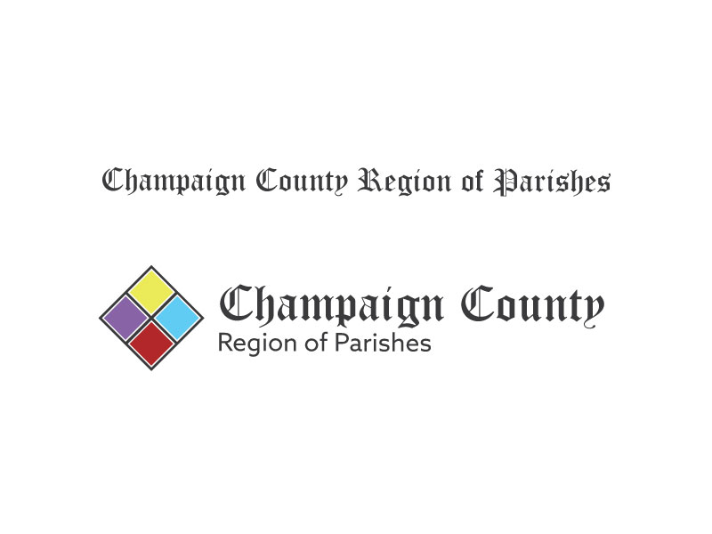
I understand the need for readability, and the fact that the picture on the front of our bulletin isn't optimum for using as a home screen for the app. But I'm a bit unclear exactly what you're showing me. It seems to me that we should be able to use the bulletin front for the website as it is, knowing that the rest of the text of the website won't be Old English font. Though we do have the names and addresses of the churches laid over the prayer cards, perhaps we can use that or something like it for most of the text of the website. (I don't know what font that is.) I think I'm not overly concerned that the Champaign County Region of Parishes be Old English as long as the One Holy Catholic Apostolic IS. Also, I'm not a fan of the diamond with the four colors, I don't think that calls to mind the bulletin cover at all and branches out in a whole other direction (and is too modern). In my mind, I'm thinking that to use the picture on the front of our bulletin as a cover for the app but to not lose the main idea would be to use the gold Chi Rho from the middle of the bulletin cover with four rectangles of color placed as they are on the bulletin cover. They would need to be colors pulled from the prayer cards though, as the colors in your diamond are what we're trying to get away from.
We're happy with the bulletin cover as our logos and tag line and would like to stick with that concept throughout, making tweaks as necessary to accommodate the app and easier readability, but we don't want to change the logo.
Hopefully that makes sense.
Thanks so much!
Hey thanks for the response! That was my mistake, it was my understanding that you wanted to use the colors from the bulletin somewhere, I pulled those colors directly from the bulletin cover with a little bit of tweaking. I will scrap that and move towards using the bulletin cards in a way suitable for the website!
Thanks,
Samuel Lanning
Thanks,
Samuel Lanning
Thanks Sam. Once we find those four appropriate colors, I would like to know what they are because I want to use them inside the bulletin itself. I'm not happy with the easter egg / cartoon colors that I'm using for the inside of the bulletin. That's why we were talking about pulling colors out of the prayer cards. But whatever colors those end up being, that would make up the rectangles (in place of the prayer cards) for the app screen. The blue needs to contain more green like Mary's cloak, the red needs to be a bit rustier or rubier like Jesus' cloak, the yellow more green/gold like the rays coming down onto St. Michael, and the purple deeper, velvetier like Mary's cloak, while still keeping them light enough that black text will show up on them in the bulletin content without looking kindergarteny. I'm not asking for much, right? 😀 I thought you mentioned a color guru that works at Diocesan who might be able to come up with something.
Thanks!
Thanks!