Change
I made a quick change and wanted to see what you think!
MUCH better! I love it! Thanks.
I really like it as well! Thanks, I will have some more logos for you to look at soon!
Samuel Lanning
Samuel Lanning
Can’t wait!
😊
😊
Hello! Here is a logo to take a look at, been pretty busy around here lately but trying to push out as much as I can as well as work on the Inner pages.
I'm pretty happy with this one and the direction it is going.
Thanks,
Samuel Lanning
I'm pretty happy with this one and the direction it is going.
Thanks,
Samuel Lanning
Thank you Sam, and I’m sorry if I’ve been bugging you. I realize good things take time. I’ve just had several people continually asking me when our new website will be up, looking for a timeline! Not everyone understands the work involved.
Anyway, I have an idea for you re the logo. Try deleting the Clearwater, FL and adding Catholic Church. And incorporate the symbol that is everywhere in the church, the trinity symbol! You see it on the outside of the church building photo that you are using? It is in the tile surrounding the Baptismal font, it is on the altar, etc. And one last thought, how about making the logo more “square” (like St. Timothy’s) rather than “rectangular”?
Many thanks,
😊 Chris
No you haven't been! I'm not sure on a finite timeline at the moment, I will talk to one of our developers to see what it is looking like, and thanks for the tip on the logo. The trinity is a great symbol and I do see it now in your pictures.
As far as square are you thinking just the logos icon (trinity) or the icon with typography as well being square?
Thanks,
Samuel Lanning
As far as square are you thinking just the logos icon (trinity) or the icon with typography as well being square?
Thanks,
Samuel Lanning
To answer your question, I was thinking about the whole thing being square.
Attached is a rough, quick idea draft I threw together in Publisher to give you an idea of what’s in my head! Obviously not with the background, but you’ll get the idea.
And thanks for attempting to get a rough idea of our timeline………….so I can pass along!
😊
Attached is a rough, quick idea draft I threw together in Publisher to give you an idea of what’s in my head! Obviously not with the background, but you’ll get the idea.
And thanks for attempting to get a rough idea of our timeline………….so I can pass along!
😊

Awesome!
I love the image of the stone trinity, I have a few suggestions and will show you with images soon.
With the design of your site the arched text will not fit very well, my main concern is size of the logo, we would need to have the logo way too large for it to be legible at certain sizes. I really think horizontal text for the website will work much better and will work for much longer(over time). you can use the square shaped logo i'm making in other spots like letterhead/envelopes or other print material since typically those use larger logos.
I hope this all make sense! I will show you what I mean with the logos ill send you soon!
Thanks,
Samuel Lanning
Here are the two I have for you!
I used the texture for fun to hit closer to the marble/stone in the image. But the logo is able to be used without the texture when needed as well. Like I said above I will suggest the horizontal for the website but the square format could be used elsewhere.
Thanks,
Samuel lanning
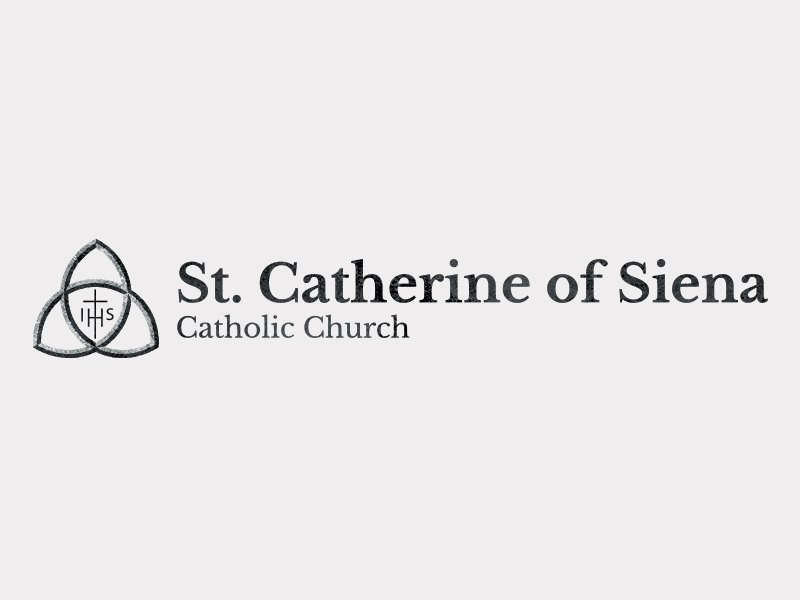
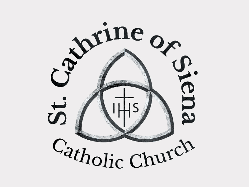
I used the texture for fun to hit closer to the marble/stone in the image. But the logo is able to be used without the texture when needed as well. Like I said above I will suggest the horizontal for the website but the square format could be used elsewhere.
Thanks,
Samuel lanning