New Website Design | Colors
Hi Rebecca,
I changed the colors on the designs from our conversation yesterday. I used the lighter brown we talked about and also used some of the sea green, cooler blues, and a plaster color as well. Here is the color scheme with there hex codes so you can see them all together. I thought they complemented each other very well.
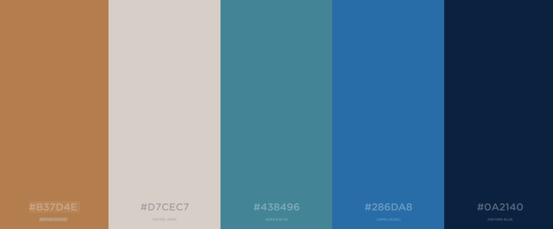
Here are the proofs with the new color scheme. I also added a texture behind the #286DA8 layers throughout the proofs to mimic that texture in the stain glass window. I thought it added some depth to the design.
I changed the colors on the designs from our conversation yesterday. I used the lighter brown we talked about and also used some of the sea green, cooler blues, and a plaster color as well. Here is the color scheme with there hex codes so you can see them all together. I thought they complemented each other very well.
Here are the proofs with the new color scheme. I also added a texture behind the #286DA8 layers throughout the proofs to mimic that texture in the stain glass window. I thought it added some depth to the design.
I thought it was a really good blend of what we talked about yesterday and I was able to keep the blues not super bright so the text is still easily readable. I think it worked well together and I hope you like. Let me know what you think of these, or if you have any questions. :)
Best,
Blake Stapleton
Best,
Blake Stapleton
Hi Blake,
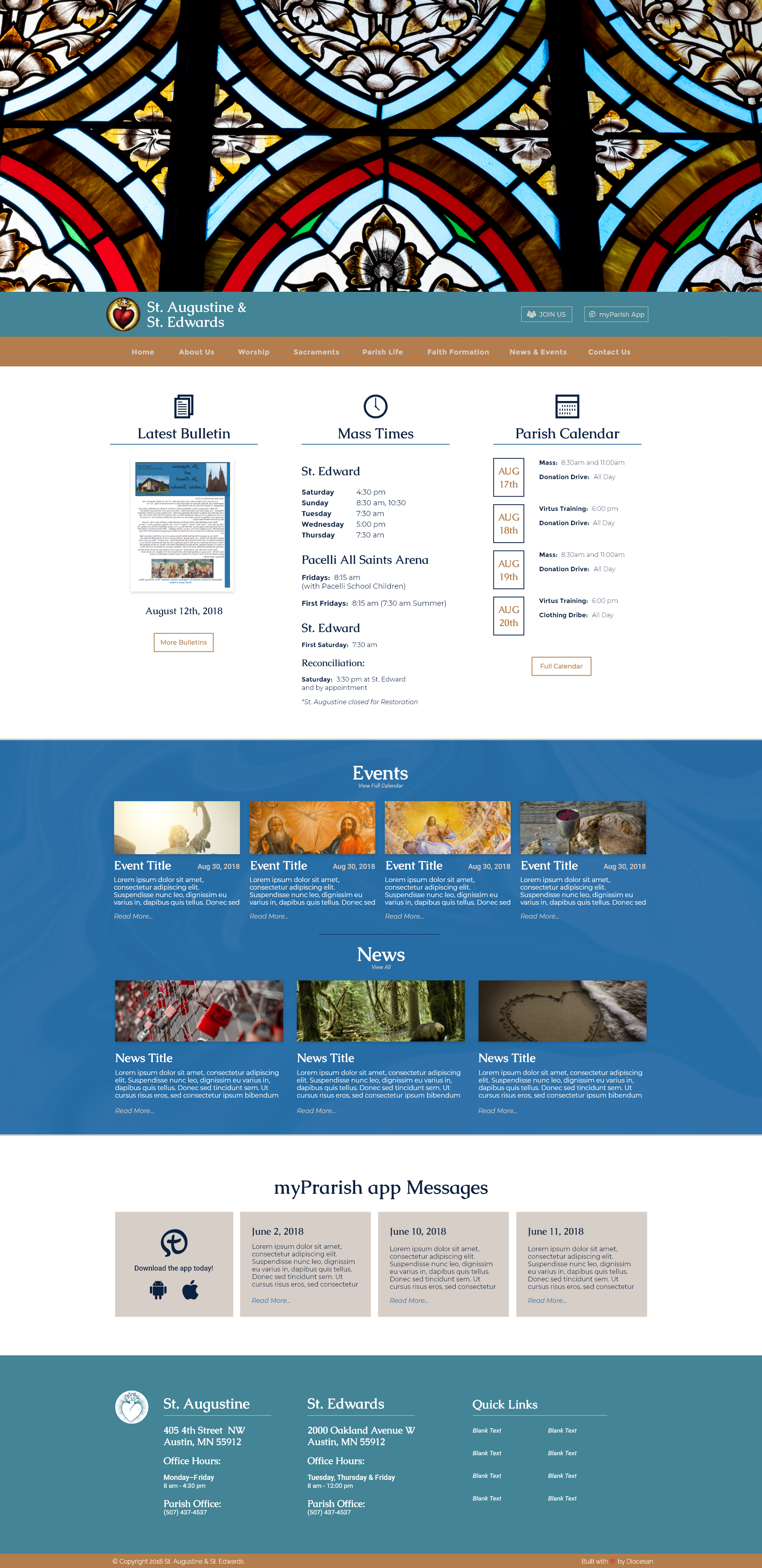
Thank you for your work on this - I think you did a great job running with the ideas we discussed. It helped to have a second set of options to compare to and contrast with. We looked at all of the design features as a team and here is what we've decided on (for all of these things, however, please use your best design judgement to implement them or let us know if they are not recommended):
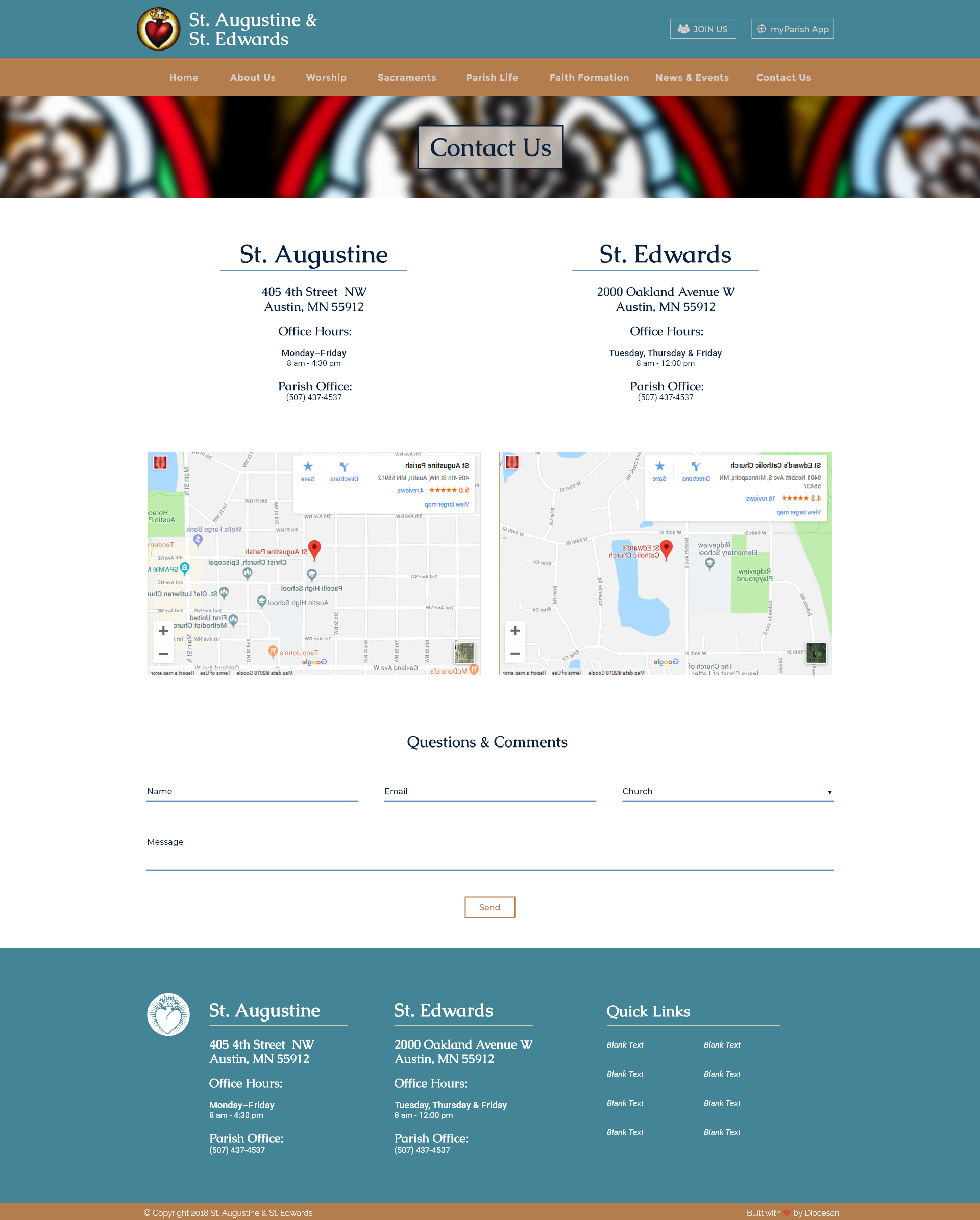
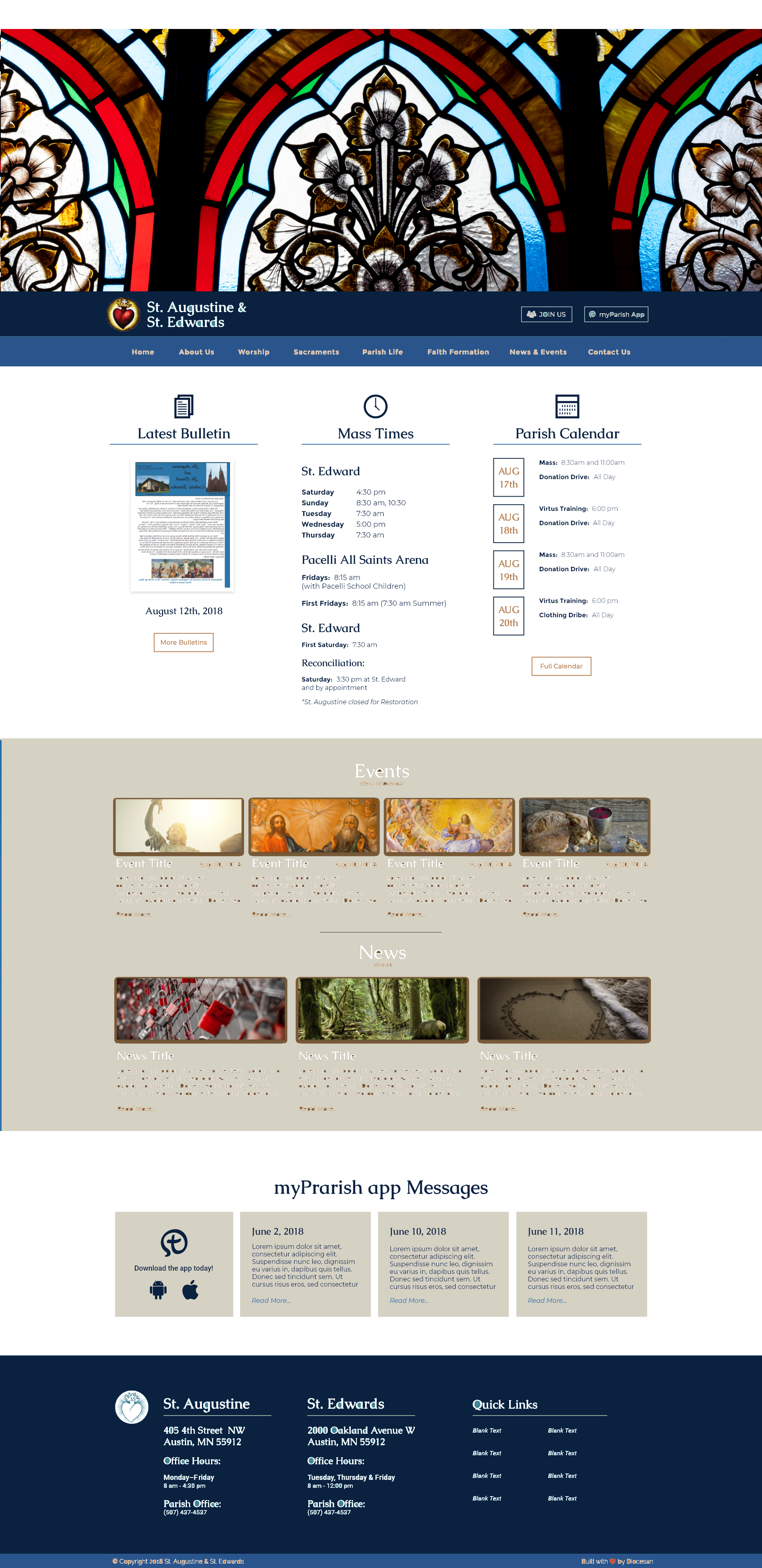
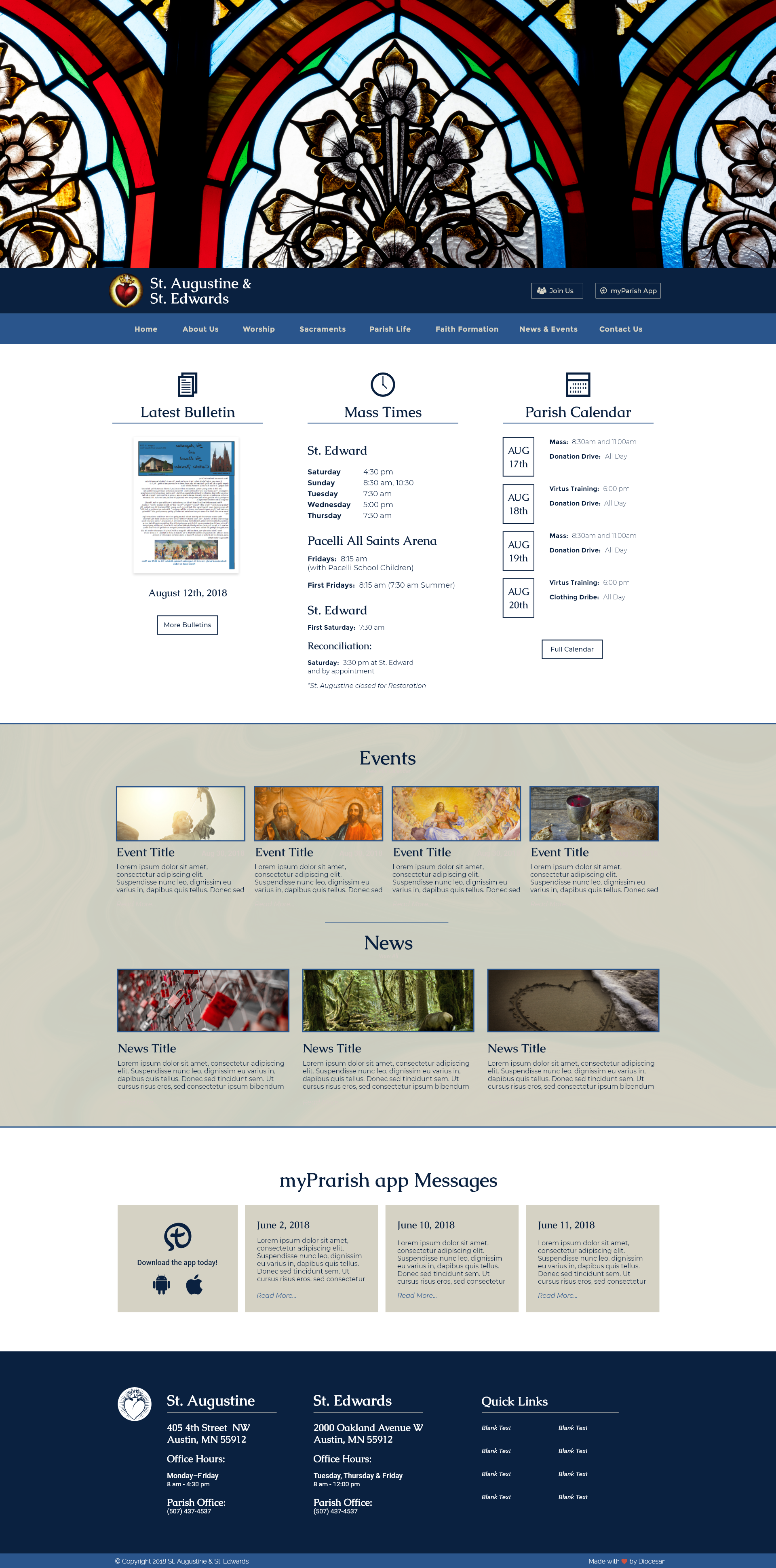
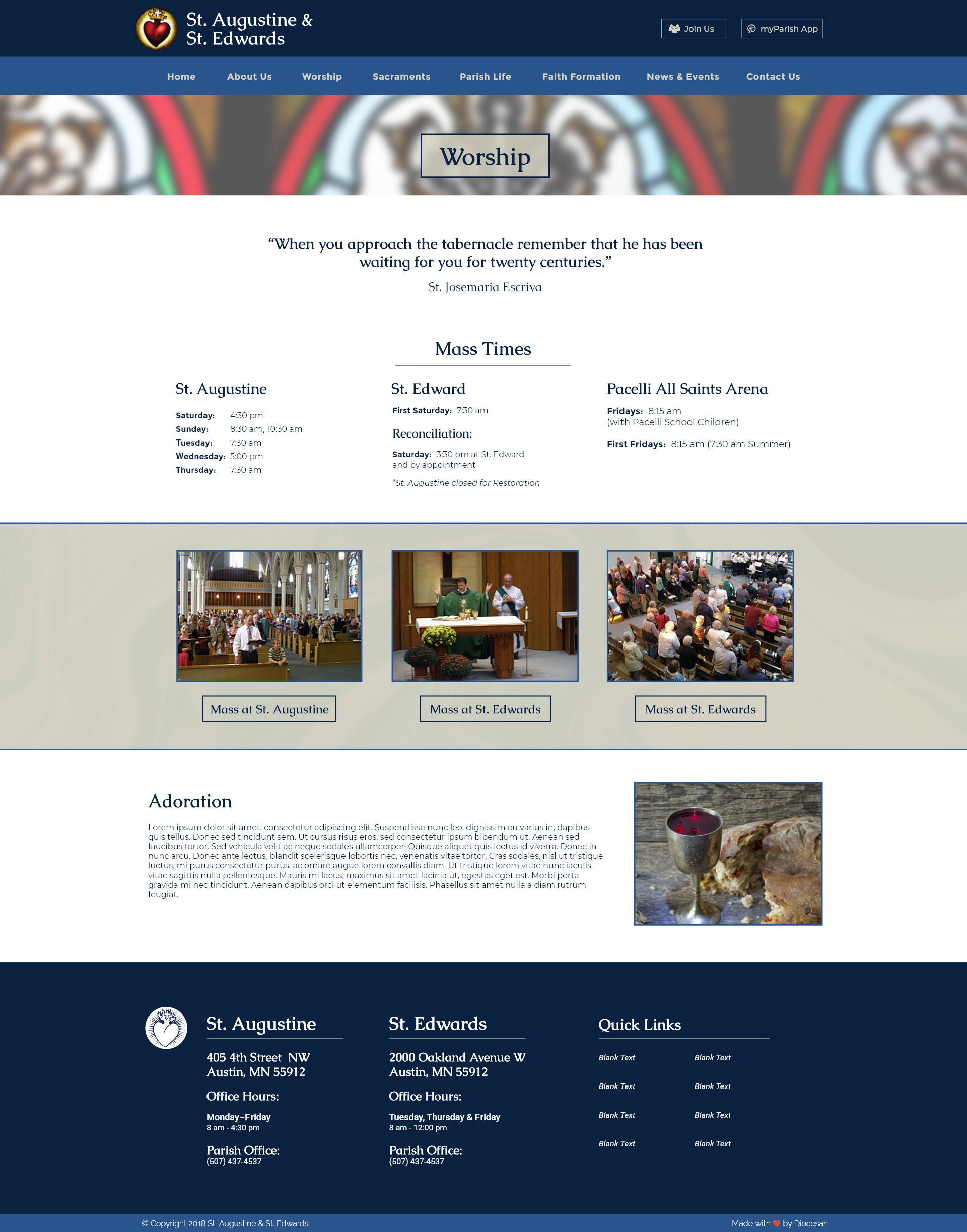
- We'd like to go with the arch-shaped version of the stained glass, not the diamond shaped one. We would like to crop it just a bit shorter, as it was feeling a little too tall - see attached sample as an example.
- We'd like to go with a Navy/Blue/Stone color scheme, see attached for an example. I just used the color picker and paint can in MS paint, so this is very rough and unprofessional looking, but it gives an idea (also, any little stray colors around images, inside letters, etc. are not intentional, they are just a byproduct of using the fill feature). Please polish it as you see fit as you make the changes - for example, it doesn't have to be these exact colors, although I just used the color picker to copy the existing colors that were already provided in various options. Note our only concern is that the stone color doesn't go into the shade that almost has a rose undertone to it. We do like the colors in these placements on the page, however, and then would duplicate them across all the sub-pages in the same way as well.
- Logo, fonts, and layouts are good.
- The places where there is text with a box around it, like "join us" "aug 18th" "more bulletins" on the home page and "Mass at St Augustine" etc. on the sub page, seem inconsistent in coloring/style - some are white, some are brown, some have a different color text inside vs for the box, etc. Can we unify those in style whenever they appear?
- Can we unify the text colors to one simple scheme? We are nervous that if we have too many choices in the overall template it will open the door to too many different admin users getting "creative" down the road... (something we had mentioned to Sam, not sure if it's in any notes anywhere so I will include just for your reference - my apologies if it's a repetition for you - we have some staff who get crazy with new colors, shapes, fonts, etc. so we want a really tight design template that we can lock down and keep consistent no matter who is editing and adding on the website). So, essentially eliminating the places where there are some brown text (aug. 18 box, etc.), yellowish text (menu words in sub-header under church name and the footer, etc.) and so on. Our thoughts were to have the page color scheme be the text color scheme, navy and white or stone, with perhaps the blue as a sparing accent or else maybe a charcoal, no other accent colors (except the typical practice of making some link text blue to indicate it is interactive, etc.). What are your thoughts/recommendations?
- Change the color behind the events/news section and any similar sections on the sub-pages to be the stone color (see attached for example), but add the texture overlay that you had in the last mock-up using a slightly darker stone color over top (we really liked that addition!). Jaci is wondering if there is a less "feminine" more "substantial" overlay pattern option?
- We like the way the photos on the Worship page have a border around them - can we do this everywhere a photo is used (including the events/news homepage area, etc.)? Perhaps just set a standard of thin Navy border around any photos on light backgrounds and stone or white border around any on a dark background? Or whatever you recommend, just something consistent.
- For the header image on the sub pages, we like the blurred focus - is there a way to also make it a little more transparent/translucent?
Fr. will return from the Holy Land this weekend; when we get a rendering with these updates we can show it to him for final approval and go from there.
Thanks,
Rebecca
Thank you for your work on this - I think you did a great job running with the ideas we discussed. It helped to have a second set of options to compare to and contrast with. We looked at all of the design features as a team and here is what we've decided on (for all of these things, however, please use your best design judgement to implement them or let us know if they are not recommended):
- We'd like to go with the arch-shaped version of the stained glass, not the diamond shaped one. We would like to crop it just a bit shorter, as it was feeling a little too tall - see attached sample as an example.
- We'd like to go with a Navy/Blue/Stone color scheme, see attached for an example. I just used the color picker and paint can in MS paint, so this is very rough and unprofessional looking, but it gives an idea (also, any little stray colors around images, inside letters, etc. are not intentional, they are just a byproduct of using the fill feature). Please polish it as you see fit as you make the changes - for example, it doesn't have to be these exact colors, although I just used the color picker to copy the existing colors that were already provided in various options. Note our only concern is that the stone color doesn't go into the shade that almost has a rose undertone to it. We do like the colors in these placements on the page, however, and then would duplicate them across all the sub-pages in the same way as well.
- Logo, fonts, and layouts are good.
- The places where there is text with a box around it, like "join us" "aug 18th" "more bulletins" on the home page and "Mass at St Augustine" etc. on the sub page, seem inconsistent in coloring/style - some are white, some are brown, some have a different color text inside vs for the box, etc. Can we unify those in style whenever they appear?
- Can we unify the text colors to one simple scheme? We are nervous that if we have too many choices in the overall template it will open the door to too many different admin users getting "creative" down the road... (something we had mentioned to Sam, not sure if it's in any notes anywhere so I will include just for your reference - my apologies if it's a repetition for you - we have some staff who get crazy with new colors, shapes, fonts, etc. so we want a really tight design template that we can lock down and keep consistent no matter who is editing and adding on the website). So, essentially eliminating the places where there are some brown text (aug. 18 box, etc.), yellowish text (menu words in sub-header under church name and the footer, etc.) and so on. Our thoughts were to have the page color scheme be the text color scheme, navy and white or stone, with perhaps the blue as a sparing accent or else maybe a charcoal, no other accent colors (except the typical practice of making some link text blue to indicate it is interactive, etc.). What are your thoughts/recommendations?
- Change the color behind the events/news section and any similar sections on the sub-pages to be the stone color (see attached for example), but add the texture overlay that you had in the last mock-up using a slightly darker stone color over top (we really liked that addition!). Jaci is wondering if there is a less "feminine" more "substantial" overlay pattern option?
- We like the way the photos on the Worship page have a border around them - can we do this everywhere a photo is used (including the events/news homepage area, etc.)? Perhaps just set a standard of thin Navy border around any photos on light backgrounds and stone or white border around any on a dark background? Or whatever you recommend, just something consistent.
- For the header image on the sub pages, we like the blurred focus - is there a way to also make it a little more transparent/translucent?
Fr. will return from the Holy Land this weekend; when we get a rendering with these updates we can show it to him for final approval and go from there.
Thanks,
Rebecca
Hey Rebecca,
Thank you for taking the time to write out all of these changes. They were very helpful and a great road map for the design.
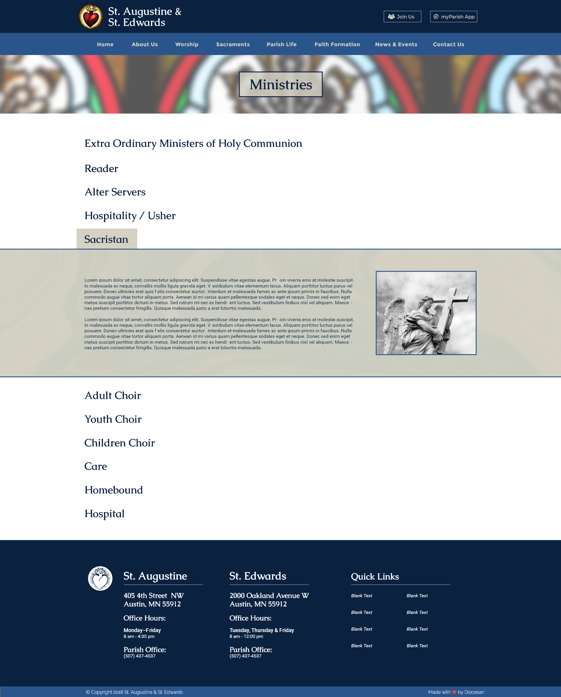
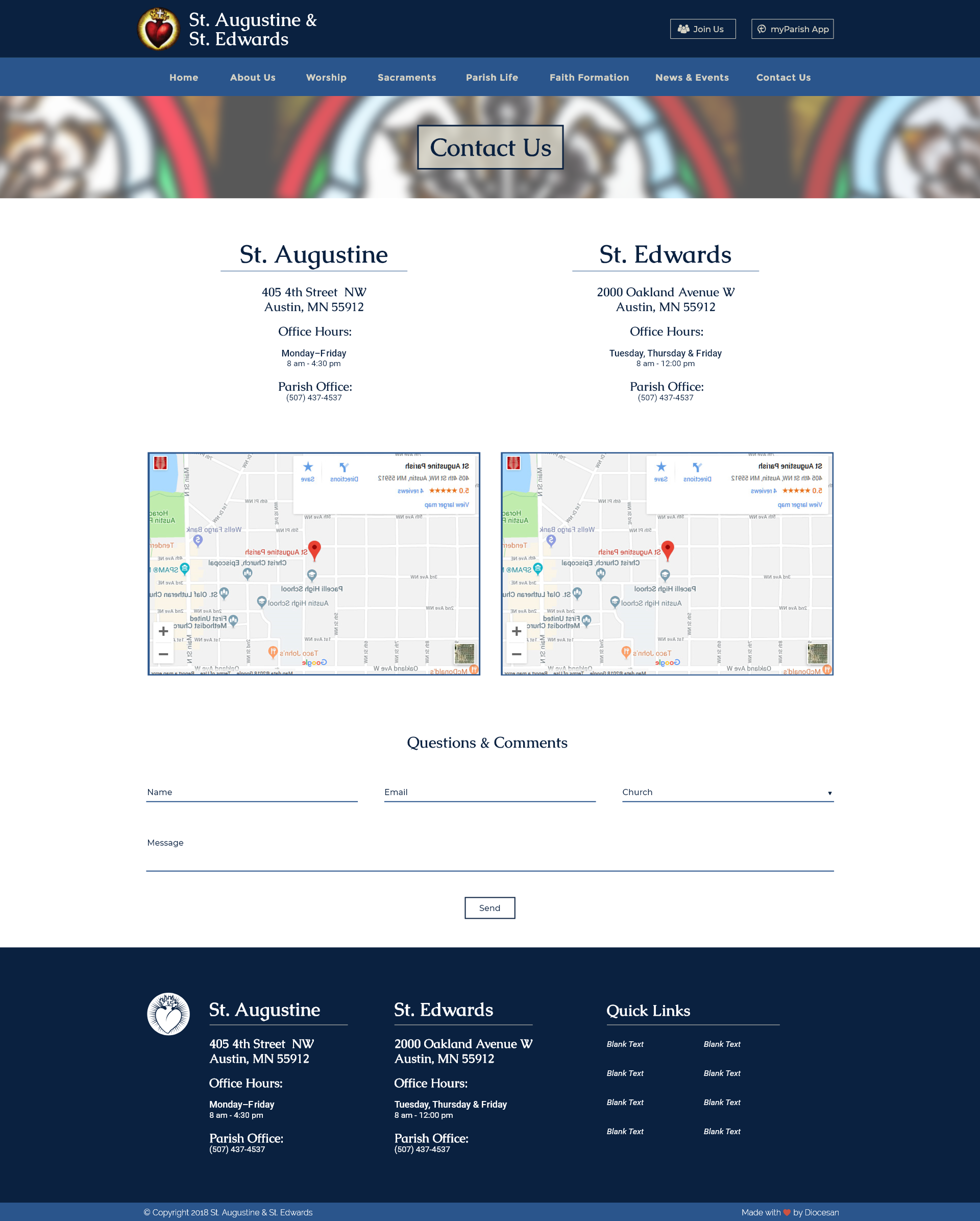
We finished making those edits, and I believe we have accomplished what you had asked for. Below I have attached the new proofs that should reflect all of these changes. Please let me know what you think of them or if you have any questions. Talk to you soon!
Best,
Blake Stapleton
Thank you for taking the time to write out all of these changes. They were very helpful and a great road map for the design.
We finished making those edits, and I believe we have accomplished what you had asked for. Below I have attached the new proofs that should reflect all of these changes. Please let me know what you think of them or if you have any questions. Talk to you soon!
Best,
Blake Stapleton
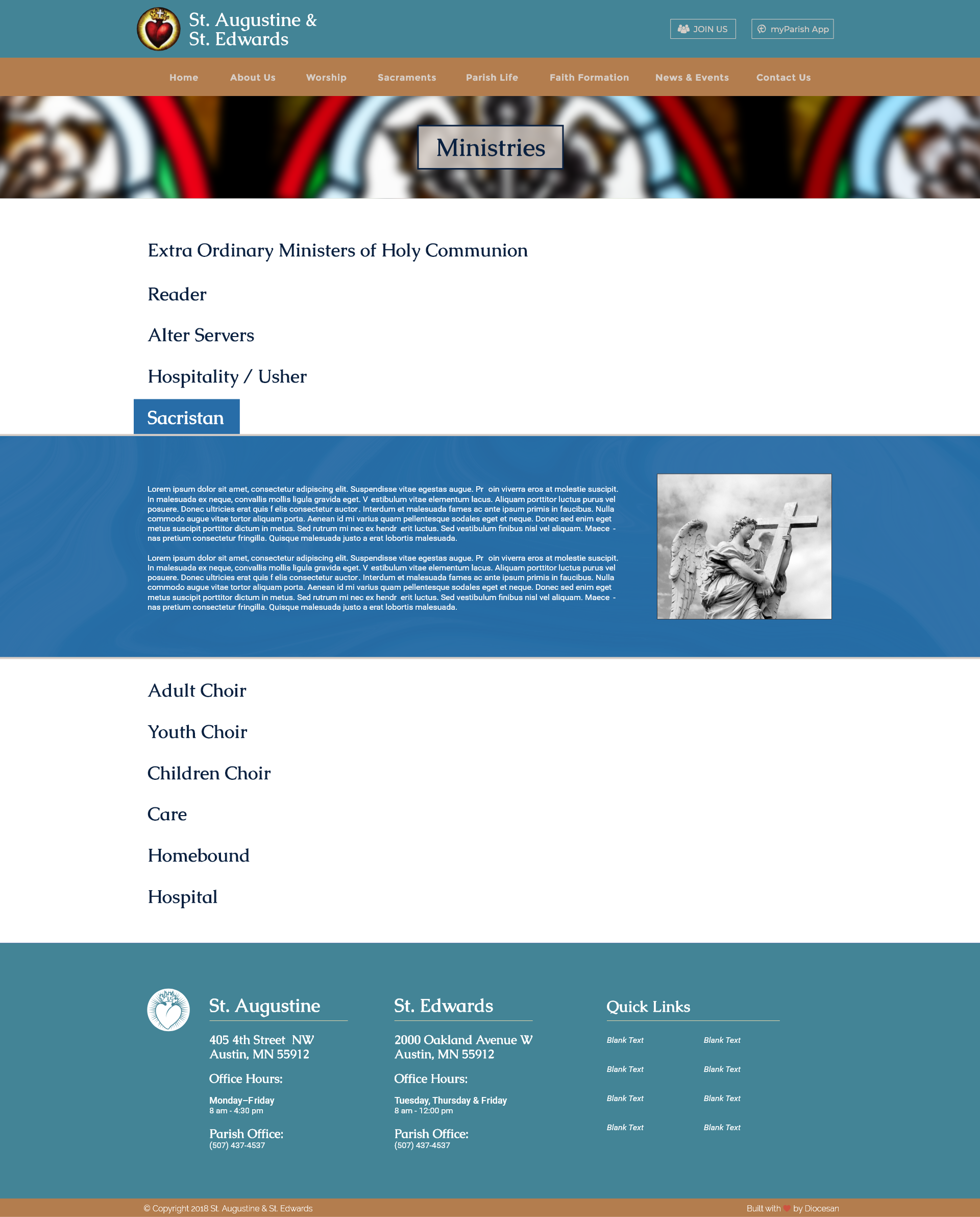
Ps:
We think leaving the "Join Us" & "myParish App" the stone color in the header made the best sense. We wanted to keep the consistency with the other buttons but we feel that this is the most legible and looks the best with the background. :)
Thanks!
Blake Stapleton
We think leaving the "Join Us" & "myParish App" the stone color in the header made the best sense. We wanted to keep the consistency with the other buttons but we feel that this is the most legible and looks the best with the background. :)
Thanks!
Blake Stapleton
Pss:
Actually we changed both of those buttons to white. We think it makes more sense to have them match the logo text color, as well as all of the text color in the footer. :)

Actually we changed both of those buttons to white. We think it makes more sense to have them match the logo text color, as well as all of the text color in the footer. :)
Hi Blake,
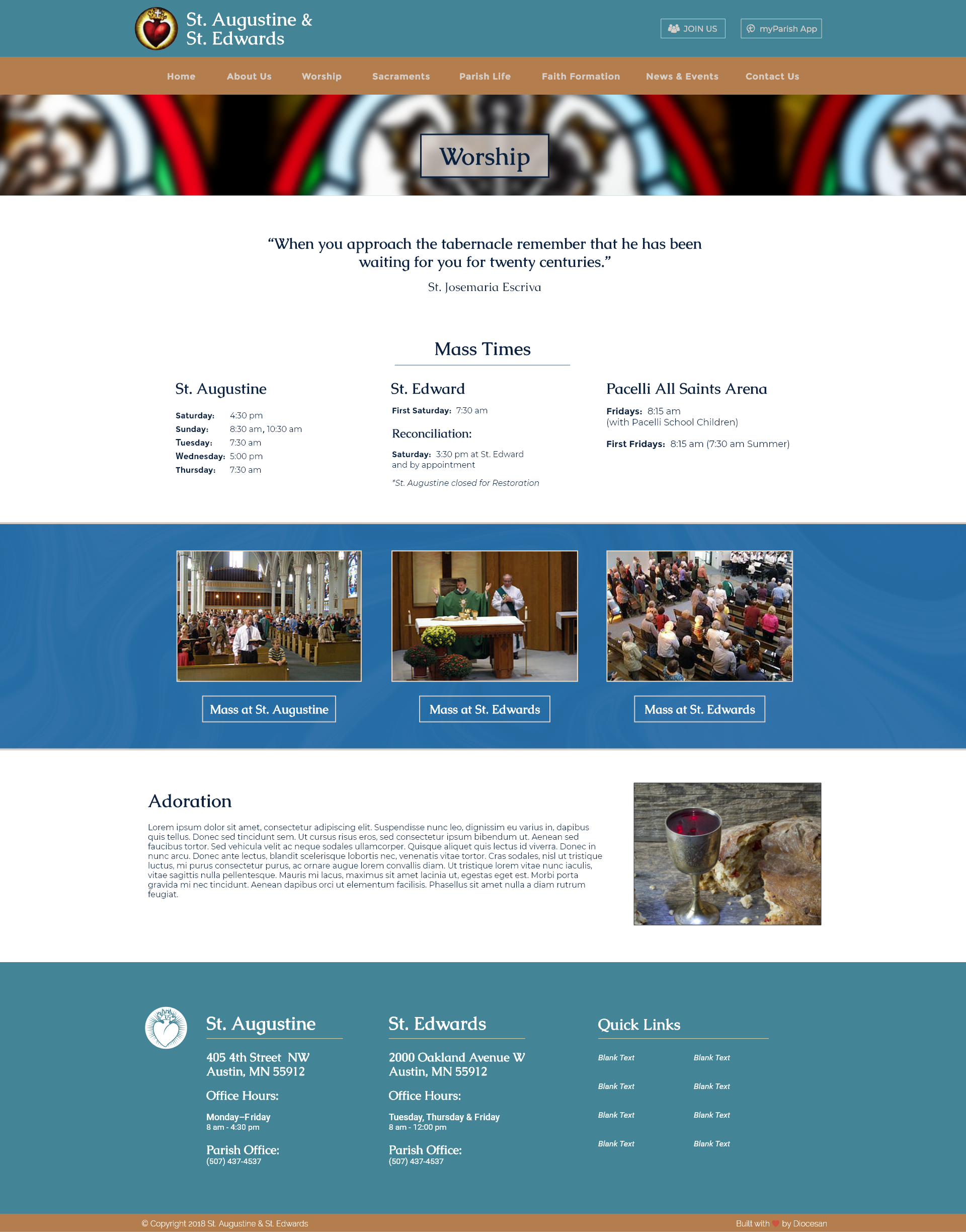
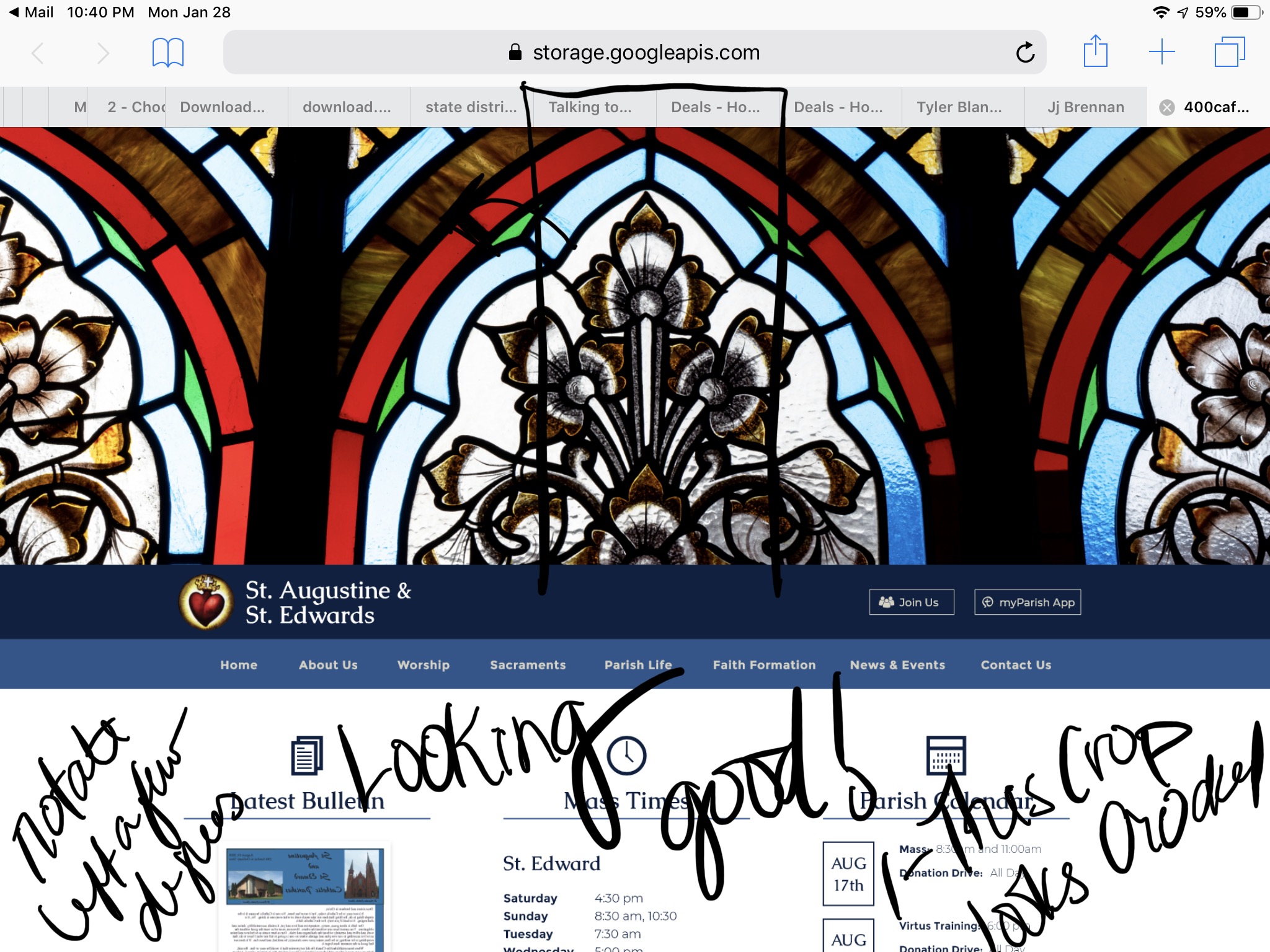
Thanks for your work on this, it's looking good!
Just a couple final tweaks that we can see:
The "overlay" on the stone colored area behind news/events doesn't stand out to me very much - should that be darker/more pronounced? I thought it was more noticeable when it was first drafted on the blue and really gave it a polished touch, I'd love to see it a little more noticeable here to give it that same polished feel.
Fr wants the navy bar in the header to be taller/a thicker navy space where the text of the church names and logo are, and the text of the church names and logo size to be increased slightly, to give that area more importance to draw the eye. He also thought the heading text size of news, events, etc. could be increased, but we also understand there could be a consistency issue with font size/etc. if we mess around with that here and there, so whatever your best judgement is based on your experience.
Finally, Jaci was thinking the main page stained glass image looked slightly rotated - see her notes on the attached image.
Then I think we are all set.
Thanks,
Rebecca
Hi Rebecca,
Thanks for sending this. I will take care of these small edits and have something for you to see early next week! :) Have a good weekend!
Best,
Blake Stapleton
Thanks for sending this. I will take care of these small edits and have something for you to see early next week! :) Have a good weekend!
Best,
Blake Stapleton