Color Changes
Here are the proofs with the color changes!

Good Afternoon,
I have not heard back from you in quite some time so I want to check in with the colors we last showcased for you.
I would love the opportunity to talk with you about the project and whatever you need to see from it. If there ism nothing else and it looks good we can then move to approval and get started with development once one of our developers has an opening.
Thanks.
Samuel Lanning


Hi Sam,
Sorry for the long delay, we have had a stretch where Fr, Jaci, or I have been travelling most of the weeks and we have some items we wanted to all take a look at and make some decisions about. I have a meeting scheduled with Fr. Steffes to review where we are at with design ideas for this tomorrow morning, so I'm hoping to have a response for you soon. I know we will be changing things, we had a photographer come take some photos of our churches and will probably use some of those photos and then pull a color scheme from there.
Thanks for your patience! I'll be in touch soon.
Rebecca
Hi Sam,
We have a few new things to try for the design:
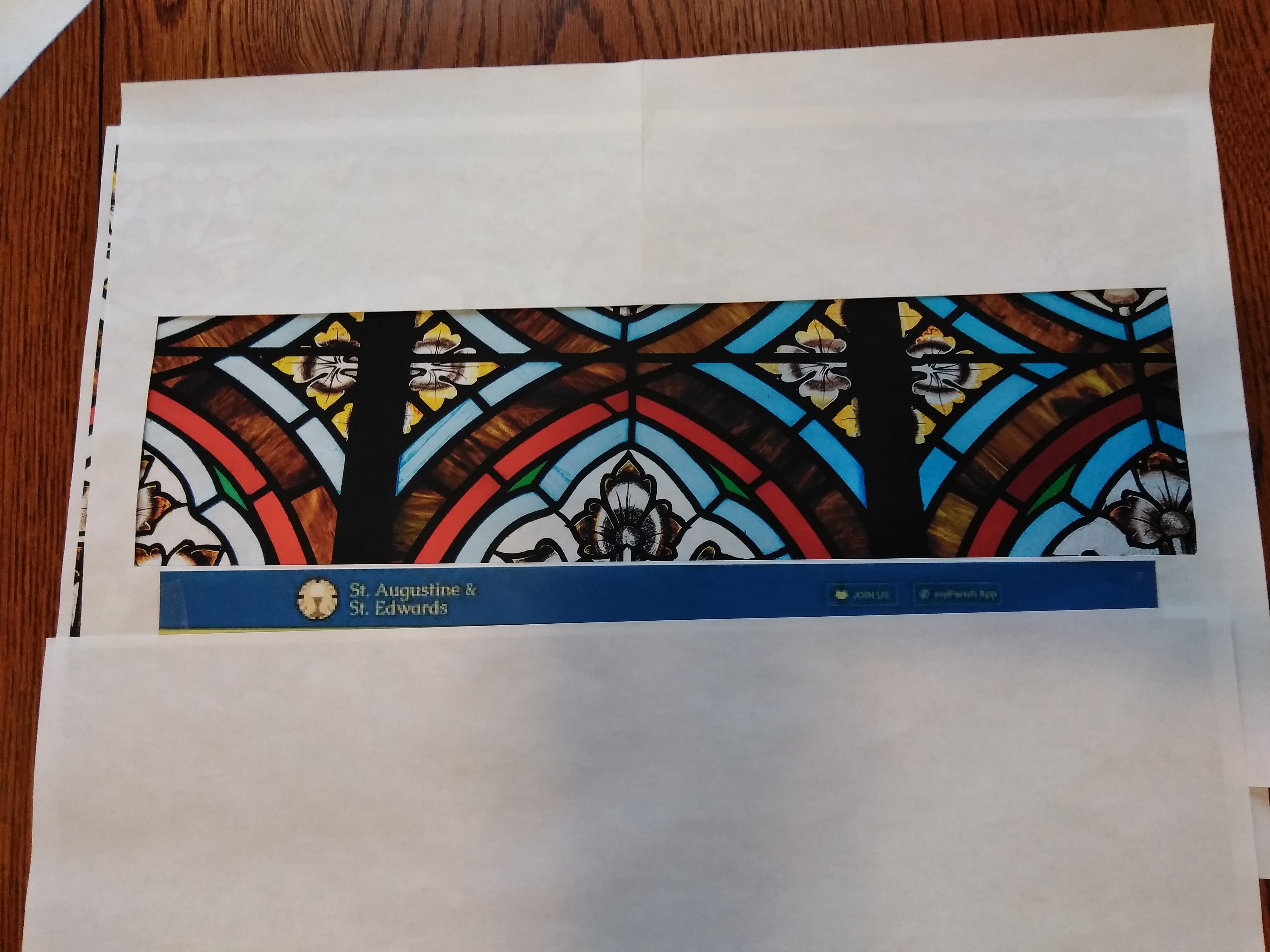
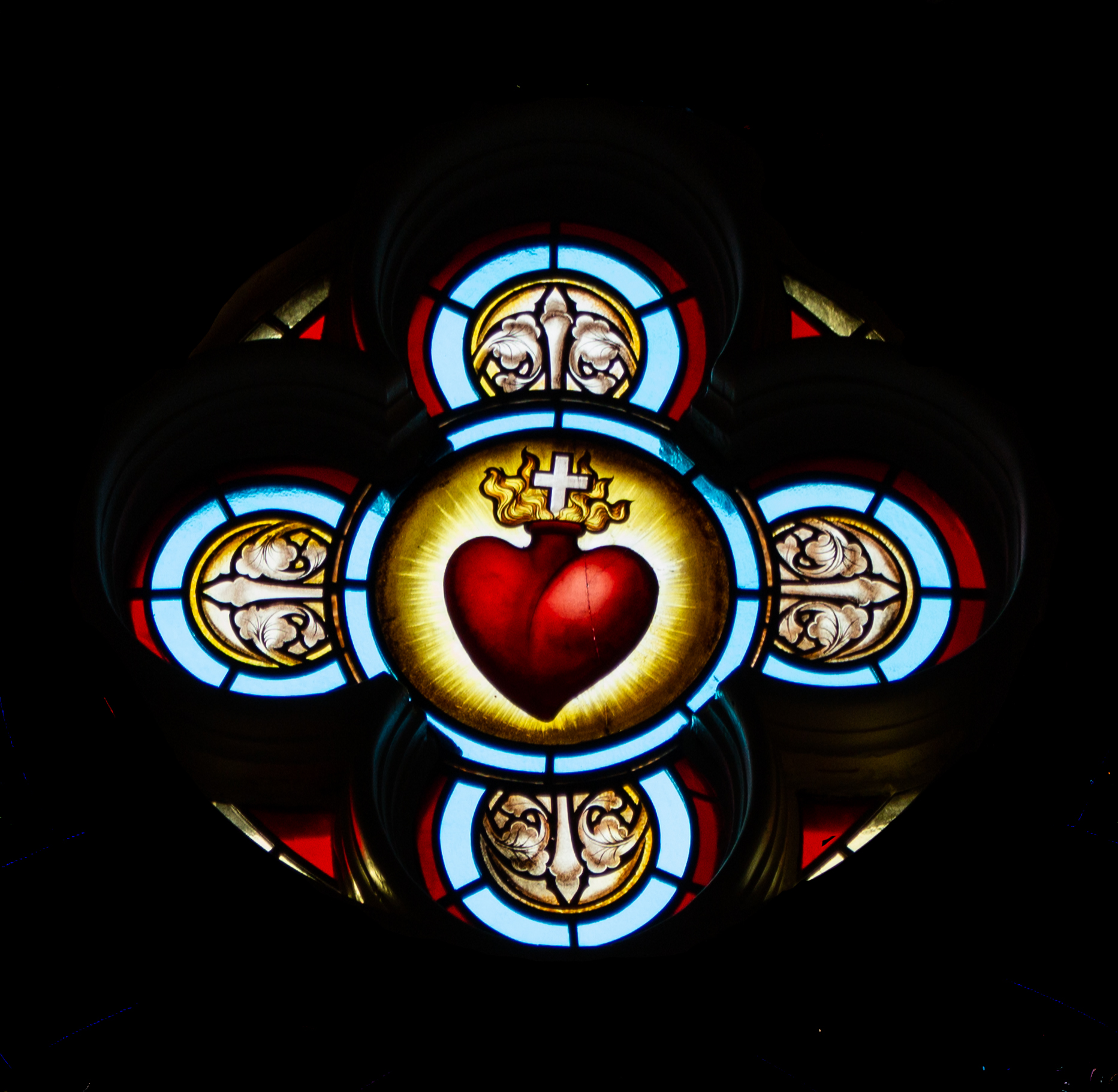
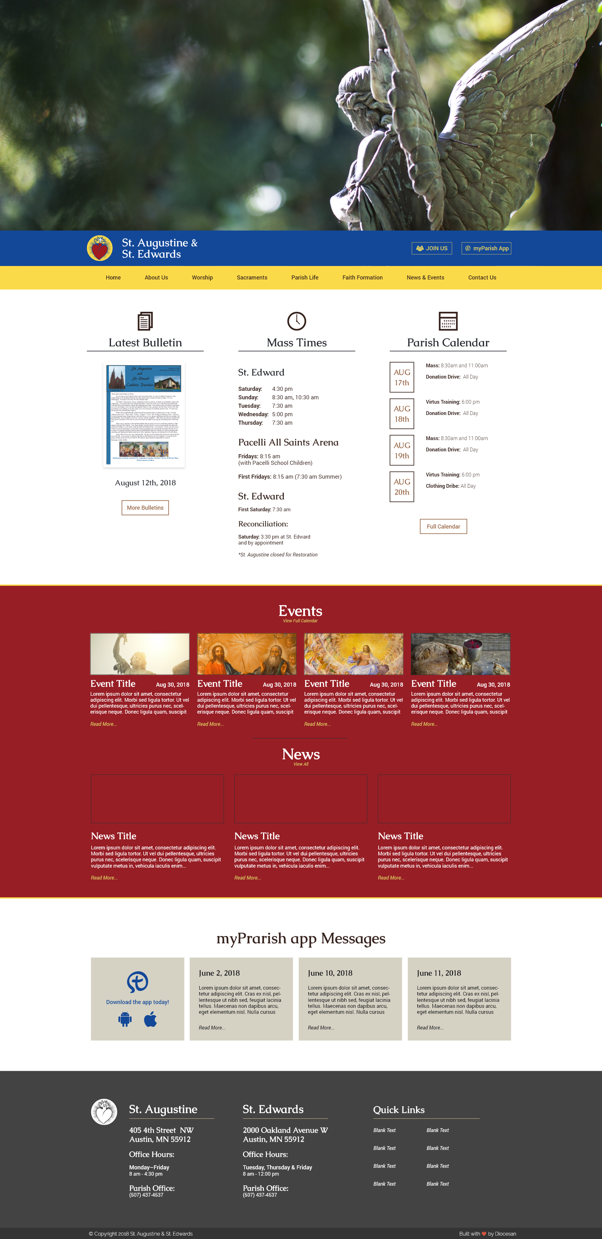
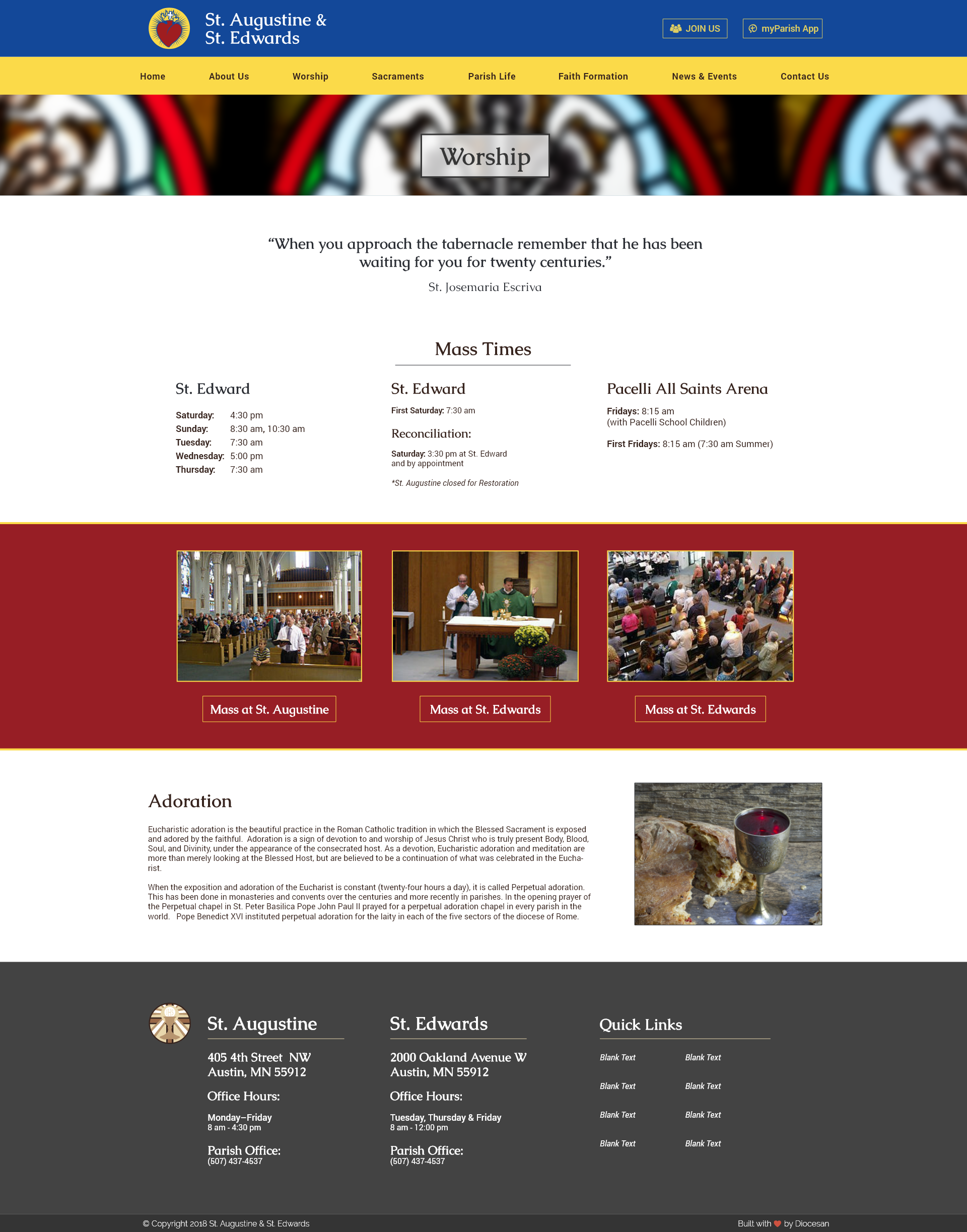
- We'd like to use the attached image as the image that creates the banners at the tops of every web page (IMG6327). See the sample viewfinder photo we took to show the rough area we would like to showcase when you crop it into a banner ("IMG20181206..." file). We'd like to be consistent with the same image on each page, but are open to the possibility of fading the image on the sub pages, or perhaps highlighting a different color within the image from page to page - we will leave that up to your design expertise/advice.
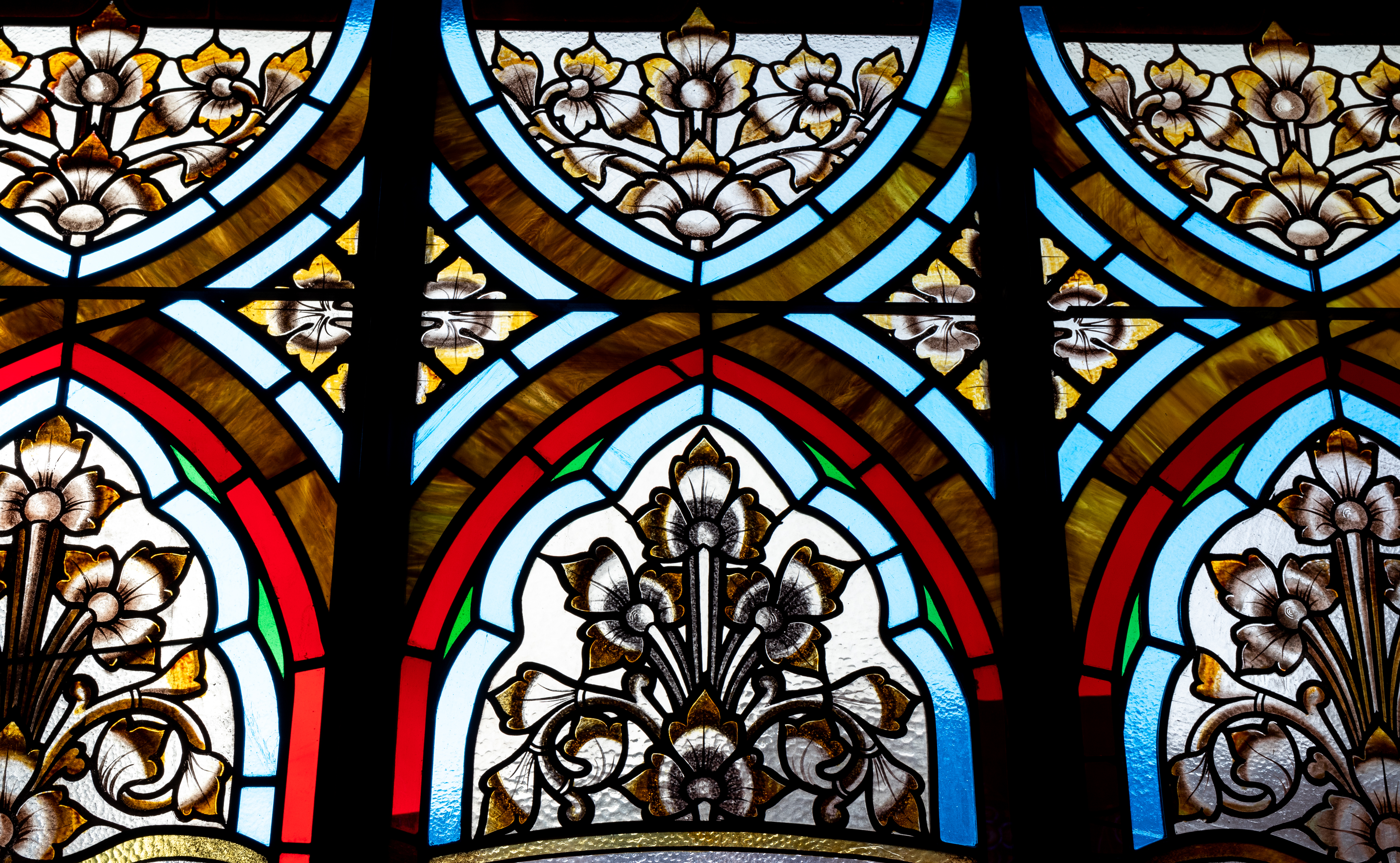
- We'd like to pull the colors from this image, so that the color that is currently the dark blue would be a match to the light blue that appears around the rosettes before the red border, and then we are wondering if it is possible to use as the secondary color (in place of where we currently have yellow) the marbled brown color from the stained glass. Is this possible to have a marbled color? If not, then a corresponding brown/neutral tone.
- For a logo image, we would like to use the attached sacred heart image, cropped in a circle at the black line that rings around the yellow area with the rays (IMG6260). We would use the color version on the website in the header and other places, but is it also possible for you to make a black line/black and white master of the image that we could then use in printing, letterhead, and other uses? Finally, Fr. is wondering if you are able to blend out the one imperfection that shows from the glass, the vertical line through the right lobe of the heart. Is that possible?
- We are still interested in seeing some sample font parings as possible alternatives to what we have now, if you are able to send any based on our last phone call.
Let me know if you have any questions or suggestions.
Thanks,
Rebecca
We have a few new things to try for the design:
- We'd like to use the attached image as the image that creates the banners at the tops of every web page (IMG6327). See the sample viewfinder photo we took to show the rough area we would like to showcase when you crop it into a banner ("IMG20181206..." file). We'd like to be consistent with the same image on each page, but are open to the possibility of fading the image on the sub pages, or perhaps highlighting a different color within the image from page to page - we will leave that up to your design expertise/advice.
- We'd like to pull the colors from this image, so that the color that is currently the dark blue would be a match to the light blue that appears around the rosettes before the red border, and then we are wondering if it is possible to use as the secondary color (in place of where we currently have yellow) the marbled brown color from the stained glass. Is this possible to have a marbled color? If not, then a corresponding brown/neutral tone.
- For a logo image, we would like to use the attached sacred heart image, cropped in a circle at the black line that rings around the yellow area with the rays (IMG6260). We would use the color version on the website in the header and other places, but is it also possible for you to make a black line/black and white master of the image that we could then use in printing, letterhead, and other uses? Finally, Fr. is wondering if you are able to blend out the one imperfection that shows from the glass, the vertical line through the right lobe of the heart. Is that possible?
- We are still interested in seeing some sample font parings as possible alternatives to what we have now, if you are able to send any based on our last phone call.
Let me know if you have any questions or suggestions.
Thanks,
Rebecca
Good Morning,
I have some changes for you to take a a look at, new colors, new logo (vector adaptation of the image above)
I have some changes for you to take a a look at, new colors, new logo (vector adaptation of the image above)
Good Morning,
I have another color combo to look at. Just trying to figure out a great combination
I have another color combo to look at. Just trying to figure out a great combination
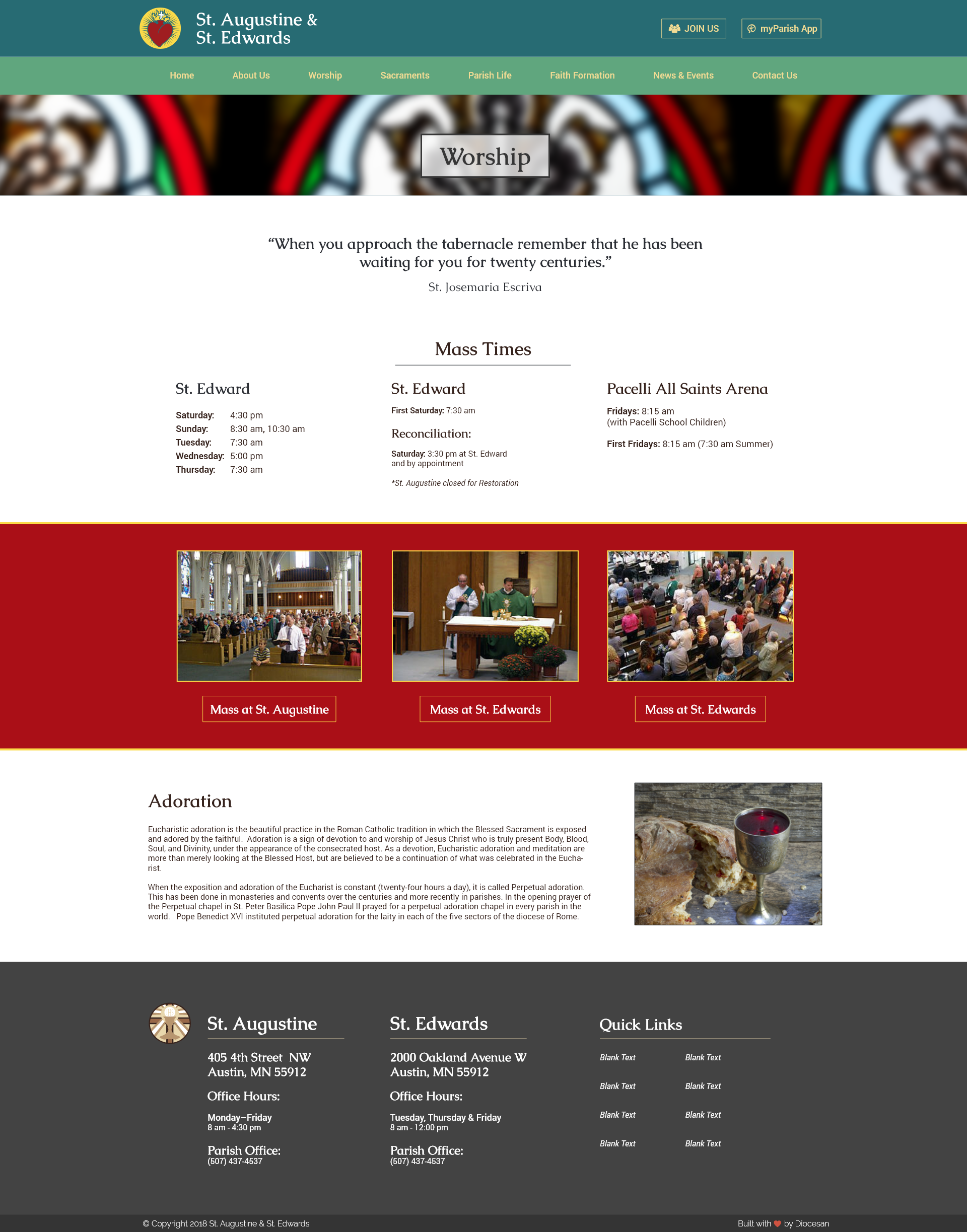
Hi Sam,
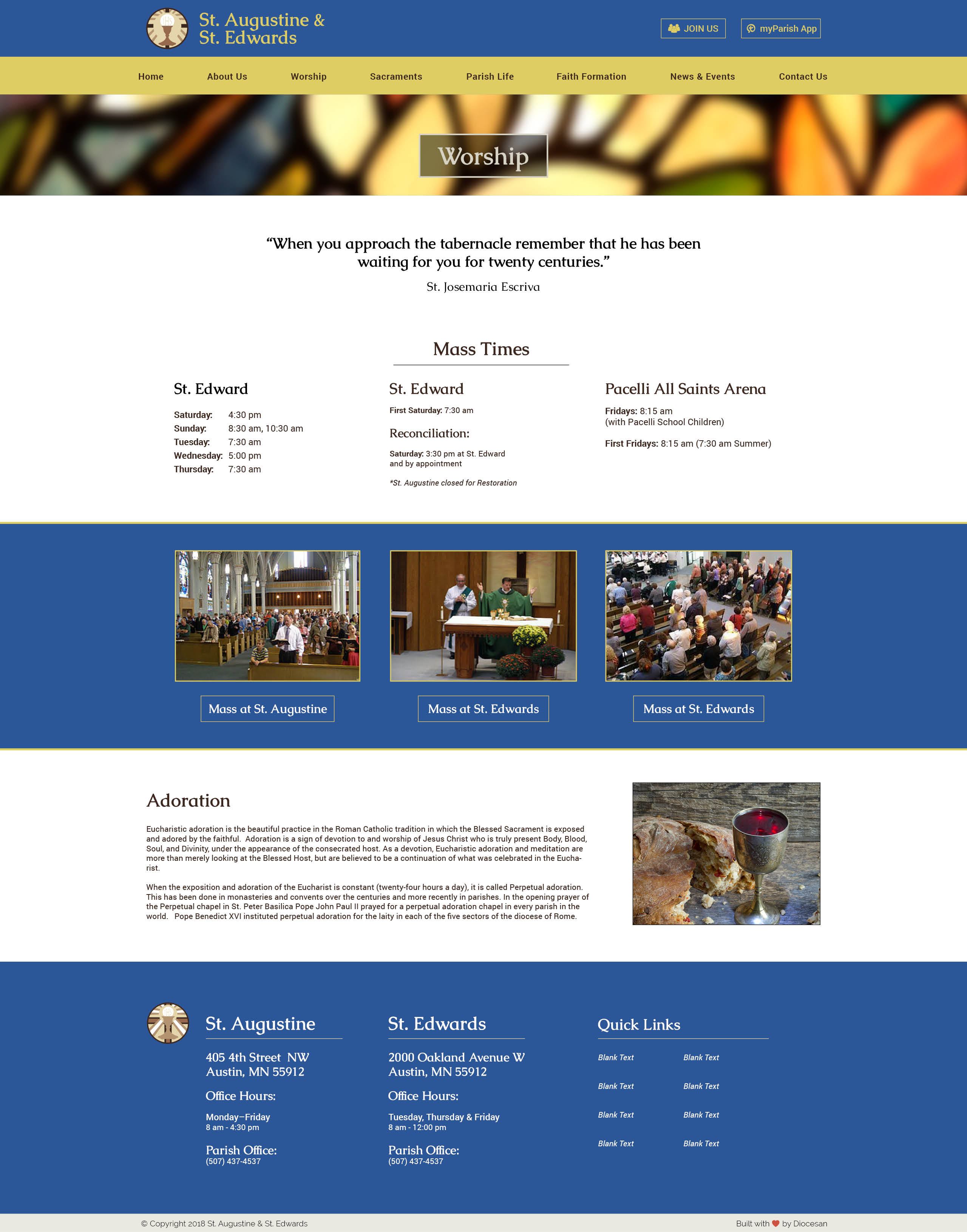
Thanks for the updates. I think we want to stay away from red as a color on the web page, since our current page is red and we've had some negative feedback to that. I'm wondering if we can try the light blue/brown combo described below/in my last email? Not sure if that marbled brown is possible, but Fr asked to find out if it was. I think the color samples right now are a bit too bright or primary as an overall look, so some softer or deeper tones might be good to test out, like some naturals or jewel tones.
I like the banner image on the adoration page, can we see it on the main page, too?
As for the logo, can we see what it would look like to keep it as the original stained glass image, but still cropped to this circle? In place of the color vector version. I see the black and white option, I do like that one as an option.
Do you have any other options/suggestions for the subtext font? I like the main/header font with the serif, but the sans serif subtext font is a little basic, reminds me of the default google docs font.
Thanks for your hard work!
Rebecca
Good morning!
Thanks for all the input, Ill work with the colors and get rid of the red! Moving the image is no problem, it will be the main image in the next proof! The log as well!
Thanks,
Samuel Lanning
Thanks for all the input, Ill work with the colors and get rid of the red! Moving the image is no problem, it will be the main image in the next proof! The log as well!
Thanks,
Samuel Lanning
As for the type, the one I used is Roboto, which yes would be one of the defaults for googles apps. For the body copy you want it to be somewhat basic and easily readable, If you want to take a look at these two options from google fonts we can try these,
Lato:
https://fonts.google.com/specimen/Lato
Montserrat:
https://fonts.google.com/specimen/Montserrat
Thanks,
Samuel Lanning
Lato:
https://fonts.google.com/specimen/Lato
Montserrat:
https://fonts.google.com/specimen/Montserrat
Thanks,
Samuel Lanning
Can we try a sample with the monserrat? I agree keep it simple and readable but I think this one at least has a little more character than the roboto.
Totally! Ill put that in the next proof and send you a sample soon!
Thanks,
Sam
Thanks,
Sam
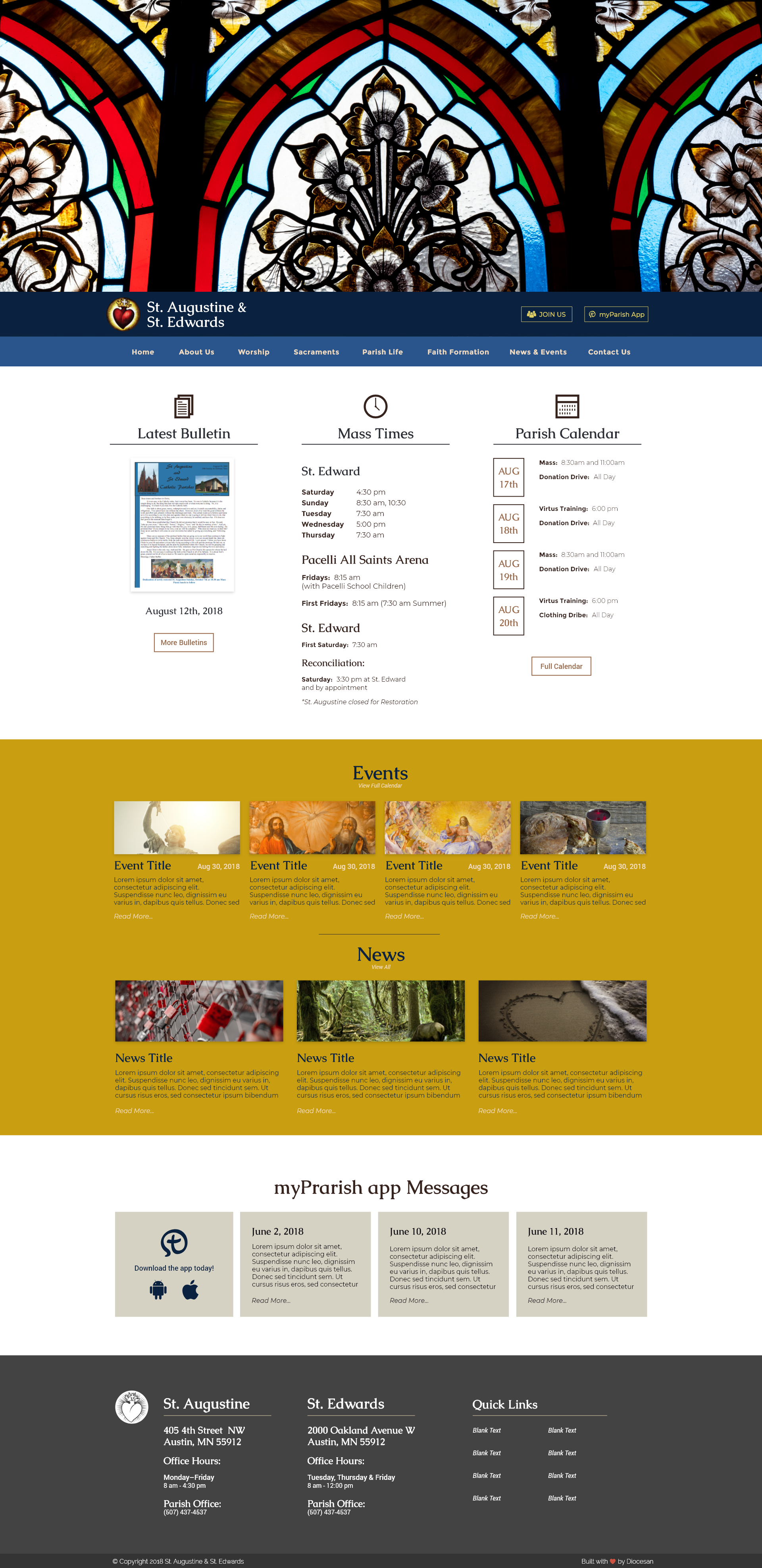
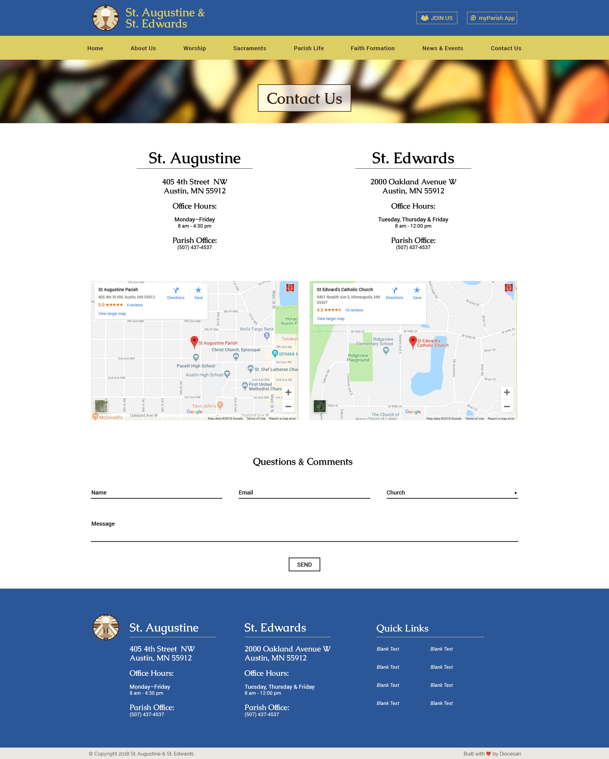
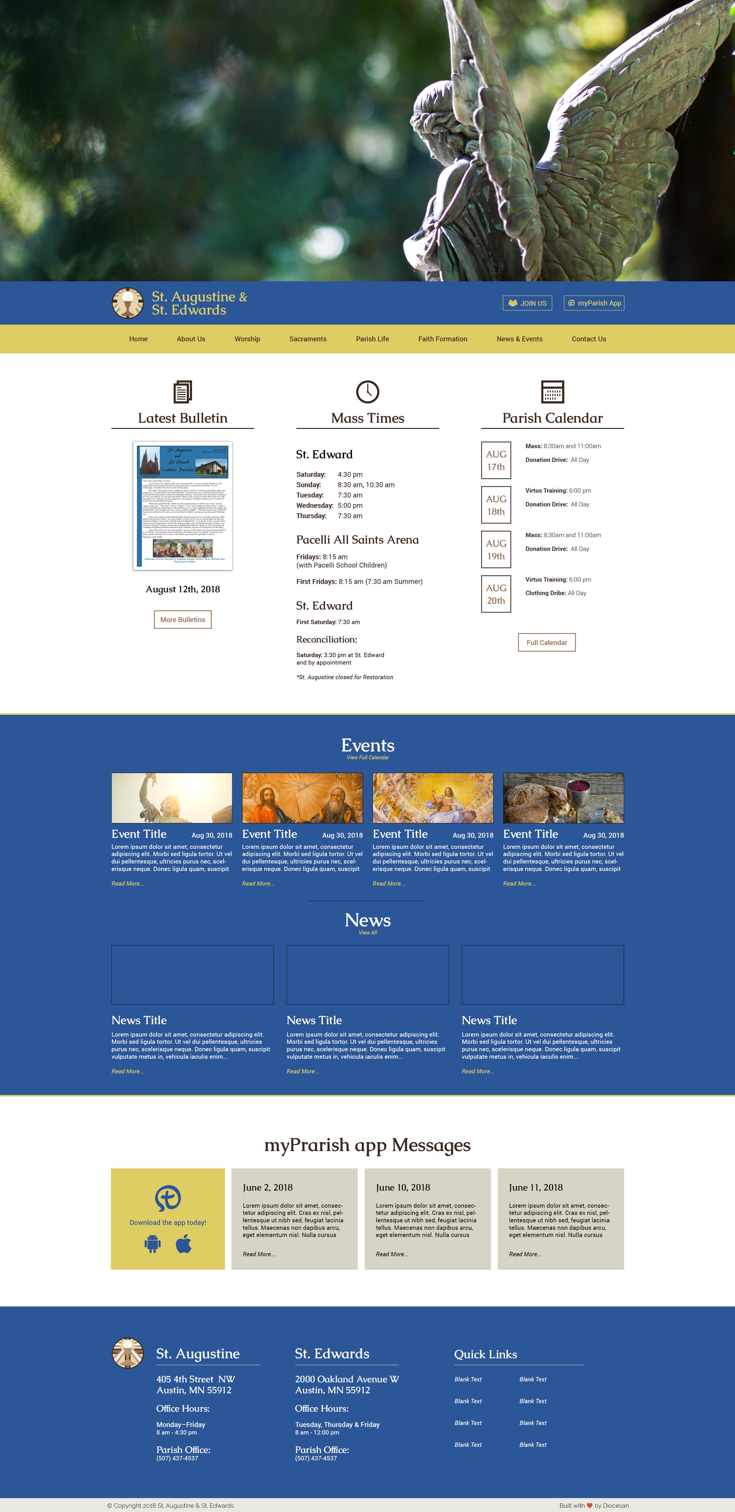
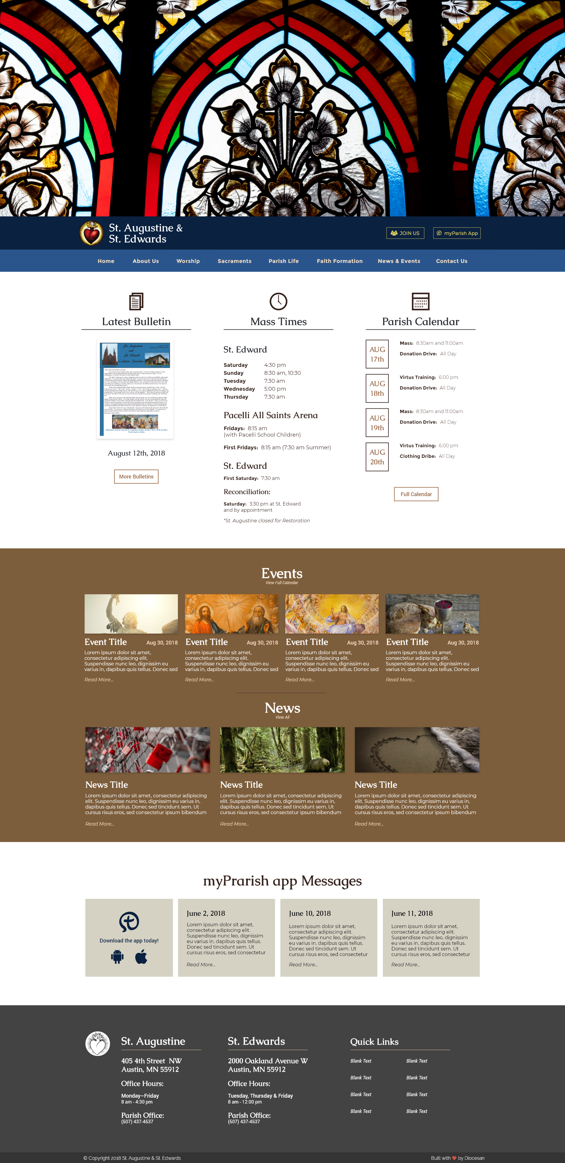
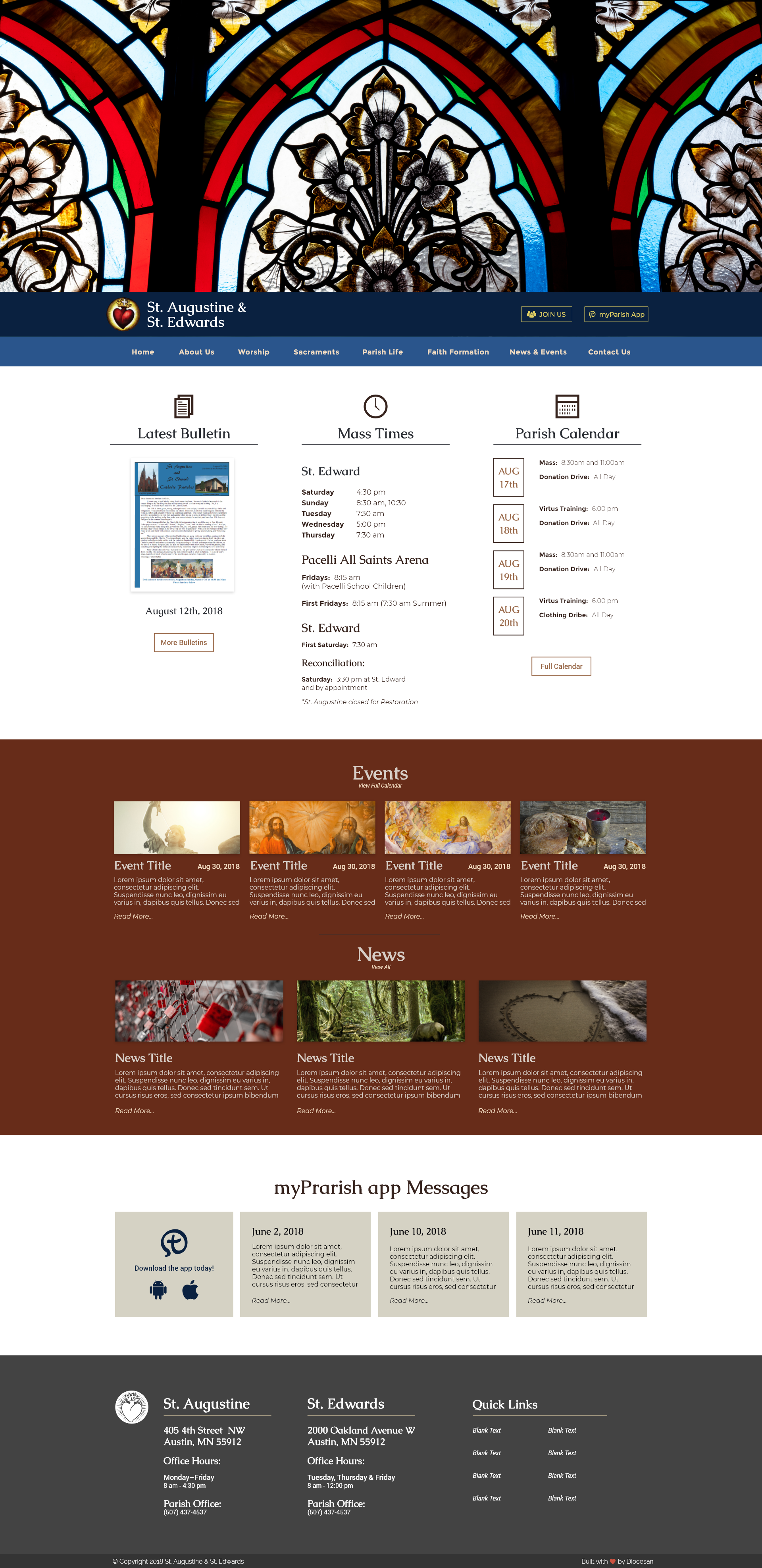
Good Afternoon! I have updated the homepage to match the styles you talked about!
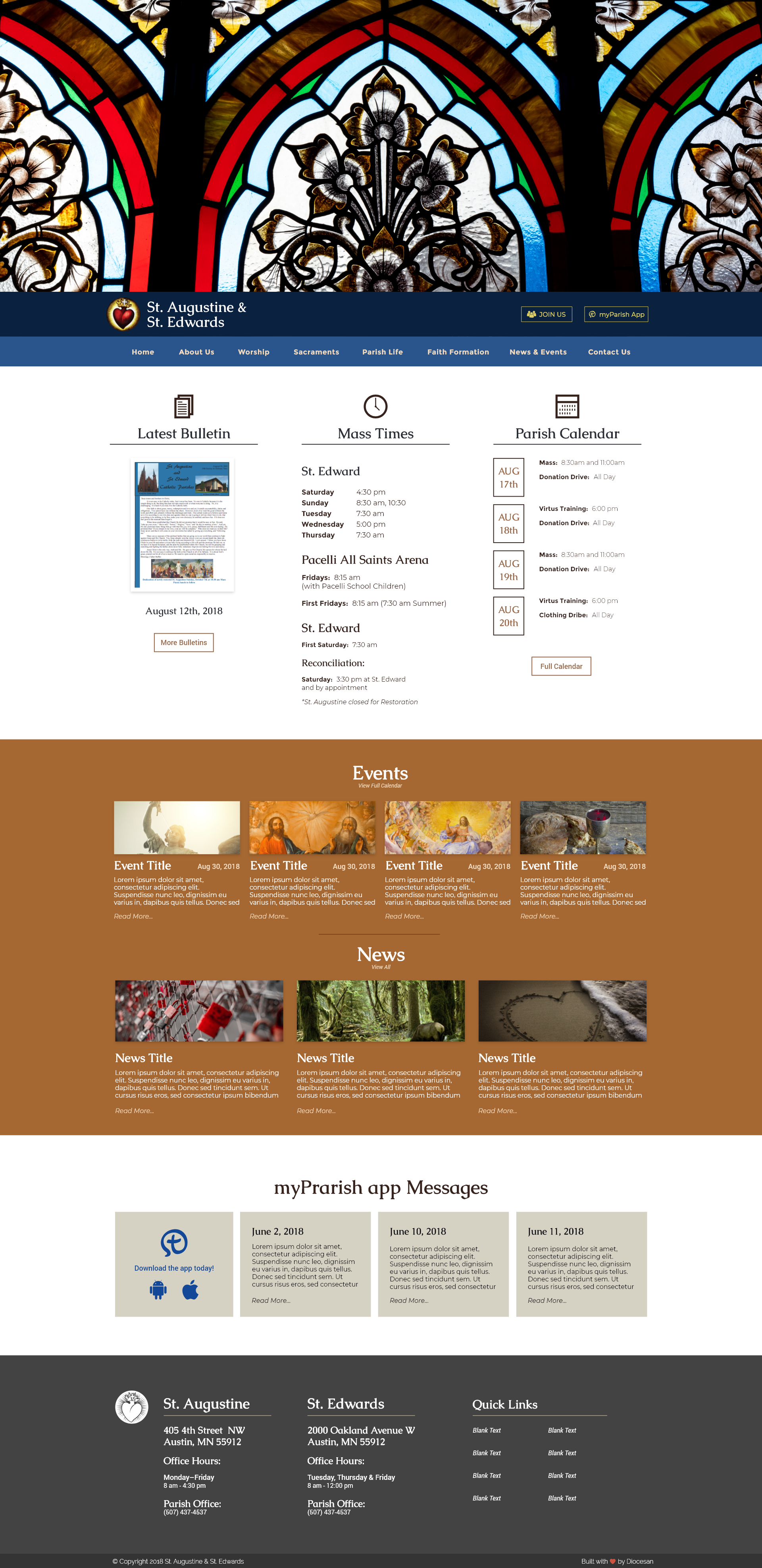
Yes I think this is headed in the right direction. I don't love the brown, the blues look nice. I know Fr. likes to have a few options to choose from, so I'm wondering if we can make 2-3 samples of color combos and then I can show him and see what way he wants to head. These blues might be an option, but maybe with a different brown.
Do you use hex code for colors at all? I'm not sure if it works, but I was looking at a website about color palettes, etc. and found some of these below. Pulling from the image itself, I'm seeing something like:
- for the main color under the photo, a light blue like 2481A3 sea green or 99d3df ice or a1d6e2 ice
- either for the second color under the photo or for the contrast further down the page, one from each of the following groups:
A - a brown like 672c19 saddle brown or 7d5e3c peppercorn or possibly a gold like c99e10 gold or c29545 golden afternoon
B - a light contrast color like b8b2af dark gray or d7cec7 grain or cdcdcd plaster
Perhaps if you can test some of those combos and see if we can get 2 or 3 sets/samples to propose to the group?
sourced from:
https://www.canva.com/learn/website-color-schemes/
(https://www.canva.com/learn/website-color-schemes/)
9 grain
29 ice and plaster
https://learn.canva.com/learn/100-color-combinations/
13 gold
14 ice
48 pepper corn
90 golden afternoon
Here you go! Got some options for you!
1.
3.